The home of architecture and design in the Asia-Pacific
Get the latest design news direct to your inbox!
Get the latest design news direct to your inbox!
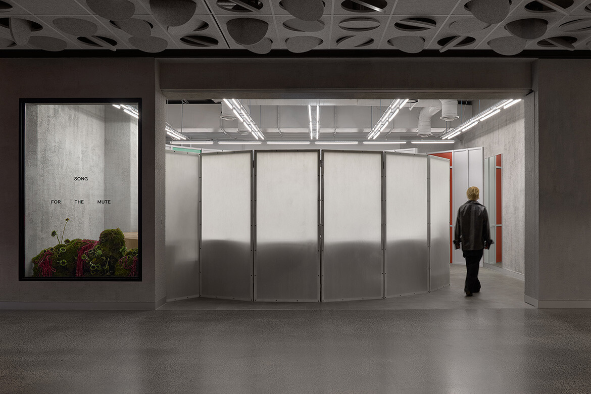
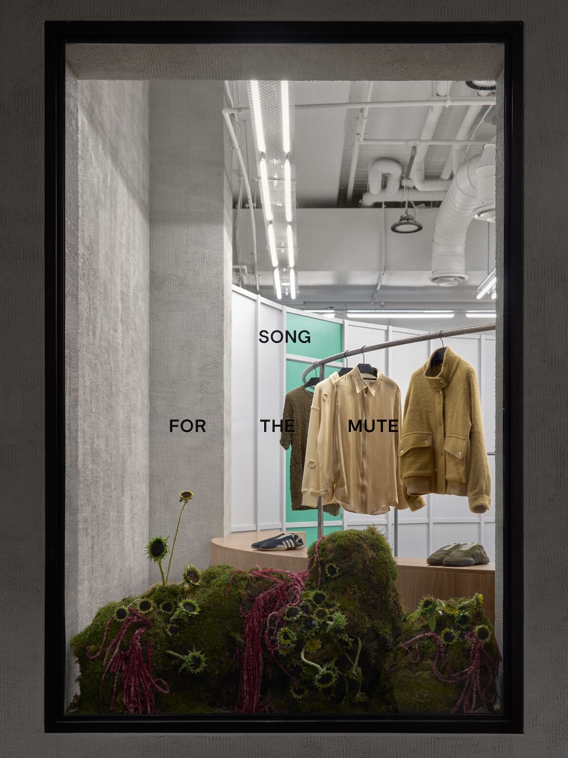
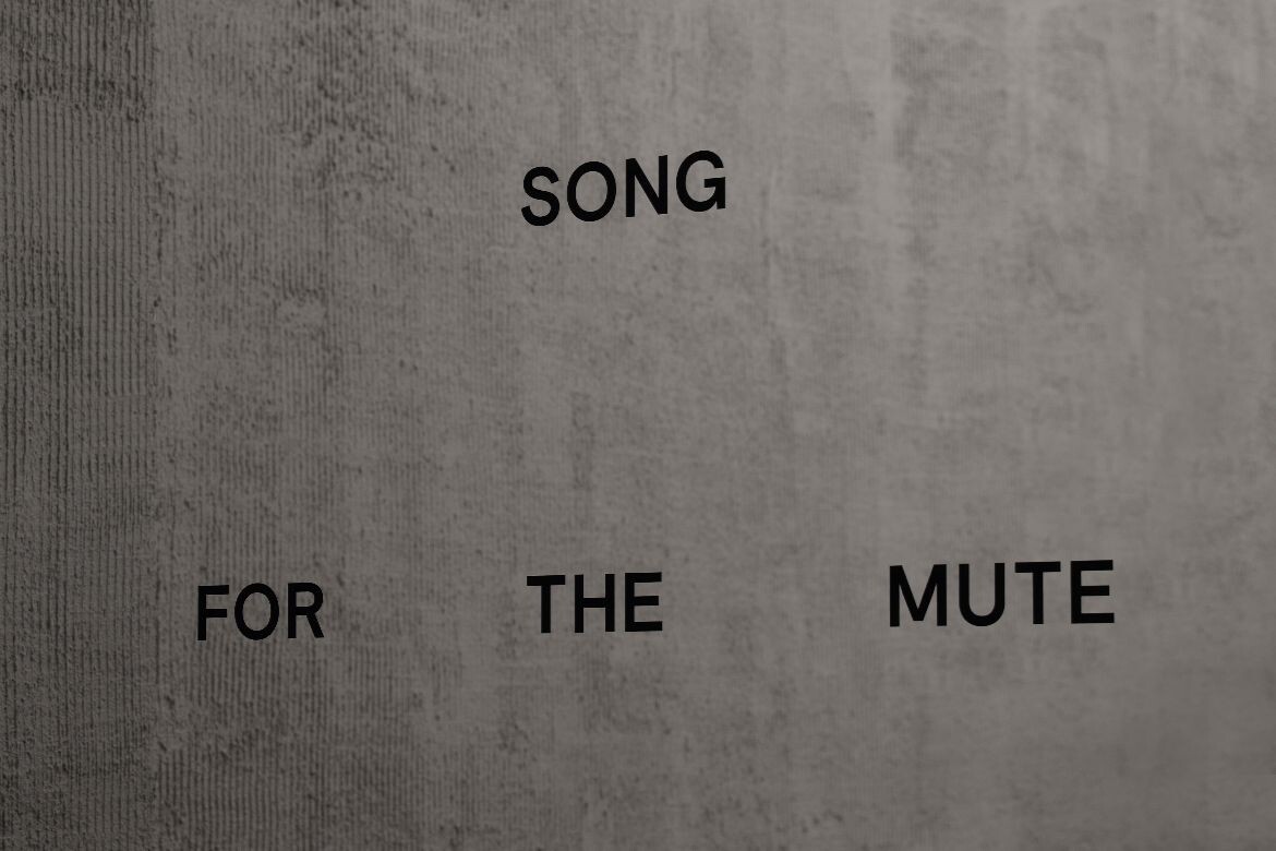
Designed by Foolscap, the debut Melbourne store for Song for the Mute translates sound and rhythm into an immersive retail experience that feels closer to a listening room than a shopfront.
January 13th, 2026
Luxury retail has long been associated with openness, visibility and the immediate reveal. For Song for the Mute’s first Melbourne boutique, Foolscap has taken a markedly different approach, one that favours restraint, atmosphere and gradual discovery over instant spectacle.
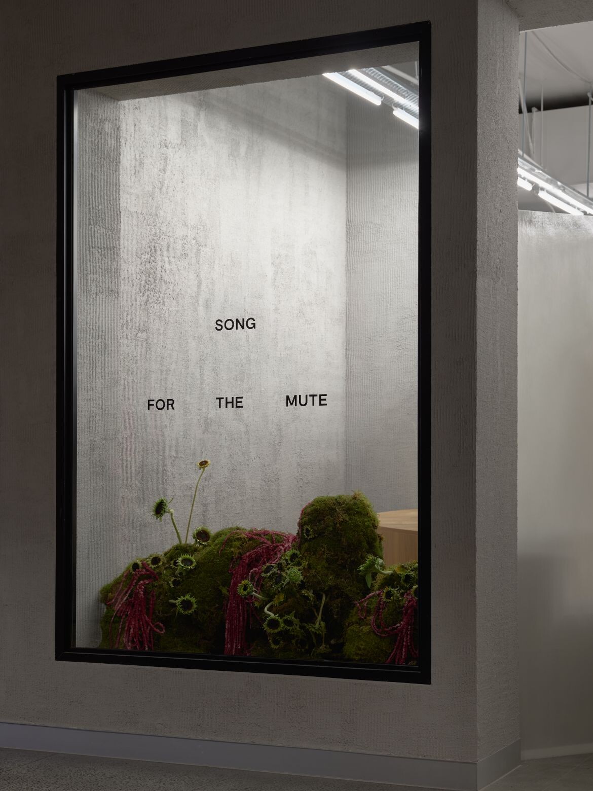
Located within a compact 68-square-metre tenancy, the store challenges conventional expectations from the outset. Rather than opening the frontage entirely to the street, Foolscap has partially closed it off, creating a sense of intrigue that draws visitors inward. The gesture feels deliberate and confident, aligning closely with Song for the Mute’s own design philosophy, which privileges storytelling, mood and emotional resonance over overt branding.
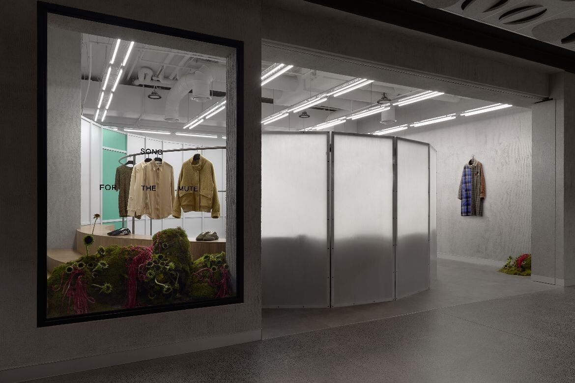
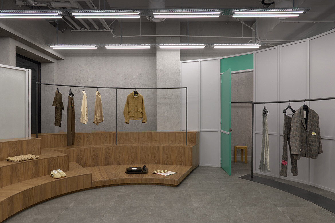
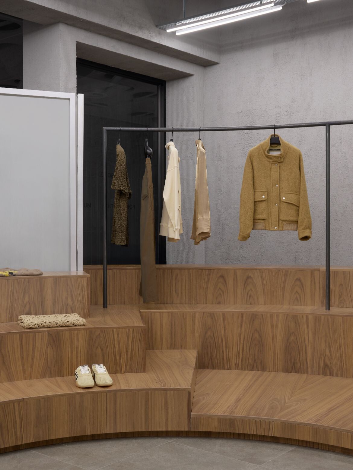
Inside, the spatial concept takes its cue from music. The layout is organised around a central, curved module inspired by the mechanics and symbolism of a record player. Clothing is displayed along the inner face of this circular form, encouraging visitors to move around it slowly, almost ritually, as though following the groove of a vinyl record. The result is a rhythmic circulation that unfolds the collection in stages, rewarding curiosity and close engagement.
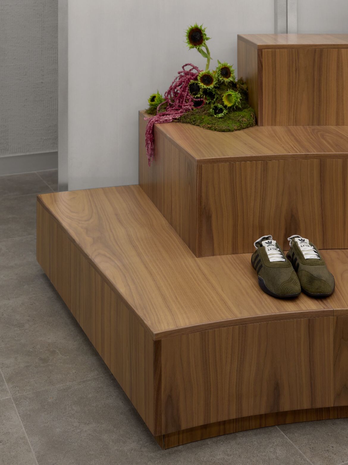
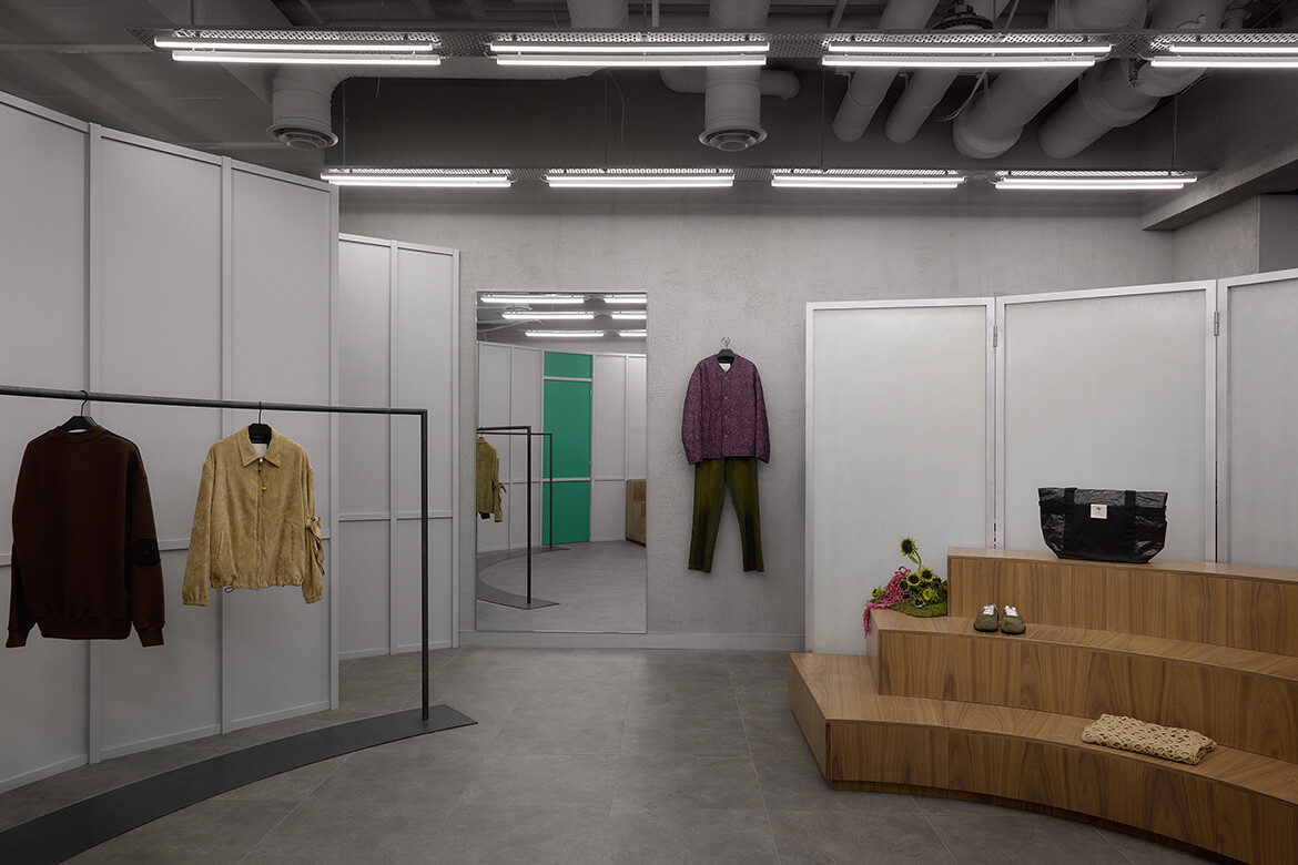
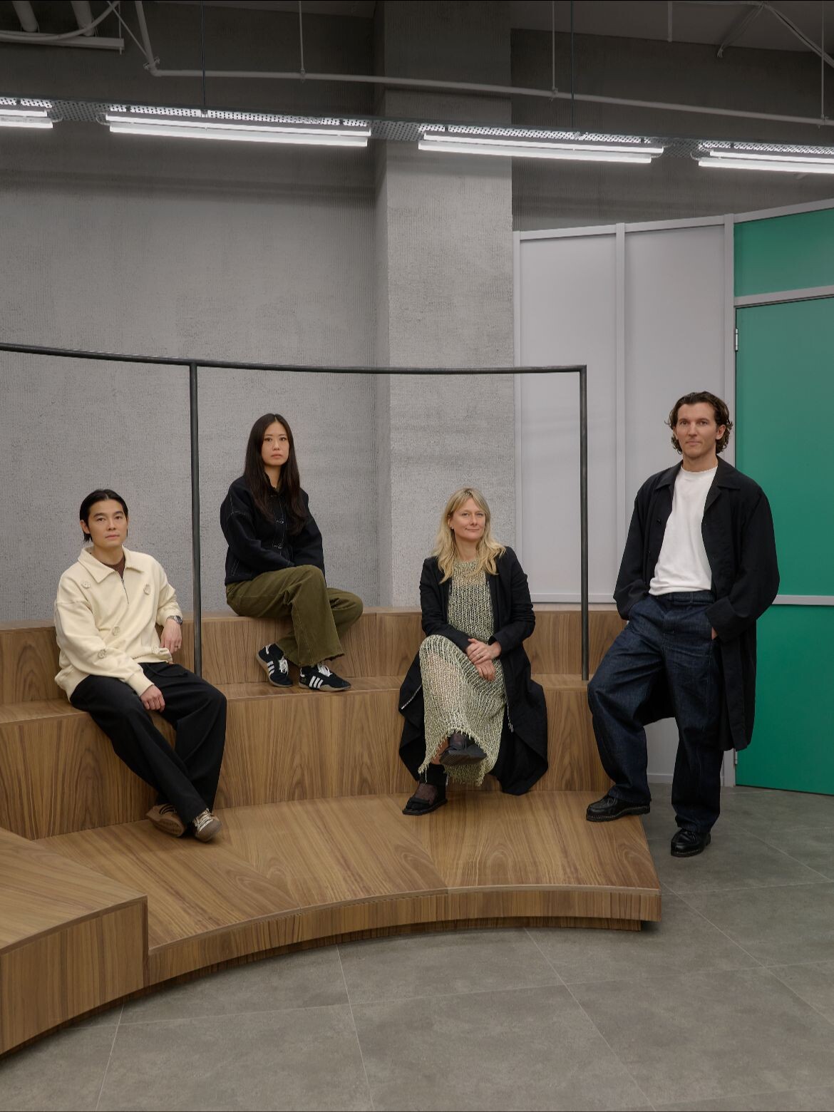
The store reads more like a gallery or performance space than a traditional boutique. Each element is carefully edited, allowing the garments to breathe while reinforcing the experiential quality of the interior. A tiered, custom timber structure anchors the centre of the space, extending toward the shopfront window and providing a flexible platform for merchandising. Partially veiled by semi-transparent partitions, the structure evokes the motion of a spinning record, abstracted into a sculptural, three-dimensional form.
Related: Norte rejects coastal cliché to win Best Restaurant Design
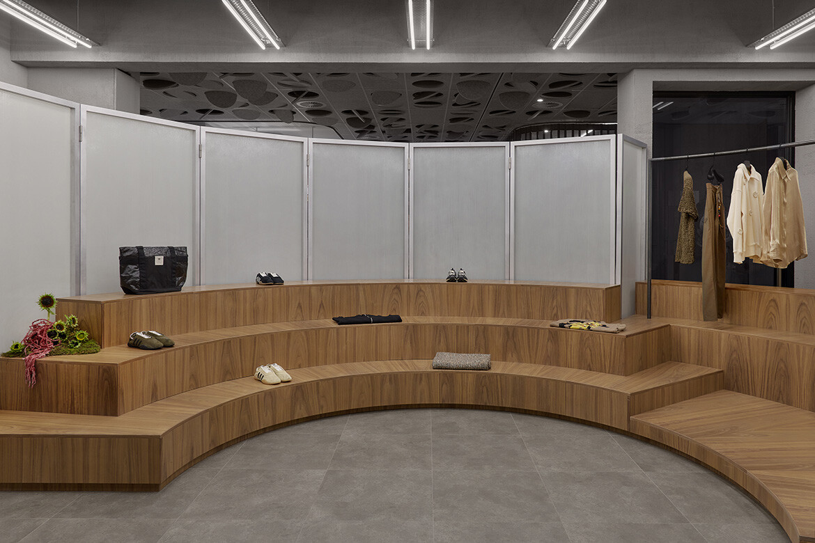
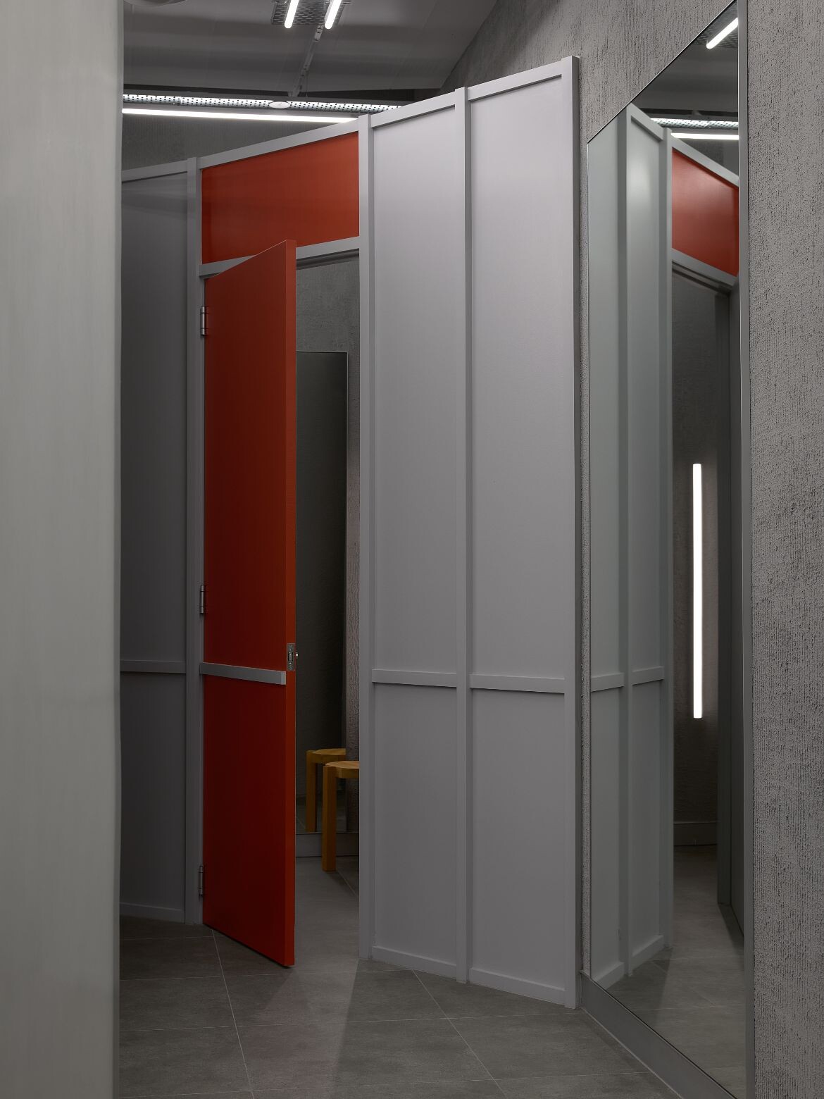
A cool, custom-textured cement render wraps the walls, lending a brutalist clarity that speaks to the building’s existing shell. Against this, walnut timber introduces warmth and tactility, recalling the intimacy of old record stores and listening rooms. Industrial elements are left exposed overhead, with raw steel cable trays and linear neon lighting creating a deliberately unfinished ceiling plane that adds to the store’s atmospheric edge.
Despite the tight footprint, the plan accommodates two generous change rooms and a discreet back-of-house zone at the rear. Angular forms contrast with the softer curves of the central module, while brightly coloured doors, informed by modernist colour theory, punctuate the otherwise restrained palette and add moments of visual tension.
Throughout the project, Foolscap’s approach reflects a broader shift in contemporary retail design, where space is conceived less as a point of transaction and more as a site of connection. The boutique does not overwhelm; instead, it invites visitors to linger, explore and form their own relationship with the brand. In doing so, it mirrors Song for the Mute’s practice of building collections as evolving chapters, each distinct yet part of a larger narrative.
The Melbourne store stands as a confident collaboration between designer and client, one defined by trust and a shared willingness to take risks. By translating musical references into spatial form, Foolscap has created a retail environment that feels immersive, emotive and quietly theatrical, a place where fashion, sound and architecture resonate in unison.
Foolscap
foolscap.com.au
Photographer
Jack Lovel
INDESIGN is on instagram
Follow @indesignlive
A searchable and comprehensive guide for specifying leading products and their suppliers
Keep up to date with the latest and greatest from our industry BFF's!
The internet never sleeps! Here's the stuff you might have missed