We spoke with Jeffrey Wilkes of WILKESDESIGN about the John Portman-designed building, which has been infused with touches of local culture and colour.

April 8th, 2024
When Mandarin Oriental, Singapore opened in 1987, DESIGNWILKES worked on the design of the Club Lounge. The Kuala Lumpur-based design studio helmed by Jeffrey Wilkes returned eight years ago for some slight refurbishment. The past year, it was engaged to revamp the entire hotel, taking six months to breathe new life into every part of the iconic building designed by US architect John Portman. The hotel re-opened in September after the USD100 million-dollar renovation.
“The main direction was to create a lively interior that was connected to Singapore, to increase the sense of place and lighten the environment,” says Wilkes, who founded his eponymous design studio in 1994. It has since created many lively hospitality spaces, such as Mandarin Oriental properties in Bangkok, Tokyo and Kuala Lumpur, W Resort in Goa India and Anantara Siam in Bangkok.

For the interior design, Wilkes referenced Peranakan architecture, black-and-white colonial houses and Angsana trees native to the island. Guestrooms feature dappled batik patterns and are given colour palettes that match their respective views of water or greenery.
Vanda Joaquim orchids (Singapore’s national flower) inspired the crystal spheres in the lobby lounge while the hotel’s transformed lounge, HAUS 65, presents a new concept in the regional hotel scene. The exclusive social space is co-curated by the Mandala Club. Its members can access the activities planned here, as well as use the hotel’s facilities.
Here, Wilkes shares more about the hotel’s design.
How did you get into design and the hospitality field?
Jeffrey Wilkes: I’ve been [aware of] interior design since I was a kid. I was very conscious of my surroundings. When I was 10, I asked my parents for black-coloured carpets. They said it didn’t exist, but I thought otherwise. After obtaining a Bachelor of Fine Arts, I went on to get a Bachelor of Applied Arts in Interior Design. From there, I worked in the luxury condominium sector in Toronto before moving to Asia where I started working in Singapore in 1992, then Kuala Lumpur in 1994. I love the breadth of the hospitality industry – I have been working in this sector for the last 31 years.

Can you describe the DNA of DESIGNWILKES?
We enjoy creating eclectic interiors, [matching] antiques with something contemporary; creating a collection, whether its furniture or art. We take our clients’ desires and [interpret] them into timeless, elegant, functional spaces.
Can you point out some interesting details in the guestroom design? What did you want travellers to feel when they are in this space?
We wanted them to feel they are in Singapore, and we also wanted to maximise the physical space. Heavy drapes were replaced with electric blinds to totally open the view. We also used cerused oak [for the joinery], which speaks to a tropical resort atmosphere. A Chinese-inspired minibar feels like it came from a shophouse and the carpet pattern looks like the shadows of palm trees on the beach.
Related: Hotel Indigo Kuala Lumpur on the Park

Can you elaborate on the design of the Royal Penthouse? How is the design both functional and luxurious?
The Penthouse is an extension of all we were creating in the rooms and suites, but with the addition of incredible views and space. There is a fabulous chef kitchen just waiting for a guest chef, a casual yet elegant living room with oriental touches, a large primary bedroom with an oversized en-suite bath, and a balcony with panoramic views of the Marina Bay area. All these make for a fabulous entertainment suite.
How does the interior design of HAUS 65 present a unique space within a hotel while also expressing the spirit of Mandarin Oriental?
Our vision from the start was that HAUS 65 would be [designed like] an apartment or a penthouse with a strong residential feel. We wanted to remove the corporate atmosphere associated with many typical hotel club lounges. Hence, we had planned from the start a mix of furniture and a collection of art. This direction also complements well with Mandala Club’s design style – the guest profile is both corporate and leisure, so it was important to make it work for both sectors.
DESIGNWILKES
designwilkes.com
Photography
Courtesy of Mandarin Oriental Singapore


More ideas about hotel and hospitality design in this exclusive interview with W Hotels’ Global VP
INDESIGN is on instagram
Follow @indesignlive
A searchable and comprehensive guide for specifying leading products and their suppliers
Keep up to date with the latest and greatest from our industry BFF's!
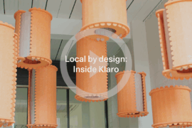
In an industry where design intent is often diluted by value management and procurement pressures, Klaro Industrial Design positions manufacturing as a creative ally – allowing commercial interior designers to deliver unique pieces aligned to the project’s original vision.
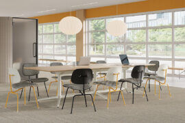
Herman Miller’s reintroduction of the Eames Moulded Plastic Dining Chair balances environmental responsibility with an enduring commitment to continuous material innovation.
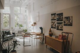
Sydney’s newest design concept store, HOW WE LIVE, explores the overlap between home and workplace – with a Surry Hills pop-up from Friday 28th November.
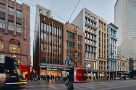
Merging two hotel identities in one landmark development, Hotel Indigo and Holiday Inn Little Collins capture the spirit of Melbourne through Buchan’s narrative-driven design – elevated by GROHE’s signature craftsmanship.
As PTID marks 30 years of practice, founder Cameron Harvey reflects on the people-first principles and adaptive thinking that continue to shape the studio’s work.
With its Academy report, WORKTECH sets out some predictions and reflections on the workplace in 2026.
The internet never sleeps! Here's the stuff you might have missed
Mexican architecture studio LANZA atelier has been selected to design the Serpentine Pavilion 2026, which will open to the public in London’s Kensington Gardens on 6th June.

Australia Post’s new Melbourne Support Centre by Hassell showcases circular design, adaptive reuse and a community-focused approach to work.