The home of architecture and design in the Asia-Pacific
Get the latest design news direct to your inbox!
Get the latest design news direct to your inbox!
Inspired by the hanami season in Japan, Wagaya is an immersive space designed to capture the sensory experience of sitting beneath the cherry blossom trees.


Come springtime in Japan and millions of locals and tourists turn out across the country to enjoy the hanami (flower viewing) season, holding feasts under the flowering sakura (cherry blossoms). It is one of Japan’s most popular annual traditions and celebrates the transience and beauty of the flowers. Only in full bloom for a few days, the flowers fall from the tree and flutter in the breeze, covering the ground in a soft, plush pink carpet.
This magical scene inspired the award-winning design of Wagaya, a new ramen restaurant in Lidcombe, Sydney. Sydney studio Span Design created an immersive space to capture the sensory experience of hanami, taking a mise-en-scène approach to the design. Mise-en-scène (French for “what is in the frame”) is used in film and theatre to activate viewers’ senses to help them imagine the world firsthand. Using colour, texture, lighting and forms, Span Design has created a scene that evokes sitting beneath the cocooning canopies of the cherry blossom trees.
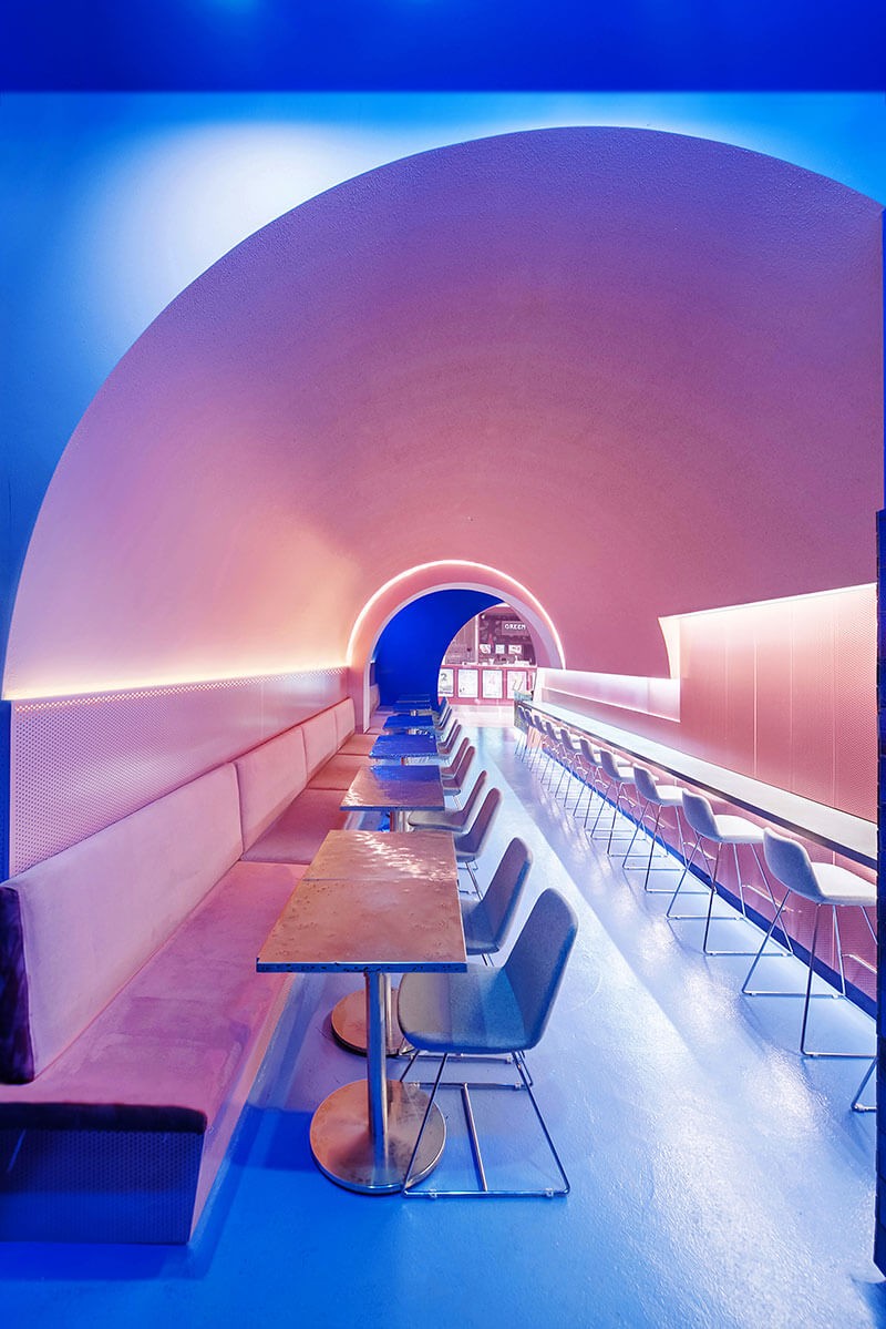
Wagaya is framed with a semi-circular opening in the façade that allows a view through the restaurant. Another long archway through the middle of the restaurant lowers the height of the ceiling and creates a tunnel for a more intimate dining space as if enveloped by the foliage of the flowers.
A twin set of arches provides the feeling of contraction and release, adding to the sense of sitting under a cherry blossom tree.
“We took inspiration from the overlaying of textures, colour, smell and experience to create this transitional space,” says Joanna Fang, director of Span Design.
The tunnel is painted soft pink to capture the feeling of falling flowers. A smooth paint finish and vinyl-upholstery seating conjure the velvety characteristics of cherry blossoms, while rough paint finish and pink perforated timber panels suggest the layering of flowers and textures. The perforated boards around the kitchen also allow for the aroma of food to permeate the space.
Cobalt blue is a vibrant contrast to the pink, like bright blue skies behind the cherry blossoms. Japanese tiles in blue linen wash add variation, depth and gloss around the façade, kitchen and bar.
Neon lights draw attention to the eatery and inject an element of fun throughout the venue, and a video-mapping projection casts speckled light, like cherry blossoms drifting and falling around people.
LED lights highlighting the arc and one-point perspective of the pink dining passage draw the eye through the restaurant and enhance the inviting atmosphere and immersive experience inspired by the splendour of the hanami season. Span Design won the Dulux Colour Award 2018 for Commercial Interior: Public & Hospitality for Wagaya.
Take a look at this other project which brings a Japanese neon vibe, HWKR by Craig Tan Architects.
–
Want more stories like this one straight to your inbox? Sign up for our newsletter.
INDESIGN is on instagram
Follow @indesignlive
A searchable and comprehensive guide for specifying leading products and their suppliers
Keep up to date with the latest and greatest from our industry BFF's!
The internet never sleeps! Here's the stuff you might have missed