The home of architecture and design in the Asia-Pacific
Get the latest design news direct to your inbox!

Get the latest design news direct to your inbox!
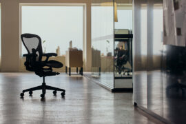
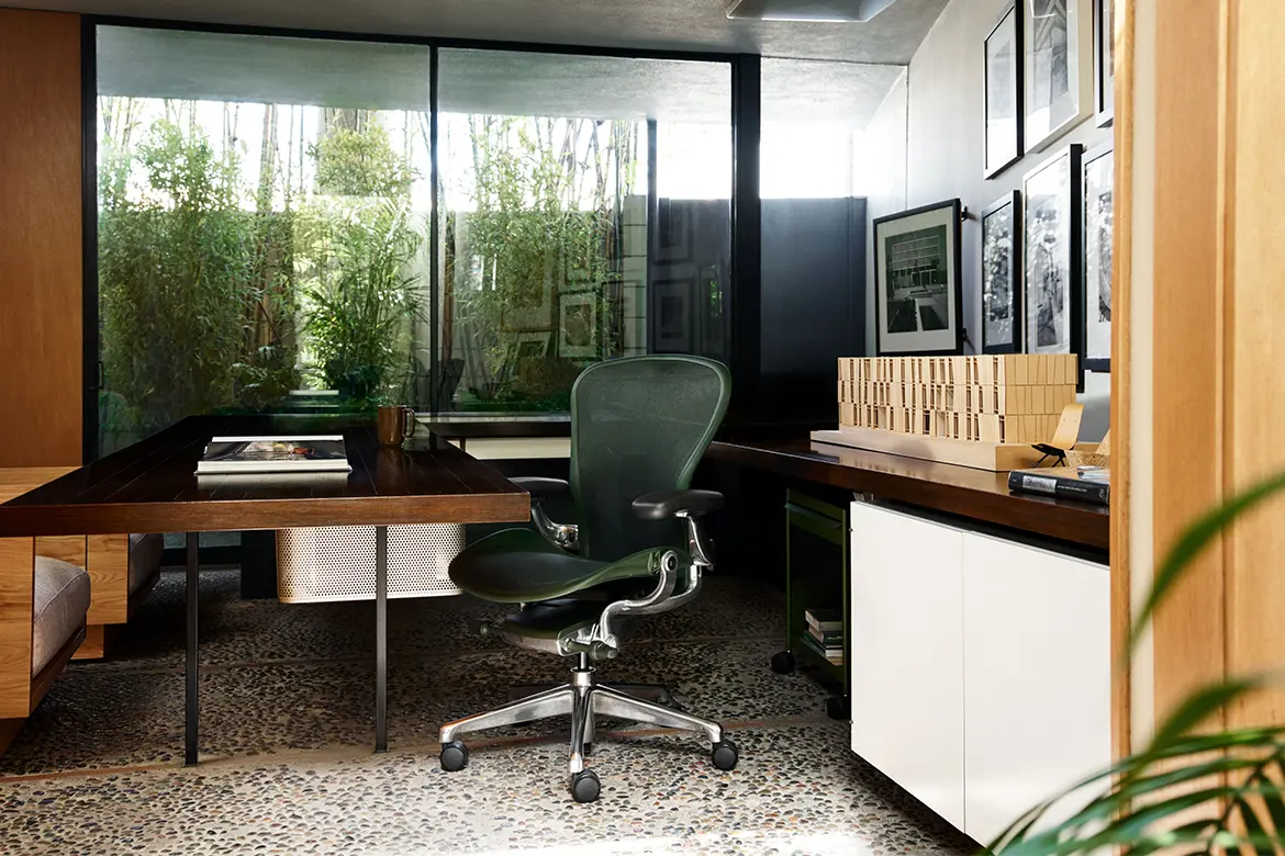
Aeron Chair’s new shades, Nightfall and Jasper, arrive with a sense of quiet cohesion – no bells and whistles, no loud technicolour; just two timeless, perfectly versatile near-neutrals. But the new hues aren’t just about colour – and their significance is much more profound than their surface-level subtlety might suggest.

July 7th, 2026
When Bill Stumpf and Don Chadwick first designed the Aeron Chair in 1994, the pioneering seat that heralded a new era of ergonomics and material innovation was briefly accompanied by a palette of jewel-like tones.
Shades like Amethyst and Sapphire reflected the metallic sensibility of the era; however, at the time, they could only be applied to the exposed flexible surface of the revolutionary Pellicle suspension – rather than to the whole form of the chair. This created a noticeable contrast between the materials – a visual dissonance at odds with Aeron’s deliberate cohesion. Herman Miller went back to the drawing board, reinforcing the innate connection between colour, design integrity and material innovation, and proving that even a revolutionary design could arrive dressed in subdued tones and still redefine the industry.
In 2016, the launch of the remastered Aeron – which integrated new research on the science of sitting and advancements in materials, manufacturing and technology – came dressed in a timeless palette of restrained neutrals. Quietly marking the transformative debut of a refined tilt mechanism, an adjustable PostureFit SL and an updated Pellicle 8Z, Onyx, Graphite, Carbon and Mineral – shades echoing the sophistication of well-tailored menswear – became synonymous with Aeron for years to come.
And then, there was colour
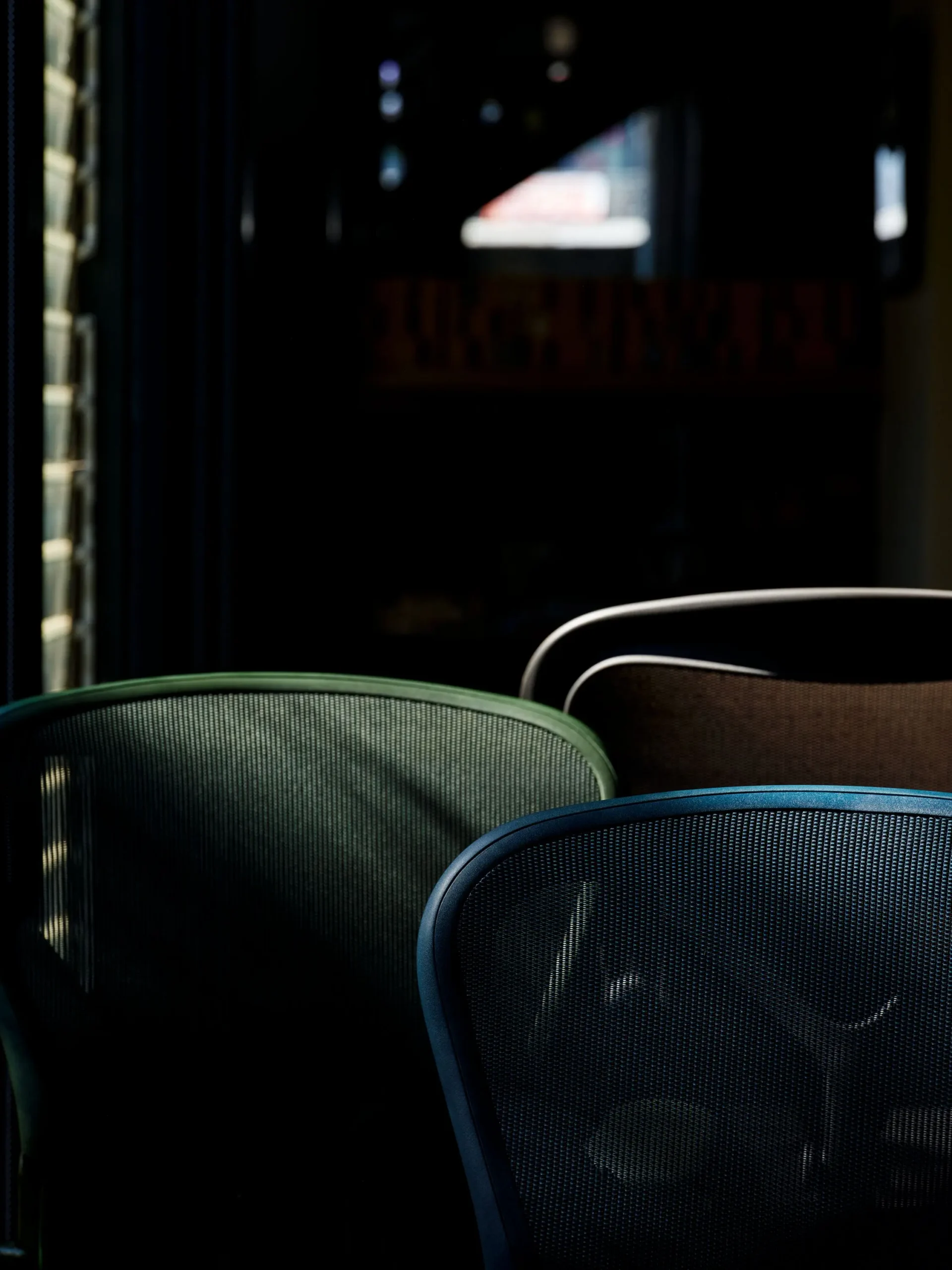
Until now. In June, as part of the “Living with Change” exhibition at Chicago’s Fulton Market Design Days, the world’s most iconic chair was unveiled in two bolder, more saturated colours.
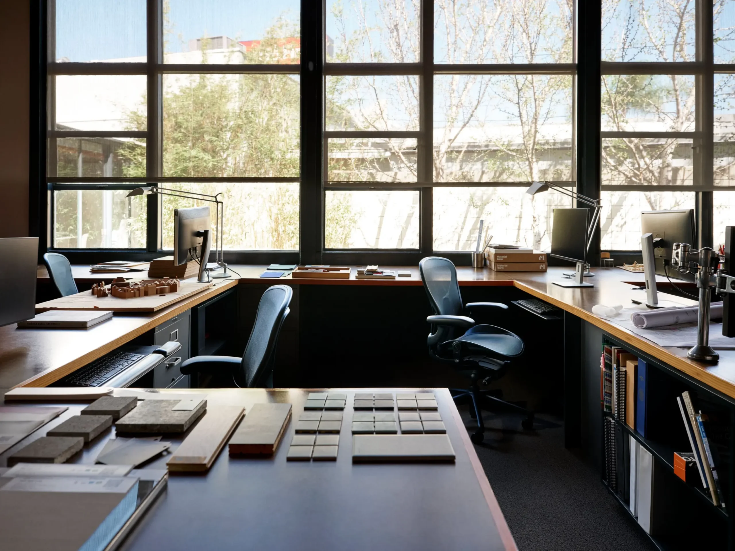
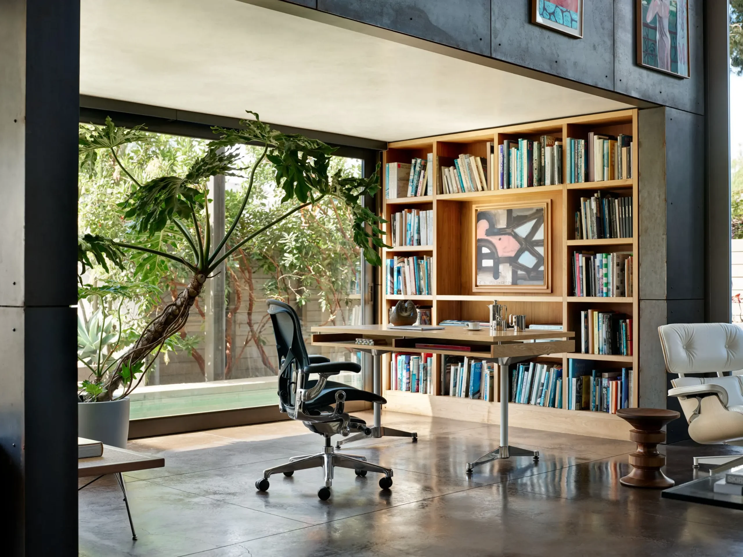
The addition of Nightfall, a navy staple in Herman Miller’s broader portfolio, and Jasper, a dark green that evokes the landscape of the Pacific Northwest, evolves Aeron’s heritage in line with the shifting role of colour in modern interiors. “Saturated colours in cohesive environments have the capacity to change our respiration, our blood pressure and even our body temperature,” says Joseph White, Director of Design Strategy for MillerKnoll. “Design, colour and furniture choices have become central considerations as individuals and organisations look to elevate and differentiate their environments.”
When developing the expanded palette, the Herman Miller CMF Designers approached Aeron much like a tailored suit, drawing on the subtle, sophisticated cues found in menswear. The refined depth of Nightfall emerged as a natural choice. Jasper, on the other hand, is a new shade that answers the crucial question: what feels right for Aeron?
Creating the perfect shade of green
Green, which has patiently crept into both residential and forward-thinking contract spaces through integration of vegetation and exposed timber finishes, quickly became the frontrunner.
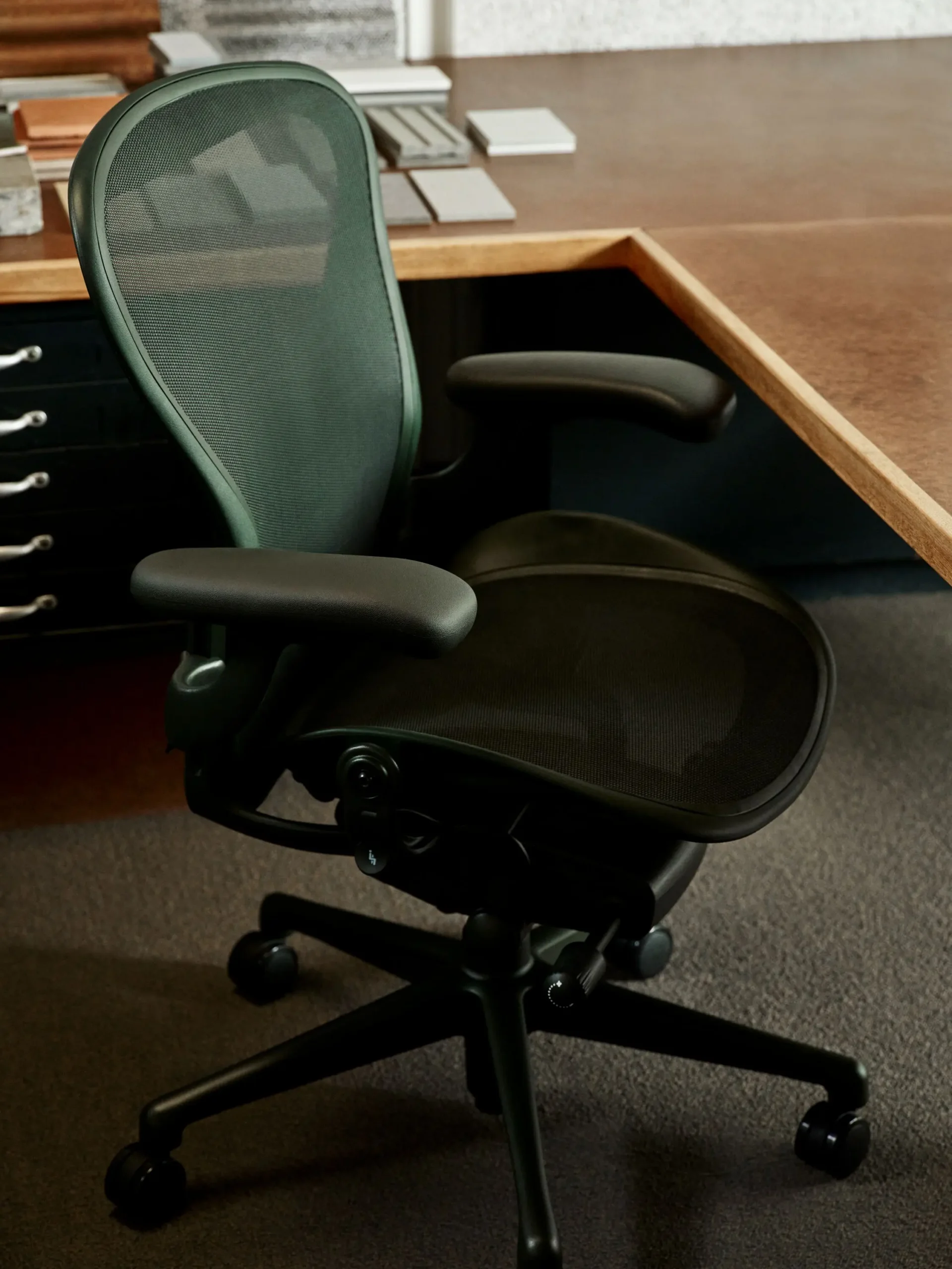
“We studied dark‑toned plants and a wide range of near‑neutral greens to understand what would resonate as a natural extension of Aeron’s material and design language,” the team recalls the creative exploration that even took them back to Aeron’s 90s archival references. Through the process, the balance of temperature and primary colours was rigorously investigated, and samples were compared against grass and trees to achieve the most authentic, natural shade.
The result is Jasper. Originally dubbed Dark Springs, this near-neutral fuses biophilia with the sensibility of contemporary interiors, deliberately ensuring cohesion with the rest of Herman Miller’s palette, including Olive. Considering the chair’s outstanding longevity, this enduring visual relevance was essential – in many cases, Aeron chairs last well beyond their 12-year warranty period, with an average of only 0.055% of the 9 million chairs made since 1994 ever needing a full replacement.
“We didn’t introduce a new green simply for the sake of it,” the CMF Design team notes. “We selected the one that harmonises with our existing ecosystem while offering a meaningful, future‑ready expansion of Aeron’s colour story.”
Colour as a direct expression of material integrity
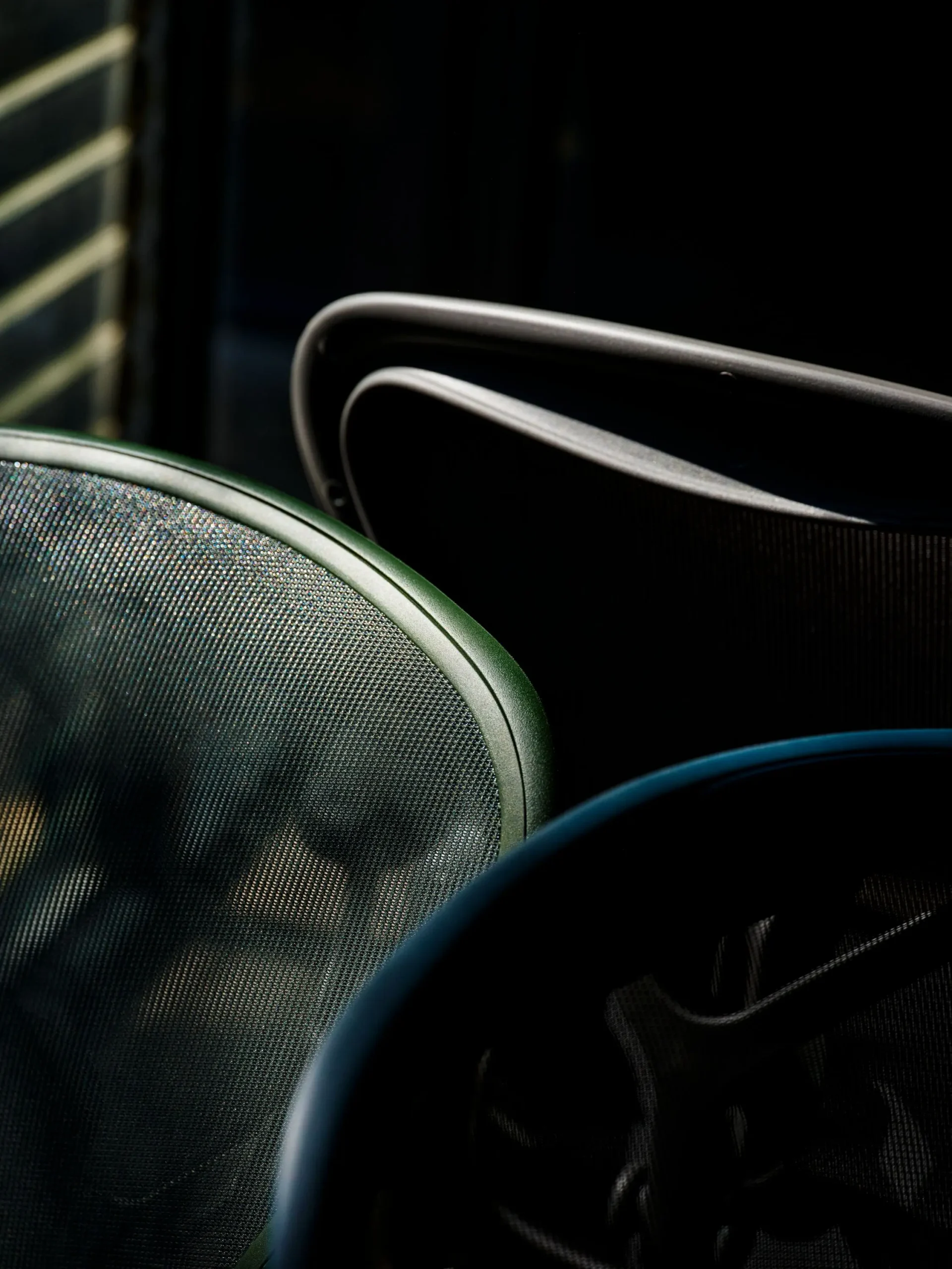
But this isn’t just a story about colour – much like colour has never been only about surface-level application in Herman Miller’s design practice. Aeron’s bold new variations – dipped in shades that transform the frame and the Pellicle suspension into a single cohesive volume – mark a full-circle moment: this uniformity brings a quiet resolution of a years-long challenge that started with the visual contrast of those 90s attempts.
What may now manifest as a new colour on the surface is anchored in the inconspicuous phantom thread of integrity and material exploration that has shaped the chair’s often-invisible yet ongoing transformation across the decades, leading precisely to this point. While the colour palette may have remained constant over the years, Aeron has never stopped changing.
The iconic chair became the first in Herman Miller’s portfolio to incorporate ocean-bound plastics and later integrated post-industrial recycled content and bio-based nylons. Then came the innovation of the aluminium base – by combining generative design with deep engineering expertise, Herman Miller reduced the amount of required material by just over 0.8 kg, without sacrificing performance or durability.
“Aeron has always evolved through rethinking materials – finding better ones, using less where we can and continuing to push what’s possible,” Gabe Wing, Vice President of Sustainability at MillerKnoll, describes the very design ethos that brought on Aeron’s innovative inception. “Bill and I had the curiosity to experiment with newer materials and processes,” shares Co-Designer Don Chadwick, echoing the momentous decision to eschew the traditional use of foam, fabric, or leather in the pioneering design.
This material rigour has been powering Aeron’s evolution ever since – it has led to an estimated 12% reduction in Aeron’s global average embodied carbon footprint and paved the way for the breakthrough that allows a consistent, saturated hue across both the frame and the suspension.
The layered shade of integrity
As a direct result of this evolution, Jasper and Nightfall encompass every shade of material innovation and engineering gain achieved over the last three decades. More than just one-dimensional blue, Nightfall’s cool depth embodies the rainbow of over 660 metric tons of plastic Herman Miller has diverted from landfills since 2023. And the calming embrace of Jasper’s biophilic disposition somehow mirrors the comfort and inclusivity that Aeron’s expanded sizes bring to the modern workplace, offering a full range of balanced, fully supported motion to sitters from the 1st to the 99th percentile.
And so, no – Nightfall and Jasper aren’t just simple renditions of neutral green and rich night sky; instead, they echo Aeron’s momentous arrival and quiet, decades-long evolution. They’re a subtle reminder that curiosity doesn’t always resolve into technicolour and industry-defining innovation rarely arrives with big, bold gestures. Herman Miller has been shaping the world of design through patient, meaningful and iterative commitment to integrity, and this palette’s restraint proves that the most sustainable progress, much like a perfectly fitted suit, is often unostentatious and defined by meticulously perfected cohesion.
INDESIGN is on instagram
Follow @indesignlive
A searchable and comprehensive guide for specifying leading products and their suppliers
Keep up to date with the latest and greatest from our industry BFF's!
The internet never sleeps! Here's the stuff you might have missed