Designed by inkmason, the Polaroid pop-up store amplifies the brand’s iconic spectrum logo, creating a visual language that expresses the joy of creating instant images.

May 19th, 2022
Located in Chengdu, China, the new Polaroid pop-up store boasts bright colours that speak to a city known for its young and vibrant creative energy. Designed by architectural and interior design firm inkmason international, the pop-up was commissioned by LoOneCommune – a retail store that specialises in analogue photographic equipment – where the pop-up is also situated.
Apart from coming up with the creative concept, inkmason looked into brand positioning, site context and the customer experience to create something meaningful. Inspired by the allure of the Polaroid camera, the phrase, ‘process of creating beauty’, served as a guiding statement for the overall creative direction. From the colours of the spectrum to the raw materiality, each element expresses a ‘process’, like each Polaroid user capturing a moment through instant photography, which unravels slowly before the eye.

“The ‘Toy Box’, a spatial form that implies both imagination and expectation, was utilised as a concept to create a highly energetic space that inspires childlike wonder and curiosity,” says the team at inkmason.
The store occupies a unit at the Sino-Ocean Taikoo Li shopping complex, a sophisticated mixed-use development with an open plan. At 24 square metres, the modest space presented various spatial constraints. The strategy was then to open up the space, making it seem visually porous from inside out and outside in. The team look toward the window display as a large-scale art installation that is as much a part of the street as it is a part of the store.

From the walkway, it is hard to miss the Polaroid pop-up store, which stands out against a shopping environment with a dark palette. Walls were painted with Polaroid colours, creating a visually-striking facade with strong brand recognition. The colours were applied like the refraction of light travelling from flat surfaces to three-dimensional surfaces.
“Optical phenomena are transformed into a poetic language, and the technology of the camera is brought to reflect a philosophical sensibility – resulting in the unique product of a flash of inspiration within a singular moment in time,” says the team at inkmason.
Scaffolding shelves and solid concrete blocks – typically heavy and harsh – were treated with lightness and simplicity, blurring the lines between reality and a dream-like world, a feeling akin to the low-saturated images generated with a Polaroid camera. Often used in construction as structural elements rather than finishing materials, these raw materials also convey a transient sense that evokes the experience of waiting for a Polaroid image to come to life.

The white scaffolding shelves trace the store without imposing, creating a sense of visual order that ties the eye-catching colours together. Maintained below eye level, the hollow concrete blocks create space for product inventory while introducing a tactile experience. The usage of these modular elements enables the pop-up to be easily scaled to other locations with room for re-configuration so it doesn’t seem like a cookie-cutter store.
Inkmason’s play on frames and blocks, colour and light, creates a vibrant and joyous atmosphere that inspires the user to pick up a camera to create their own instant images. “This pop-up store curated a space that is meant for each person, every day, every moment, to be unique,” concludes project architect Kin Lam.


Client: LoOneCommune
Location: Chengdu, China,
Design Firm: inkmason International Architectural Design Consultants (Beijing)
Project Architect: Kin Lam
Design Team: John Zhang
Lighting Consultant: Liquidesign
Design Period: June to July 2021
Completion Date: November 2021
Total Floor Area: 24 sqm
INDESIGN is on instagram
Follow @indesignlive
A searchable and comprehensive guide for specifying leading products and their suppliers
Keep up to date with the latest and greatest from our industry BFF's!
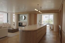
Natural stone shapes the interiors of Billyard Avenue, a luxury apartment development in Sydney’s Elizabeth Bay designed by architecture and design practice SJB. Here, a curated selection of stone from Anterior XL sets the backdrop for the project’s material language.
In a tightly held heritage pocket of Woollahra, a reworked Neo-Georgian house reveals the power of restraint. Designed by Tobias Partners, this compact home demonstrates how a reduced material palette, thoughtful appliance selection and enduring craftsmanship can create a space designed for generations to come.

Now cooking and entertaining from his minimalist home kitchen designed around Gaggenau’s refined performance, Chef Wu brings professional craft into a calm and well-composed setting.
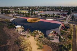
At the Munarra Centre for Regional Excellence on Yorta Yorta Country in Victoria, ARM Architecture and Milliken use PrintWorks™ technology to translate First Nations narratives into a layered, community-led floorscape.
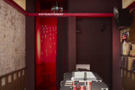
Blurring the line between dessert bar and listening lounge, AIR Design Studio delivers a modular, low-waste fit-out where sound, sustainability and social ritual take centre stage.
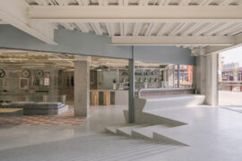
Cycling culture and heritage seldom converge, yet the AITASHOP flagship in Beijing is a space where both coexist.
The internet never sleeps! Here's the stuff you might have missed

Cottee Parker Architects has launched ‘Elevate,’ an eight-month program designed to rethink how emerging leaders are mentored, recognised and prepared for the realities of contemporary practice.
Italian architect and designer Roberto Palomba has been travelling across Australia in February 2026 for a series of talks, showroom events and product launches.