The home of architecture and design in the Asia-Pacific
Get the latest design news direct to your inbox!
Get the latest design news direct to your inbox!
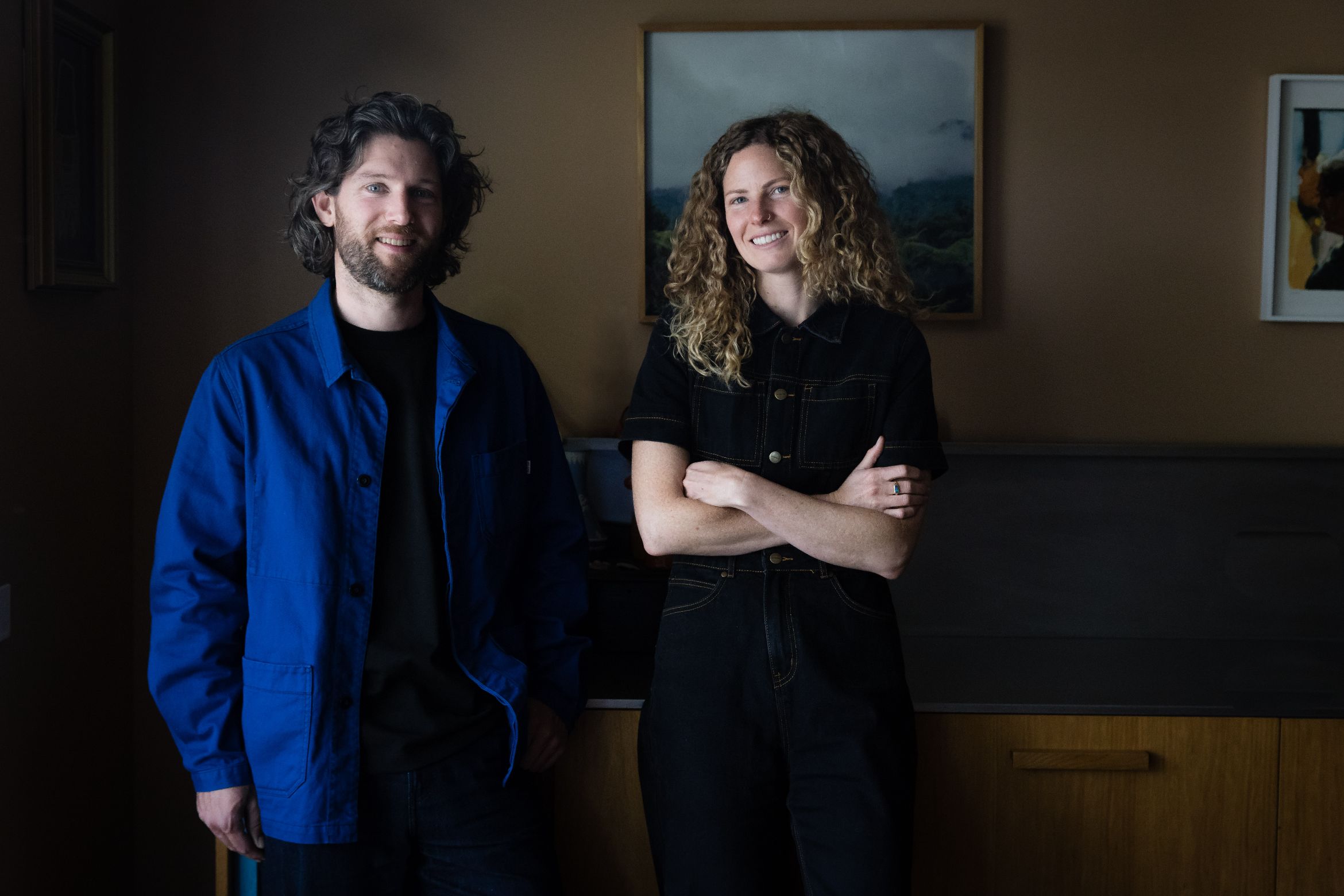
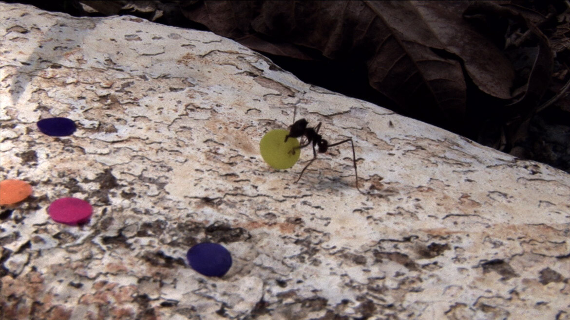
Chus Martínez and Nguyen Le reflect on the importance of exhibition design as their own show – ‘A velvet ant, a flower and a bird’ – runs at the Potter Museum of Art.
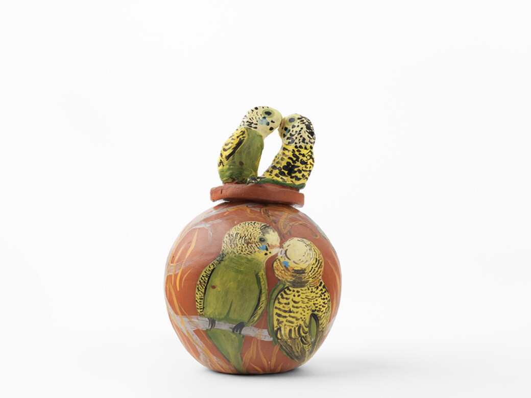
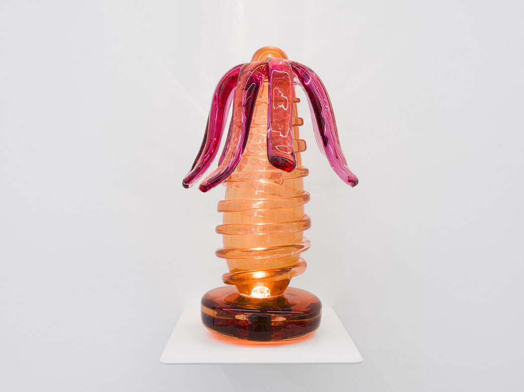
Installation photography by Christian Capurro.
February 24th, 2026
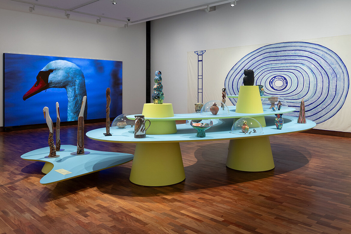
Objects in exhibitions have typically been displayed in white rooms, on white plinths, accompanied by simple captions with black text on a white background. However, Spanish curator Chus Martínez and Sydney-based architect Nguyen Le believe this white-cube mode of display no longer makes sense for our times.
“Exhibition design should not be neutral,” Martínez says. She is passionate about the important role exhibition design and exhibition architecture can have in helping us to interrogate our relationships to nature, politics and each other. Le, who designed the 2025 maximalist exhibition 65,000 Years: A Short History of Australian Art feels similarly about this under-discussed field of design practice.
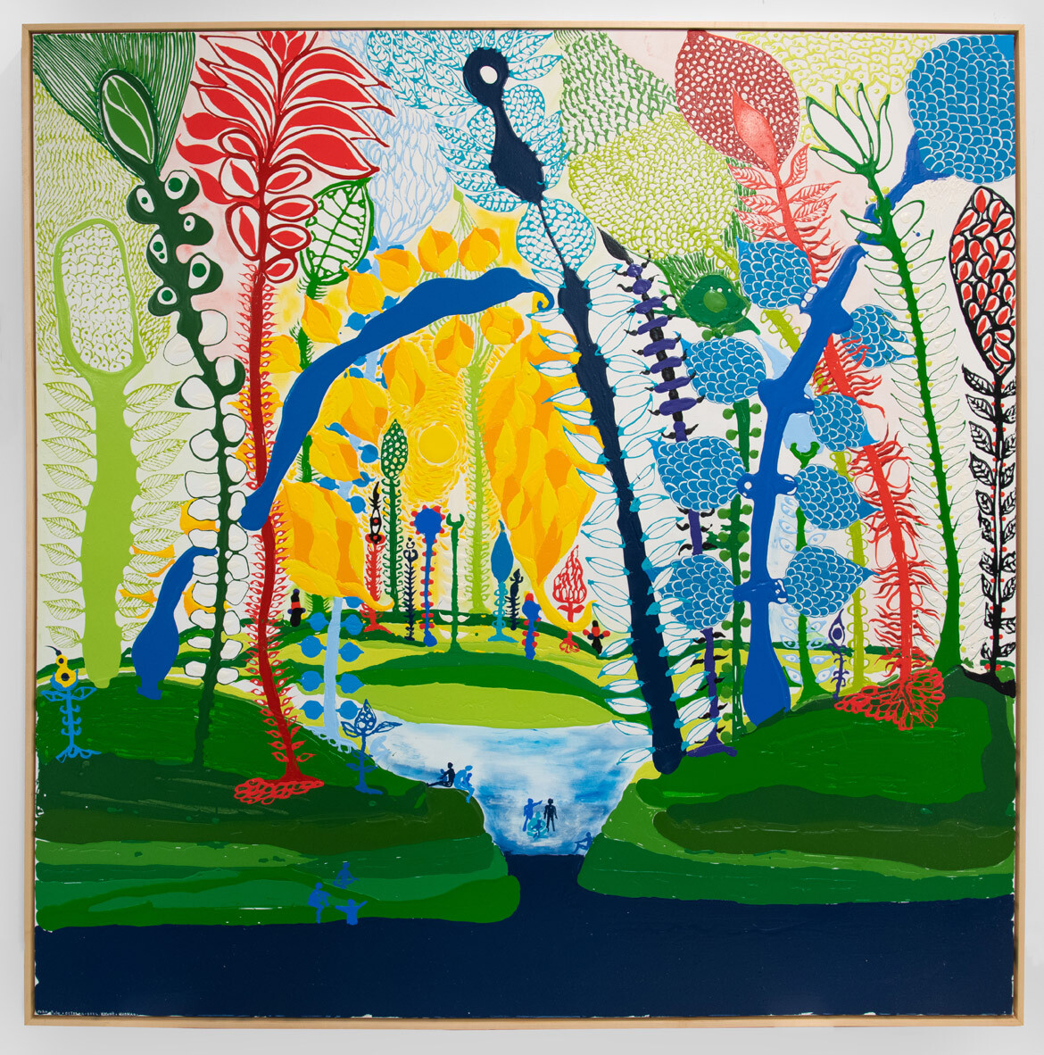
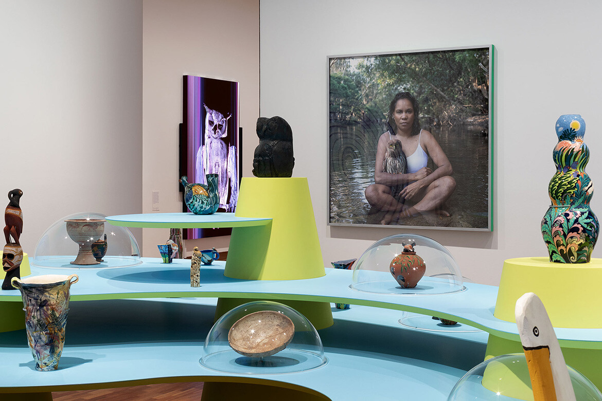
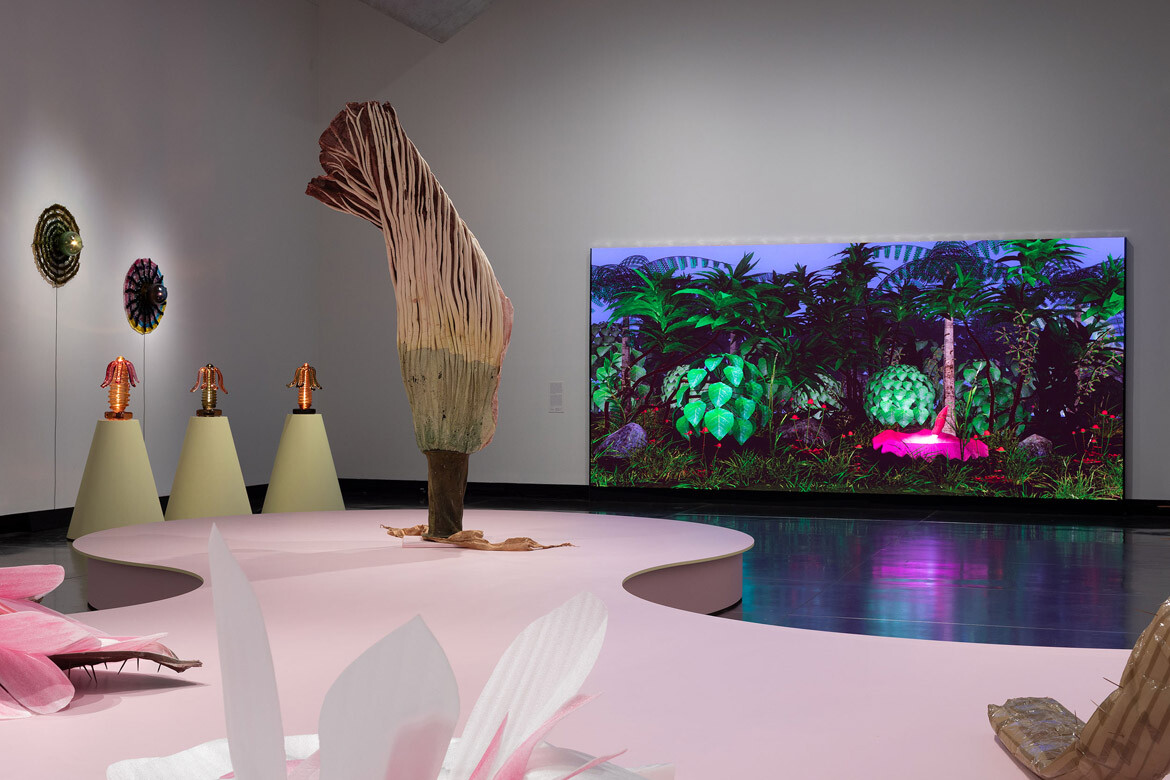
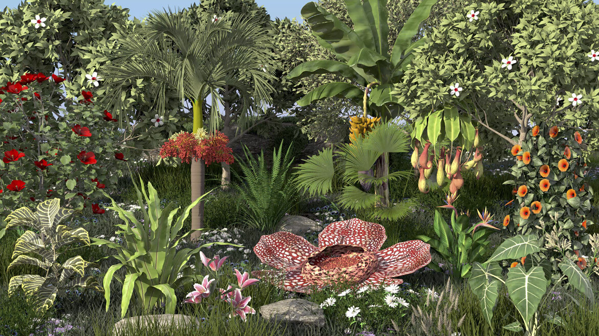
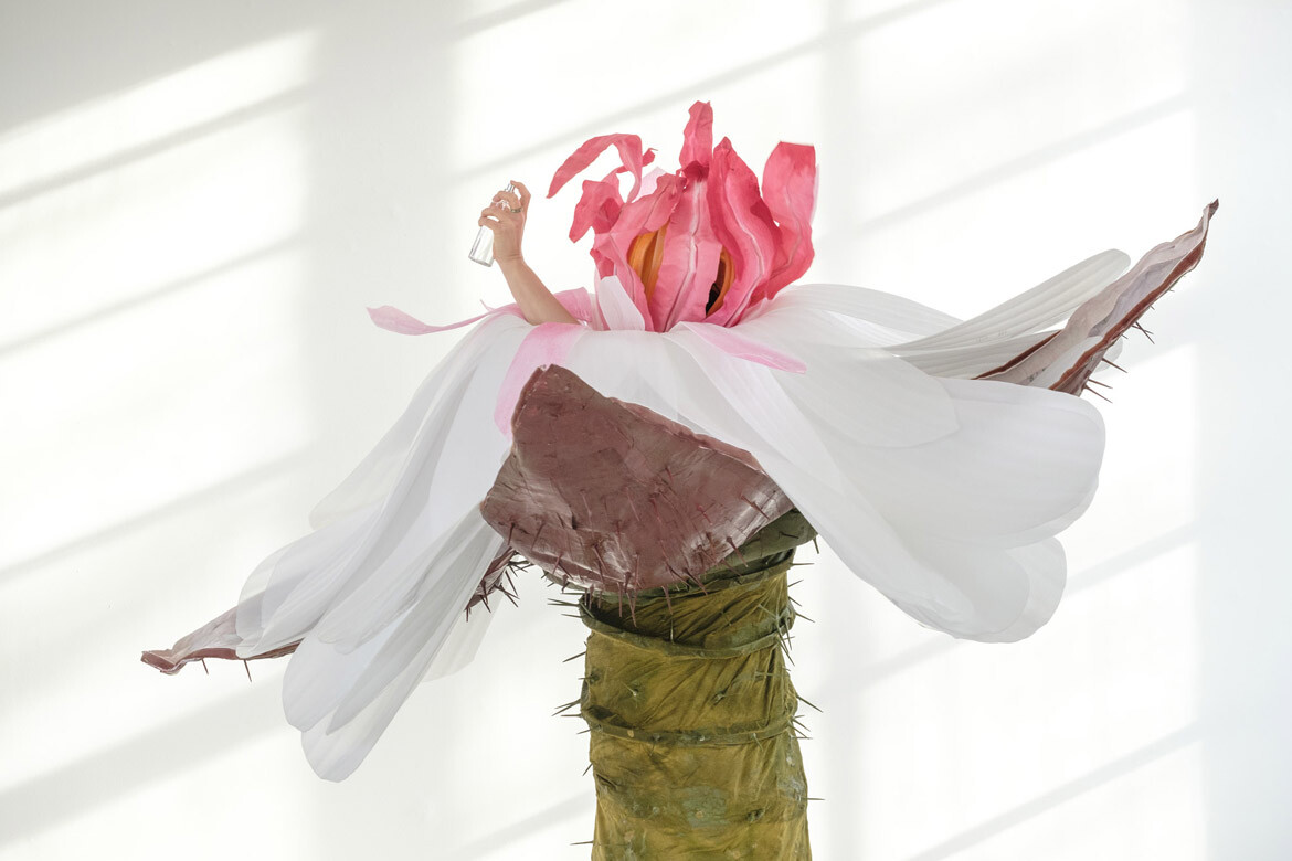
Their new exhibition, A velvet ant, a flower and bird – which runs at The University of Melbourne’s Potter Museum of Art from February 19th until June 6th – demonstrates just how prominent a role exhibition design can play when pushed in new directions. To walk into the exhibition is to enter a jungle of colour and sculpture where play, curiosity and unexpected connections are encouraged.
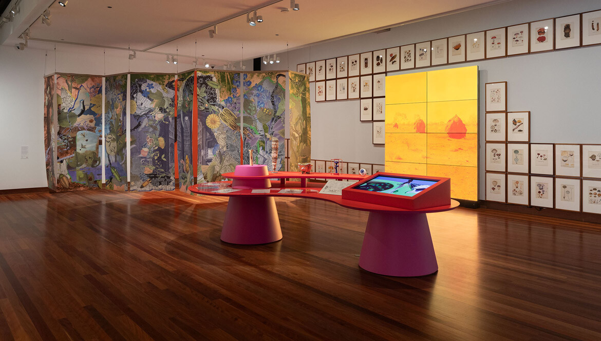
The exhibition presents objects and artworks related to its title subjects – ants, flowers and birds – across three floors of the museum. Through these curatorial chapters, objects from the university’s diverse collection – which spans the fields of biology, archaeology, ancient history and art – come together cohesively alongside new commissions exploring the relationship between us and the natural world.
Here, Martínez and Le reflect on how they curated and designed the exhibition, sharing the importance of doing things differently to respond to the times:
Lara Chapman: Please could you introduce yourselves?
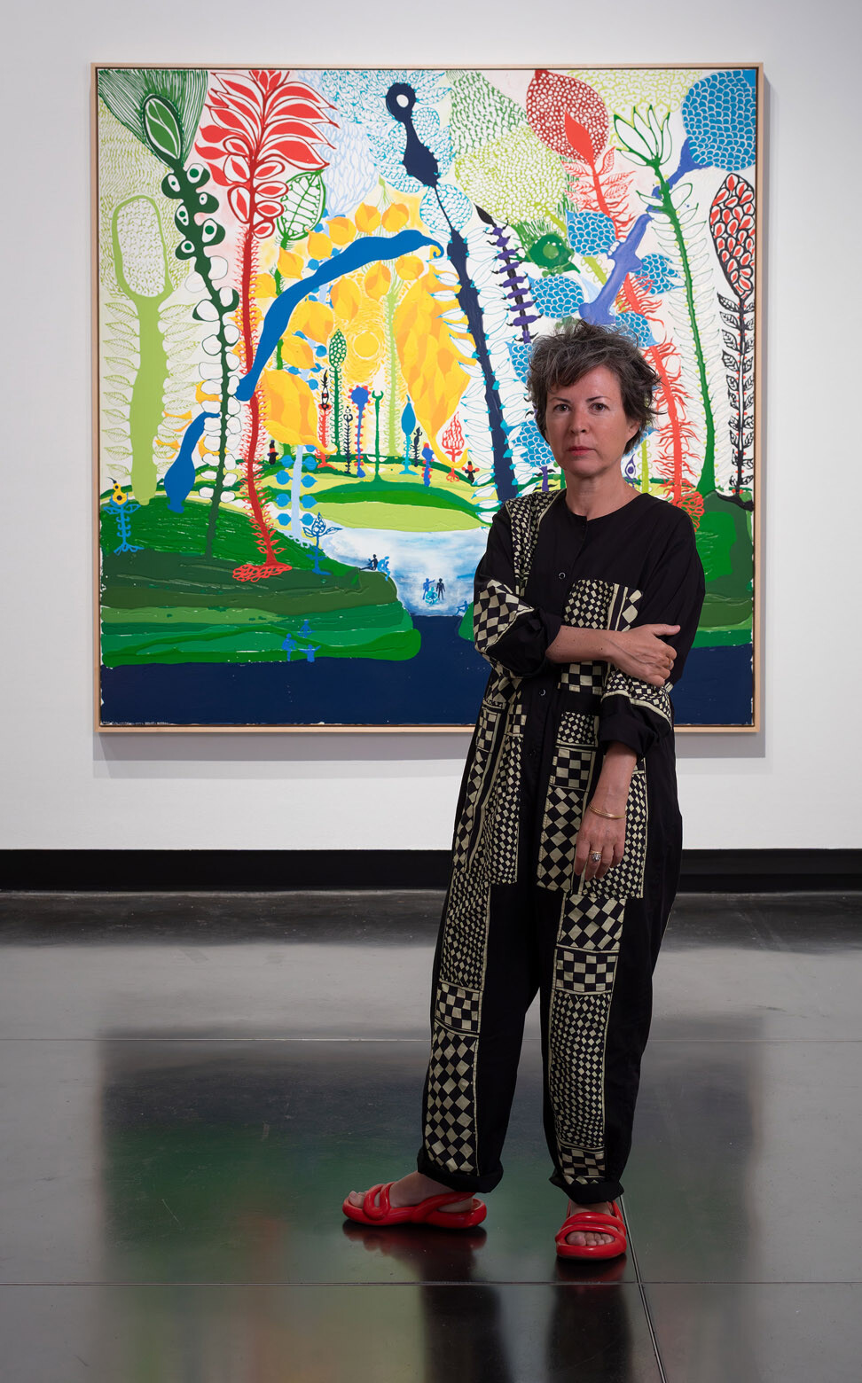
Chus Martínez: I am a curator with a background in philosophy and art history. I am the Head of the Institute Art Gender Nature, which is the art school of Basel, and I’m also Associate Curator at TBA21, a non-profit organisation that works with art and nature. I have worked, and continue to work, with many other institutions. At TBA21, we work on climate change, policymaking and oceans. Recently, we have also been focusing on peacemaking, exploring the important role of art in producing and regenerating the ideas of democracy. I’m currently curating the Danish pavilion for the upcoming Venice Biennale.
Nguyen Le: I’m an exhibition designer at the University of Melbourne and, parallel to that, I am an architect at Studio Johnston in Sydney, where I do a mix of residential work and affordable housing. I’ve always dipped between architecture and exhibition design and love working at where they intersect with art too. Working at the NGV for a couple of years was super instrumental to my thinking around this.
LC: What triggered A velvet ant, a flower and a bird?
CM: The museum had a desire to review its collections and to find a curatorial method or path that would actually address those collections. This is a difficult task because the collection is very heterogeneous – from herbariums to Roman and Greek coins that have nothing in common. If you unify the objects by reducing them to certain periods in history, they become very problematic and you cannot enjoy them.
So, how to do it? How can you create commonality? Potter’s team had been following my obsessive practice, which is about trying to connect different intelligences, for years. When they approached me to work on a show, I said yes immediately.
What curatorial path did you devise to meet the difficult task of reviewing the collection?
CM: My approach was to produce a nature-like environment in which to view the objects alongside contemporary artworks. I thought this would create a dynamic force that feels the same as entering a garden or a forest, or starting a hike. When you enter those environments, there’s such a good energy – you start understanding them, then you get something out of them. It is these feelings of flow and connectivity that motivate humans to feel.
So, the primary idea was about creating this environment but then unifying the objects needed to be super simple. We decided to dedicate every floor to an animal – a velvet ant, flower and bird. Those entities are alive, they exist, and they have their own natural histories. They also have a symbolic life in culture and are a good way of introducing the audience to the constant oscillation between the symbolic and the real.
Why is symbolism important for audiences to think about?
CM: This is very important right now, because the right wing is playing games with symbols all the time. For example, Elon Musk is playing with symbols of the Roman Empire and birds. In the exhibition, we also look at the Roman Empire, but for different reasons. The exhibition offers the possibility of understanding that symbols, in certain moments of political narrowness, become really important.
You mentioned the diversity of the types of objects in the exhibition – how do you go about creating a design to unite these objects spatially?
NL: It’s always such a fine balance but it really boils down to collaboration. I think of my role in the design world, whether in architecture or exhibition design, as a facilitator. It’s about gathering in all this information, bringing it together, reflecting on it and then slowly starting to piece things together like Lego. It’s always an experiment.
In exhibition design, everything happens a hundred times faster than working in architecture. In this case, having a really beautiful overarching theme without a sense of chronology or sequencing opened up a lot of freedom and play. Chus and I were really lucky to have had a three-day intensive workshop together, where we created momentum, flow and synergy, and evolved the design.
Although, at the end of the day, it’s quite unfair to credit one or two designers for the whole exhibition. It was the perfect result of collaboration and a huge team effort. For example, we worked with the most amazing fabricators to realise the plinths. Many people’s input, advice or suggestions went into the design.
The plinths are a particularly striking element of the design. What was the thinking behind them?
CM: The typical white plinth comes from monumental male architecture – Napoleon on a horse, on a plinth. They were designed to reinforce the person on them, making them bigger. It’s about looking up at someone or something. For me, it was instead very important to produce a sensation of horizontality by using plinths that are very wide and hold the objects in a softness, like a lotus leaf on a lake.
One of the influences I was thinking about as we designed the plinths was a TV-series called Maya from the 70s. It’s a cartoon of a cute baby bee. In it, the insects land on big leaves and relax there. If they fall, they pass through the layers of leaves, softening the drop. The exhibition’s architecture similarly resembles big leaves of gigantic plants that embrace the objects. They are organic, round forms with a friendliness to them.
Nguyen, you worked on Potter’s 65,000 Years exhibition last year. How did that inform your thinking around the idea that exhibition design shouldn’t take a step back, but can instead add to the art and objects on display?
NL: There’s a lot of freedom, autonomy and stakeholder-ship at the University of Melbourne when it comes to exhibition design, which is amazing. 65,000 Years was all about maximalism in its own right – it was about colour upon colour, upon information, upon artwork, upon history, upon everything. This exhibition takes a different approach with a quite beautiful restraint. We were super selective and careful with the plinth’s designs. We also wanted to respect the honesty of the museum’s architecture, which already has so much history and context associated with it.
In architecture and design generally, you can get bogged down by so many project references. Those are super important but with this project, it was beautiful to be super intuitive. The design largely emerged and evolved through conversations.
Related: Sydney Fish Market podcast
Can you speak about your use of colour?
CM: Black and white do not exist in nature. We, as humans, forget that because we are so focused on our own cosmos and, in a way, our species supremacism, that we think that institutions correspond to life. So if you do an exhibition that addresses some of the dynamic forces of nature, then those colours don’t play any role there. Black and white were the first things to go.
Then, an old cover story from National Geographic helped us to use colour in an unprejudiced way. It showed us how to depart from the typical conventions we impose on space. Ten years ago, an MIT team with [American marine biologist] David Gruber created a video camera that replicated the optic nerve of turtles. When they took photos underwater with it, they discovered that what we see as grey and monotonous was actually bioluminescent! The radiance of phosphorescent-like colours communicate certain things like danger. They found super saturated pinks, yellows and more.
NL: Adding to this idea of leaning towards the natural was the early decision to open up all the windows and let as much natural light in as possible. This is really incredible because in museums, everything is usually quite dark, as often you need that low lighting to meet conservation requirements. It can be quite stifling. Opening up the windows creates a nice connection to the outside environment.

What was the biggest challenge of this exhibition?
CM: Doing things differently demands an incredible sense of responsibility towards the things that have been done before. The fact that we are not using the conventional language is not because we don’t agree with it or respect it. On the contrary, things have been developed because they were necessary, but things develop further because it’s also necessary. At different times in history, new repositories of spatial languages are needed. So, we are now producing a necessary mutation of that language, but with full respect for the previous language.
It took us some time to find the exhibition’s language. It seems very simple now that it’s done, but the heterogeneity of the objects made it very difficult. Are you allowed to put them all on a big surface together? What should you use… Shelves? Cases? There was a lot of questioning before we arrived to this organic conclusion. It took months. It was not easy. It required us to meet in person and draw together, then suddenly the signature and core language became super clear.
Play is central to the exhibition’s language. Why is playfulness important at this moment in history and in this exhibition?
CM: Play is a very difficult notion because people think it means ‘effortless.’ For us, the idea of using play means that you, as a visitor, have the responsibility to make connections in the exhibition and in life. Right now, every human uses a prompt or trusts an algorithm to do the play for them. Play has been automatised by AI. Take daydreaming, for example, it’s all about connecting things that are unconnected and is fundamental for our cognitive systems. But now daydreams are out of reach because we wake up and follow our algorithms.
A friend of mine said to me yesterday, ‘Be radical. Think by yourself.’ I think that this is exactly the motto we need right now. Be radical, spend at least an hour a day trying to make connections yourself. It is fundamental to say no to allowing machines to make connections for you. So, what we call play in this exhibition is the responsibility of visiting and making your own interpretation of the objects. I hope people try to find two or three other items that, in their view, connect narratively, experientially. That’s very important.
NL: Play is so instinctive and, when you’re in the space, there’s no real hierarchy. It’s about whatever work instinctively draws you to it. It’s a big playground for you to go and explore.
Potter Museum of Art
potter-museum.unimelb.edu.au
Photography (installation)
Christian Capurro
INDESIGN is on instagram
Follow @indesignlive
A searchable and comprehensive guide for specifying leading products and their suppliers
Keep up to date with the latest and greatest from our industry BFF's!
The internet never sleeps! Here's the stuff you might have missed