The home of architecture and design in Asia-Pacific
Get the latest design news direct to your inbox!
Get the latest design news direct to your inbox!
Ban Ban’s interior by Genesin Studio is a low-tech K Pop minimalism treat for the eyes in the heart of Adelaide’s CBD.


There are a few names synonymous with Adelaide’s current design renaissance and Genesin Studio is one of them. The practice’s hospitality work has been instrumental in re-branding the South Australian capital as a hub of design, with fit-outs such as the exquisitely detailed Viet Next Door and Scandi-inspired Nordburger contributing to the State’s renewed cultural landscape.
Founder and director Ryan Genesin is not only a master at balancing materials and finishes, but he also knows how to get the most out of problematically small spaces, as the recently completed Ban Ban proves.
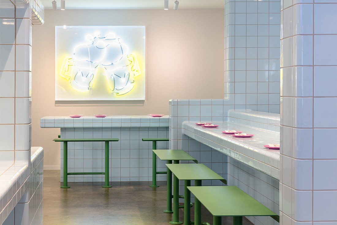
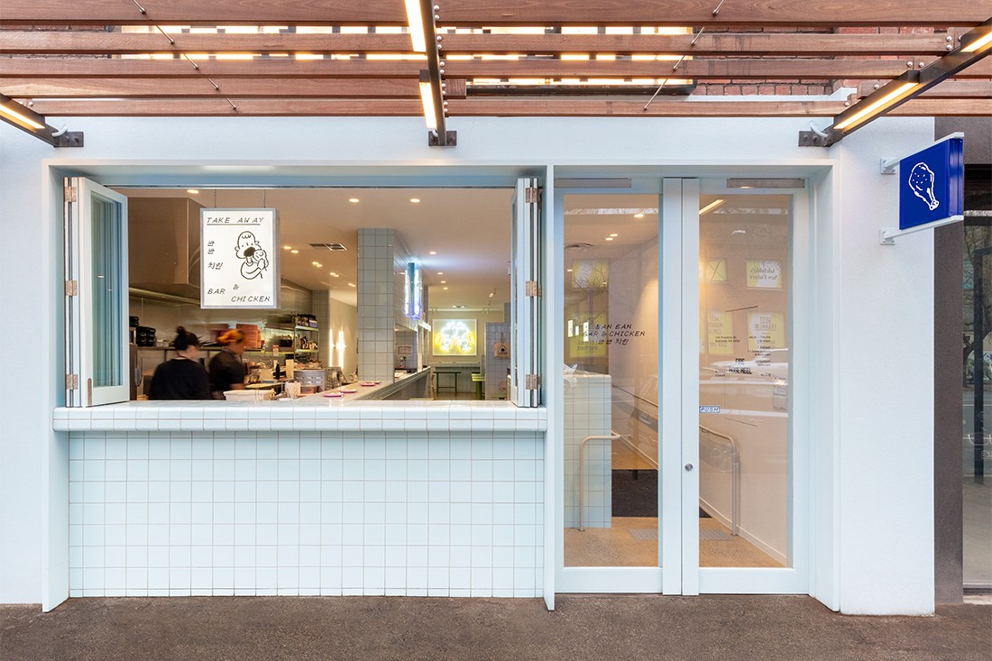
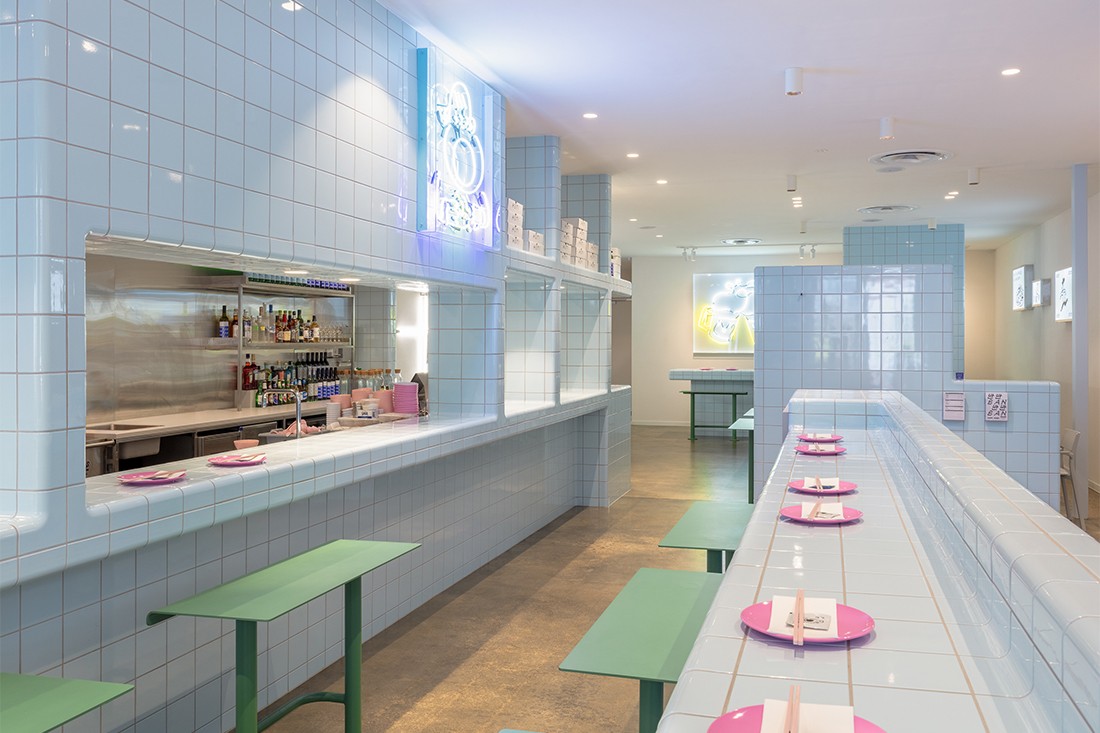
The Korean fried chicken eatery is essentially a fast food joint on Franklin Street in the heart of Adelaide’s CBD. But Genesin’s colourful treatment of the 150-square-metre space via what he calls a “low-tech K Pop minimalism” has transformed it into an immersive customer experience memorable for its playful aesthetic.
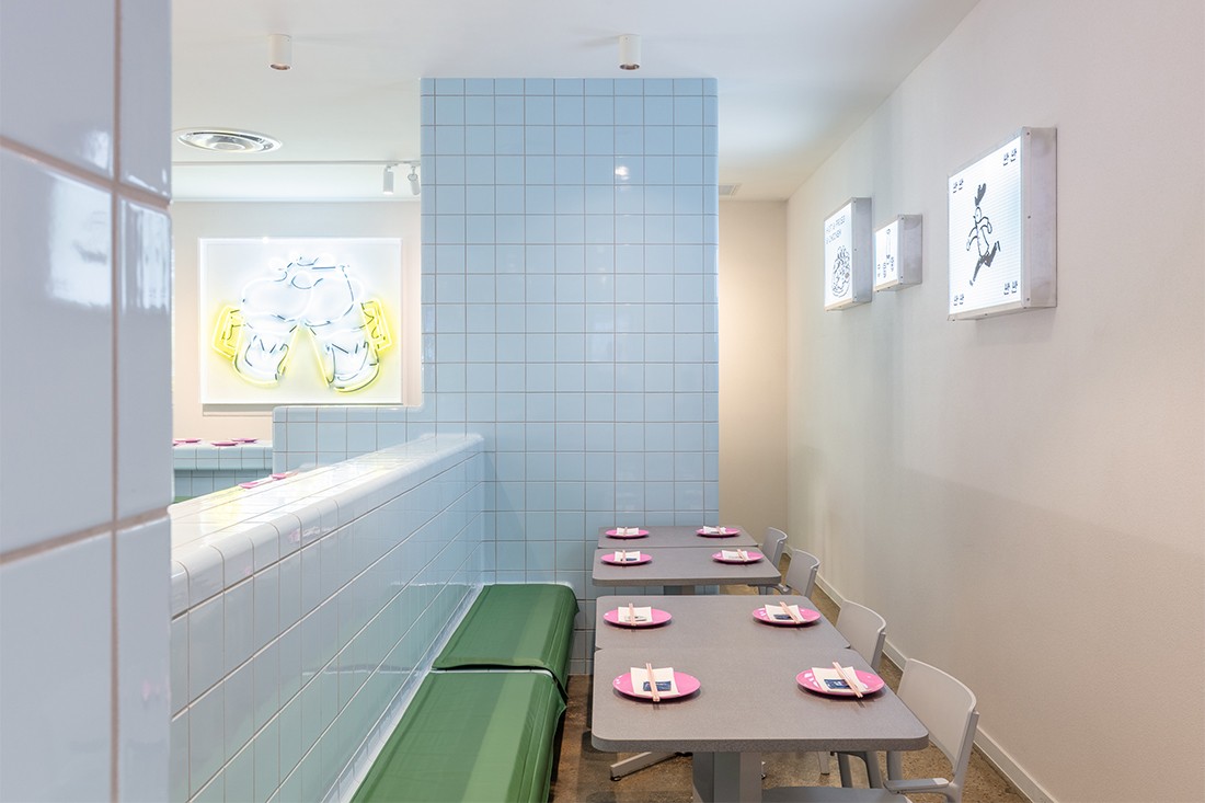
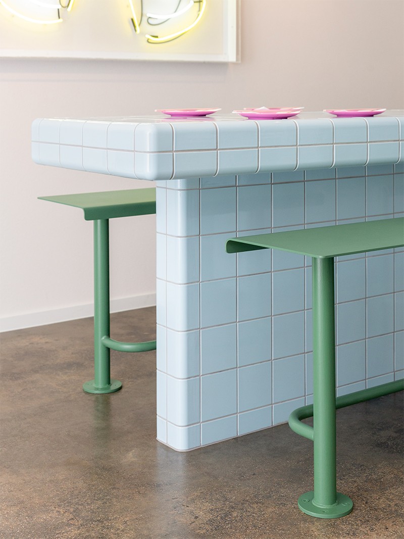
Built-in tables and storage units stand monolithic in the space, anchoring the overall scheme and creating a clear circulation path. These forms are further highlighted by a glossy pale blue D-Tile modular tiling system that evokes the futuristic fashion trend favoured by some K Pop performers. More importantly, the tiles’ pale finish and rounded edges provide the perfect backdrop for the deep green stools, hot pink crockery and yellow neon artworks, while also expressing the branding’s grid motif in an impactful way.
As Genesin explains, “This grid is an integral part of the design and sets the tone for the branding, which is applied to the menu, signage, packaging and website, weaving Ban Ban’s physical and digital spaces together.” Indeed, Genesin worked closely with London-based graphic designer Carlo Jensen from Peculiar Familia to develop the design concept and this has resulted in a cohesive visual outcome.

Their collaboration definitely allowed for a degree of curation across both physical and digital spheres as they were able to brainstorm ideas from the outset. They also worked with Japanese illustrator Masao Takahata, who produced the original artwork that’s installed in neon or as a lightbox and brightens the space, adding yet another fun element.
The shopfront’s new bi-fold window and glass doors have re-activated the streetscape by opening the kitchen up to passers-by. It places the theatre of the back-of-house front and centre and ensures the food is never overshadowed. There’s a sense of measured balance in this fit-out – the accent colours are bright but not ostentatious, the branding is bold but used with restraint – that makes this hospitality offering very inviting.
Get more hospitality design inspiration by taking a look into our archive.
–
Be in the know with the design industry, join our mailing list.
A searchable and comprehensive guide for specifying leading products and their suppliers
Keep up to date with the latest and greatest from our industry BFF's!
The internet never sleeps! Here's the stuff you might have missed