The home of architecture and design in the Asia-Pacific
Get the latest design news direct to your inbox!
Get the latest design news direct to your inbox!
The new Aēsop store in Shibuya, designed by TORAFU ARCHITECTS, features a juxtaposition of materials that celebrates the opposite ends of perfection and imperfection.
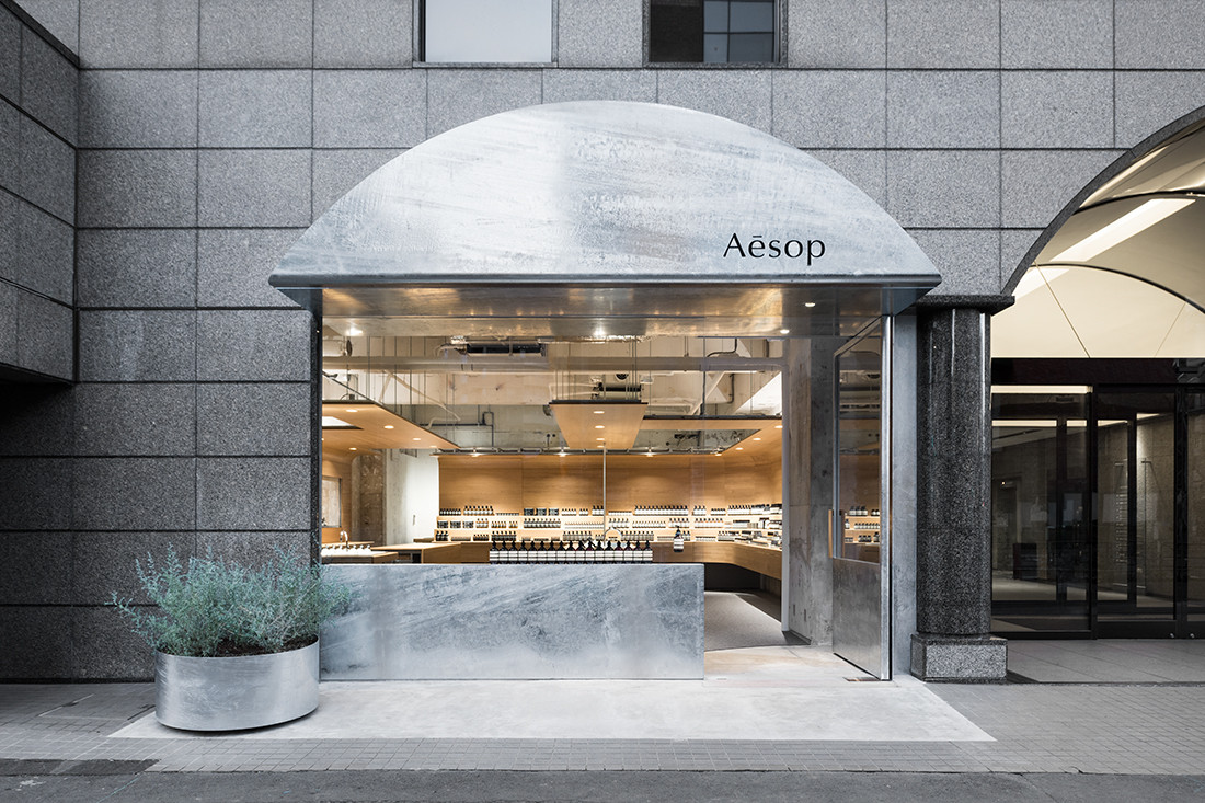


A new Aēsop store in Shibuya, Tokyo reaches out to passers-by with graphic emphasis. An arced signboard imitating the shape and colour of the building’s entrance is paired with a cement mat that cuts into the tiled pavement – both details that associate the store with its context from the onset.
“The client asked us to take a hint from Shibuya, where development around the train station progresses day by day. [Keywords such as] ‘avant-garde’ and ‘metabolism’ were thrown around,” says Koichi Suzuno, co-founder of TORAFU ARCHITECTS – the studio tasked with the design.
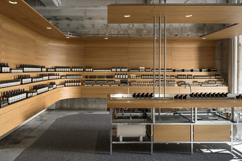
Aēsop’s branding strategy is to have a different design for each of its stores worldwide. Each one experiments with different materiality or form to display the botanical-focused products in refreshing ways while also referencing the store’s location.
Here, Shibuya’s perpetual state of flux (or ‘metabolism’) informs the design. Rather than covering up signs of the repeated repairs in the space, the architects decided to introduce refined elements alongside to highlight their disparity.
“We aimed for a space with a dynamic contrast of old and new, [mixing] existing concrete surfaces with high-quality, customised furniture,” says Suzuno. The latter takes the form of a continuous, curvilinear band of domestically sourced chestnut wood that loops overhead to create intimacy in parts of the store, bends to form counters, or folds into features such as a bench by the entrance. Products are stacked on shelving tiered like staircases to enhance the browsing experience for customers.
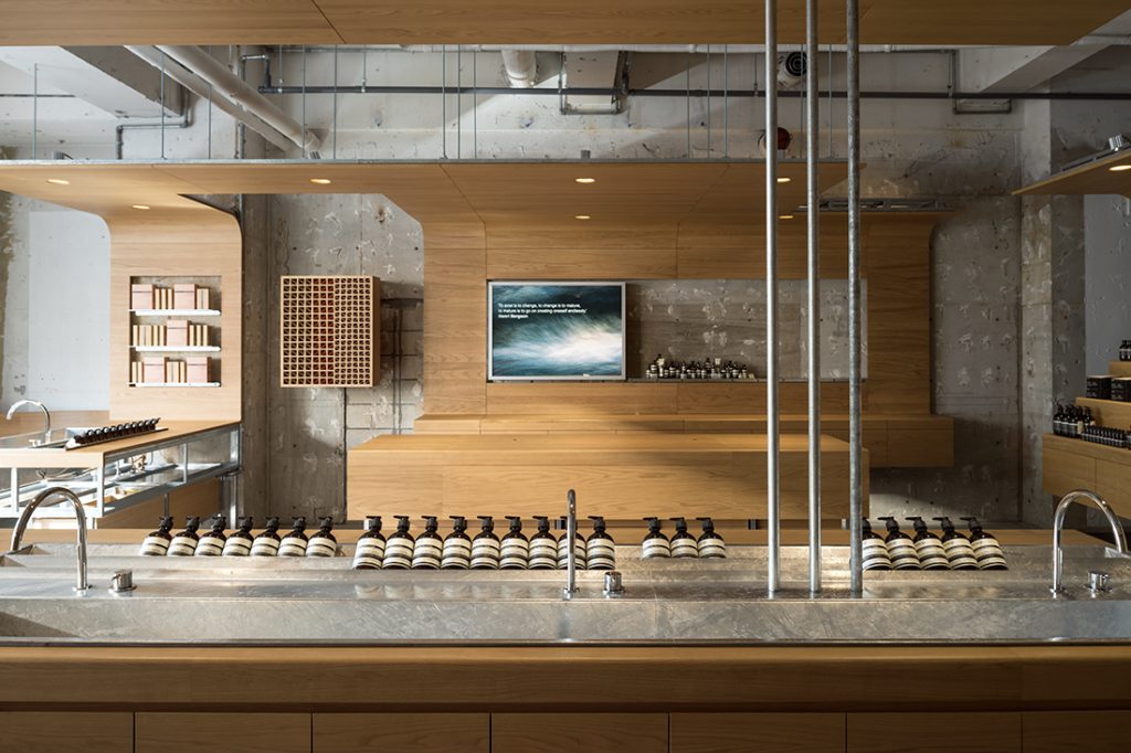
A cashmere carpet underfoot softens customers’ footfall. The carpentry’s steel framework, which has been given a corrosive-resistant molten zinc coating that echoes the entrance eave and front counter, heightens the juxtaposition.
Cutouts in the timber surfaces reveal the raw concrete wall behind, intensifying the relationship between the materials. Chestnut displays that protrude from the concrete wall echo this effect in an inverse manner.
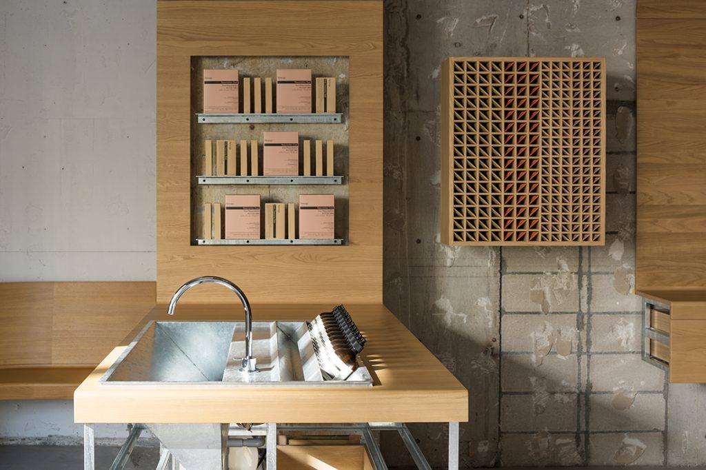
Precise detailing accompanies the polished quality of the timber finish. Furniture manufacturer Karimoku was engaged for the carpentry with this purpose in mind. Because galvanising is used more for building components than as an interior finish, the architecture team visited the factory to educate themselves about each material from the production stage. Similarly, a visit to Karimoku’s factory helped them to understand how to implement the precision of furniture production into spatial components.
Other than display, storage integrates seamlessly into the timber ribbon and island counter for easy replenishment. Lighting is just sufficient to create a calm ambience that is not too bright, and the sink is also finished with the corrosive-resistant molten zinc coating for easy maintenance. Practicality and aesthetics come together holistically in Aēsop Shibuya to make for a delightful, seamless experience for customers and staff alike.
Interior designer: Torafu Architects
Builder: D.Brain, Karimoku
Graphics: Aesop
Lighting Design: BRANCH Lighting Design
Area: 85sqm
For more design inspiration, join our mailing list.
INDESIGN is on instagram
Follow @indesignlive
A searchable and comprehensive guide for specifying leading products and their suppliers
Keep up to date with the latest and greatest from our industry BFF's!
The internet never sleeps! Here's the stuff you might have missed