The home of architecture and design in the Asia-Pacific
Get the latest design news direct to your inbox!
Get the latest design news direct to your inbox!
Warren and Mahoney’s rebrand leans into its regional identity as well as the past, the future – and some colourful new graphic design.
June 3rd, 2024
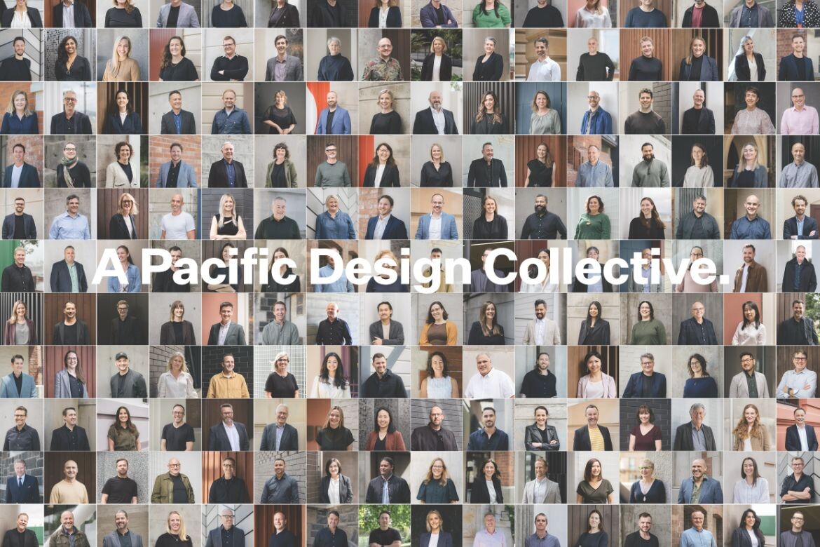
Pacific-based practice Warren and Mahoney’s rebrand is many things, but there are also many things it is not. It isn’t exclusive, nor is it bound by what is and isn’t possible. It’s a cohesive, reflective mechanism that embodies the essence of the 350-strong team, drawing on the practice’s tactility, humility and design excellence.
The new expression stretches across website, collateral and even email addresses, and comes with the adoption of WAM, the practice’s all-too-perfect acronym. Undertaken in collaboration with NZ-based web agency Sons & Co. and international branding agency Design by Toko, the decision to rework the practice’s identity came from a desire to re-align with the practice’s DNA.
The new brand was built from the shop floor, in order to capture the essence and DNA of WAM. A number of workshops and surveys were held, with Group Clients and Markets Director Chris Tillman (pictured below left) and Head of Design Blair Johnston (below right) intent on ensuring the consultation process wasn’t carried out in an echo chamber.
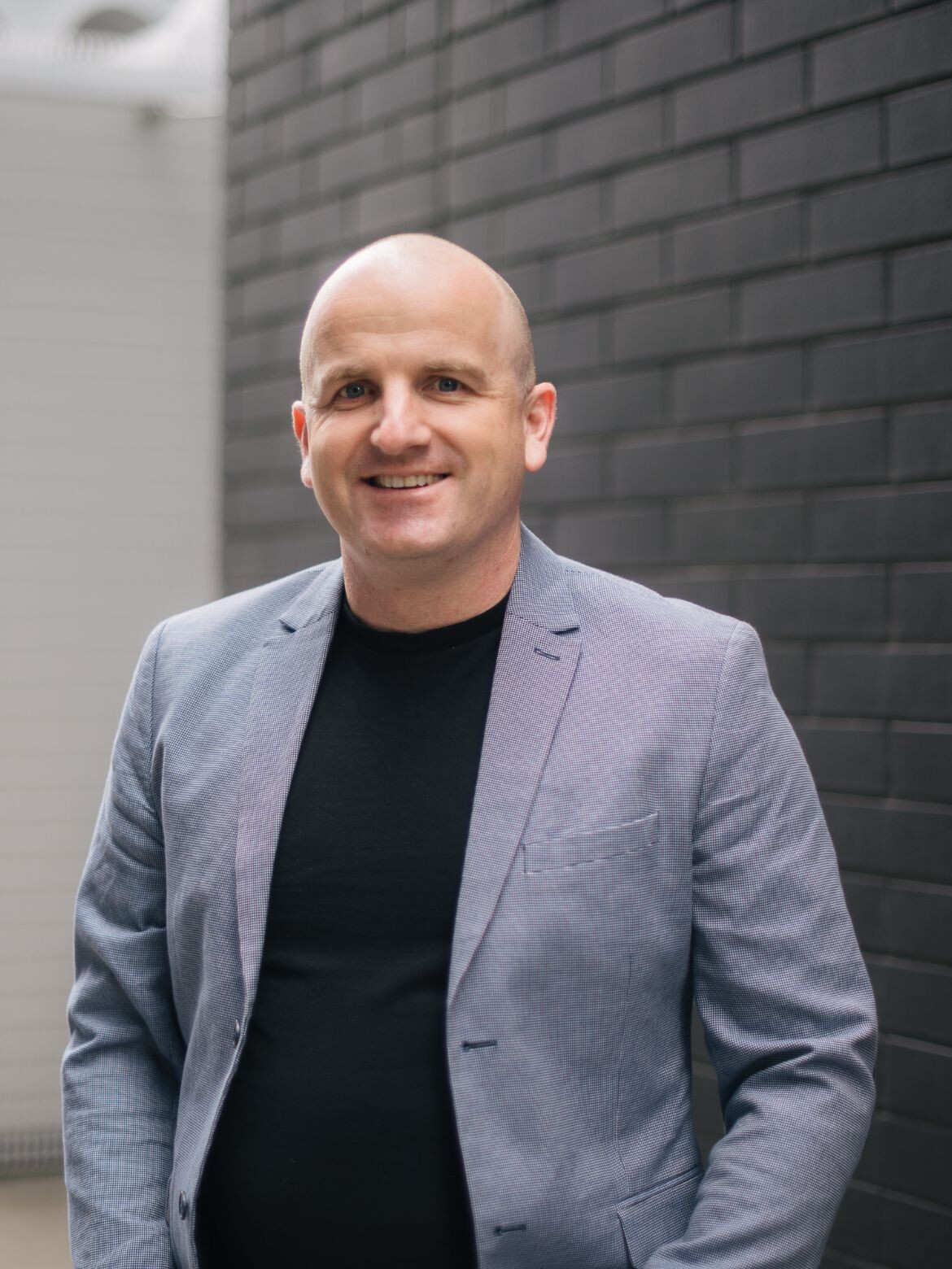

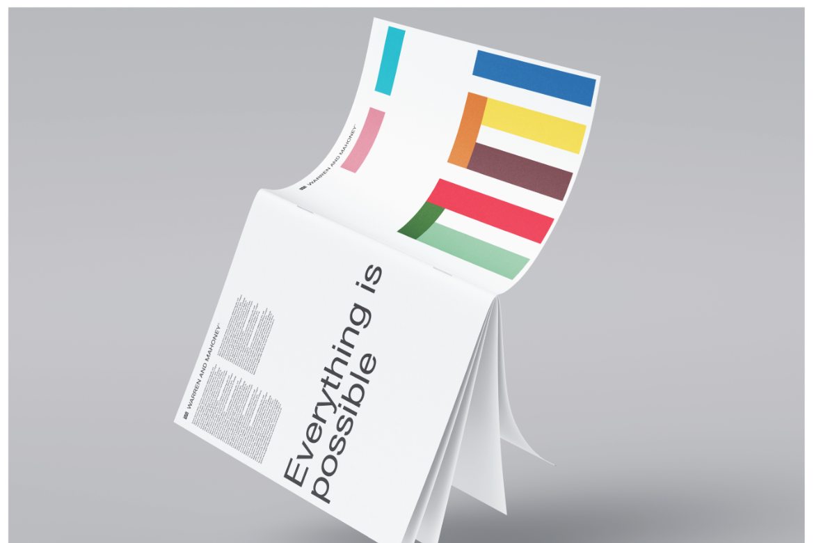
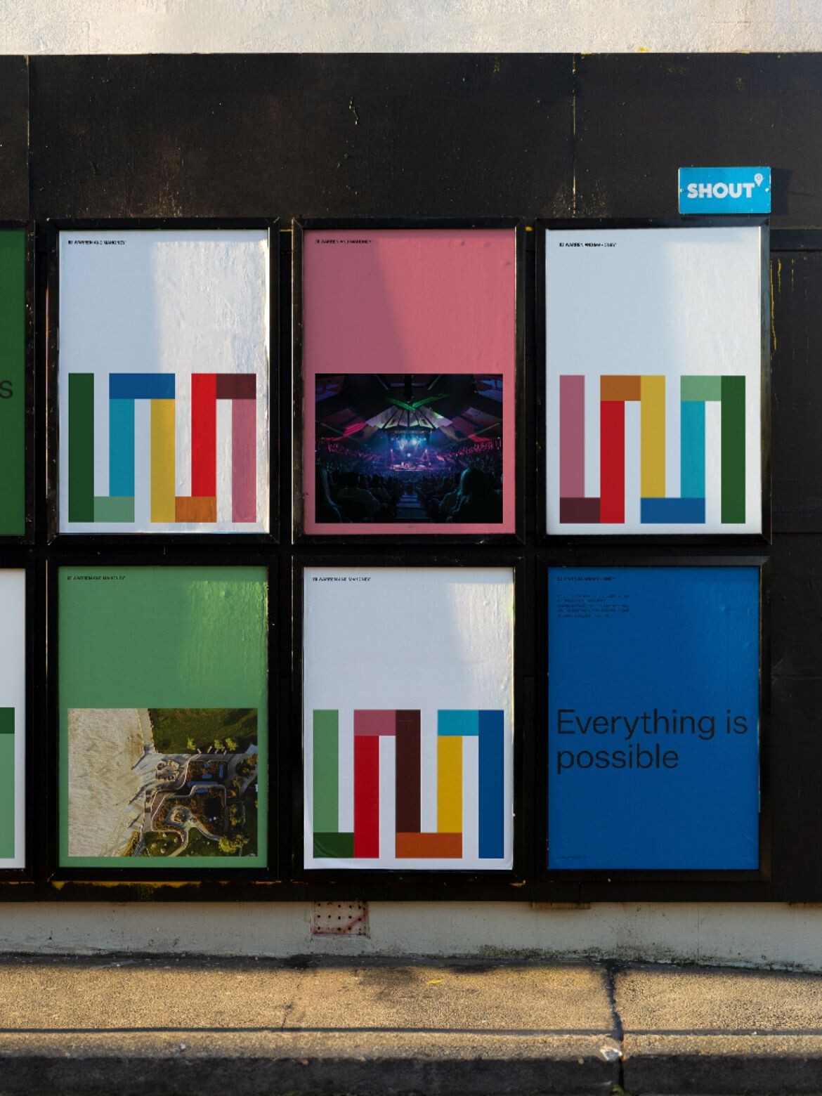
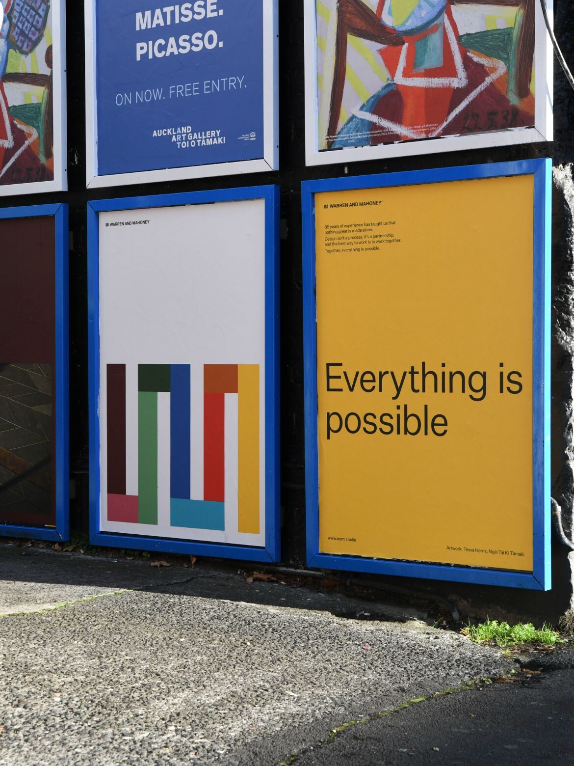
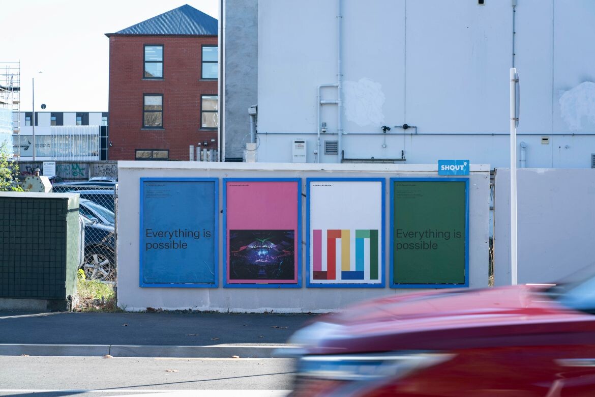
Tillman says a common theme emerged throughout the early engagements with employees, one that inspired much of the invigoration: “Through the process, this belief came out that everything is possible. It became apparent that WAM can’t be defined by one style of work, or one approach or one belief. Trying to distil our organisation down into a singular idea or concept was doing us a disservice.
“The idea that everything is possible for WAM has manifested into a list of always and never behaviours. The list is regarded as the glue that holds all of its foundations together, that is an approach to client engagement, and unites and galvanises the entire team.”
When architectural firms undertake rebrands, the search for an answer can be exhaustive. WAM discovered that the solution was right under their noses.
Enter the worm.

The worm, as it is affectionately coined, was created by famed NZ graphic designer Mark Cleverley in 1962. While it wasn’t necessarily front of mind within the WAM team throughout the rebranding process, Design by Toko’s involvement certainly brought it to the very precipice.
The worm harks back to fifteenth century iconography and contemporary art pieces of the time of Cleverley’s creation. Described as “perfect” by Design by Toko’s, Michael Lugmayr, WAM set to work on embracing the worm, but with a twist.
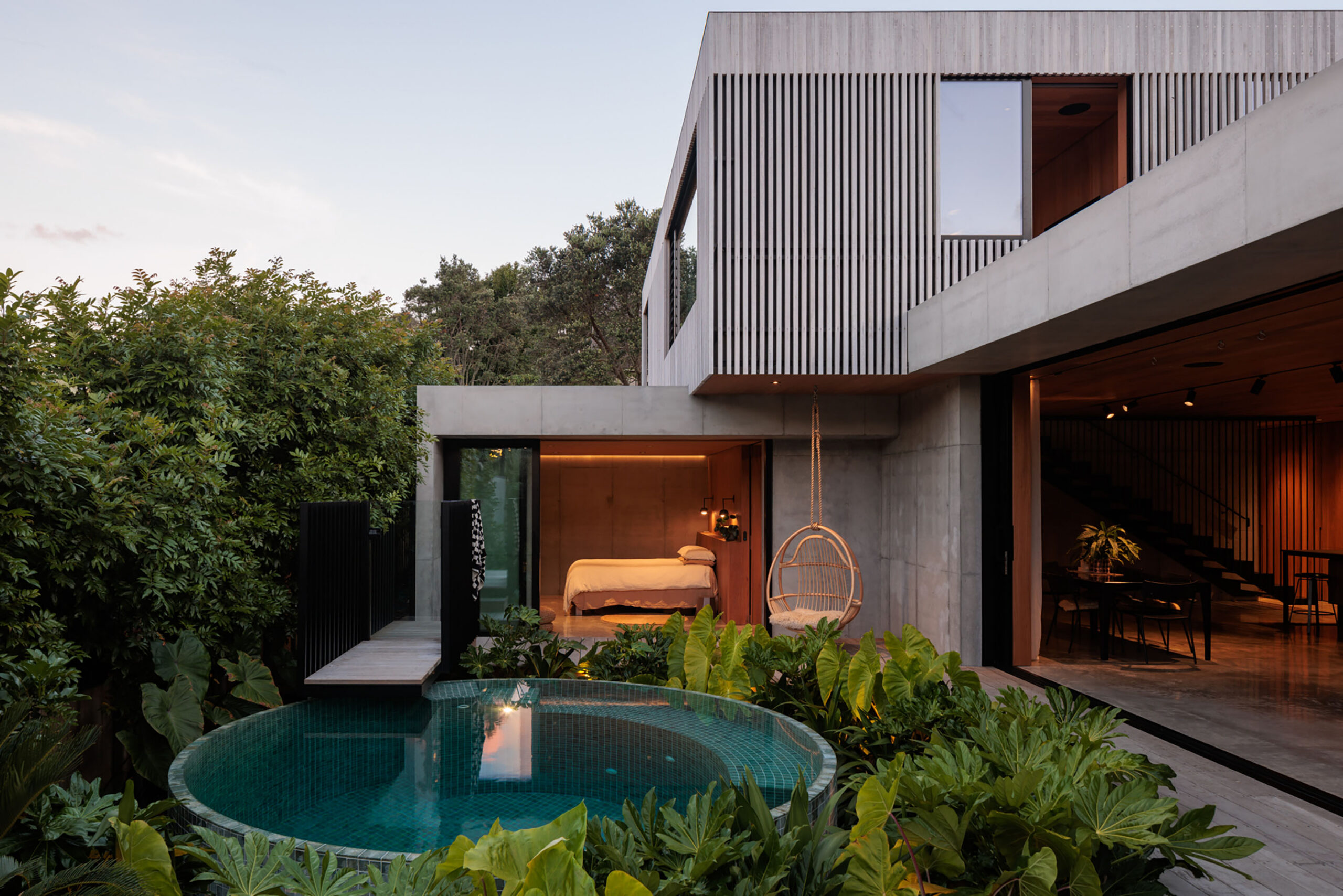
Related: Warren and Mahoney’s work on the wider site at One Queen Street
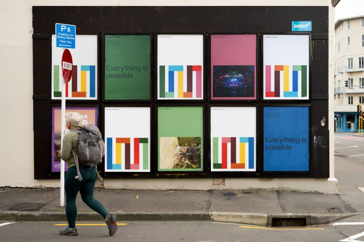
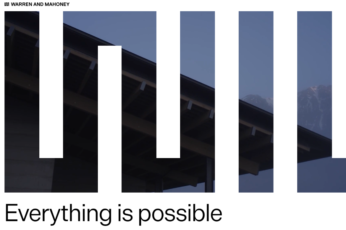
“The challenge has always been to develop an identity that represents all of us now and into the future,” says Johnston. “The power of the collective strength of the team, a multi-authorship design practice, and an international context, all of which is quite different from our origins. We want our brand refresh to represent all of us, and we felt colour could play a role.
“We wanted to look at the influences of culture, context, and the geographies in which we work. These ideas of optimism and hope are expressed through bold colour. We also wanted to acknowledge our Pacific landscapes. All of that helps us to arrive at a new expression we call the colour mark, which serves as the core of our refreshed identity,” Johnston adds.
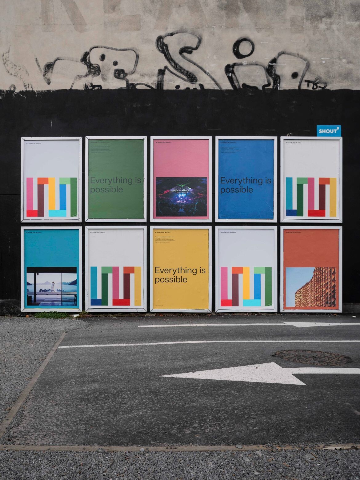
WAM’s alignment with the Pacific Rim informs much of their process, throughout design, client engagement and this new identity. It even became a key theme throughout surveys and interview, along with Hope, Collective and Excellence.
While most architecture practices in both Australia and abroad aim to position themselves as global firms, WAM wants to “embrace our unique corner of the world,” as Tillman coins it.
“We think there’s something really unique about our Pacific footprint and the worldview that it empowers and enables as well. So, we really wanted to embrace our region and everything that that stands for.”
When quizzed about what he’s most proud of, Johnston says the journey WAM embarked on to find itself has now reached its indelible conclusion: “I’m proud of finding an answer that represents all of us and our evolution over time.”
He continues: “It looks back while leaning into the future. It relies on the strength we’ve built up over 60 years, but takes it to a different place. I think it’s really important in our current context that architects, in particular, are optimists. The world has many challenges, both social and environmental – and economic. It should be the role of architects to imagine the future and bring it to fruition in partnership with their clients. That’s the part I get excited about.”
To view WAM’s new-look website, click here: www.wam.studio
INDESIGN is on instagram
Follow @indesignlive
A searchable and comprehensive guide for specifying leading products and their suppliers
Keep up to date with the latest and greatest from our industry BFF's!
The internet never sleeps! Here's the stuff you might have missed