The home of architecture and design in the Asia-Pacific
Get the latest design news direct to your inbox!
Get the latest design news direct to your inbox!
LAANK turns the traditional stark white clinic aesthetic on its head with a bold art deco-influenced interior of black lines and geometric patterns.

July 5th, 2018
I’m rather curious: where does the name LAANK come from? “I was having drinks with friends and we were thinking of what to name the firm with the philosophy of designing things for the better,” says Cherin Tan, the founder of Singaporean design studio LAANK. “A friend suggested an acronym of ‘Life As We Know It’ – LAWK – and we started exploring how the logo would look. And when we wrote out ‘LAANK’, and we realised that the two ‘As’ resembled the roofs of houses. This represents two of our design philosophies: one, to house our best intents for design, and the other, to house our best intent of what we do for people,” she explains.
For Epion, the client was someone LAANK had worked with previously. “We knew her aesthetic preferences and that she believes in doing things to a tee,” says Tan. When the client took the design team on a walkthrough of the site at Tudor Court, an incongruous row of English-themed shophouses close to Orchard Road, they noticed there were plenty of Art Deco influences already present. They also referenced a mid-century sensibility.

Says Tan, “We drew inspiration from elements such as bold radiant tiles, a strong sense of symmetry and geometry, and contrasting colours. That shines through in the space, when you look at the interplay of black and white.”
While LAANK‘s stated philosophy is focused on each of their projects being unique, are there still common themes to their designs? “It’s less to do with our themes, but more about our processes,” explains Tan. “When we first receive a brief, we always try to understand the issues our clients face. We look at their existing brand and think about the best direction they can develop in, as well as what makes them different. Our work doesn’t just need to look nice, it also has to be functional in terms of their business operations and also the betterment of the brand. And I think they appreciate that.” Epion is a case in point.
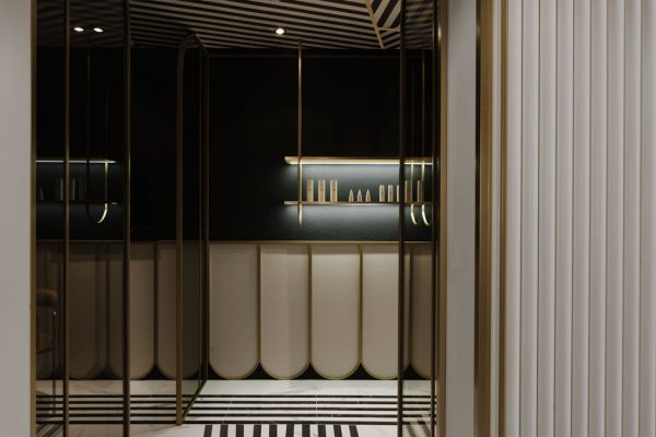
Whereas aesthetic clinics are often stark white and sterile, LAANK deliberately set out to counter that minimalist image. “If you look at other clinics, their focus is often on looking pristine and clean,” says Tan. “There’s also a desire to communicate a sense of peaceful tranquility. Those are the common keywords and trends in the healthcare industry at large, but with Epion being an aesthetic clinic, we thought it was just as important to demonstrate that the clinic both has and understands aesthetics and style.” And it does, in spades.
INDESIGN is on instagram
Follow @indesignlive
A searchable and comprehensive guide for specifying leading products and their suppliers
Keep up to date with the latest and greatest from our industry BFF's!
The internet never sleeps! Here's the stuff you might have missed