The home of architecture and design in the Asia-Pacific
Get the latest design news direct to your inbox!

Get the latest design news direct to your inbox!
Brick represents stability. But can it also channel porosity and lightness? The versatility and charm of brick is showcased in a house in Singapore designed by RT+Q Architects for a multigenerational family.

October 26th, 2018
Brick is hardly a protagonist in RT+Q Architects’ oeuvre where glass, marble, timber and steel are more commonly sculpted into sleek, minimal forms. However, exposed facing brick is the presiding material in The Brick House, as its name implies.
The house is built for a couple and their married daughter and her family. Designed to facilitate multigenerational living, the programmatic diagram is simple, with the former staying on the first storey and the latter residing above. “The key datum was privacy – both within the family and from surrounding neighbours – with porosity,” explains Tiw Pek Hong, the project’s lead architect.
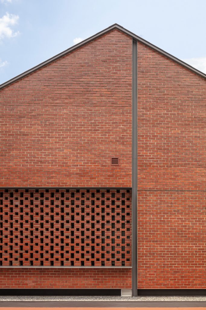
The massing of the house takes the form of two interconnected double-storey blocks. It echoes the site’s longitudinal shape that becomes wider toward the rear. To cater for autonomous living, the lift and main staircase are situated just behind the front facade. An alternative circulatory route is found in a second staircase. Both levels have similar plans, with the living, dining and kitchen up front and, bedrooms to the rear housed in a barn-shaped volume with views of a lush garden.
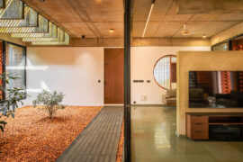
It is interesting how the brick surfaces metamorphose throughout. At times, brick takes on the compactness and stability it is more often associated with; other times, it patterns into porous skins to filter light, ventilation and views, which is important since apartment blocks surround the longer elevations.
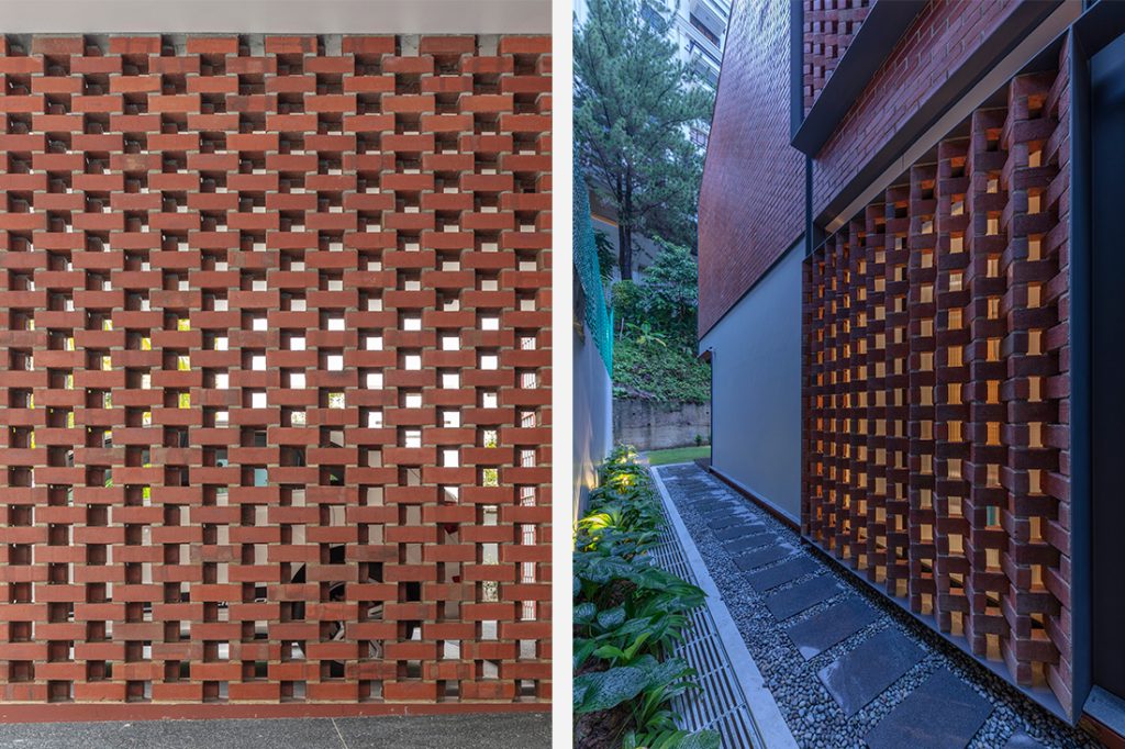
Shares Tiw, “The common approach of using bricks to form solid walls was broken down to its root technique – the action of stacking. As a result, we employed some unconventional stacking patterns to form different screens in front of the main window openings.”
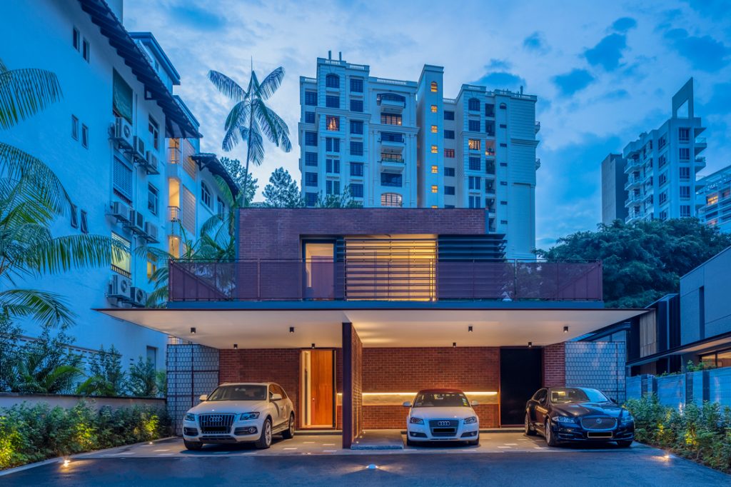
Hence, at the car porch wall, the conventional brick wall’s running bond was ‘stretched’ and the double brick walls staggered to allow indirect porosity. At the southwestern elevation where the neighbouring apartments are closest to the boundary, the brick screen is laid diagonally to prevent direct views into the house. At the northwestern side where the neighbour’s house is further away, a straight vertical stack pattern allows more porosity. Fluted laminated glass, large overhanging canopies and strategically placed horizontal perforated metal mesh louvres provide additional privacy. These exercises in brick design further RT+Q’s initial explorations of the material in the House on Seletar Hill (2012) where facing bricks were simply used in the traditional form of solid walls.
The material extends into the interior – in bathroom walls – complemented widely by metal to perpetuate an industrial character, though the refined details mean the house never strays from sleek to sloppy. Externally, Tiw considered maintenance with thoughtful design details. “Galvanised steel elements cap off corners and wall edges, as brick at these areas tend to chip or wear badly if left exposed. Galvanised steel elements break up extensive exposed brick surfaces, to prevent cracks forming along the mortar joints due to thermal expansion and contraction,” he shares.
Additionally, the galvanised steel elements were left unpainted to eliminate the chances of paint flaking if water seeps in between the primer and paint layer due to improper application. The distinct maroon colour of the iron oxide primer perfectly partners the brick’s red shade.
Depending on the form, brick can either be monumental or cosy but its elemental honesty is universally endearing. Here, that is particularly so as one’s sensitivity to tactility, climatic alterations and scenery is heightened while traversing through the house.
Photography by Masano Kawana (courtesy of RT+Q Architects)
INDESIGN is on instagram
Follow @indesignlive
A searchable and comprehensive guide for specifying leading products and their suppliers
Keep up to date with the latest and greatest from our industry BFF's!
The internet never sleeps! Here's the stuff you might have missed