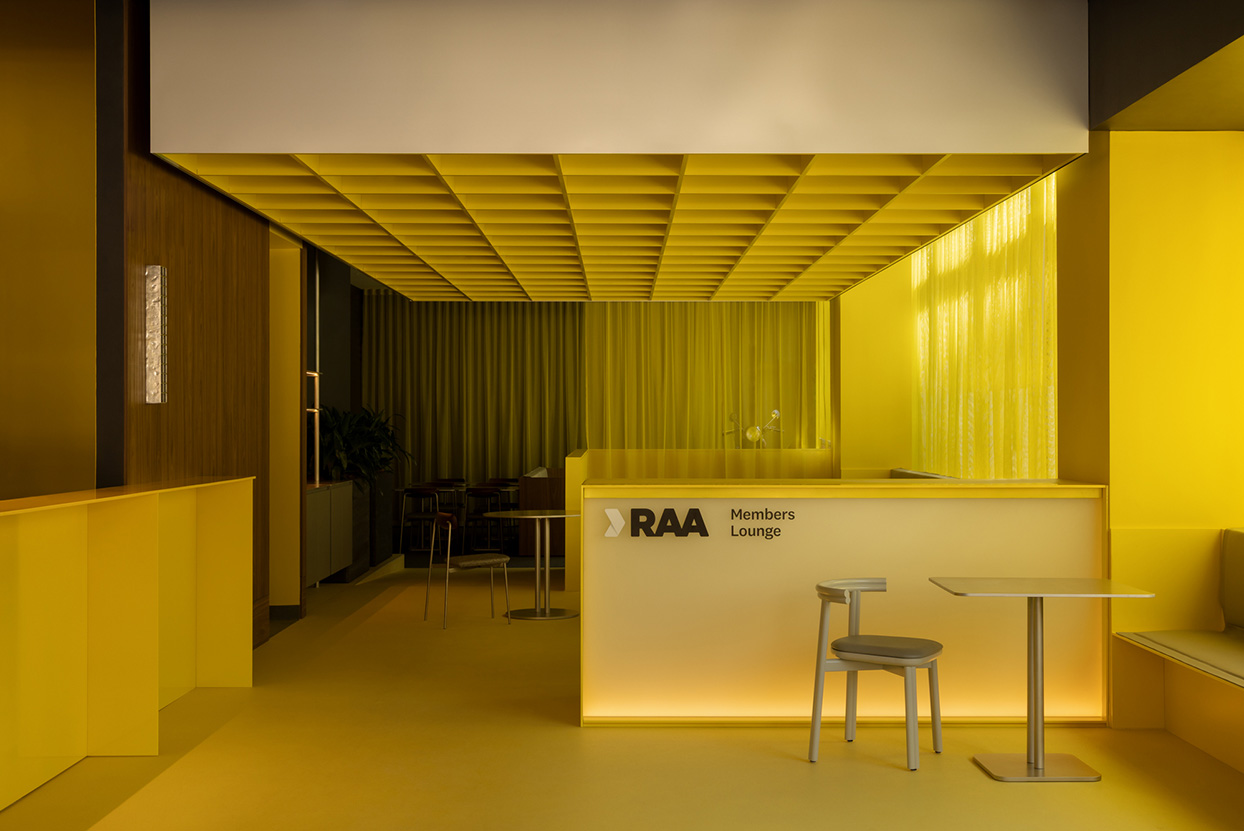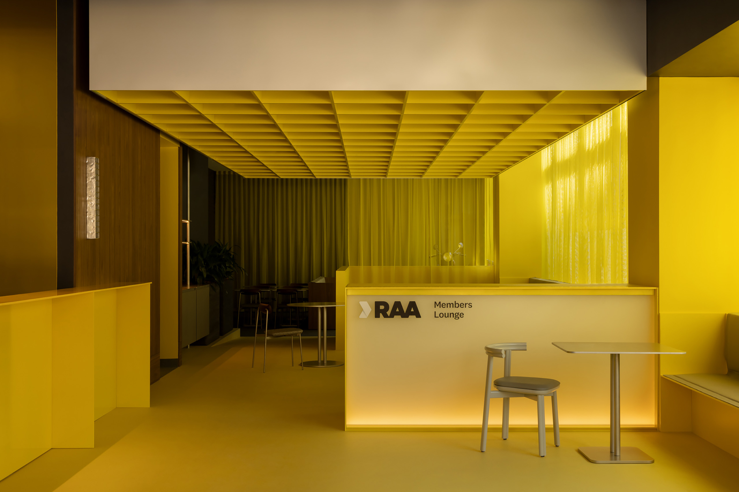
There are few colours as immediately recognisable in South Australia as RAA yellow. It carries with it more than brand recognition; there is memory and a sense of reliability embedded in it as a known graphic footprint of roadside assistance. At RAA’s new Adelaide headquarters though, that iconic memory is turned from past towards the future through a contemporary reinterpretation of the brand by Walter Brooke.
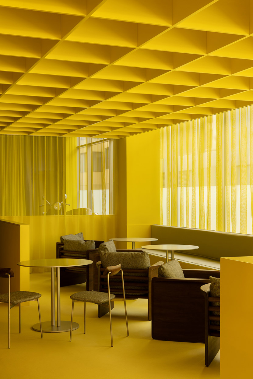
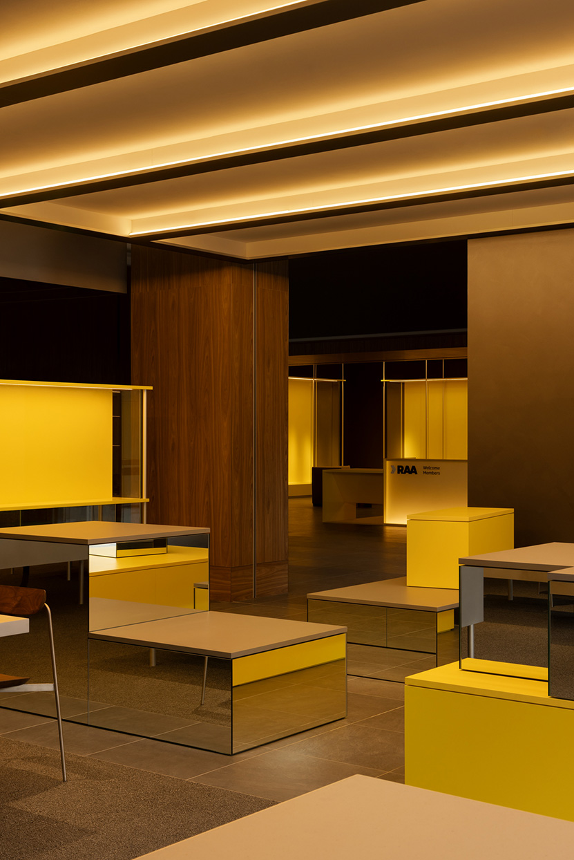
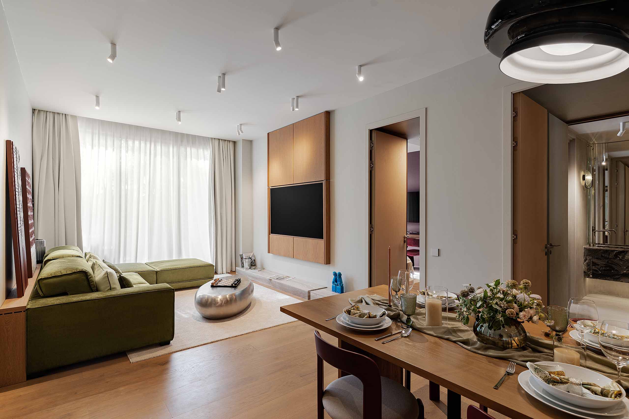
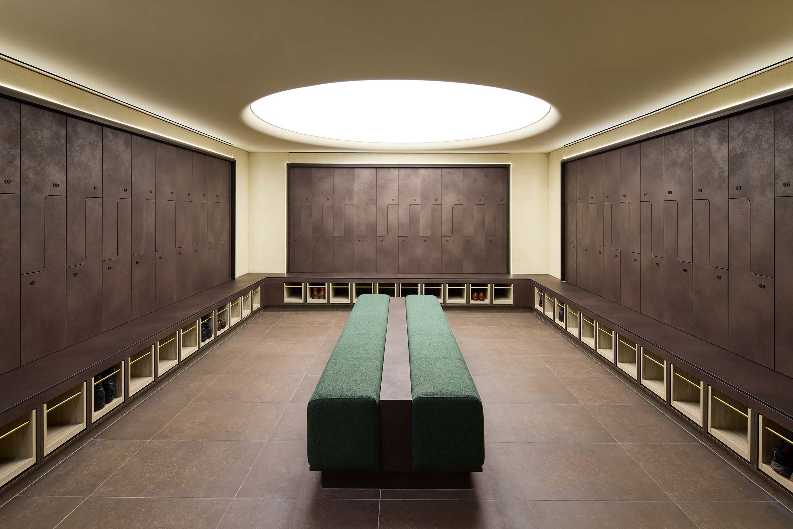
The response needed to be both confident and controlled, with the use of RAA’s yellow colour unmistakably present and integrated while avoiding the application of a singular graphic gesture. Instead, it shifts in saturation and intensity across the building, appearing within deep-set reveals, joinery and thresholds, and against dark timber that gives the brighter moments greater depth. Sharp geometries and strongly framed openings bring a precision to the interior, while cork, glass block, planting and softer acoustic surfaces temper its more corporate edges.
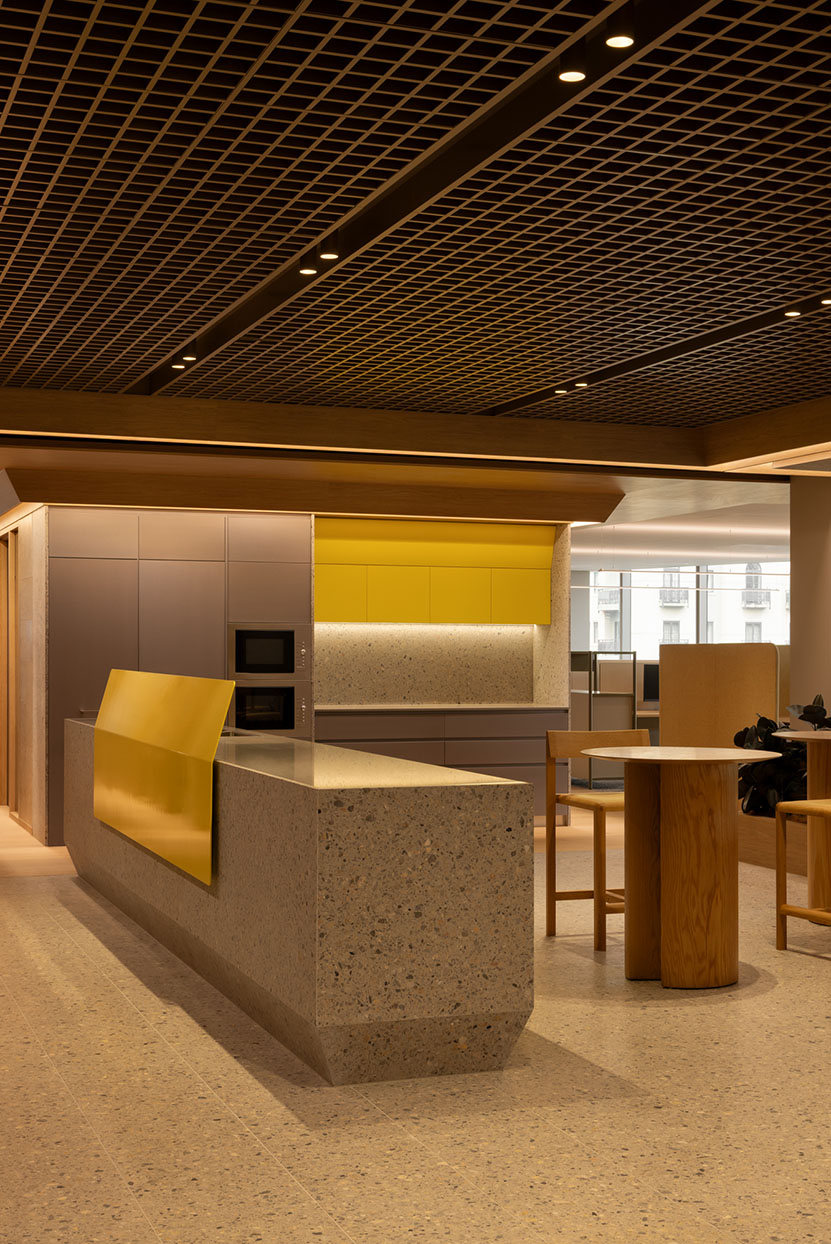
“We wanted the workplace to feel more domestic and approachable, with subtle references to the brand rather than simply using bold yellow everywhere,” says Mark Berlangieri, Director at Walter Brooke. “It was about finding different ways for RAA to be recognisable and an innovator.”
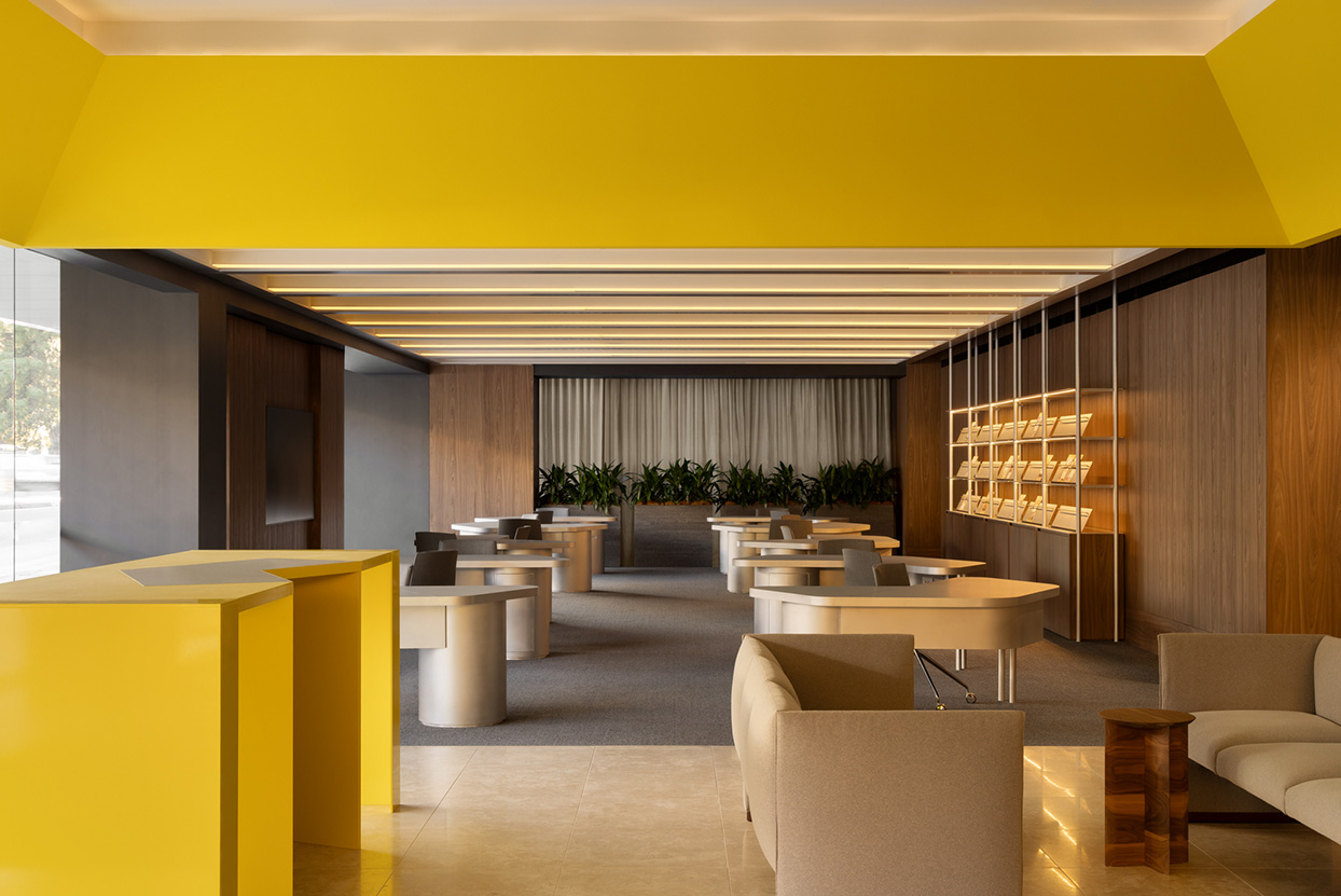
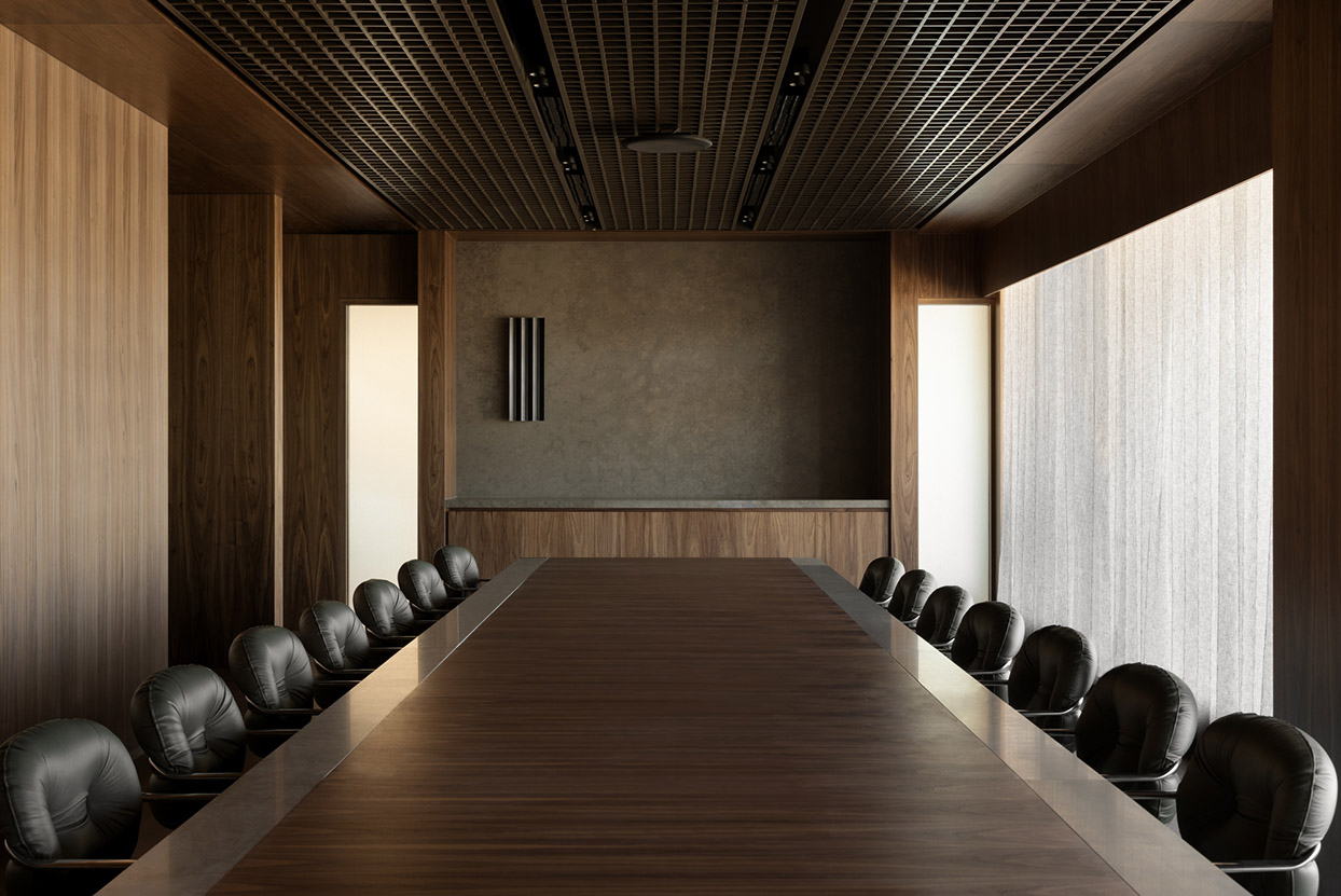
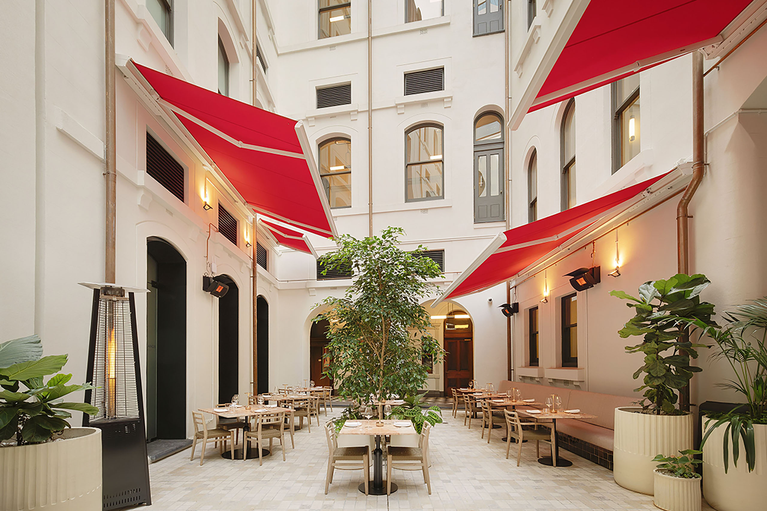
That calibration changes as the building moves between public and private. At ground level, RAA presents a more explicit face to Grenfell Street. Retail, travel and member services sit alongside a cafe, creating an active public interface and bringing previously separate functions into one address. Yellow becomes bolder here, while timber provides continuity with RAA’s existing retail environments across the state.
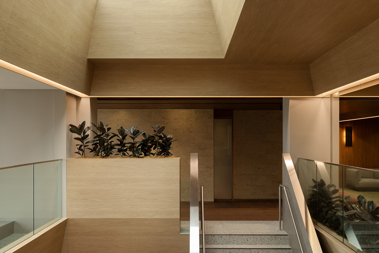
Above, the palette becomes quieter. A cork-clad central stair forms the social and spatial heart of the workplace, connecting breakout spaces, meeting rooms and varied work settings intended to encourage movement between teams.
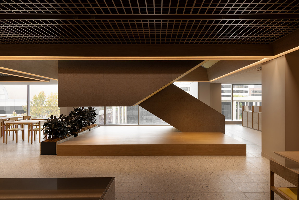
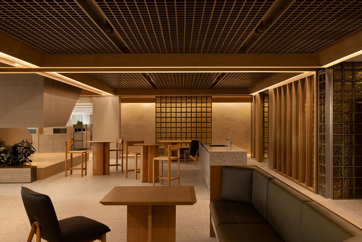
“The idea of ‘One RAA’ was important,” says Berlangieri. “The stair, shared spaces and different work settings are all about creating greater interaction and connection between people.”
Related: RIZEN’s wellness fit-out in Sydney
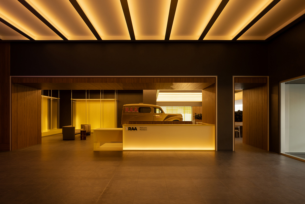
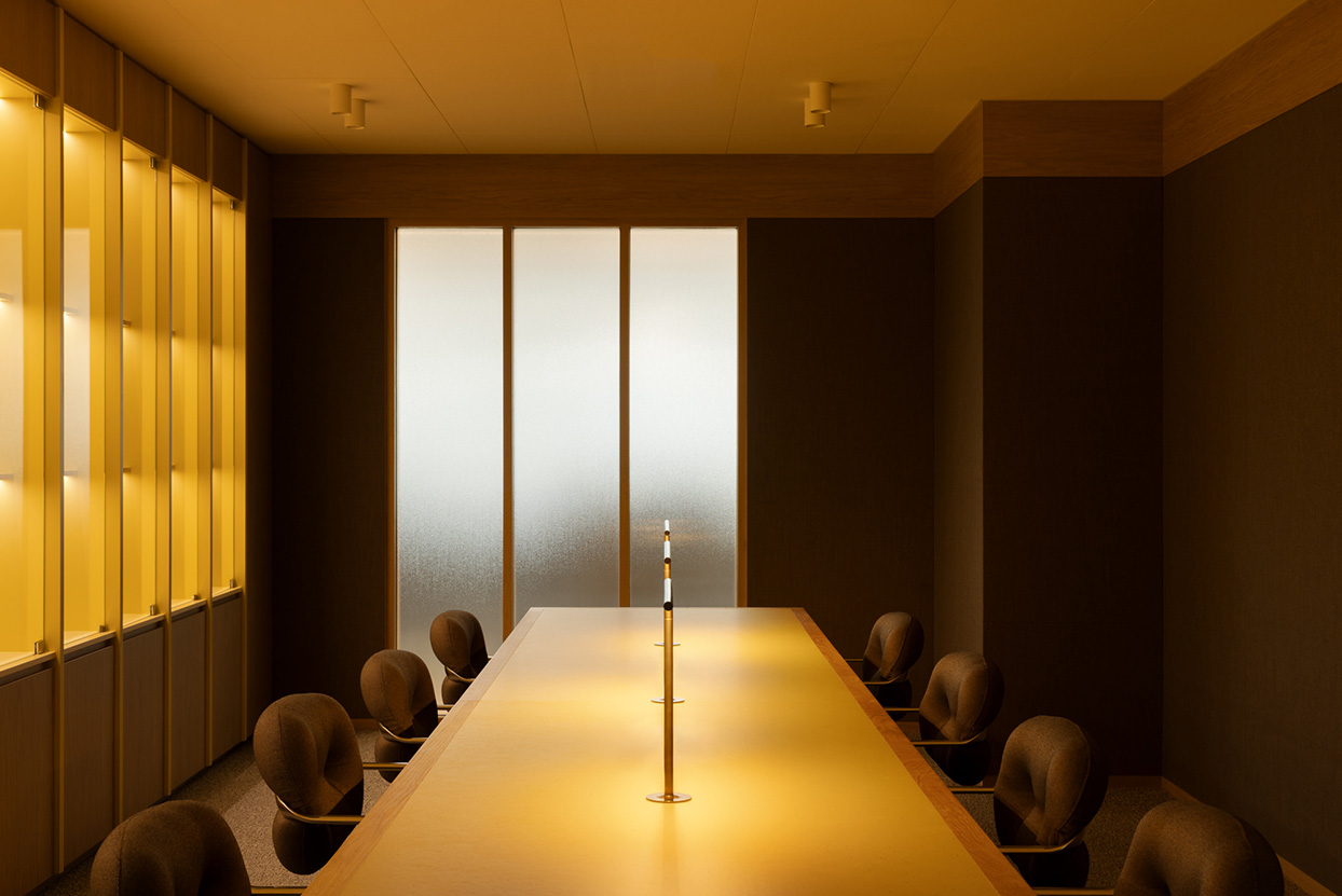
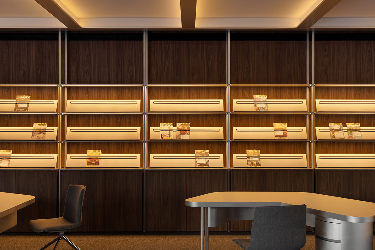
Perhaps more interesting is the way history has been folded into this contemporary language. Rather than isolating RAA’s extensive archive as a static display, memorabilia and objects are dispersed throughout the workplace. Against the precision of the new interior, these fragments introduce something less polished and more personal: reminders of an organisation whose identity has accumulated over generations.
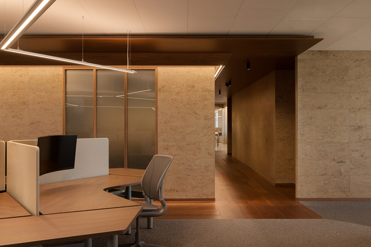
“Memory and experience are embedded throughout the workplace through the presentation of the RAA archive,” Berlangieri explains. It is a relatively simple move, but an important one. The past is neither replicated nor erased; it becomes another material within the project.
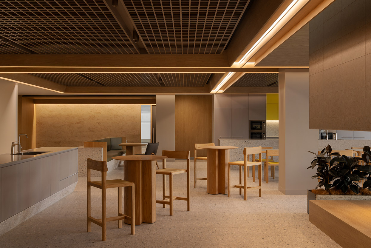
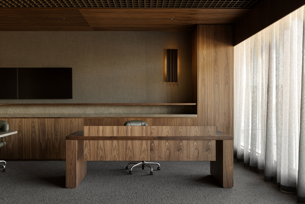
The result is an interior that feels distinctly RAA without relying on branding alone. The architecture itself is as iconic as the colour, and draws on both the past and future. Familiar elements have been abstracted, sharpened and reassembled, with yellow integrated against dark timber, objects within deep reveals, history alongside a more agile workplace. Rather than inventing a new identity, Walter Brooke aims to express an existing identity in spatial terms: recognisable, contemporary and still carrying traces of where it came from.
Walter Brooke
walterbrooke.com.au
Photography
Timothy Kaye