The home of architecture and design in the Asia-Pacific
Get the latest design news direct to your inbox!
Get the latest design news direct to your inbox!
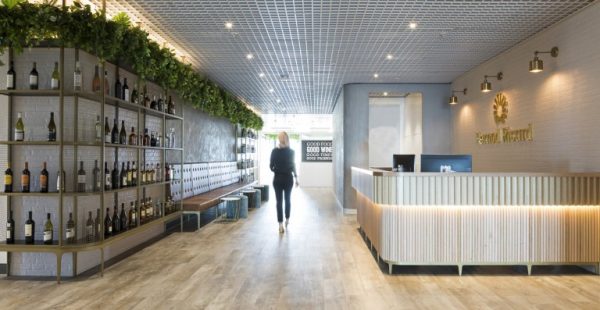
Wine and spirits company Pernod Ricard enlisted the help of The Bold Collective to reinvigorate its space and transition from a disjointed office in North Ryde, to a spacious 2500-square-metre space in Barangaroo.


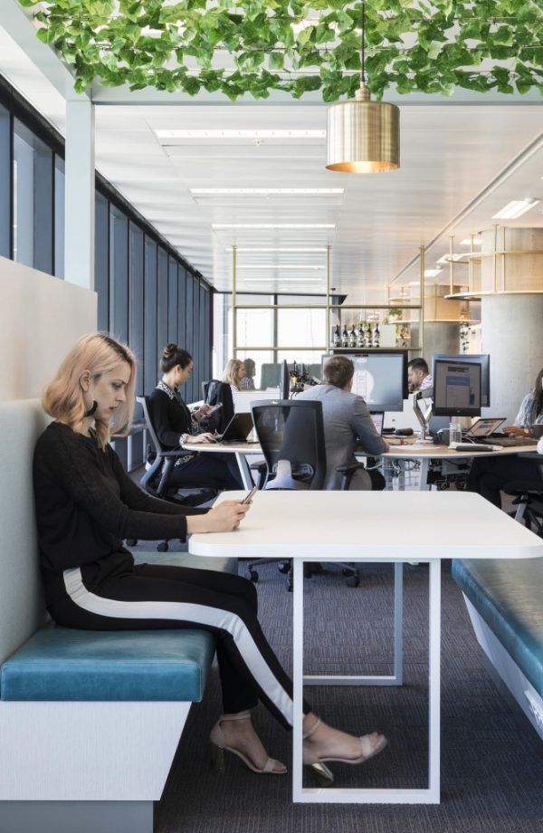
Pernod Ricard is a leader in the Australian wine and spirits market, fittingly The Bold Collective approached the design of the company’s new Sydney Barangaroo office as both a workplace and hospitality project. Pernod Ricard’s focus on ‘moments of conviviality’ mean spontaneous encounters of social interaction were designed throughout the floor, not just restricted to the front of house or bar/breakout space. This concept was then translated into the new environment by ensuring all spaces were inviting while being softened through an abundance of vines and plush upholsteries.

A celebration of its varied brands is realised through environmental graphics and bespoke joinery display areas for bottles of wine and spirits. The outcome is a flexible, connected and collaborative environment that drives innovation through great planning, design and technology.
Monika Branagan, Design Director at The Bold Collective, discusses the re-design.
How did the design concept develop?
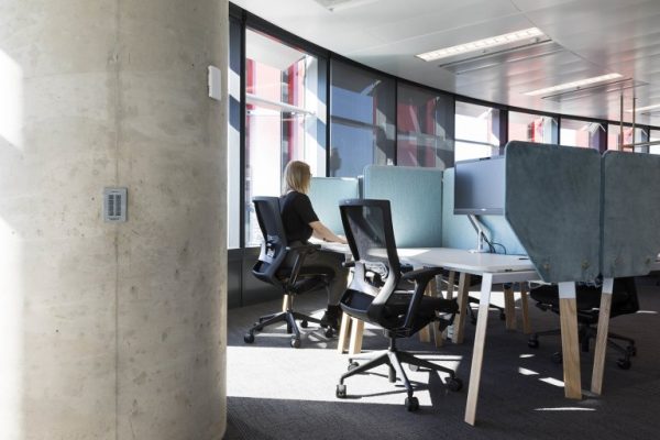
We were briefed by Unispace’s workplace strategy team who had conducted extensive interviews and observations around Pernod’s current work patterns and culture. Their recommendation to Pernod was to adopt an agile neighbourhood model with an emphasis on collaboration and innovation. Our interpretation of this brief was to include multiple informal meeting, collaborative and innovative areas alongside team tables, quiet working and contemplative zones. The floorplates in Tower One have some distinct challenges and to a degree dictate the functionalities of the spaces. There is a narrow area leading off from the lift core, which is a natural reception/arrival point in terms of proximity to the lifts but not in itself very grand in proportions.
Consequently, we presented this area more like a hotel concierge space than a workplace reception with a large product display area framing the seating for visitors and providing visibility through to the innovation zone and southern façade. Moreover, it was obvious from the outset that the bar would be the heart of the interior, and the architecture of Barangaroo Tower One made the decision of where to locate this space easy. We positioned the bar within one of the double height zones known in Barangaroo as ‘vertical villages’ and the panoramic views looking north towards Sydney Harbour Bridge more than added a wow factor to the bar’s stylish interior.

What was the approach to the colourways and materiality of the design?
Pernod Ricard is associated with premium brands and the brief was clear in that the finishes, detailing and overall aesthetic needed to convey a high level of sophistication. For example, the reception desk, banquette joinery and bar design have a refined level of craftsmanship to reflect the premium nature of the company. We designed tapered brass legs in these key joinery items rather than standard plinths with built-in skirting as another subtle detail that elevates these items to key statements pieces. We drew inspiration from the warmth of timber in wine barrels and vineyards but instead of looking at heavy recycled timbers we used more contemporary lighter finishes such as oak and ply.
The two main colour ranges of pinks and blues were drawn from very different sources. The pinks are interpretations of rosé, Shiraz and pink champagnes, and the blues are a subtler translation of Pernod’s brand colour. We used a variety of plush velvet-like fabrics and backlit brass bottle displays to further reflect the premium focus. There are a number of overhead planting canopies to mimic vineyards and create another layer of softness. There are even some living plants that have a hint of pink to them to tie into the overall tones and hues.
What R&D was involved?
We worked with AWM Commercial Furniture & Joinery on a previous project to develop the Alpha workstation leg. The domestic and warm aesthetic of this design seemed appropriate for the Pernod concept. We rolled out this leg design into high bench zones and individual quiet desks. We also worked with AWM to design plush desk screens, which provide privacy for focused working.
Further, we designed the environmental graphics and worked alongside Wallflower Images to experiment with white ink printing on frosted vinyl and customised printed graphics on acoustic panelling and cork. The workplace was to act as a celebration of Pernod’s brands so we worked alongside Pernod’s marketing team to develop graphics that captured the essence of the diverse wine and spirit brands.
Photography by Andrew Worrsam, boardroom photo by Shannon McGrath.
INDESIGN is on instagram
Follow @indesignlive
A searchable and comprehensive guide for specifying leading products and their suppliers
Keep up to date with the latest and greatest from our industry BFF's!
The internet never sleeps! Here's the stuff you might have missed