The home of architecture and design in the Asia-Pacific
Get the latest design news direct to your inbox!
Get the latest design news direct to your inbox!
CUN Design redefines the retail experience with a dramatic industrial design for Qpokee, geared towards China’s Gen Z shoppers.

December 23rd, 2021
Re-defining the retail experience, CUN Design has completed a transformative design for the Qpokee Flagship Store in Sanlitun, in the Chaoyang District of Beijing, China.
The stunning interior of the store has been conceived to display the multitude of products on offer from Qpokee but also to reflect its client base of primarily GEN Z shoppers. With a new floorplan and dramatic colour palette the Flagship store is making waves in the capital and has gone viral on social media.

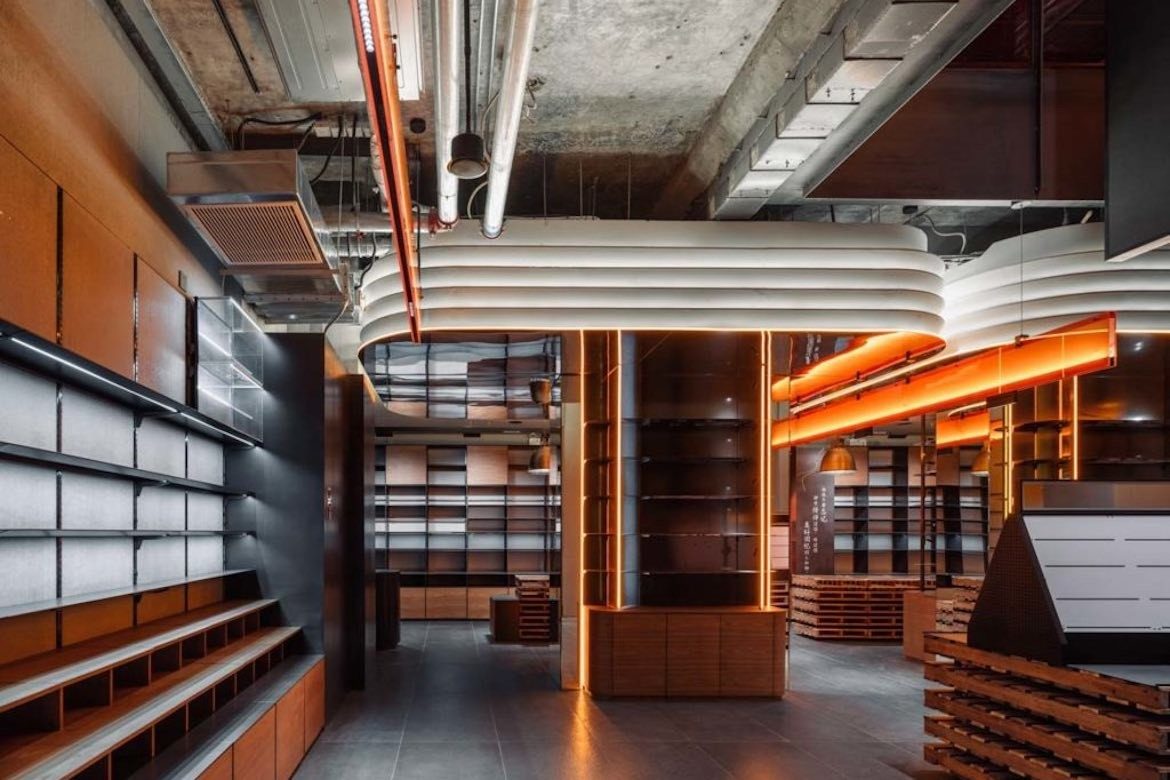
To begin, CUN Design and chief designer, Cui Shu, spent time devising the new concept for the 500 square metre space choosing an ‘industrial style’ that would complement the building and allow a more, free-flowing approach to the interior.
Through customer research, the design included space modules composed of composite factors from all aspects to present a more diverse and interesting concept.

Correct product display was essential to a successful end result and so the designers spent time with the Qpokee team to discuss and assess the layout. The result was a three-dimensional design achieved through product partitioning, vertical displays and colour display. CUN Design also reviewed client online feedback of existing stores and spent time observing store operations in order to enhance and adjust product visualisation.
“We have always believed in the saying, ‘You can only know the direction of waves by standing in the water’. We turned the problems on site into design goals to solve them!” says CUN Design.

The space comprises ground and two floors that are linked by a structural staircase. The stair was not only a necessity for flow traffic, solved the challenge of overlapping displays but is also used to display product. The products are arranged logically and scientifically according to the sales movement lines, their proportions and selling prices.
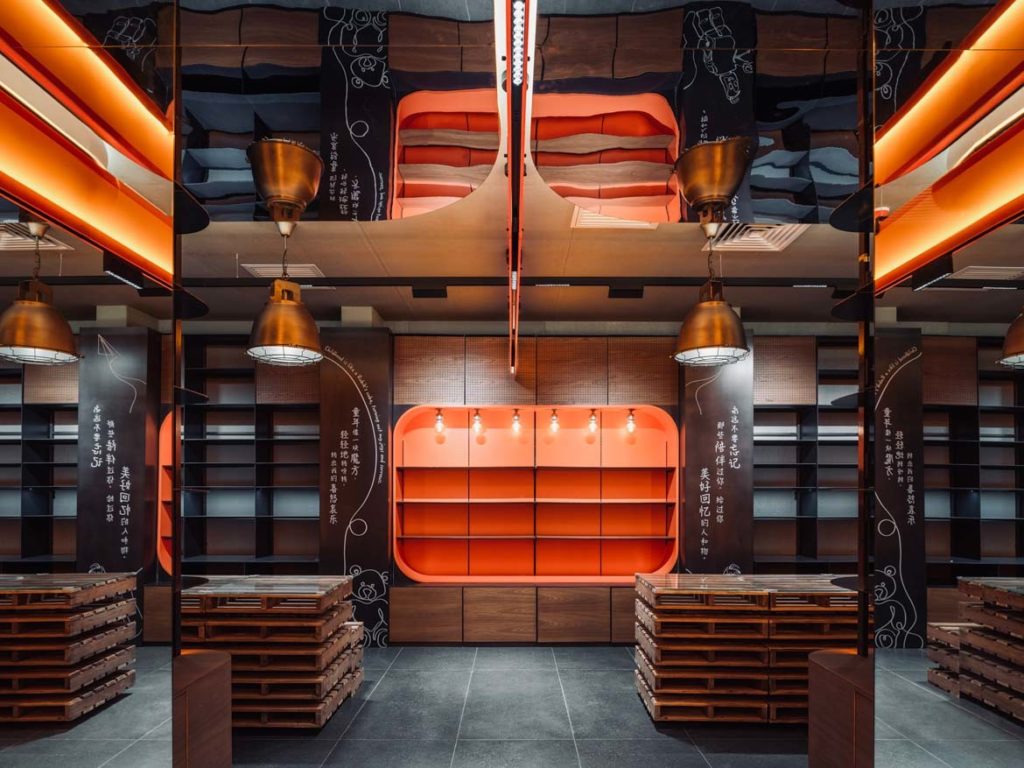
The colour palette is primarily a rich warm tomato red that not only makes the interior a stand out but appeals to the store’s demographic. One of the features of the project is the large display window that allows those outside to see in and through expert lighting the interior is both exciting and inviting.
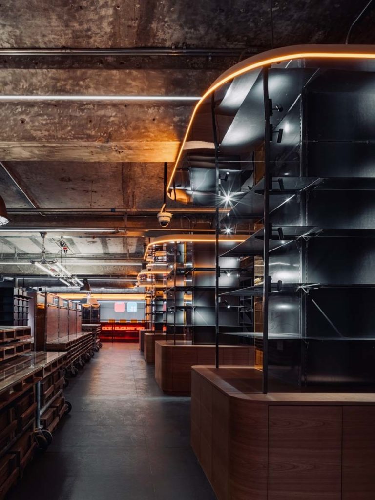
“We used the style of the entire space to form vision, the structures to assist products, props to complete functions, and lights to light up the levels,” says the design studio.
The Qpokee Flagship Store in Sanlitun is a riot of colour and sets the tone for the array of clothing, beauty products, home appliances, stationery, plants and food on offer to its discerning clientele. It’s a fabulous design statement that is fresh and inventive and CUN Design has exceeded the client’s expectations of the brief to perfection.


CUN Design
cunChina.cn
We think you might like this story on YSG Studio’s dreamy design for Cultiver, in Sydney.
INDESIGN is on instagram
Follow @indesignlive
A searchable and comprehensive guide for specifying leading products and their suppliers
Keep up to date with the latest and greatest from our industry BFF's!
The internet never sleeps! Here's the stuff you might have missed