The home of architecture and design in the Asia-Pacific
Get the latest design news direct to your inbox!
Get the latest design news direct to your inbox!
Bates Smart has revitalised the Pier One landmark with a luxurious facelift. Elana Castle takes a look at the compelling combination of historical artefacts, original features and luxurious finishes that characterise its new public persona and hospitality spaces.
May 6th, 2015
“We took the elements and forms we saw on the pier and embedded those details into the design,’ said Brenton Smith, Studio Director of Interior Design, Bates Smart when asked about his team’s approach to revitalising the public areas of the Pier One Hotel in Sydney’s Walsh Bay.
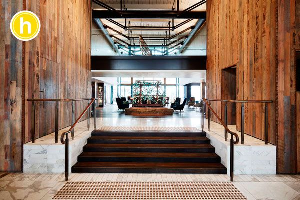
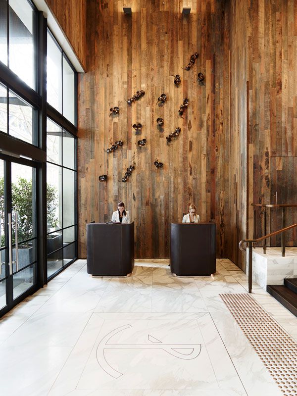
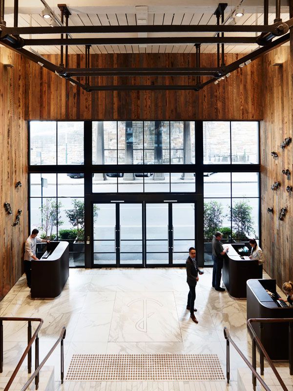
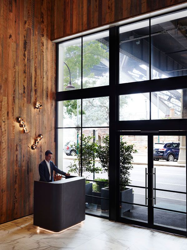
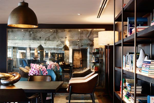
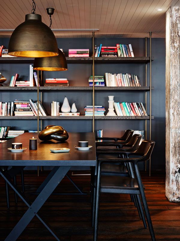
All these traits are evident in the lobby where the natural rawness of reclaimed timber wall cladding references the exposed external timber on the pier and the use of stucco, metal joinery elements and an aged bronze patina finish in the bathrooms seem to hark back to the past.
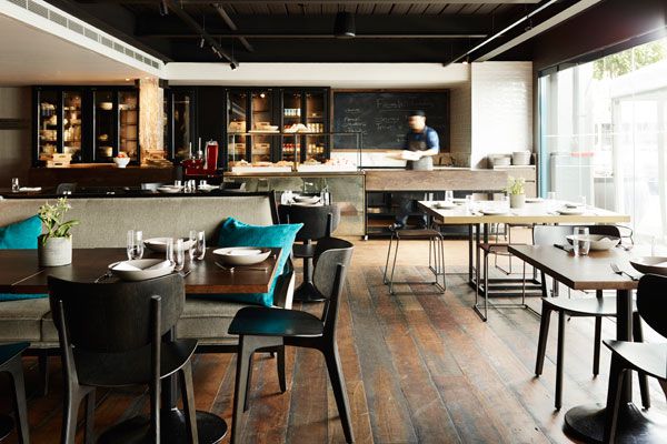
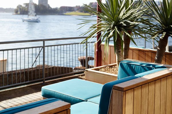
Located on the Pier One finger-wharf, the newly completed The Gantry Restaurant & Bar draws on the architectural language of its maritime environment and the building’s historical fabric (it once functioned as a terminal for P&O liners in the 1910’s) to create a sympathetic, yet luxurious overlay that also responds to the activity of Sydney harbour beyond.
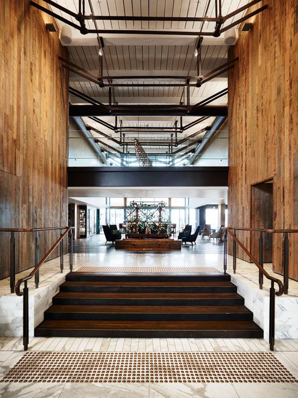
All these traits are evident in the lobby where the natural rawness of reclaimed timber wall cladding references the exposed external timber on the pier and the use of stucco, metal joinery elements and an aged bronze patina finish in the bathrooms seem to hark back to the past. Aged finishes in a sense, that perfectly contrast with more luxurious materials, such as polished stone floor and Calacutta Oro marble offset by accents of gold that creates a sense of grandeur within the scheme.
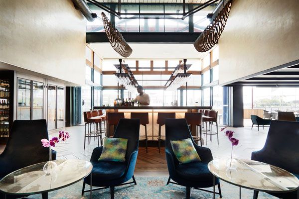
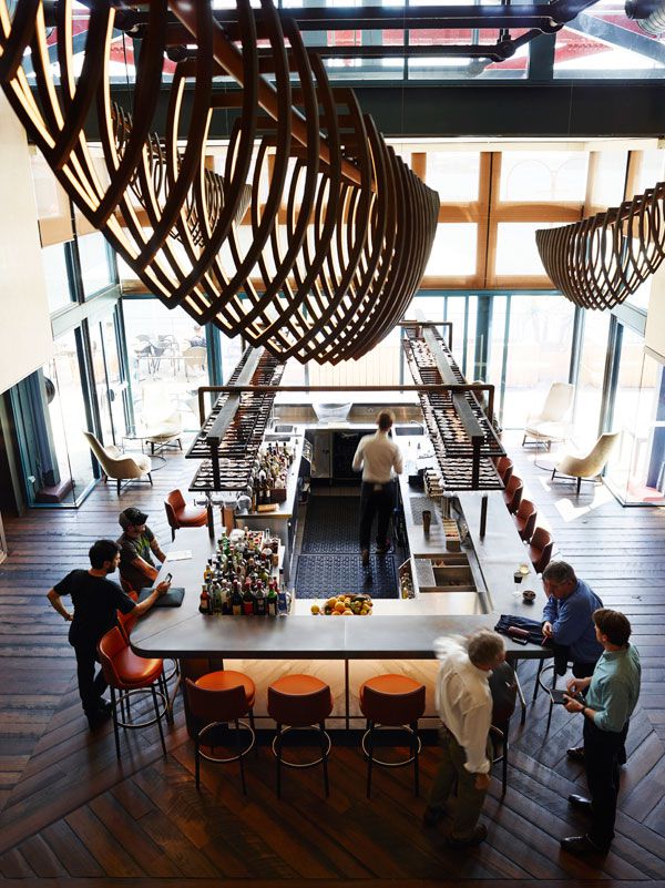
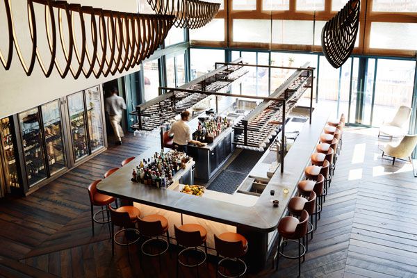
From a planning perspective, Bates Smart’s selection of rich materials forms part of their strategy to activate the previously disconnected public spaces and draw guests into the bar and restaurant. In addition, the bar now occupies a central location, becoming the central hub of the ground floor lobby. The aesthetic is one of “club-like casual elegance”, that creates a cosy feel whilst expansive glazing opens up the spaces to the harbour.

In addition to the blend of old and new, a key challenge involved making the spaces as approachable and welcoming to guests at all times of day. “It is notoriously difficult to get spaces to work all day and all night,” explains Smith. “We worked hard to make sure that patrons will feel as comfortable having their coffee and eggs for breakfast at the bar, as they will sipping a martini at midnight.”
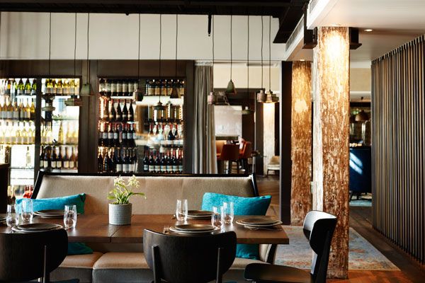
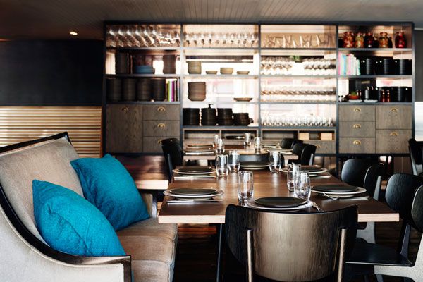
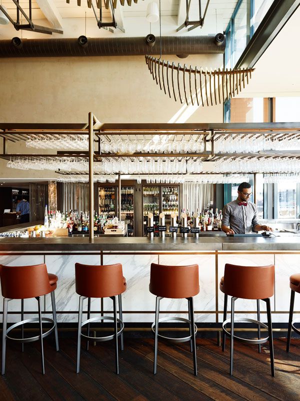
In response, the bar forms the centrepiece of the space. A fusion of Axolotl zinc cladding on the counter forms a rustic counterbalance to the polished marble front. A specially-designed frame for the glassware frames the bar, along with bespoke, boat-shaped lights. Casual lounging area creates a sense of intimacy in the space as does a mini-library at the rear.
ARCHITECT: Bates Smart
PHOTOGRAPHER: Anson Smart
INDESIGN is on instagram
Follow @indesignlive
A searchable and comprehensive guide for specifying leading products and their suppliers
Keep up to date with the latest and greatest from our industry BFF's!
The internet never sleeps! Here's the stuff you might have missed


")