The home of architecture and design in the Asia-Pacific
Get the latest design news direct to your inbox!
Get the latest design news direct to your inbox!
The Intention of the Australian Communication and Media Authority’s (ACMA) new Melbourne headquarters, designed by peckvonhartel, is to bring ACMA personnel in to a new work environment that emphasises the ACMA brand and values. Accordingly the tenancy design uses a clever integration of branded elements into the new tenancy. Alice Blackwood reports.
April 4th, 2014
Wayfinding, orientation, collaborative working spaces and greater connectivity were just some of the issues addressed by peckvonhartel in the redesign of the Australian Communication and Media Authority (ACMA) headquarters (HQ) in Melbourne.
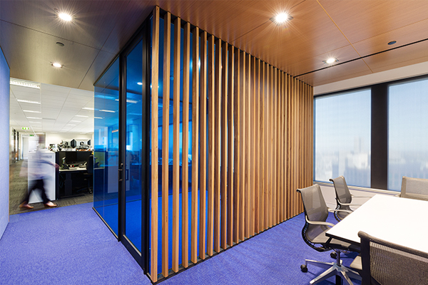
Located within an office tower on Elizabeth Street in Melbourne’s CBD, ACMA downsized from 3 floors to 2, engaging peckvonhartel to solve a number of key challenges using clever workplace design and graphic solutions.
The original floorplate (which is diamond-like in orientation), while boasting fabulous views, proved to be extremely disorientating for staff, who could never quite get their bearing once they had entered the tenancy.
“When you are in this office tower which is offset at 90 degrees to Melbourne’s Hoddle grid it is disorientating as to where you are in the building, especially as it’s a central core building,” said project spokesperson and senior design architect with peckvonhartel, Joshua McAlister.
A re-organisation of space saw senior executives’ offices moved to the centre of the building “effectively allowing most people to have a window seat,” said McAlister.
“It was a positive result, allowing the workforce to all have natural light, and fantastic views,” he said.
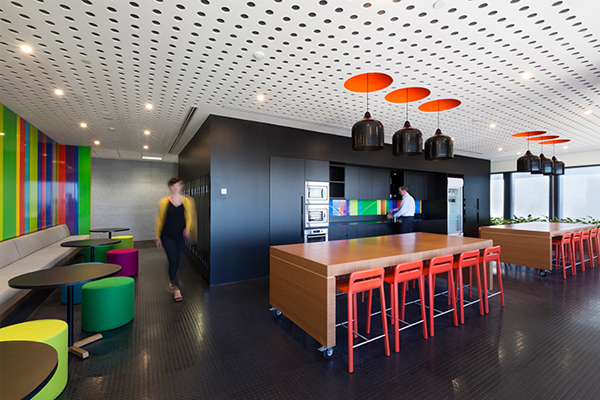
Collaborative spaces which double as break-out and meeting areas are located at all four points of the diamond floorplate and thereby assist as orientation devices, these collaborative spaces are named after the landmarks (such as Docklands and Dandenongs) which lie in the direct sight-line of each facade.
Among peckvonhartel’s other design objectives was a need for greater connectivity between departments and the reinforcement of ACMA’s brand identity to the public and ACMA staff.
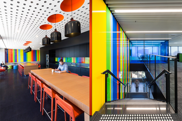
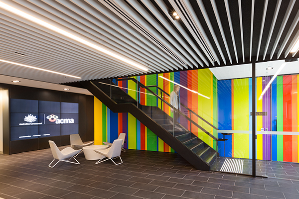
The increased visibility across the diamond floorplate was integral to providing visual connectivity, while the addition of an inter-tenancy stair creates an instant connection between the sweeping entrance foyer and the upper-level offices.
The stair itself is a major focal point, derived from the ACMA brand identity and features a multi-coloured ‘convergence spine’ which straddles the double-height tenancy void. The rainbow colours displayed prominently on the interconnecting stair wall directly references the ACMA brand, bringing it to life through structure and space.
“The ACMA brand symbolises the ‘ever increasing concept of convergence’,” explained McAlister. Here the peckvonhartel interiors team explored imagery and ideas around convergence to conceive a design that would communicate the ACMA brand to staff and external visitors.
“We had a great opportunity with the inter-tenancy stair which, with its double height volume, which became the focal point to anchor the whole design.”
To maximise this brand impact and allow the rainbow hues to be powerful, peckvonhartel also “pulled back” the rest of the palette to muted greys and whites.
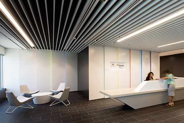
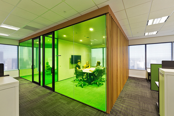
The rainbow colours continue to reappear around the remainder of the fit-out, integrated wherever possible into the tenancy structure, rather than be applied as an afterthought or superficial finish.
As a whole, the project “provided ACMA’s team with new spaces that they’d never had before,” said McAlister. The collaborative work spaces, and ability to easily identify with ACMA’s ethos and brand values being the most important benefit of all.
peckvonhartel
pvh.com.au
INDESIGN is on instagram
Follow @indesignlive
A searchable and comprehensive guide for specifying leading products and their suppliers
Keep up to date with the latest and greatest from our industry BFF's!
The internet never sleeps! Here's the stuff you might have missed