The home of architecture and design in the Asia-Pacific
Get the latest design news direct to your inbox!
Get the latest design news direct to your inbox!
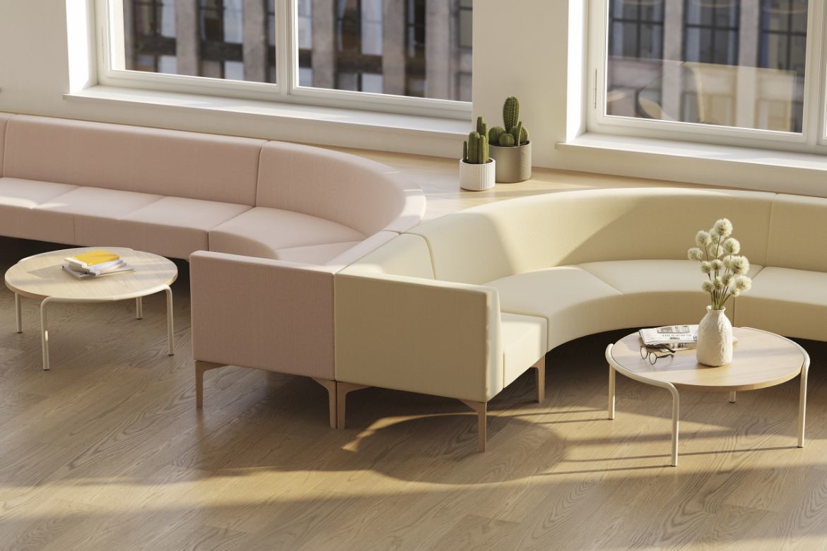
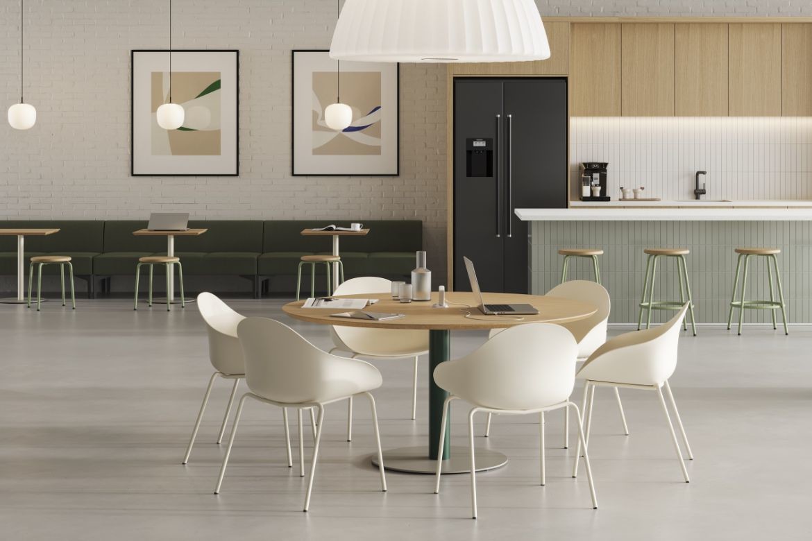
Achieve unlimited design outcomes with NaughtOne – whose new look speaks to simplicity and versatility

November 2nd, 2022
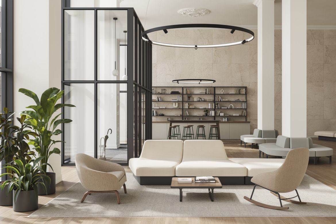
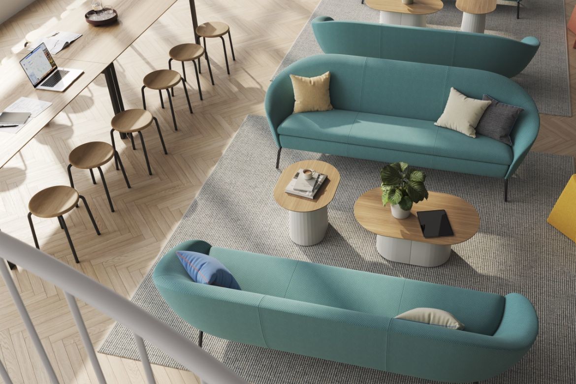
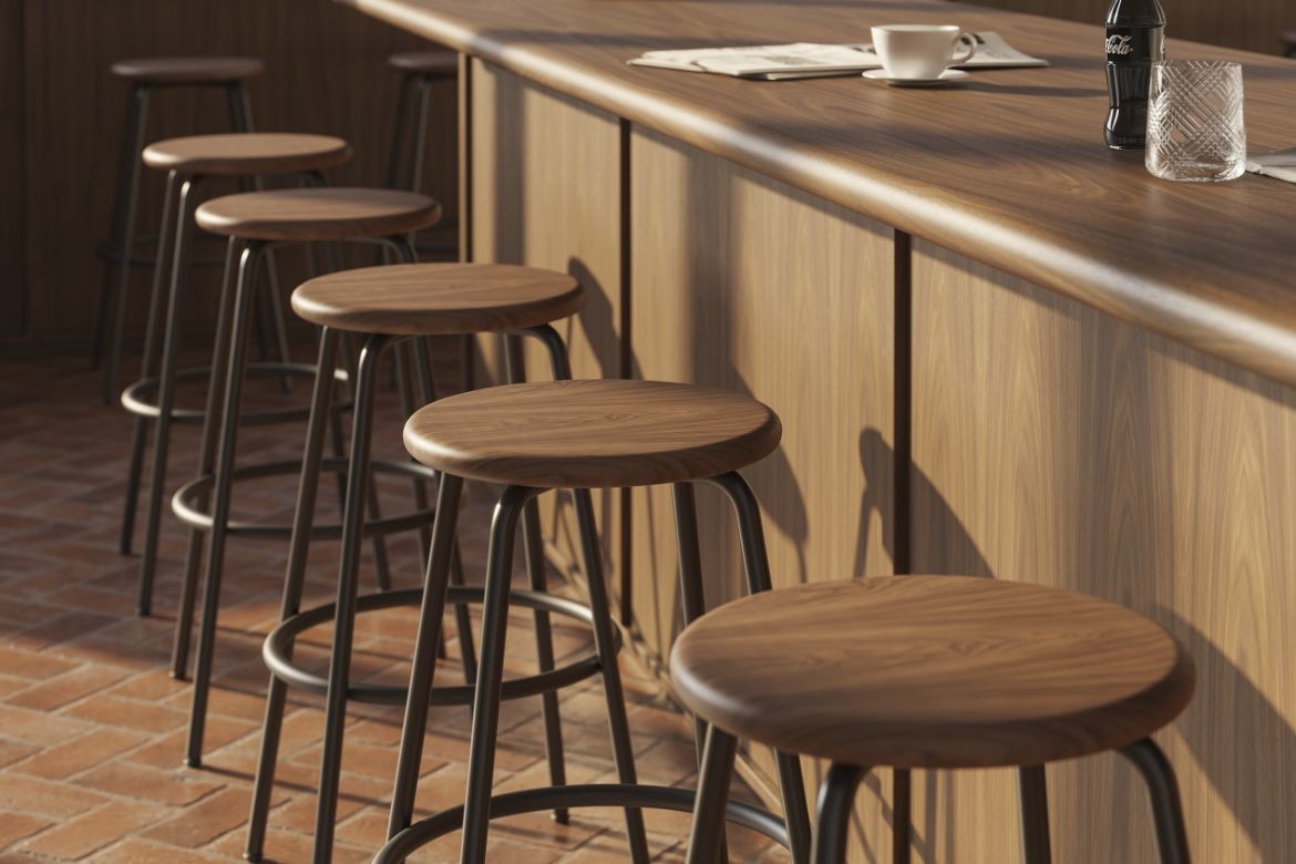
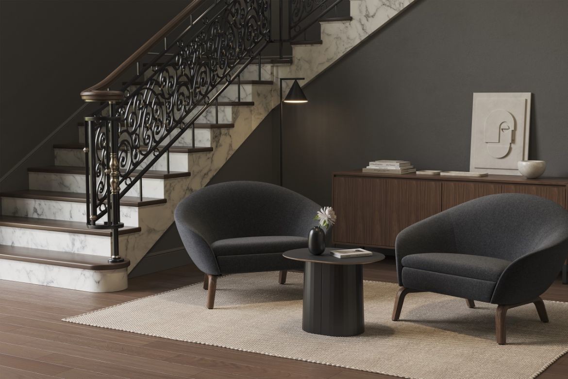
Anyone who knows minimalism knows the simplest things are often the hardest. Without the superfluous to hide behind, simplicity is an exact science, requiring precision and perfection without distraction. NaughtOne is a commercial brand that taps into this philosophy. Its range of commercial furniture consists of a core offering of simple pieces that give designers the freedom to apply them wherever and however they choose. Named after binary code, NaughtOne opens a world of infinite design possibilities, and with a new-look brand identity, every facet of the brand celebrates the freedom that is born from simplicity done right.
“The irony of simplicity is that it’s actually quite complex,” says Nadean McNaught, Managing Director at NaughtOne. “To design something—a space, a product, an approach—that demonstrates ‘less is more’ usually requires incredible insight, refinement and conviction. The beauty of this dichotomy is what energizes us to show through our brand how purposeful simplicity can result in a creative freedom spaces need. Given NaughtOne’s continued growth and expansion over the last few years, we thought it was the perfect time to refresh our brand and reimagine that belief in new and exciting ways—the landscape has changed a lot over the past 17 years.”
The first step in this branding journey was to create a stronger visual identity that more clearly connected to the origins of the company name. In binary code, the digits “zero” and “one” are used to form strings of patterns that create a numerical language. NaughtOne draws on this, referencing the specificity of simplicity and the endless arrangements it can be used to create. Drawing on this, the brand has updated the previous name “naughtone” to “NaughtOne” and added a new logo (“O/1”).
“We are thrilled about all of it—but especially the logo,” says McNaught. “The logo was born from our desire to further amplify the vision and goals of NaughtOne. We wanted to provide a fresh symbol that highlights the conversation around why we exist and represents what we mean to the design world.”

This first step will be followed by a creative update to the brand’s website, social channels, packaging and more, signaling a new chapter in the company’s 15 year history. Importantly, this new evolution demonstrates the reach of NaughtOne and the success of their design approach, having moved beyond their Yorkshire roots as they’ve grown into a global force.
“One of the earliest hallmarks of our brand was our presentation of British sensibility within the realm design— an openness to experiment, solving functional human needs with a creative twist,” says McNaught. “We loved seeing how our brand’s playfulness, small beginnings, brightness and ingenuity resonated across the world. With our updated approach to the NaughtOne brand, we can both represent that original philosophy while better incorporating some of the exciting ways we’ve matured as a brand over the last several years of expansion and growth.”
In 2019, global furniture leader Herman Miller welcomed NaughtOne into their brand suite, helping to distribute the brand’s considered designs across the globe. With a goal to leverage the power of design to improve people’s lives, Herman Miller resonated with the way NaughtOne seeks to improve spaces in a thoughtful way, only introducing products that have a true need and a defined purpose.
NaughtOne’s approach to sustainability is also aligned with the HermanMiller name, where products are designed not just for people, but for the world. Starting before environmental concerns truly hit the mainstream, NaughtOne has showed a decades long commitment to sustainable design, with an approach to circularity that highlights consideration in each stage of the design phase.
Now, this new look NaughtOne is being celebrated by HermanMiller, with their pieces being distributed by HermanMiller dealers across Australia, New Zealand and Asia.
Whether you’re designing for workplaces, hotels, education institutions, airport lounges, or multi-use spaces, this is your sign to discover the NaughtOne collection, specify via Herman Miller dealers, and open the door to a new world of design possibilities.

We think you might like this story on SLAB’s studio trip to Herman Miller US.
INDESIGN is on instagram
Follow @indesignlive
A searchable and comprehensive guide for specifying leading products and their suppliers
Keep up to date with the latest and greatest from our industry BFF's!
The internet never sleeps! Here's the stuff you might have missed