The home of architecture and design in the Asia-Pacific
Get the latest design news direct to your inbox!

Get the latest design news direct to your inbox!
Tamara Veltre, director at Breathe, reflects on the studio’s collaboration with Haymes Paint — a deliberately reduced, architect-designed palette that reframes colour as part of architecture, not an afterthought.
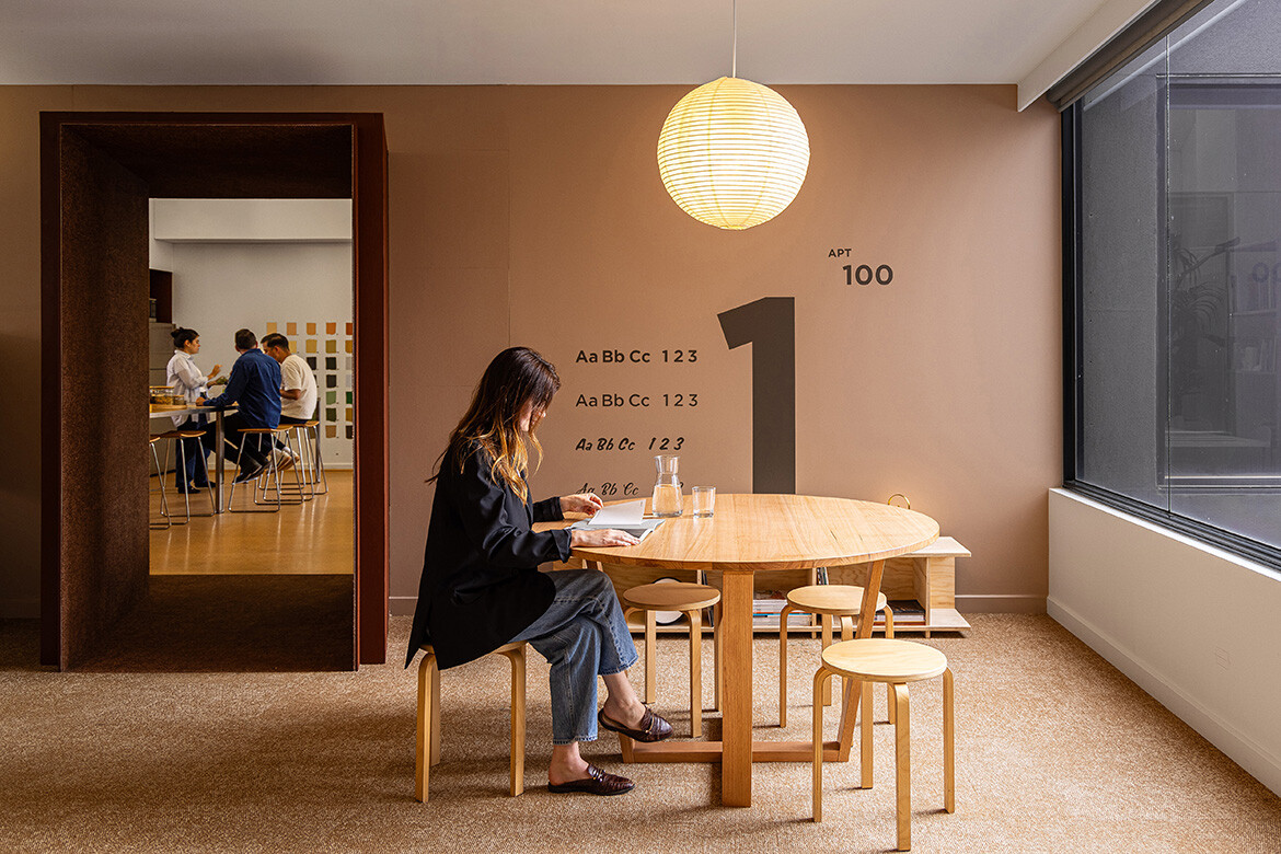
Photography by Sam Copland.
May 7th, 2026
What prompted Breathe to move into developing a paint palette — and how does colour sit within your broader architectural thinking?
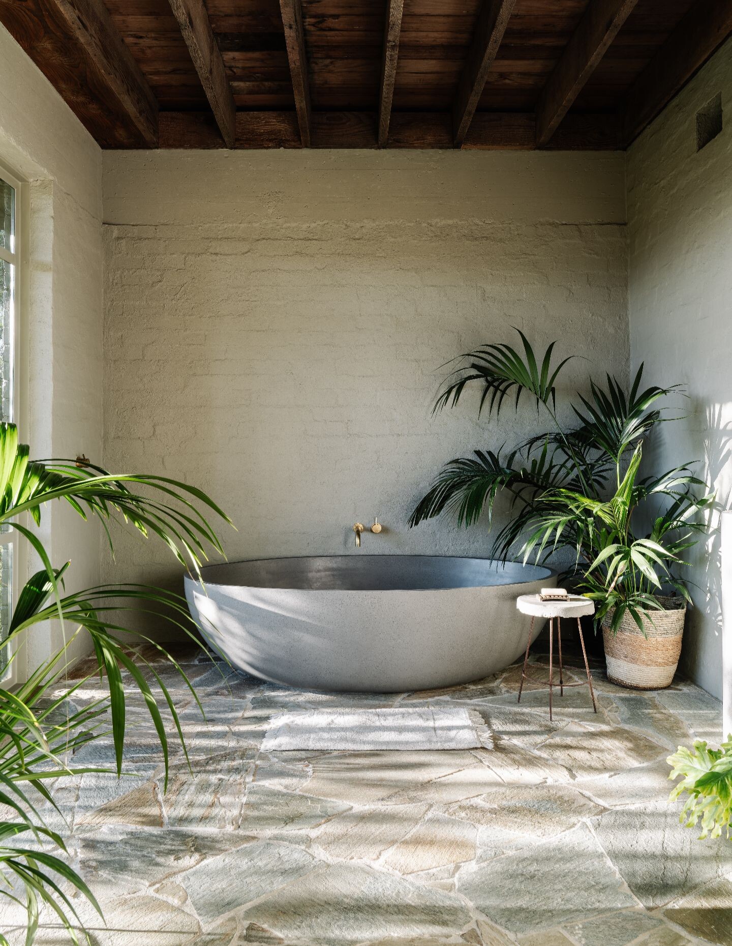
The Breathe Palette grew from a desire to approach colour with the same care, restraint and responsibility that we bring to architecture. We wanted to create tones that sit comfortably alongside natural materials — timber, brick and stone — and feel grounded and enduring rather than driven by trends.
At Breathe, we spend a lot of time thinking about materials: how they age, how they respond to light, and how they belong within the Australian landscape. Paint is often the final layer of a building, but it has an outsized impact on how architecture is experienced. Colour can fundamentally shift the perception of a space — it can compete with the architecture, or it can quietly support and reinforce it.
The palette is intentionally limited to 63 colours — how does reducing choice actually improve outcomes?
We intentionally limited the palette to 63 colours to simplify the process of choosing colour and remove the noise that often comes with expansive paint ranges. Rather than overwhelming people with endless options, the Breathe Palette is designed to offer clarity and confidence in decision-making.
The range is carefully composed to create natural harmony across spaces and projects, making it as useful for designers as it is accessible for everyday homeowners. It reflects an architecture of reduction — one that values intentionality over excess.
By refining choice, we not only streamline specification but also reduce waste, minimising the environmental impact of producing and discarding countless paint samples. The result is a palette that feels considered, coherent and easier to use.
Related: Surround sound of colour and movement
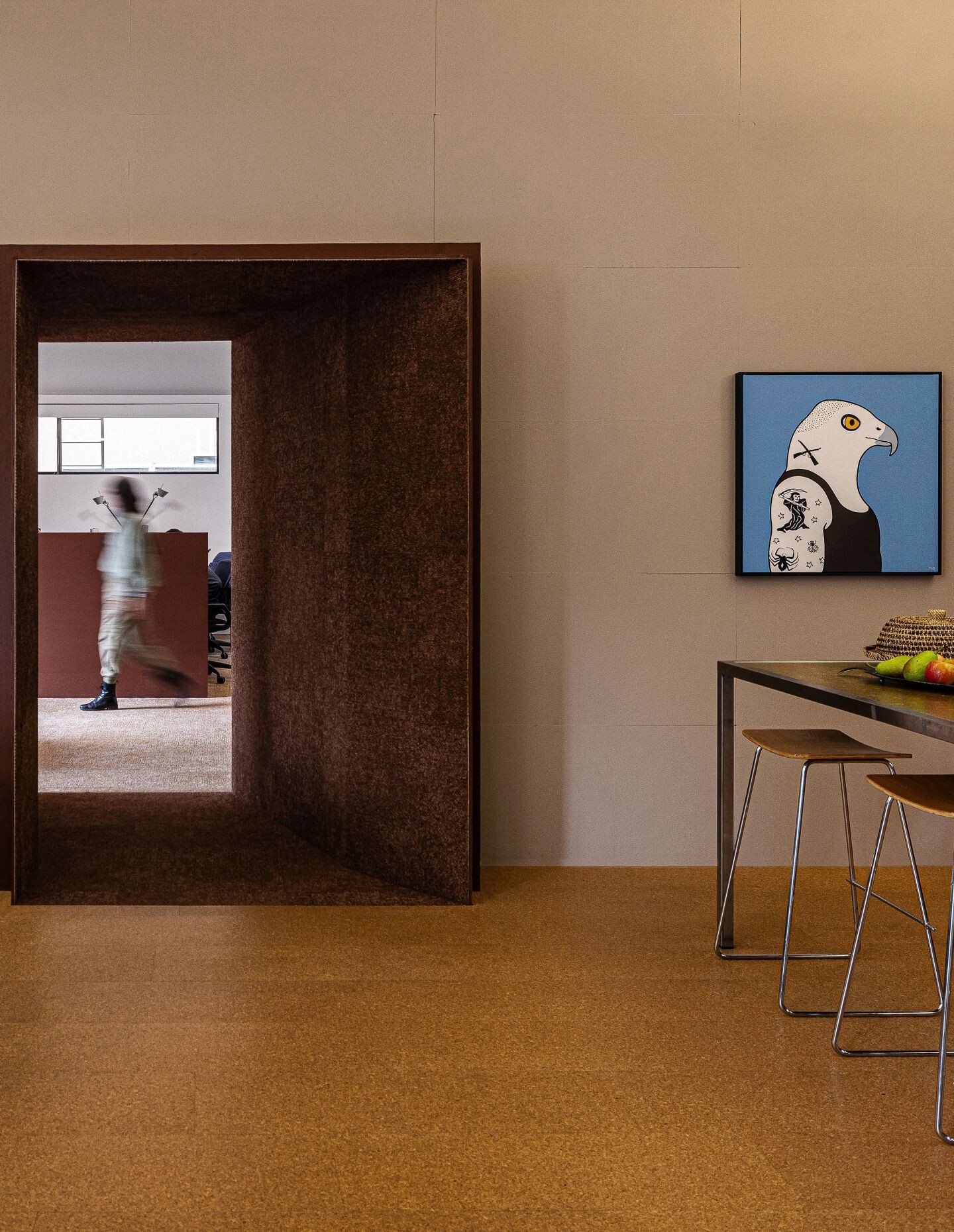
How did the Australian landscape and quality of light inform the palette?
The palette has been distilled from decades of practice — from the materials we return to again and again, and from colours that sit comfortably within Australian light. These are tones designed to belong alongside timber, stone, earth and sky — never dominating, always supporting.
Australia has a very particular quality of light: bright, high-contrast and often unforgiving. Colours that might read as subtle elsewhere can appear much more intense here. In developing the palette, we were highly attuned to how each colour performs in that light, both internally and externally.
The palette draws from tones already present in the landscape — weathered sandstone, ironbark, banksia leaves, dry grasses and coastal driftwood. These colours have an earthy, mineral quality that feels grounded in place.
Durability was also key. The palette relies on stable iron oxide pigments that hold their depth and integrity over time, even under intense sun exposure.
For homeowners, the key consideration is how colour will respond to light across the day and seasons, and how it relates to surrounding materials. The most successful outcomes come from choosing colours that work in harmony with their context, enhancing the architecture rather than competing with it.
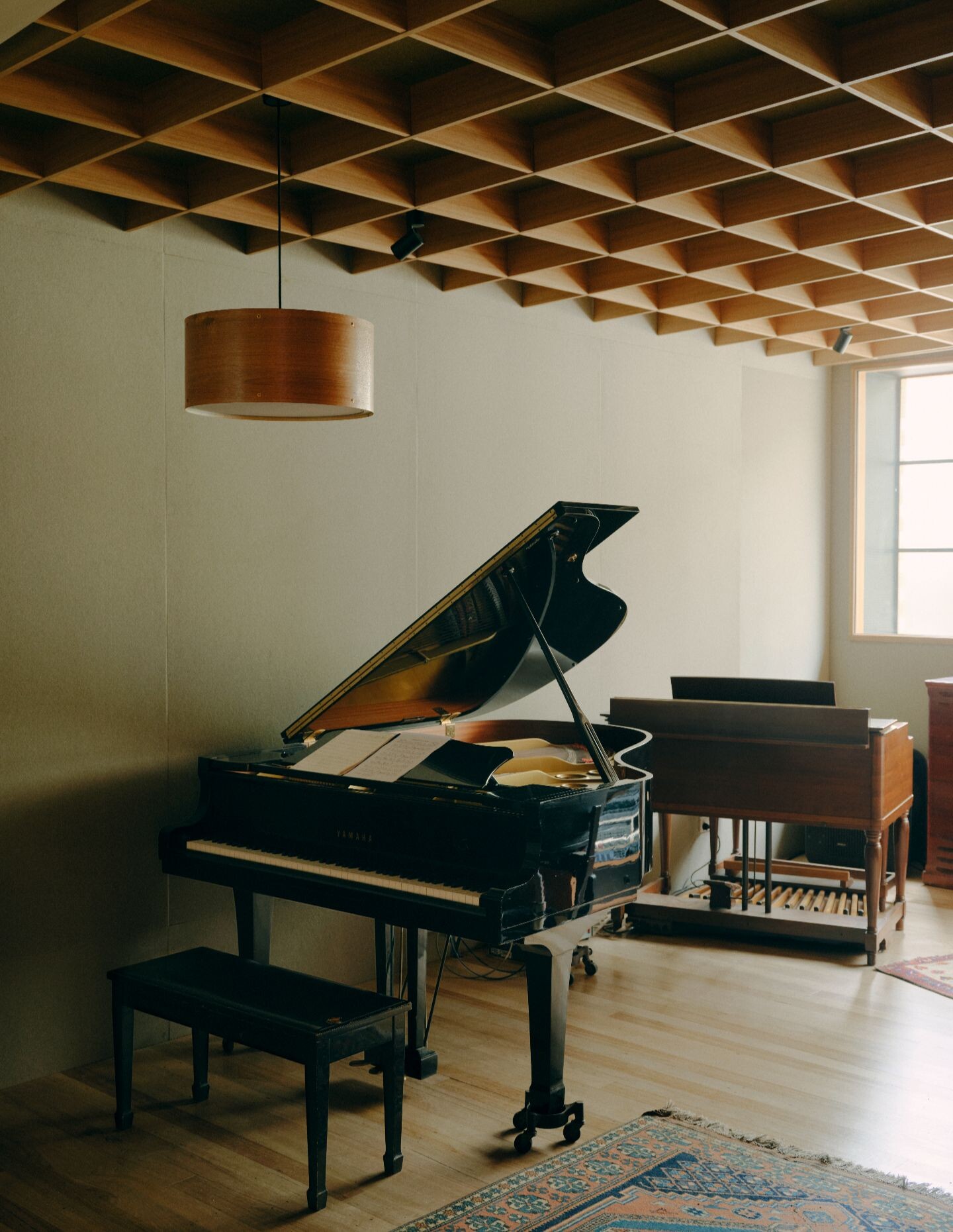
How do sustainability decisions translate into tangible benefits?
Sustainability was embedded in the range from the beginning. That meant thinking carefully about how the paints are made, what they’re made from, and how they perform over time.
For consumers, that translates into a product that is healthier to live with, longer lasting, and more materially responsible. The range is low or ultra-low VOC, water-based, and manufactured locally in Ballarat, reducing transport impacts while supporting local production.
A key decision was to work with high-performance iron oxide pigments, chosen for their depth, stability and connection to naturally occurring mineral tones. These pigments offer exceptional colour fastness and longevity, meaning colours hold their integrity and require less maintenance.
Performance was also considered as a form of sustainability. High opacity and durable finishes mean fewer coats, less material use and a longer lifecycle overall. So while the palette is carefully resolved aesthetically, it also delivers practical benefits: healthier interiors, lower maintenance, and a product consumers can feel confident using.
Ultimately, the range reflects a broader belief at Breathe — that good design should be beautiful, useful and responsible in equal measure.
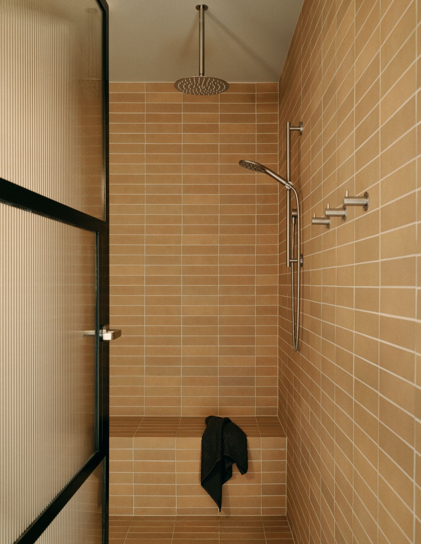
The palette allows walls, trims and doors to be treated as a single architectural gesture — how can this be applied in practice?
The idea is about reducing visual clutter and allowing a room to feel more cohesive. Rather than treating walls, trims and doors as separate elements to be contrasted, we see them as part of a single architectural composition.
For homeowners, that can be as simple as carrying one colour across walls, skirtings, architraves and doors. It creates a calmer, more resolved interior and allows light, shadow, proportion and materiality to become more noticeable. In many homes, it can also make spaces feel more generous and less busy.
The palette was designed to support this approach. High pigment solids and deep bases give the colours depth and opacity, while finishes allow walls, trims and doors to sit together as one considered gesture, with subtle variation in sheen and texture where needed.
It’s a practical way to use colour architecturally — not just as decoration, but as a tool to shape how a space feels.
Do you see architect-designed products like this as a way of democratising good design?
Yes — that was a big part of why the range felt worthwhile to create. Architecture often shapes how we feel in a space long before we consciously register why. Colour, materiality, light and proportion all play a role in that, but access to considered design thinking can still feel out of reach for many people.
What interested us was the opportunity to distil that thinking into something practical, accessible and widely usable. The goal wasn’t to create a “designer” product in a precious or exclusive sense, but a palette that reflects how we think about homes at Breathe: calm, grounded, materially connected and responsive to how people actually live.
Architect-designed products can help shift how people approach their homes — away from trends or isolated styling decisions, and towards a more holistic understanding of atmosphere, longevity and material relationships.
Even a simple decision, like choosing a more resolved and enduring palette, can influence how a home feels and functions over time. That’s where design becomes meaningful — when it moves beyond aesthetics and starts shaping daily experience in a more thoughtful, lasting way.
Breathe
breathe.com
Haymes Paint
haymespaint.com
INDESIGN is on instagram
Follow @indesignlive
A searchable and comprehensive guide for specifying leading products and their suppliers
Keep up to date with the latest and greatest from our industry BFF's!
The internet never sleeps! Here's the stuff you might have missed