The home of architecture and design in the Asia-Pacific
Get the latest design news direct to your inbox!
Get the latest design news direct to your inbox!
How branding studios are cutting through the visual clutter with distinctive, integrated and complementary design.


Photos by Tom Ross.


April 2nd, 2019
No longer is branding and signage an add-on to the design of a café or fast-food venue. In the days of Instagram, these small venues have got slicker about creating an engaging space and attention-grabbing brand. We speak to three branding and design studios that are cutting through the visual clutter with a distinctive, integrated and complementary design.
Creative agency Alter worked with Bergman & Co. on the design of Hella Good in Melbourne. From the owners of the iconic Greek venue Stalactites, Hella Good was originally called Stalactites Express until Alter renamed it. “It’s pop culture wordplay that describes the quality fast-food and is a humorous link to Hellas [Greece],” says Johnathan Wallace, founder of Alter. “We wanted Hella Good to be fun, fast and fresh. Given the high levels of expectation for Melbourne’s takeaway food, we thought a crisp and modern identity would combine well with the beautiful and sophisticated interior.”
The venue draws attention for its vivid blue. Alter selected an electric blue to move away from the traditional Greek palette, while still inherently representing Greece. The blue exterior is bold and distinctive on Elizabeth Street, and vibrant blue marmoleum marks a path to the point of sale.
Bergman & Co designed the timber dowel ceiling to pay homage to the famous ceiling in Stalactites, and Alter worked with Bergman & Co to match the finishes and create harmonious detailing. White menu boards are framed in black to mirror the grout lines, and tan leather straps draw a connection to the timber. “I really love that this little restaurant is smart and beautiful without being pretentious. It strikes a perfect balance between confidence and humility. It’s good humoured,” says Johnathan.

Photos by Tom Roe.
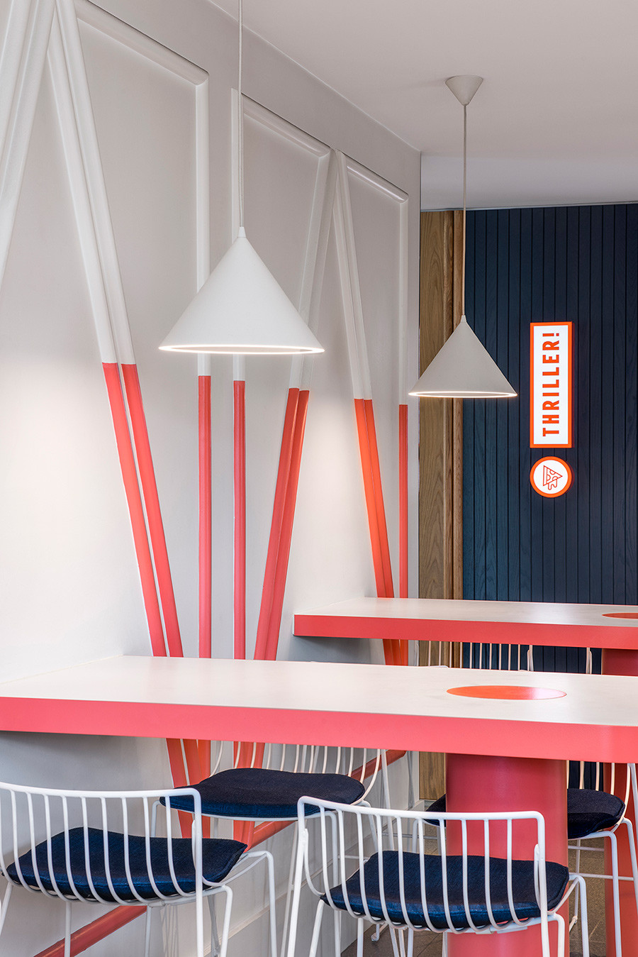
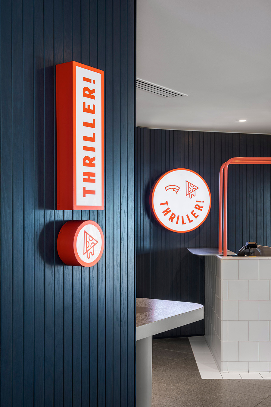
Crafty Design worked with Walter Brooke (architecture) and Genesin Studio (interiors) on the design of Thriller, a new pizzeria located in the Mount Barker cinema complex, Auchendarroch House, in Adelaide. The clients wanted an engaging brand aimed at 10- to 30-year-olds, and in keeping with the movie offering, Crafty Design came up with the name Thriller.
“We wanted to create a ‘creepy’ yet fun brand, which emulated the scary nature of a thriller movie,” says Dave Lawson of Crafty Design. The branding and signage needed to be modern and approachable with an element of curiosity to lure people in. Crafty designed a face using slices of pizza – one half eaten – for the eyes. “The eaten pizza eye and the oozy, dripping cheese is all part of the theatre,” Dave explains. The triangular shape of the pizza slice is also replicated on the wall panelling, and the bright orange colour palette carried through the detailing, including the grout lines of the tiles.
“The brand gets a reaction and connects with the everyday consumer on a few levels. As a designer I strive to create brands that people want to engage with and this ticks the box,” says Dave.

Photos by David Sievers.
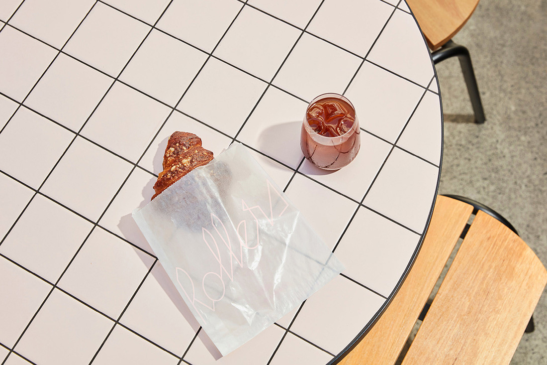
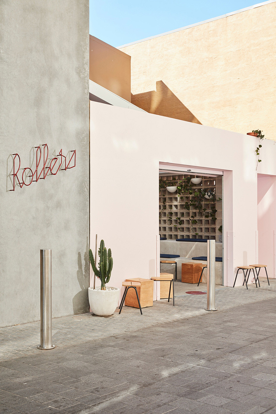
A Friend of Mine (AFOM) collaborated with interior designer Brad Barrow on Rollers Bakehouse, tucked behind the Manly Corso in Sydney. The clients wanted a brand with strong typography and signage that represented their experimental and playful approach to transforming humble pastries into new and exciting flavour profiles. “We created a fun, relaxed yet quirky brand identity for Rollers, featuring custom cursive typography and a cute rolling scroll marque,” says Suzy Tuxen of AFOM.
Signage was an integral part of identifying the café as it is hidden in a laneway behind the main pedestrian zone. It also needed to inspire Instagram sharing. AFOM created a strong and simple wrought-iron typographic sign that casts ever-shifting shadows on the wall. “The shadows are a part of the design and change throughout the day,” says Suzy. “It has a timeless materiality from bygone days, yet our custom typography makes it feels fresh and contemporary.” The branding is continued on the roller door with the Rollers marque visible when the café is closed.
AFOM worked with Brad on the interior and branding, discussing finishes, colour schemes and the flow of the space. “We always adopt a collaborative approach so that signage does not come across as an afterthought, but rather a highly integrated and complementary part of the overall design approach.”

Photos by Tom Ross.
Looking for more branding inspo? We look at narrative-led hotel projects. And join our mailing list for even more design stories.
INDESIGN is on instagram
Follow @indesignlive
A searchable and comprehensive guide for specifying leading products and their suppliers
Keep up to date with the latest and greatest from our industry BFF's!
The internet never sleeps! Here's the stuff you might have missed