The home of architecture and design in the Asia-Pacific
Get the latest design news direct to your inbox!

Get the latest design news direct to your inbox!
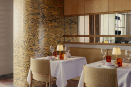
Asia’s latest Instagram bait – Waka Haiku Setsugekka Japanese Restaurant – by Sun Tianwen of Shanghai design studio: Hip-Pop Architectural Decoration Design Co. (HPADDC) points to hospitality further heading toward the sensory and experiential path of its retail sister.


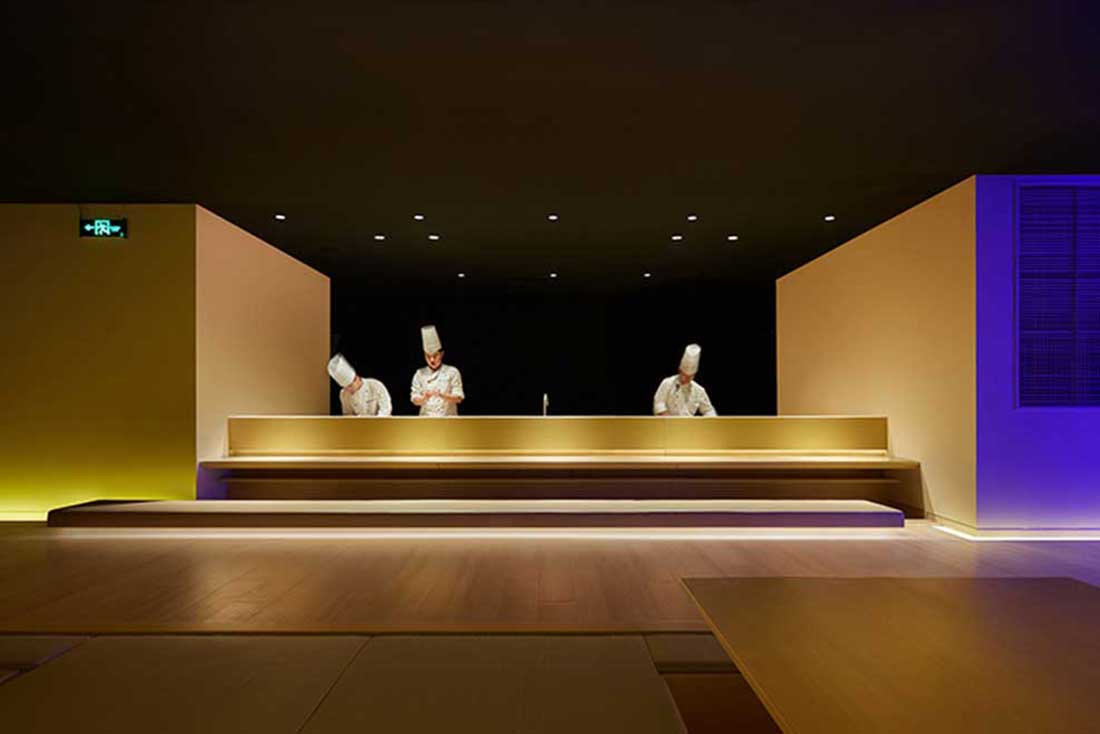


Waka Haiku Setsugekka Japanese Restaurant, Hip-Pop Architectureal Decoration Design Co, China, Asia Pacific Design, Hospitality design
Much like the retail sector, hospitality design is becoming increasingly sensory; spaces that encourage a tactile, engaging experience built around hype and spectacle. But hospitality is a fairly different beast, where the typology has become not just a transactional space, but one for working, living and playing. This hybrid functionality obviously has huge implications for designers who are charged with delivering spaces that are simultaneously three or four sectors combined.
In his recent design of the Setsugekka Japanese Restaurant in Changchun’s Jilin Province, HPADDC’s Chief Architect Sun Tianwen produces several smaller design elements, which only when combined “mix harmoniously for the appropriate design and conceptual tounchpoints.”
Individually for example, the ultra-clear glass engraved with the Sakura, the blue LED light band and the complete black background of the sushi counter do not necessarily express the sense of “Zen” — however, when each of these elements come together as a whole, then an appropriate design is obtained.
Perhaps one of the most important factors of Tiawen’s approach is his study of the psychology of design. Sure – design psychology is one of those wafty, undefined “easy-target” industry jokes that either designates you as a “snob” or a “novice”. But when you really look into what the term is, it’s about researching and mapping the data of how and why we use and behave within particular settings.
Here, the design approach was to communicate the restaurant’s themes of zen and more importantly “setsugekka” – meaning “Snow Moon Flower”, a Japanese topic in art and design borrowed from old-world China. Setsugekka is an important aspect of Japanese culture, referring to the seasons of the year (the three whites): blue-white (winter), yellow-white (autumn) and pink-white (spring). These three hues dominate the essence of the interior by using deeply vivid LED lights around the space.
And that, I think, is the important distinction between sensory retail and sensory hospitality – that the hospitality spaces which use these interactive, highly-spectacular design devices are used not because they attract the moths to the flame (though initially, that may be the case) but because they are imbued with meaning that user can take with them long after they’ve left the venue.
The important takeaway here is that unlike our retail counterparts, hospitality designers can’t just specify based on “bright, colourful and crazy” alone. We need to dig a little deeper to sew the purpose and philosophy of the client and their users into the very walls, so that while your immediate reaction might be shock and awe, it’s a layered experience that delivers well beyond your initial encounter. And that’s the mark of good design.
.
INDESIGN is on instagram
Follow @indesignlive
A searchable and comprehensive guide for specifying leading products and their suppliers
Keep up to date with the latest and greatest from our industry BFF's!
The internet never sleeps! Here's the stuff you might have missed