The home of architecture and design in the Asia-Pacific
Get the latest design news direct to your inbox!
Get the latest design news direct to your inbox!
We spoke to Israeli designer Sruli Recht about his re-invention of Joey Roth’s Ceramic Speakers.
October 8th, 2010
Earlier this year Amercian designer Joey Roth called on other creative colleagues to re-imagine his celebrated ceramic speakers, sending each of the designers a pair to play around with.
Roth asked each designer to work with a musician they admired to create an original soundtrack for the speakers.
We spoke to Israeli designer Sruli Recht about his approach to this intriguing project.

Why did you re-imagine Joey’s speakers in this particular way?
There was no real brief other than “do what ever you like”.
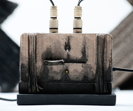
When we finally got the package from Joey out of customs, we took out the speakers and amplifier and completely stripped them back to just the rawest components – the drivers and chips. We replaced pretty much everything, including the LEDs.
I was playing with this dominant cross shape for the speaker housing – a big imposing and destroyed feeling, which reminded me of the shape of the wave breakers on the Okinawa coast…
There is some nice connection between the wave breaker and wave maker.

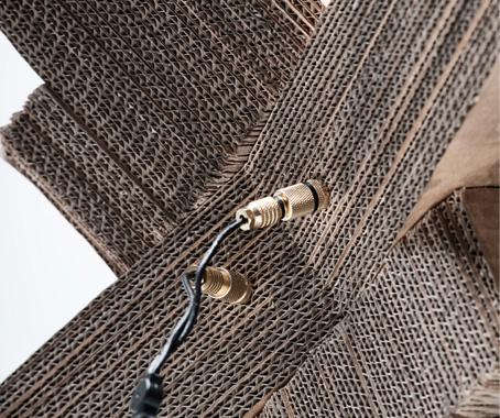
We had been working with this layered carton idea for the ring and carbon dater boxes, and wanted to see how it would look on a larger scale.
As the shapes came out it made sense to treat them more like the Carbon Dater box, which was intended to look covered in grime and dirt that leaked upward, but had inadvertently looked burned and charred when completed. So with the speaker I intentionally pushed the burned feel, making the carton sheets flake more, and the ink appear more singed and scorched.
How did you work with Ben Frost on the collaboration?
I asked Ben to take an mp3 from his record By The Throat and alter it to be more of a stand-alone track rather than part of the record. And he did. And then we sent the mp3 with the speakers to Joey.
Are the speakers actually burnt?
The appearance of the burnt speakers is a hand-painted ink and water treatment.
The ’burnt’ cardboard housing the speakers makes them appear almost like a contemporary object imagined as an unearthed artefact – is this the intention?
I went at this project to just enjoy making something – something that didn’t have any constraints of production, budget etc. It was just a case of – if it looks good, it is good.
I think in some way it was a response to Joey’s brief, where he has asked us to redesign not something classic or recognisable, but something brand new. I thought it would be interesting to make our version them look older, more used and loved than the original fresh design itself.
So maybe it is a retort to the current trend of over-documenting the design process, and the desire by designers to immortalise their process like it is going to one day be looked back on by curators or maybe just that everybody is out to intentionally design a classic.
So it is less of an unearthed artefact of contemporary life, and more of a temporal hiccup, an alternate history, to muse over the situation of the newer design looking older than the older design that wants to be renewed before it has had time to age.
It is strange, this current obsession with fame, and this situation where designers want to be more recognised than their products.
Sruli Recht
srulirecht.com
Photography by Marinó Thorlacius www.marinot.com
INDESIGN is on instagram
Follow @indesignlive
A searchable and comprehensive guide for specifying leading products and their suppliers
Keep up to date with the latest and greatest from our industry BFF's!
Raising the profile of the replica debate, in the Sydney Morning Herald this weekend Corporate Culture’s Richard Munao went head-to-head with Managing Director Adam Drexler, who started replica furniture manufacturer Matt Blatt 10 years ago, after figuring out a loophole in Australia’s intellectual property laws. Munao founded the Authentic Design Alliance alongside 4 other furniture […]
The internet never sleeps! Here's the stuff you might have missed