The home of architecture and design in the Asia-Pacific
Get the latest design news direct to your inbox!
Get the latest design news direct to your inbox!
There are many ways to tackle the constraints of small square footage. Studio Adjective’s clever space planning and use of materials for an apartment in Hong Kong makes an exemplary case study.

December 19th, 2018
Hong Kong’s residential interiors are infamous for being diminutive. It takes innovation and sensitivity to create comfortable spaces that cater to living, cooking, eating and resting, among other daily rituals. The Taikoo Shing Apartment by Hong Kong-based Studio Adjective is an example of that innovation.
The 528-square-foot, two-bedroom apartment was opened up to remove wasteful spaces such as a corridor, and create a feeling of flow and spaciousness. “The service area was taking up half the living space, potentially making the apartment smaller and creating a strong feeling of oppression,” shares Studio Adjective’s co-founder and Design Director Wilson Lee. Interior walls were removed and rearranged to incorporate a guest bathroom and dressing corner as requested by the client.
The design also considers the client’s interest in Chinese architectural aesthetics and tea drinking. Specifically, Lee was inspired by the building principles of the siheyuan – a historic dwelling found throughout China that generally comprises a complex of rooms arranged around a courtyard, or layers of courtyards. A screen wall inside the gate is commonly positioned for privacy.
In the Taikoo Shing Apartment, the kitchen and bathrooms are designed as ‘pavilions’ with overlapping clear and transparent layers to soften the boundaries between zones. “It also creates [increased] visual depth for the compact apartment without compromising functional needs,” says Lee.
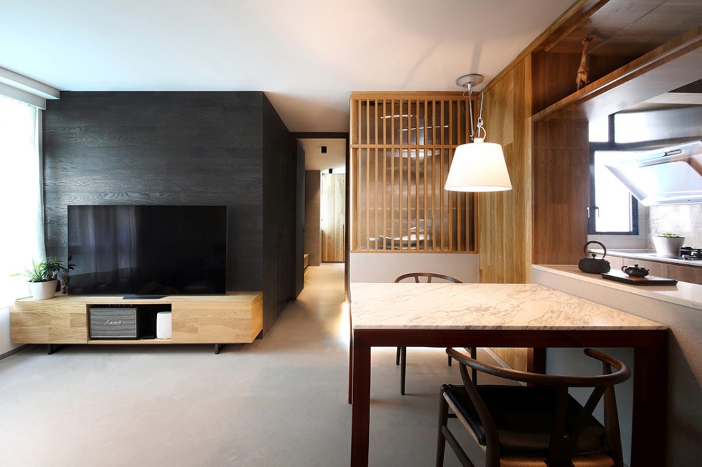
One enters the apartment into the living space with the dining on the right. A metal frame-and-glass partition loosely divides the teak-wrapped kitchen and dining area, while also storing tea-making equipment. “There’s no solid separation so one can view the tea-making process in the kitchen from the living area,” highlights Lee.
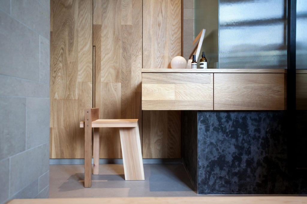
The guest bathroom behind the dining table is demarcated by a structure of grey stone tiles and a screen of timber fins and fluted glass. Light penetrates the transparent shell, mimicking a lantern while providing additional illumination for the adjacent spaces. A light cove beneath this structure serves the same function in a neat, minimal way. Further in, the master bathroom is clad with metal and fluted glass. Light oak, found in the kitchen, echoes the wardrobes, platform master bed and cantilevering dresser – the latter of which aids in the creation of a feeling of lightness.
The varied material palette – grey honed marble flooring, stone-tile wall cladding and teak – was also influenced by traditional Chinese buildings. “We tried different gradients of grey in the space to deliver different textures and feelings when you touch [the surfaces].” Says Lee.
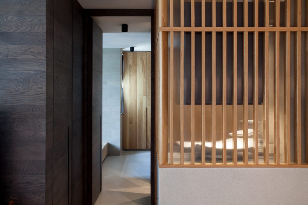
The amalgamation of patterns and layers on the right side of the apartment contrasts with the more minimal living area, backed by the TV wall wrapped in dark, smoked oak, which Lee describes as “creating a flow between the living room and bedrooms, connecting the apartment horizontally while concealing the bedroom doors”.
Typically, many would default to a white foil to create the illusion of space. Lee eschews that strategy for one that employs layers, contrasting light and dark planes, and the combination of materials in a fluid, bold manner, in order to enhance the spatial quality of the tight space. The result is a home that offers many points of interest and an intimate ambience that works with, not against, the original spatial structure.
INDESIGN is on instagram
Follow @indesignlive
A searchable and comprehensive guide for specifying leading products and their suppliers
Keep up to date with the latest and greatest from our industry BFF's!
The internet never sleeps! Here's the stuff you might have missed