The home of architecture and design in the Asia-Pacific
Get the latest design news direct to your inbox!
Get the latest design news direct to your inbox!
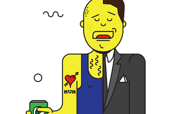
Websites, like people, have personalities. And what those websites say about your business is quite telling to the consumer. Too much information, verses too little. Well-designed layouts with no brand substance verses poorly-designed spaces with valuable content. Take the below quiz and find out what your website say about your business.
June 10th, 2014
Aesthetics have proved to be a key asset in business – particularly in this industry. In a world where consumers have increasingly microscopic attention spans, an instantly eye-catching website can be what seals the deal.
However, people ultimately come to your site for content. Although the first impression of design and layout may attract attention, content will determine whether visitors return or not. Many companies make the mistake of having a well-designed website and thinking that their search engine rankings or name-recognition will keep traffic flowing and visitors engaged. And while these things are critical elements, the demand for excellent content should not be put on the backburner.
Content is a huge part of digital success, but if that content isn’t tempered with a well-designed, on-brand layout, then no one will stick around long enough for the content to have an impact. User-centric design should be integral in your digital strategy. Overloading users with mountains of content they are unable to navigate through or even locate to begin with, gives the impression that your business is cluttered, messy and un-organised.
The first impression this potential customer will have about your business is based on your salesperson. Let’s say that you had one salesperson. He was poorly-dressed and unkempt. He made babies cry. (Okay, so maybe not that bad, but you get the point) Would you send out this person to visit with potential customers? Chances are you wouldn’t, and this same principle applies for your brand’s digital presence.
Like it or not, your website speaks on your behalf, creating impressions and either attracting or turning away potential business. A cheap-looking, non-functional website gives the impression that the business does not care to invest in the things that matter. A website that is not user-friendly may tell your visitors you lack caring and basic customer service. A blog that has not been updated may speak of neglect. Regardless of your product or service, it is vital to consistently evaluate the message you are sending across the digital sphere. Creating a user-friendly, professional, and meaningful site may take some time and money, but the alternative may be even more costly.
TOP THREE DIGITAL BUSINESS PERSONALITIES
Aesop – aesop.com
Hansel – ilovehansel.com
Sydney Living Museums – sydneylivingmuseums.com.au
INDESIGN is on instagram
Follow @indesignlive
A searchable and comprehensive guide for specifying leading products and their suppliers
Keep up to date with the latest and greatest from our industry BFF's!
The internet never sleeps! Here's the stuff you might have missed