TURNER’s contribution at Santa Sophia Catholic College involves the addition of colourful environmental graphics and wayfinding at the new college, which is a vertical school servicing a growing community. The integrated graphics are designed to inspire students aged from 3-18 to explore, innovate and thrive in their learning environment.
The project is a vivid demonstration of the impact of experiential design when delivered as part of a strong design collaboration, according to Aniss Adler, Associate Director and Head of Experiential Design at TURNER.
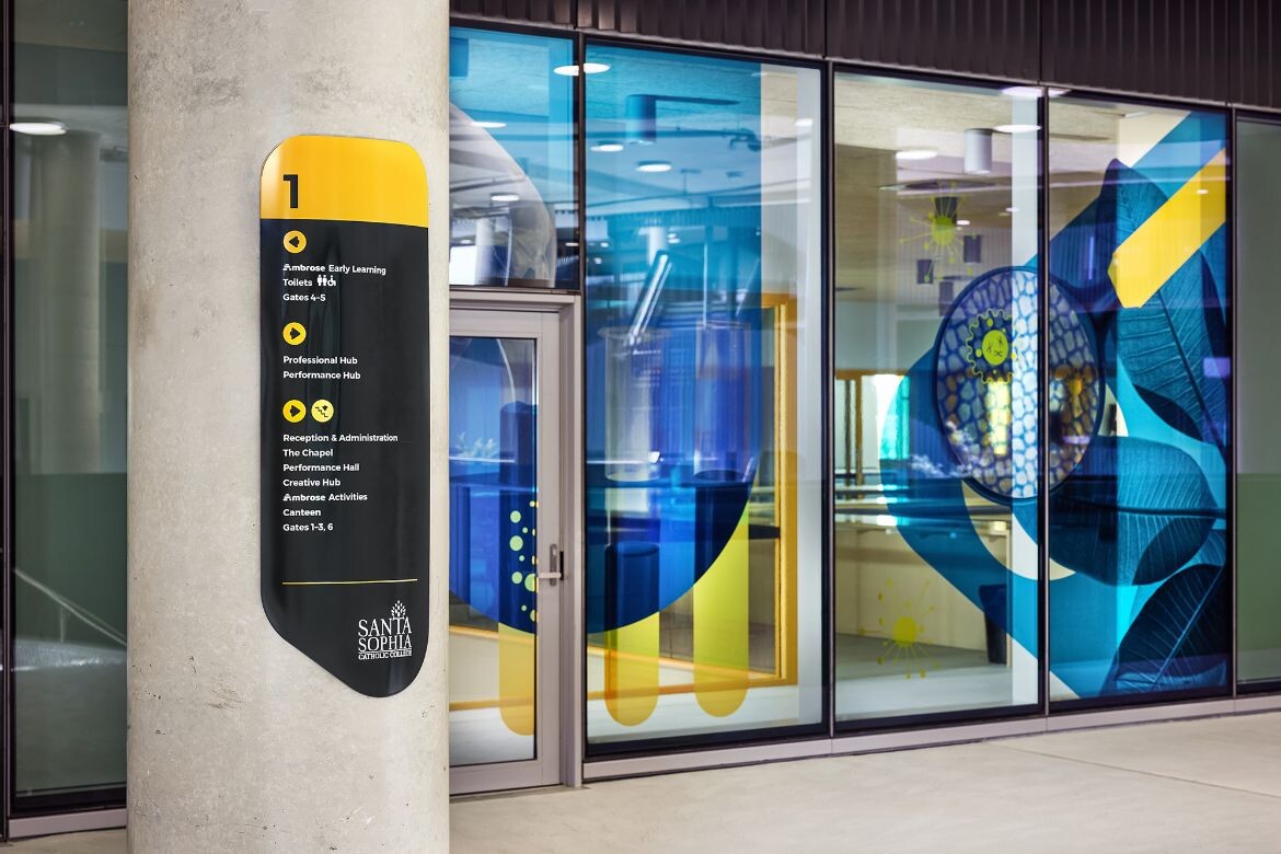
“We worked closely with BVN to enhance their beautiful architecture and overlay learning and fun through complementary design elements,” says Adler. “All our design work is a direct translation from the architectural form and colours.”
Santa Sophia Catholic College consists of four linked buildings across six levels, and includes learning areas, creative and performance hubs, rooftop play spaces and sports facilities for Kindergarten to Year 12 students.

The TURNER team used experiential design to turn the school’s buildings into a teaching tool by creating a ‘green trail’ for students that highlights the sustainable design principles embedded in the indoor and outdoor spaces.
“We curated a trail that has 12 stations across two levels of the school. Each station highlights a different aspect of sustainable design,” says Adler. “For example, there is a station at the chicken coup where the school canteen composts its waste. Other stations highlight the way glazing impacts on comfort and energy use, and explain the school’s grey water system.”
Related: Dr Fiona Young on education design

Stickers on the ground guide the students from one station to the next, and they receive a stamp at each station when completing the tour. The initiative supports the teachers by providing real-life examples that can be woven into different curriculum streams. It also contributes to the school’s Green Star rating, which was important to the client.
The value of a clear wayfinding system is found in assisting navigation through the complex, multi-level campus. A versatile family of signage creates a consistent visual language that has been applied across all elements of the environmental branding, including vibrant window decals that are appropriate to age and learning zone.

Graphic elements have been further used to encourage interactive play. In one part of the playground, a circle on the ground features the musical notes to ‘Happy Birthday’, encouraging children to gather, sing and celebrate each other. Elsewhere, colourful periodic tables brighten paving and can be used for games like hopscotch.
Adler also underlines that the team was mindful of durability with regard to maintenance and vandal-proofing, as well as ensuring that graphics never compromise visibility and sightlines: “The architects we work with are excited by the potential for art and environmental graphics to add value to their offer. We speak the same language, understand their design intent and can seamlessly integrate our work from the outset, rather than coming in and tacking something on later.”

TURNER adds that schools have a growing appetite for experiential design because it makes a strong impression on first-time visitors. Attracting prospective families is important to school principals operating in a competitive environment.
“It’s not just for new builds,” concludes Adler. “Experiential design can be integrated into refurbishment programs and can transform a tired campus into an engaging, exciting place for the entire school community.”
TURNER
turnerstudio.com.au
Photography
Ryan Linnegar