This article originally appeared in Indesign Magazine — find out more and subscribe!
A financial services HQ in the centre of Sydney isn’t exactly the first place one might look to see the benefits of central planning. Soviet-era master-planning it is not; nevertheless, 1 Elizabeth is an almost dizzyingly large and multilayered project with one secret ingredient – a single client. This is a whole city block in the very centre of the city’s CBD, so let’s be clear about one thing from the beginning: this kind of opportunity doesn’t come along very often these days. That is, an architectural opportunity defined by a single, holistic coherent vision (namely, Macquarie’s).
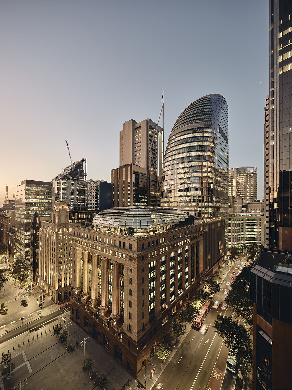
The site adjoins 50 Martin Place, another significant JPW project, and was compulsorily acquired by the government in 2015. It’s now the global headquarters of Macquarie Group, with JPW responsible for the architecture and Architectus leading the workplace interiors, while ASPECT Studios developed the landscaping.
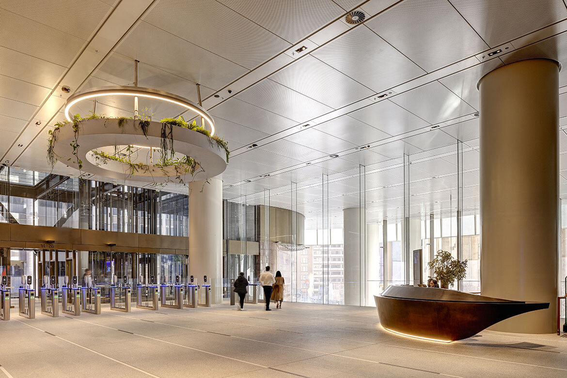
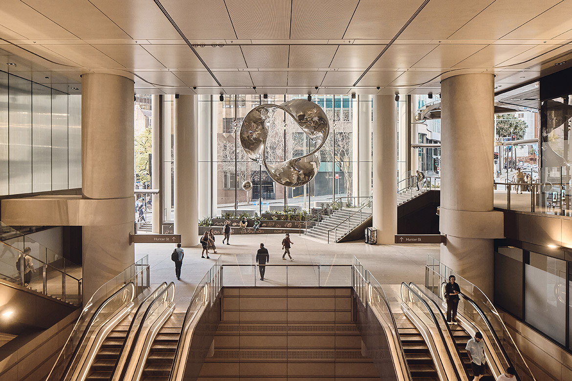
“Business as usual would have been building a [Metro] station with a concrete deck on top and then tendering the development rights,” explains Matthew Morel, Director at JPW. “But the team [of JPW, Grimshaw and Macquarie] proposed that, designing the station and tower together, we could make a much more meaningful contribution to the city. We set out a vision where the public places could be much more generous – a full-site ground floor plaza, the Metro station having a greater share of the ground plane, and the workplace sharing some of its unique spaces with the public. Uniquely, Macquarie – as developer and occupier – could take key decisions that a typical developer may not have.”
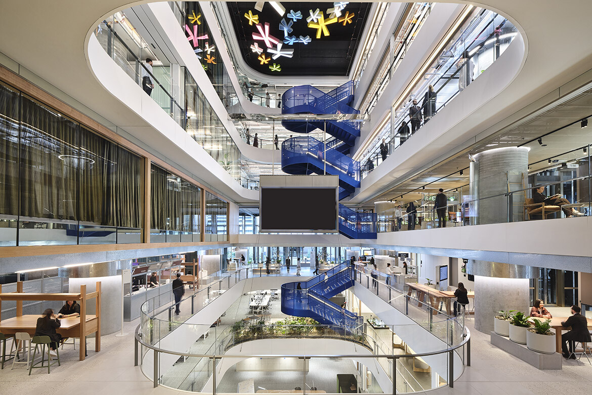
If 1 Elizabeth’s sense of overall coherence derives directly from this singleness of purpose, its architectural scale is expressed vertically through the void. Tempting as it must have been, the architects decided not to extrude one great big void up the full 37-level height of the building from the underground Metro station. Instead, the architecture pivots around the lobby interface. From here it all makes sense: transport and public ground plane below, workplace above, with major events space ILUMINA sitting across levels two to four.
The void, or atrium, is what ties the project together into a coherent whole. Structurally, it has been made possible by positioning the lift cores to the side of the floor plan.
“The side core enables any building the opportunity to have contiguous floorplates, so your organisation can sit as one community in one space with vertical connectivity through the atria,” says Simone Oliver, Principal, Interior Architecture at Architectus. “That was really important to Macquarie philosophically because it’s all about trust and a sense of collegiality and connectedness of people to their workplace.”
Within the atria, the blue staircase is perhaps the most distinctive feature – important behaviourally, stylistically, functionally, and symbolically. As Oliver notes, “The stairs and the void are globally emblematic of workplaces for Macquarie.”
She continues: “The most interesting thing we did was an empathy study. We actually stood on the stairs and interviewed people. What we discovered is that people love to walk stairs, but they don’t like to have to stop their conversation to get up and down. So, it became really important to have three people who could walk together in conversation and be able to get from A to B without necessarily feeling any discomfort or stopping what they were doing.”
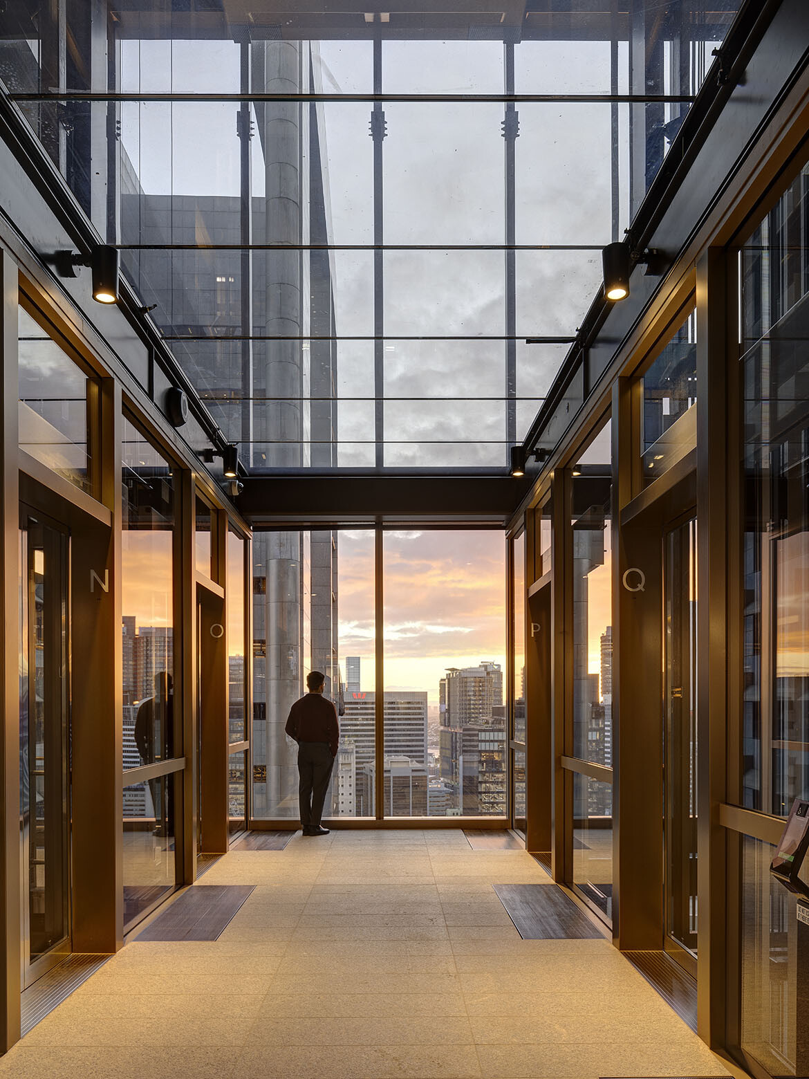
The higher office floors then bring out what Morel describes as the feeling of “being wrapped in the view”. 1 Elizabeth is a project with multiple faces; one is the generous public ground place connecting down into the Metro, but the other is the curvilinear glass presence reaching into in the sky. It’s hard to find the right word to describe its form, but the south-facing elevation evokes something of an Armadillo-esque carapace. It’s at once neat, orderly, and organic.
Related: fjcstudio moves into Australia Square
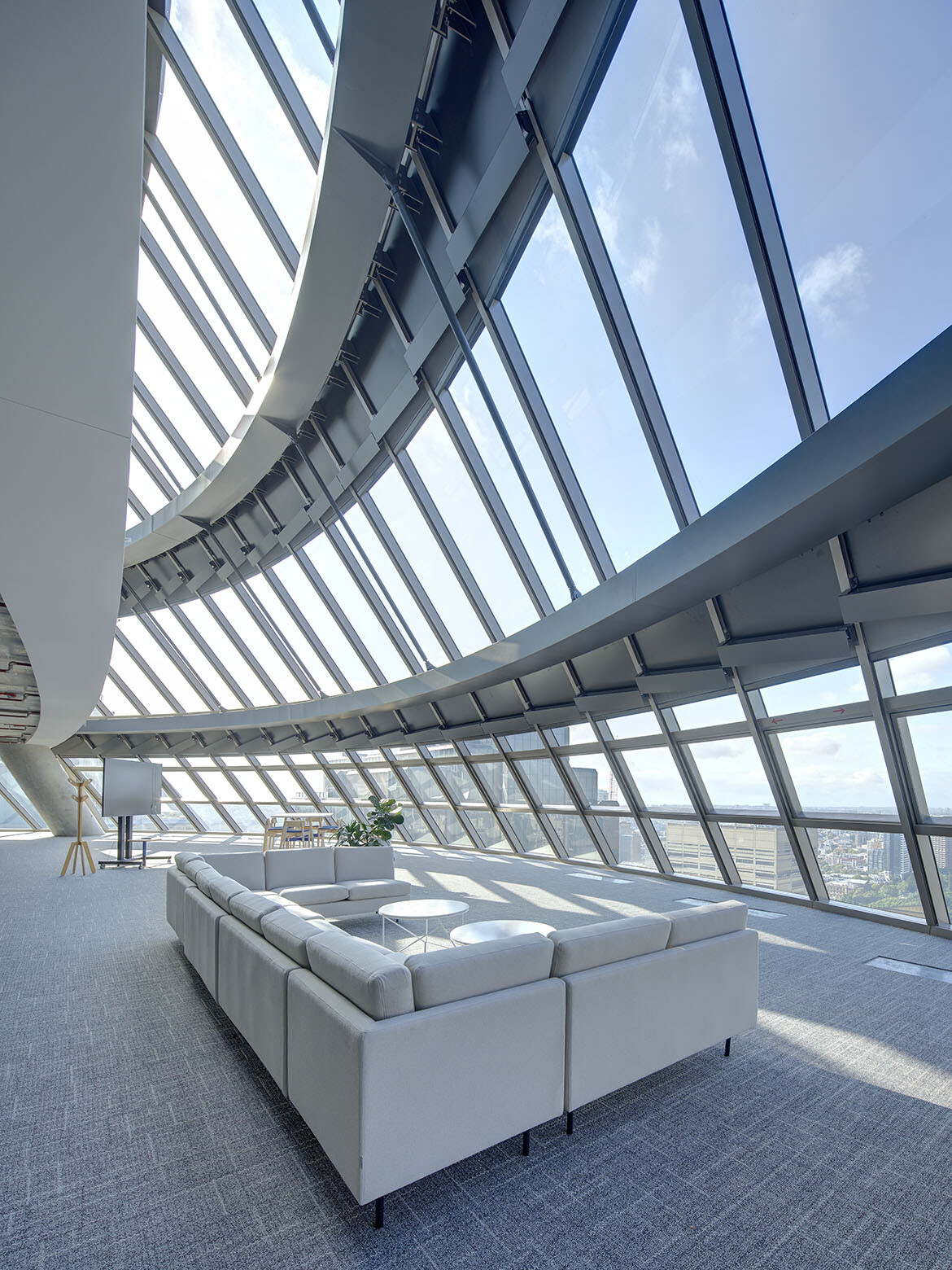
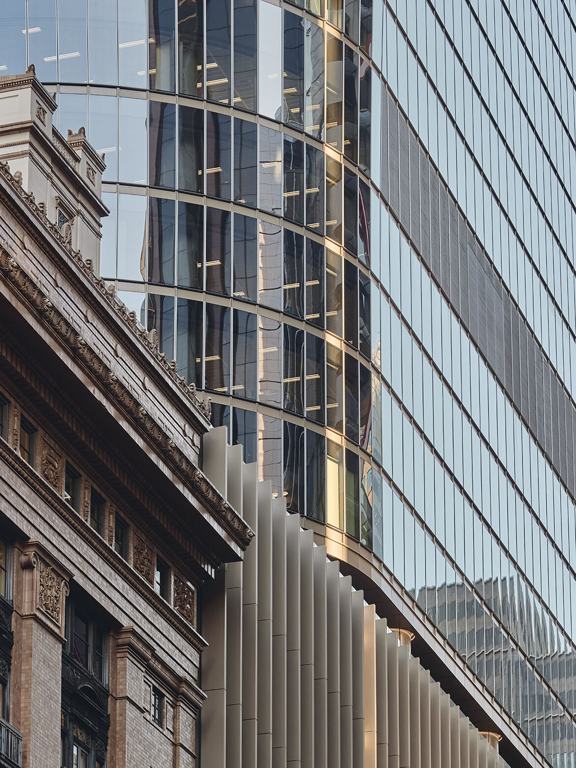
“The tower was shaped by and for the city,” says Morel. “It was a singular response to the Martin Place sun access plane rather than a chamfered tower form. Its curvilinear shape responds to the silver dome on top of 50 Martin Place, improves wind conditions, and increases sunlight and sky views from the street. The curved corners allow the building to address public spaces that are diagonally opposite in the way that a rectangular building wouldn’t. From the inside out, that form gives a workplace floor that has fewer corners and, with the glass lift shaft, it has light, views, and outlook in all four directions.”
Meanwhile, hospitality touchpoints and greenery proliferate throughout the building to add layers of humanity and warmth to the workplace. Whether high up in the light-filled office floorplates, stepping down through the void on a section of the striking stairs, or making one’s way up from the Metro to the lobby, 1 Elizabeth is packed with multilayered moments tied together by a single architectural vision.
JPW
jpw.com.au
Architectus
architectus.com.au
ASPECT Studios
aspect-studios.com
Photography
Credited individually