The home of architecture and design in the Asia-Pacific
Get the latest design news direct to your inbox!
Get the latest design news direct to your inbox!
Smeg launches Linear in black and white.
August 25th, 2014
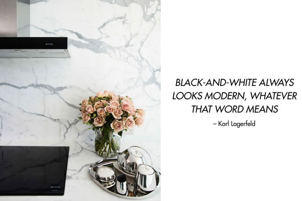
NEVER OUT OF STYLE
There’s something about a monochrome palette which never goes out of style. Whether in high contrast black and white for maximum impact or softer greys for romance, its a palette of universal appeal which is always fresh and inviting.
Perhaps it’s a psychological recognition of extremes— of day and night, or good and evil, or a physical reaction to the extremes between the total absorption of light versus the total reflection, or even a simple nostalgia for a time captured on black and white film, there’s no doubt about the appeal of black and white.
A HISTORY OF STYLE
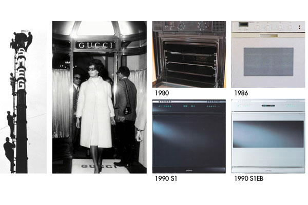
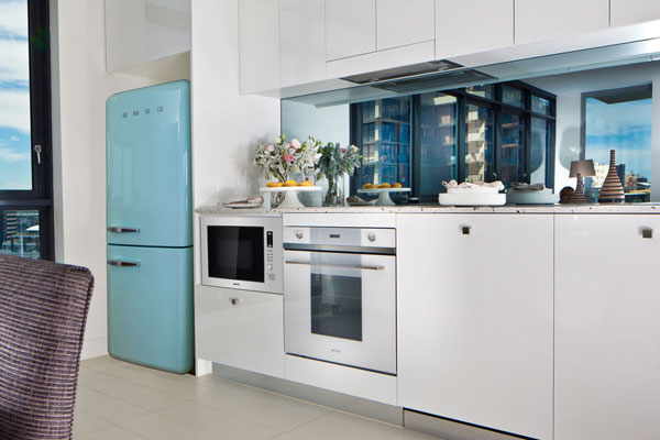
Smeg’s Italian roots and emersion in Italian design means they are consistently monitoring the ebb and flow of the demand for coloured appliances to ensure designers can specify appliances to meet design needs. In 1980 Smeg was the first brand in the world to develop retractable knobs in its black and white models. In 1990, Smeg produced the S1 black and white models with streamline looks that are in high demand today.
LINEAR IN BLACK AND WHITE
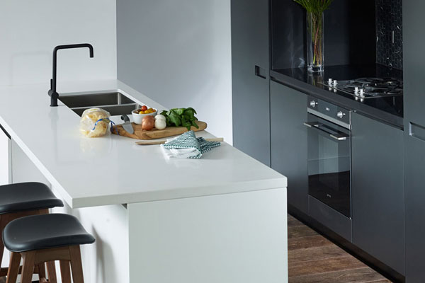
Smeg first launched black and white Linear into Australia in 2006. Since then it’s undergone more upgrades with the inclusion of Smeg’s S-Logic large format electronic displays and Smart Sense menus, which means the ovens are now even easier and more logical to use.
Available for all of your high-end specification work, new Smeg Linear, in black and white, is fast becoming the jewel in the crown of Smeg’s portfolio, furnishing many premium high-rise developments.
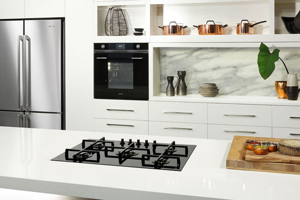
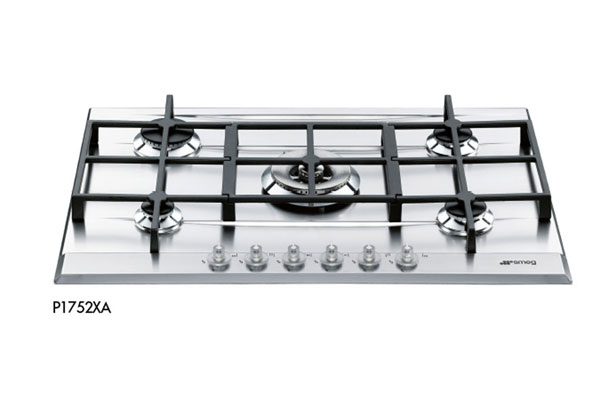
VERTICAL FLAME
Linear cooktops also feature unique and eye-catching sculptural design. The signature trivets with light, floating style, allow easy movement of pans across the cooktop. Smeg Linear cooktops also feature the advanced vertical burner technology. Smeg engineers have developed these advances over many years and have produced a flame with 20% higher energy efficiency than traditional gas burners.
Smeg
smeg.com.au
INDESIGN is on instagram
Follow @indesignlive
A searchable and comprehensive guide for specifying leading products and their suppliers
Keep up to date with the latest and greatest from our industry BFF's!
The internet never sleeps! Here's the stuff you might have missed