The home of architecture and design in the Asia-Pacific
Get the latest design news direct to your inbox!
Get the latest design news direct to your inbox!
Inclusivity and the recognition of diverse voices and perspectives have become driving values of our time. How do we translate this new focus on cultural sensitivity into hospitality design?


November 21st, 2019
Design is a potent storytelling medium. This is particularly true when it comes to stories of the past: architectural relics are vestiges of bygone eras, flaking frescoes paint ghostly images of ancestral lore, and unearthed objects provide glimpses into what daily life was once like. But what of the present? How can design reflect the concerns of today, including the push toward greater inclusivity in the stories we tell and the ways they are told?
Ironically, addressing concerns of the present may entail looking toward the past. Such was the approach taken by Jeremy Bull, principal of Alexander & Co, when his practice was tasked with refurbishing The Imperial Hotel – a Sydney LGBTQI (lesbian, gay, bisexual, transgender, queer, intersex) icon, and backdrop to the vibrant opening scenes of cult classic The Adventures of Priscilla, Queen of the Desert. “There was a massive collection of history and cultural value,” Bull explains. “We knew that if we were going to do the work and substantially reposition the venue, we couldn’t lose this cultural history.”
Consequently, while The Imperial’s interiors are undeniably contemporary, they also draw on the camp iconography that has long been entwined with LGBTQI culture. Sumptuous velvet is paired with fringe in complementary colours, while streamers in celebratory shades of orange, yellow and scarlet hang from the ceiling; in the heritage-listed front bar, a Renaissance-style ceiling fresco depicting a religious scene and characters from the LGBTQI community looms large.

“Our practice felt the significance of our role to create legacy and inclusivity for a community in need of safe haven and to steward the next lifecycle of this structure within the LGBQTI community of Sydney,” says Bull. “It had to be outrageous, inclusive and fantastic but not light. Among its array of colour and shape is the gravity of its legacy, the shadow of history cast upon its many surfaces. This is a place to celebrate and discover, but also a place with significant history and sometimes even heaviness.”


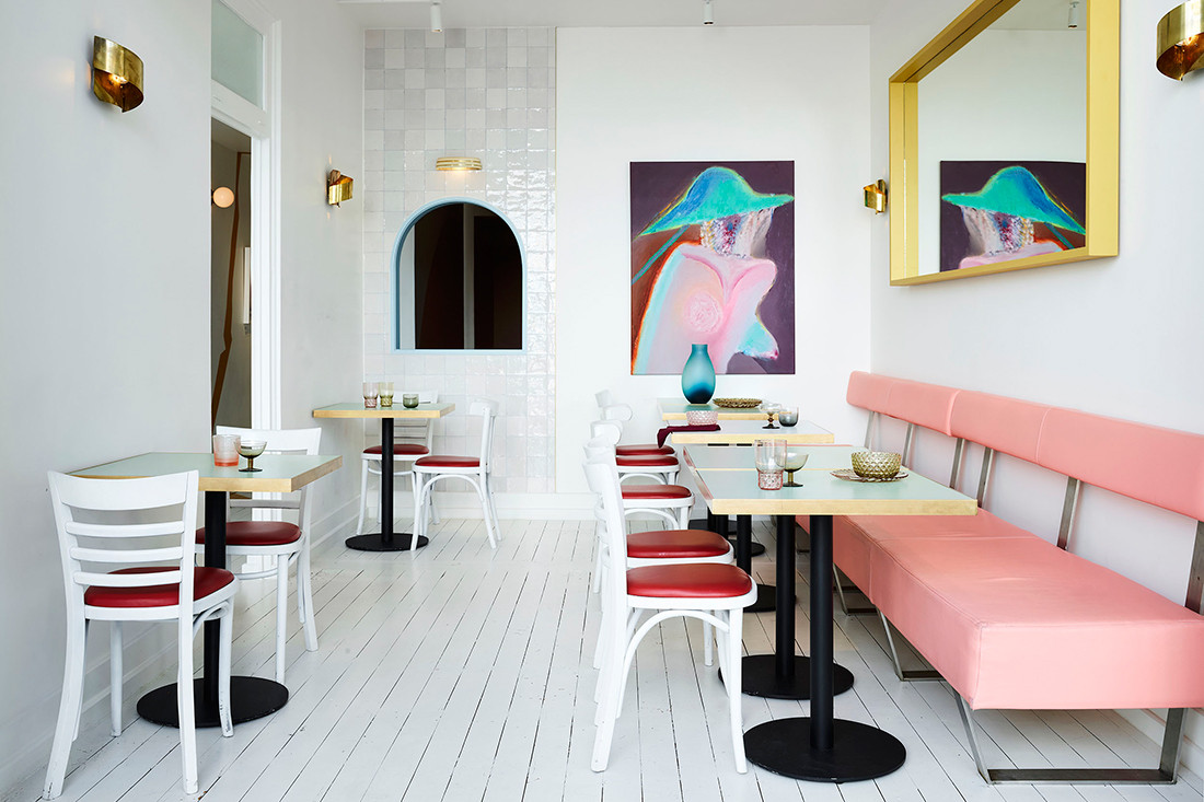
This respectful design approach is shared by Sydney practice Pattern Studio, which recently completed a fit-out for Locura, a South American restaurant in Byron Bay. From the outset, the practice was determined to pay homage to South American culture and aesthetics without trivialising them. “In the classic Aussie Mexican restaurant, there’s a desire to do something kitsch – bright colours, sombreros on the walls,” muses Lily Goodwin, director of Pattern Studio. “We really tried to take an approach that was more considered than just, ‘Let’s paint cacti on the wall.’ ”
Goodwin and practice co-director Josh Cain drew from their travels throughout South America to create an evocative, multifaceted restaurant interior that is redolent of Mexico’s humble, everyday late-night venues. “For us, the charm of venues in Mexico and South America is really this sense of having been put together by hand, of being a bit rough around the edges,” Goodwin says. This handcrafted charm is echoed in Locura, where quiet confidence transcends the need for easy iconography or design gimmickry.
In the main bar, grey brick and raw concrete are sparingly adorned with bare-bulb sconces and hand-painted planes of colour, while leafy plants cast shifting shadows from the outdoor courtyard space. The overall effect is exotic without being exaggerated, and sensitive without being safe. Far from restricting Pattern Studio’s practice, cultural sensitivity has only enriched it, enabling critical thinking about the responsibilities that accompany design’s storytelling capabilities.


“We always try to be very conscientious that if there are any cultural influences in our work, we respond to these in a way that avoids appropriation,” Goodwin explains. Reflective of the approach taken by Alexander & Co to The Imperial Hotel, Locura is a triumph of thoughtful design that understands the discipline’s role in not only telling new stories but doing justice to old ones.
This article originally appeared in issue #78 of Indesign magazine – the ‘Customer Experience’ issue. Get regular design inspo, join our weekly newsletter.
INDESIGN is on instagram
Follow @indesignlive
A searchable and comprehensive guide for specifying leading products and their suppliers
Keep up to date with the latest and greatest from our industry BFF's!
The internet never sleeps! Here's the stuff you might have missed