The home of architecture and design in the Asia-Pacific
Get the latest design news direct to your inbox!
Get the latest design news direct to your inbox!
WOWOWA’s portfolio is characterised by repeated pops of rich colour that only add to the contemporary studio’s immense popularity and appeal.

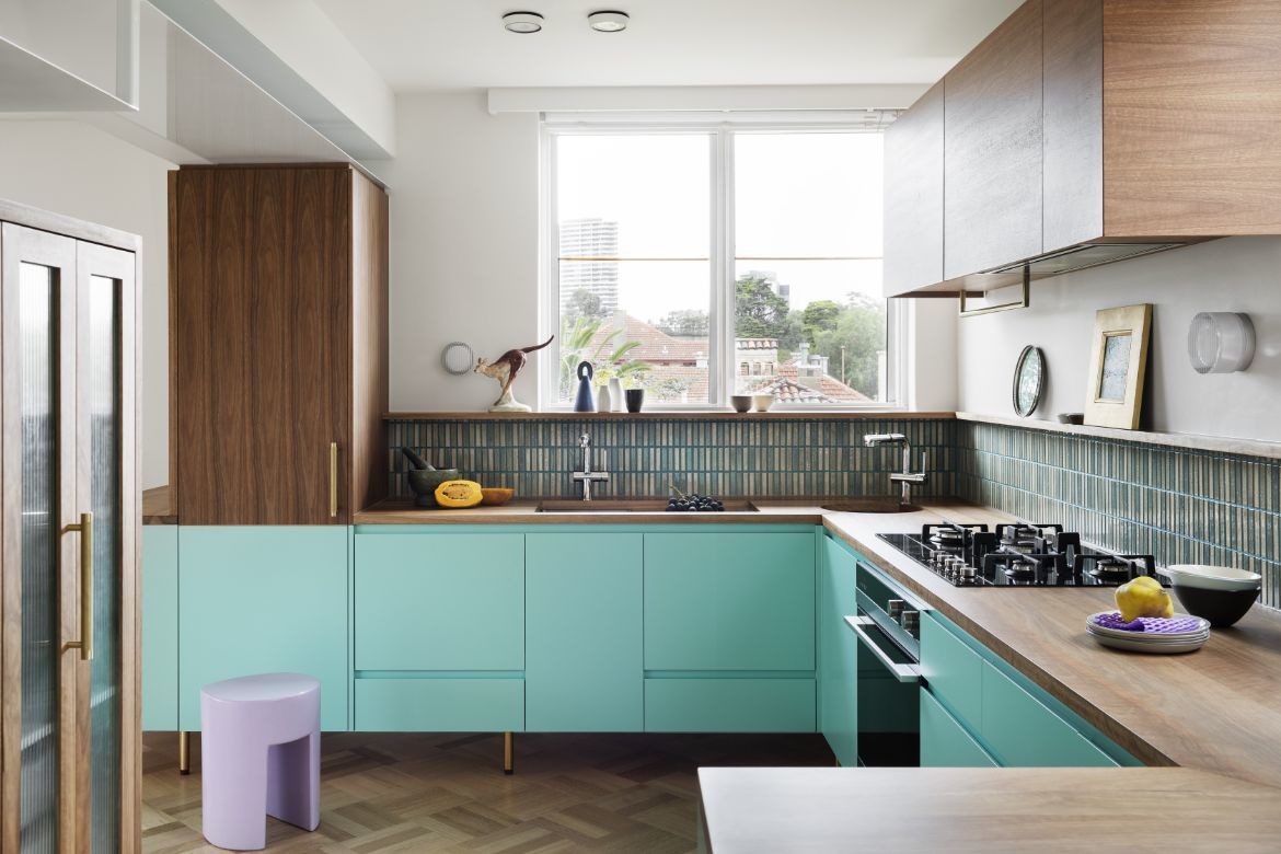
Pony, Brighton West, photography by Martina Gemmola.
November 14th, 2022
In recent years, WOWOWA has designed some of Australia’s most head-turning residential and commercial projects. The Collingwood-based studio is known for its flair for colour, injecting all it does with a fun, playful aesthetic that packs a visual punch.
There’s certainly nothing drab in the world of co-founders Monique and Scott Woodward and their team, all of whom also ensure each project is underscored with a rigorous, strong concept. Selecting five of WOWOWA’s finest colour moments is a difficult task, but we’ve given it our best shot.
1. Modo Pento, St Kilda

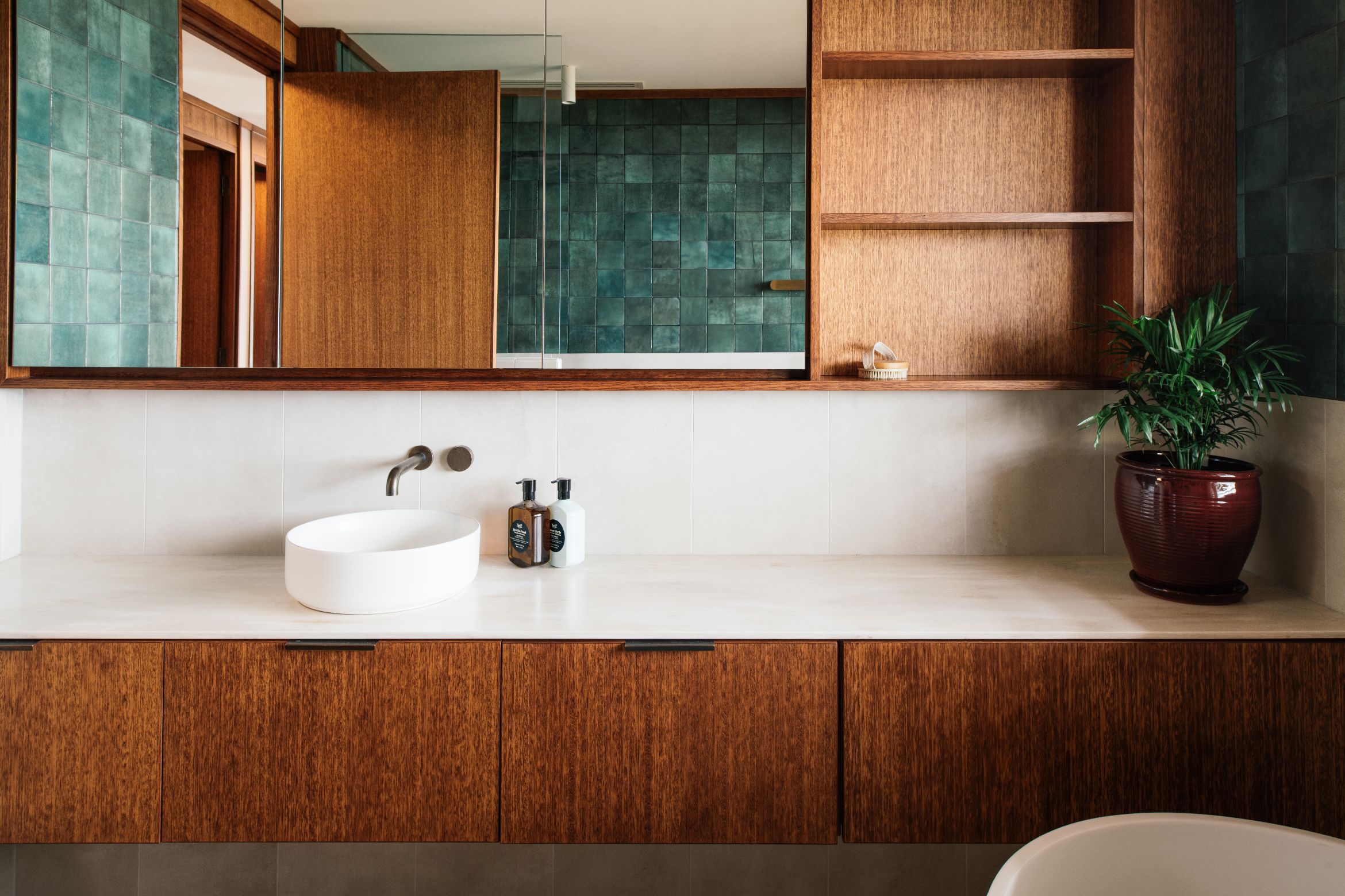
Situated on the top level of a three-storey brown-brick walk-up, this penthouse’s design was inspired by the client’s mood board of mid-century hors d’oeuvres imagery. Prawn cocktails, jellies and moose tarts provided the colour and material references, resulting in a warmly rich scheme punctuated with pops of turquoise. It features as a colour block on the kitchen’s joinery, which evokes all the charm of a 1950s interior, and again in a more mottled effect on the tiled splashback. In the bathroom, turquoise is also featured on the mosaic wall tiles, the perfect complement to a lavender-hued curtain.
2. Hampton Park SC Gym, Hampton Park


This gymnasium’s impressive refurbishment belies its tight budget to deliver a stylish interior comprising two basketball courts. WOWOWA cleverly highlighted the original structure in bright red, creating a striking web effect across the entire vaulted volume. It makes for a graphic visual feast that not only celebrates the school’s colours, but also elevates the once dilapidated space to a play area the students are proud to call their own. This is a masterful study in judicious colour application.
3. Coburg West Primary School, Coburg
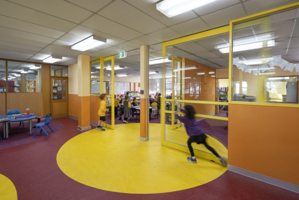

A vibrant palette of yellow, teal, burgundy, green and orange transforms this primary school to better suit its junior students. Colour has been used to zone the classrooms and activate break-out spaces, without creating a distraction. As a result, the interior provides a fresh backdrop for students’ learning, which includes plenty of exploration and experimentation. WOWOWA knows how to deliver a bright, colourful education design that doesn’t feel gimmicky or forced and will stand the test of time.
4. Pony, Brighton West


Be still my heart because this apricot and lemon treat is almost too much to take. An agile alteration and modest addition to a 1960s brick home in Melbourne’s south-east suburbs, the family of six who calls this gelato-hued abode home is very fortunate, indeed. WOWOWA has created moments of delight with their unexpected colour palette and matched it with a bold materiality that includes heavily speckled terrazzo and timbers that are either honey or mocha coloured. It sounds like it shouldn’t work, but it does, and those shiny yellow kitchen benchtops are especially hard to resist.
5. Kepler, Brunswick East
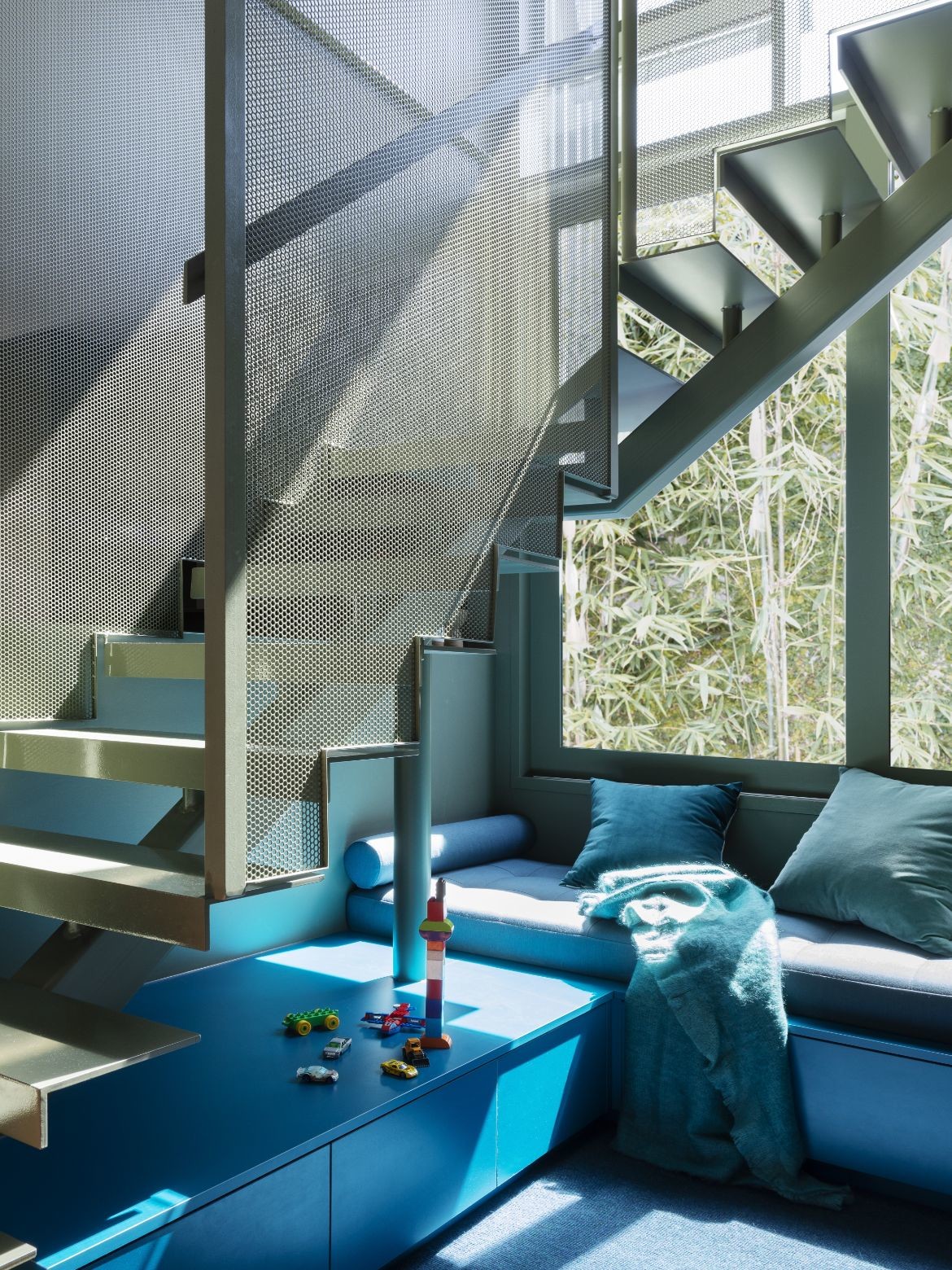
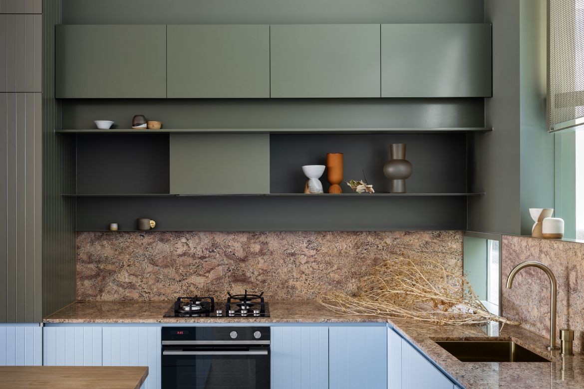
Who said blue and green should never be seen? A combination of bright and pale blues along with muted eucalyptus green bring the small spaces in this inner-city home to life. While the kitchen’s colour palette is deftly complemented by a dappled apricot marble benchtop and splashback, it’s the stairwell that catches the eye. Rather than have it fade into the background, WOWOWA transformed it into a fun kids den, bringing it to the forefront with a colour-saturated scheme that’s a definite crowd pleaser.
WOWOWA
wowowa.com.au
We think you might like this article about six spiralling staircases that are out of this world.
INDESIGN is on instagram
Follow @indesignlive
A searchable and comprehensive guide for specifying leading products and their suppliers
Keep up to date with the latest and greatest from our industry BFF's!
The internet never sleeps! Here's the stuff you might have missed