The home of architecture and design in the Asia-Pacific
Get the latest design news direct to your inbox!
Get the latest design news direct to your inbox!
What are the best colours to style with blue?


May 4th, 2022
Colour is incredibly important when it comes to interior design – for psychological as well aesthetic reasons. Studies have proven that the colour scheme of a room can have a distinct physio and psychological effect on the viewer, especially with prolonged exposure. This makes the interior colour schemes of a home or an office extremely important, because decorating these areas in certain shades and colours can negatively affect your mood and productivity.
One of the main colours that should be avoided is white. This is doubly true for an office setting. All white environments are extremely detrimental to creativity, and subjects repeatedly report that attempting to work in an all-white environment feels restrictive and clinical.
However, that is not to say that white should never be used in a home or featured in a colour scheme. White provides necessary neutrality and calmness – but this must always be used in conjunction with other stimulating colours to avoid the environment feeling sterile or empty. It is for this reason that blue and white pair so nicely.
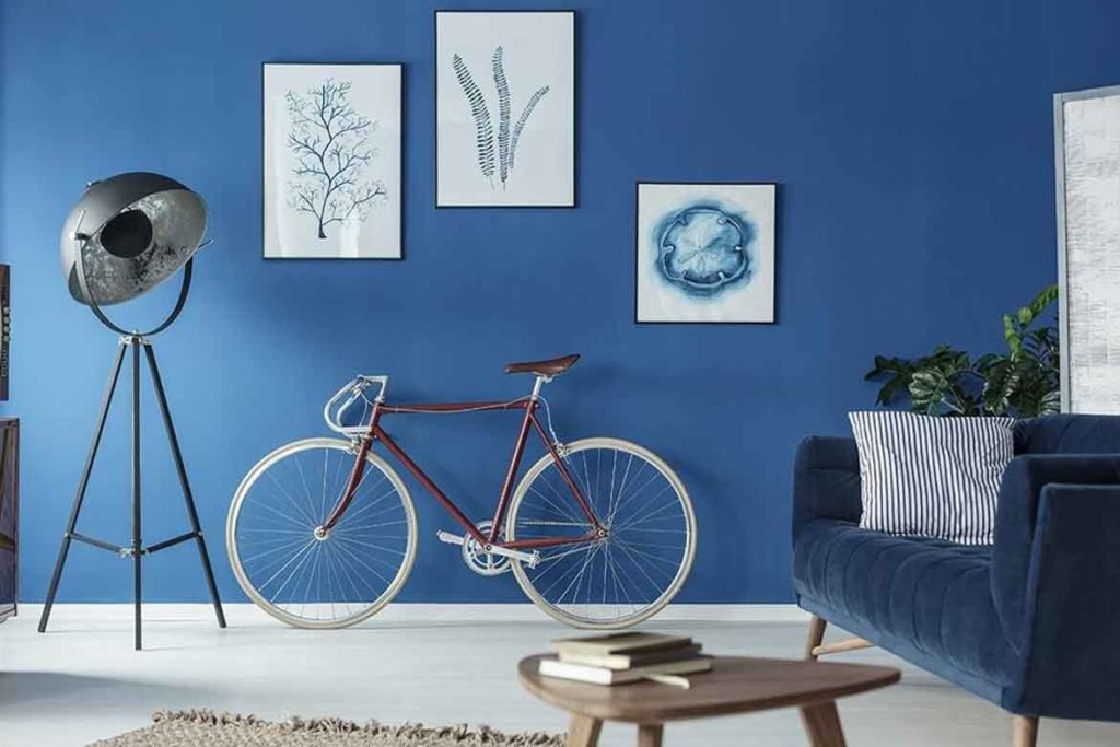
Blue is the colour of creativity. It is a popular choice in workplaces and schools because it has a calming effect that promotes concentration. Styling your home with a blue colour scheme can help to bring a sense of peace and settlement into your everyday life. The subdued and deep appearance of all shades of blue creates a soothing environment which preps the mind for new inspiration.
Blue is one of the most versatile colours in the world. There are seemingly innumerable different shades and hues of blue, each with a subtly different effect. What colour shirt do you picture when you think of a broadly ‘blue’ shirt? The chances are two people would have very different answers. It is this flexibility that makes blue a design favourite across the world.
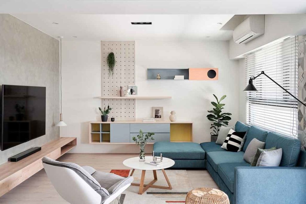
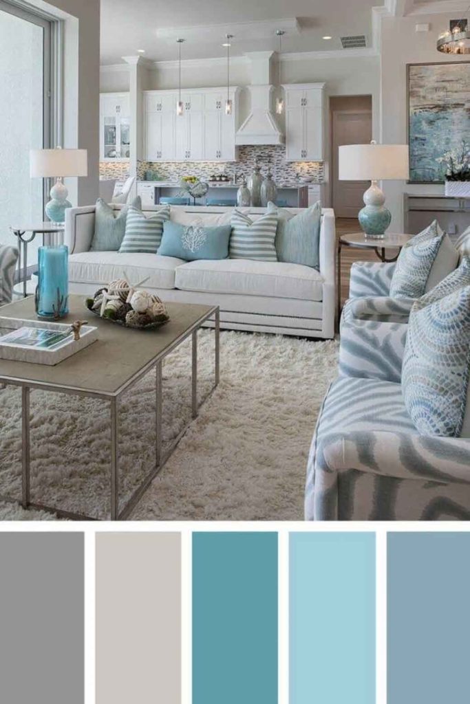
Dark, bold blues are popular in contemporary colour schemes, while pastel blues are very common in vintage décor. Light blues are also a favourite in coastal, French country and Hamptons styles, due to its unassuming elegance. The master of disguise, blue can clearly do it all.
Generally, colour schemes involving blue tend to take a cooler colour palette. Blue is commonly offset with white, green, grey and purple design elements. This creates a uniform atmosphere of tranquility that can be incredibly beautiful. Colour schemes like this are popular in contemporary design, which likes to include harsher colours and materials like steel to achieve an industrial chic. However, cool tones are not the only options for a blue colour scheme.
Blue can look lovely when paired with its opposite high contrast warm colours like yellows, oranges or reds. One of the most beautiful applications of blue is when it is complemented with a bright gold, creating a rich and elegant atmosphere that promotes tranquility without subduing any of the room’s beauty. To help you decide which blue complementary colours would look best as a colour scheme for your home, here is a list of the top seven colours that go well with blue.
What colours match with blue? Colours that go with blue in all its forms
07. Baby Blue – Lavender
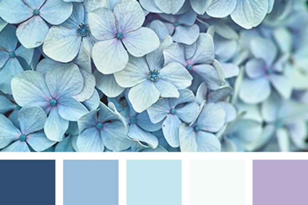
Baby blue works best with gentler surrounding colours. Cool tones like white, purple, and other shades of blue create a peaceful and subtly beautiful atmosphere. Baby blue also works well in conjunction with soft browns or warm greys.

This allows for the brightness of baby blue to shine through and create a dynamic space, rather than a too bright or too dark colour palette. You can purchase the baby blue cotton sheets pictured above here from the Sheet Society for $65.
06. Pastel blue

Slightly darker and more subdued than baby blue, pastel is one of the favourite shades of blue for interior design due to its versatility. Pastel blue matches well with both bright and dark colour schemes, and can appear both warm and cool. For an interior with pastel blue walls, there are a lot of options when it comes to what colour furniture to choose.
However, pastel blue looks best when offset with darker and bolder colours of a similar tone and hue. Dark browns and greys contrast nicely with more neutral cool grey and white, and pastel blue ties the whole scheme together.
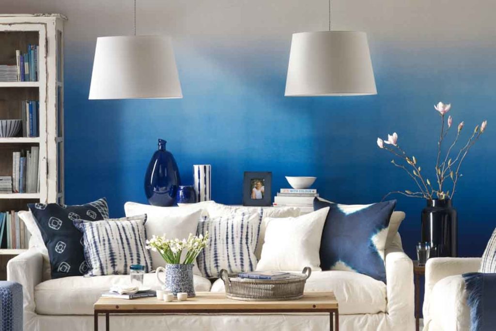
05. Dark blue
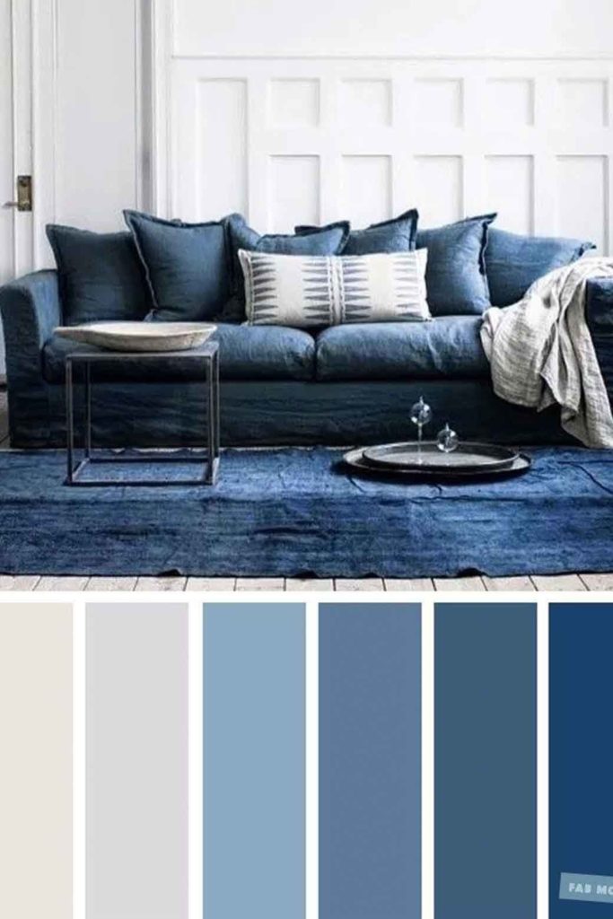
Dark blue is one of the most enjoyable shades of blue to style. This is because it is bold and has many potential matches at various points on the colour spectrum.

Dark blue looks amazing when contrasted with white, creating a crisp and vibrant environment. When toned in with lighter shades of blue, the effect is artistic, moody and creative.

Dark blue also looks exceptional when toned with rich, warm colours like yellow, cream or gold.
04. Sky blue

Sky blue is a gorgeous colour that works particularly well in bedrooms. Sky blue shines as a colour when paired with warm shades of white and a few slightly lighter shades of blue, to create the visual effect of a cloudy sky.
03. Aqua
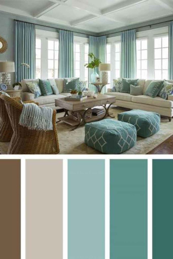
Aqua has a lot of potential within colour schemes as it is slightly in between blue and green. This means that it matches well with warm browns, cream, light greens, and even rustic yellows.
An aqua colour scheme has a distinctive coastal feel which can be emphasized or subdued to your personal tastes.
02. Royal blue

Royal blue has an eclectic beauty that cannot be ignored.

Any colour scheme with royal blue is sure to feature this bold shade as the center feature.

Royal blue couches are the most common manifestation of royal blue in contemporary colour schemes, usually paired with various shades of white, cream, black, dark green, dark grey, and gold.
01. Light blue
Light blue has a friendliness that softens some of the cool effect that layering shades of blue often produces. Light blue communicates happiness, peace and contentment.

It works best with cream, light brown, warm grey, and other similar variations of blue.
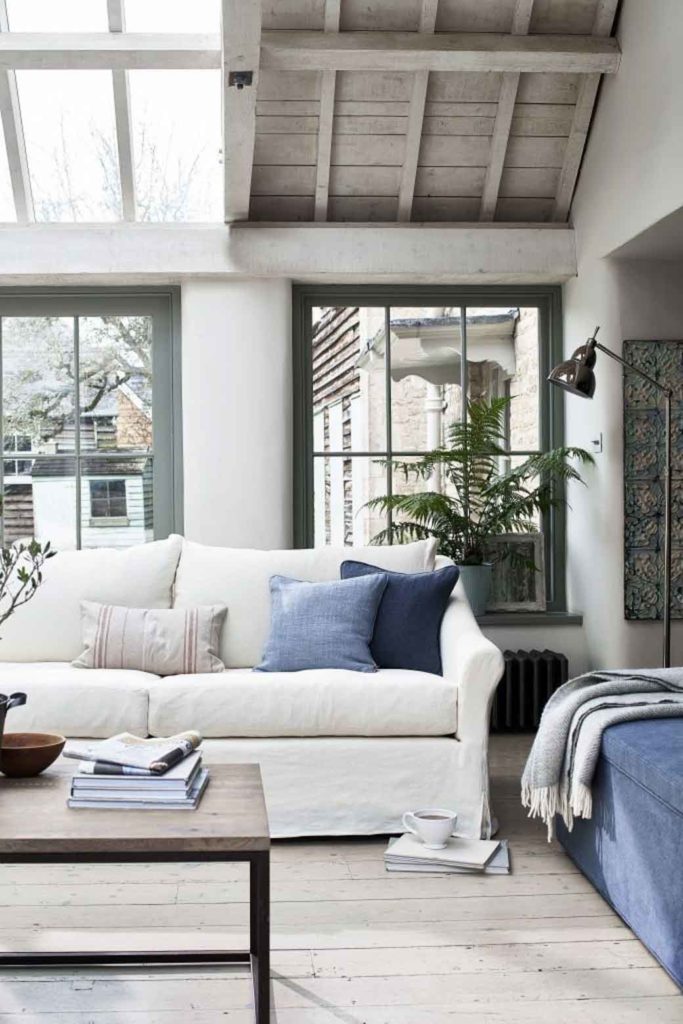
Light blue is also well suited for patterns and feature walls as it is an artistic colour that will not overwhelm the rest of the room.
INDESIGN is on instagram
Follow @indesignlive
A searchable and comprehensive guide for specifying leading products and their suppliers
Keep up to date with the latest and greatest from our industry BFF's!
Sydney’s art community will be out in force tonight to raise money to help save the Firstdraft Gallery – the city’s oldest artist-run initiative – which is being forced to upgrade it’s facilities to meet fire codes. Tonight’s auction aims to raise around $30,000 to complete the required upgrades and save the gallery from being […]
The internet never sleeps! Here's the stuff you might have missed