The home of architecture and design in the Asia-Pacific
Get the latest design news direct to your inbox!
Get the latest design news direct to your inbox!
Secret rooms, killer art and a formidable piece of architecture – Raft Studio’s dramatically dynamic workspace by Edition Office makes a fitting home-base for the avant-garde graphic design squad.


Sequestered within one of Collingwood’s famous old Foy & Gibson warehouse buildings, down an unassuming hall and behind a nondescript door, Raft Studio inhabits a cavernous industrial shell. So far, so Melbourne. But behind this door is an absolute trip.
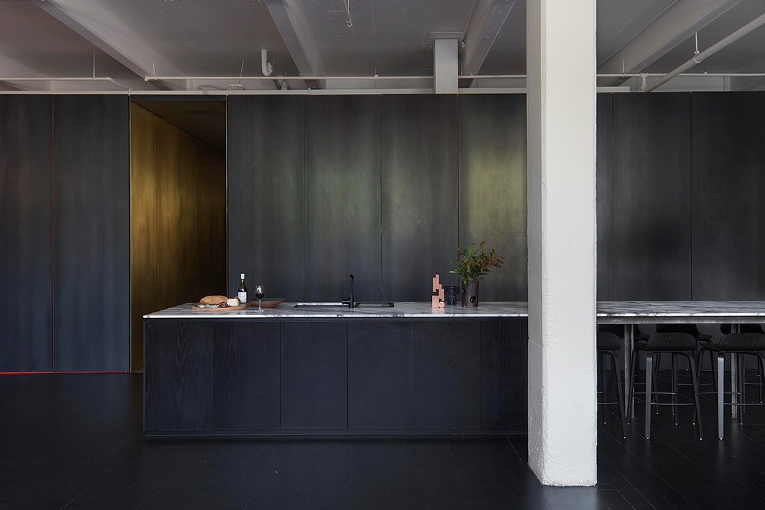
Once over the threshold, at your left and right peripheries, you can choose to follow the white-walled paths into the main studio – but these might not immediately occur to you. More likely, you will be transfixed by the gleaming corridor cutting through the centre of the structure directly in front of you, rendered entirely of brass. “There is a very intentionally compressed volume at the entrance, and multiple paths that don’t reveal themselves up front,” says Kim Bridgland, co-director at Edition Office. “So by the time you travel into the workspace itself, you feel a very physical sense of arrival.”
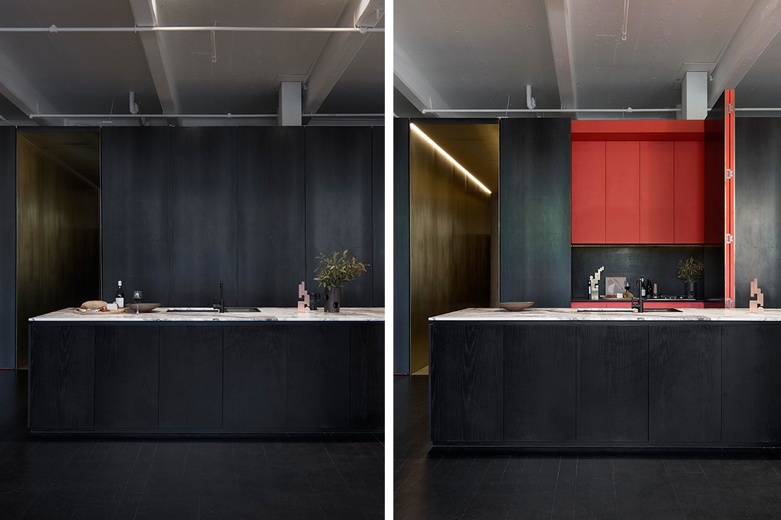
This form obscures the expansive office area from the entrance and brings definition to the spacious warehouse volume. When closed, the pavilion’s enigmatic, brutal mass creates a strikingly bunker-like effect. “In our interactions with the clients, we had a sense that they had these fascinatingly layered personas in their life and work, and were conscious that their environment should reflect that,” says Aaron Roberts, co-director at Edition Office. “We conceived of the internal pavilion as being the body of a beast.”
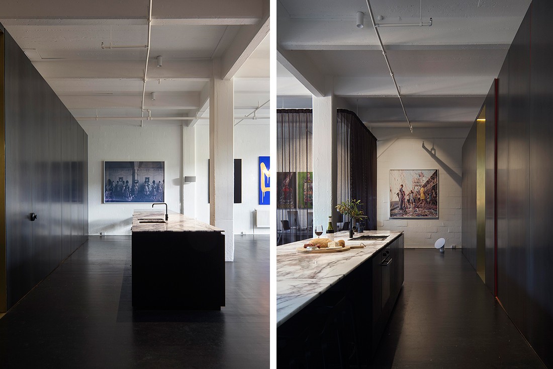
Its visceral nature is hard to miss. Bisected by the spine of the golden walkway, cleverly compartmentalised rooms are concealed within the rectangular pavilion. On one side, a slick ‘black mirror’ boardroom and bathroom elicit an almost sensory deprivation effect. “It is this idea that you’re being plunged into another realm, and you’re being stripped of any preconceived notions you might have had when you stepped in,” Roberts says.
The other side encases perhaps the most riotously immersive experience of the office – Raft’s famous Red Room, an almost claustrophobic cube saturated in the primary hue. The red room’s playful door handles are a particularly delightful detail – custom-made magnets which can be placed anywhere on the steel doors, so strong they can double as hooks, and completely detachable to maintain the streamlined integrity of the design.

“Something we didn’t fully anticipate was that beautiful bleed of red light as it spills out from the open doors,” says Bridgland. “The programming is such that the pavilion appears quite stark when closed, but once you start to discover all of its compartments, there is a generosity to it that speaks to the overall space.”

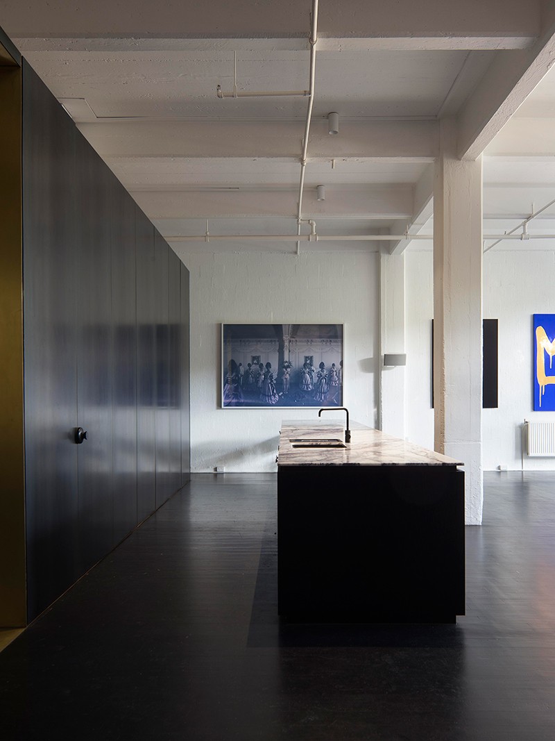
White walls are decked in thought-provoking pieces by a selection of Australian artists. A blue and gold work by Reko Rennie is a staff favourite. Spanning much of the central area, a long marble bench top appears to hover, setting the stage for Raft’s generous staff cook-ups. Stasia Raft, founder and creative director, and her partner, practice director Edward Commons, are keen and convivial hosts.
“Edition Office delivered not only in terms of the sculptural outcome, but also because they understood what was important to us from a design perspective,” says Raft. “They knew what the intention of the space meant to our business and brand identity, without forgetting the day to day functional requirements we had for the studio.”

Part gallery, part entertainment space, it’s a high impact backdrop for an agile team constantly seeking creative stimulation and a shake-up to their surroundings. At the time of writing, Raft Studio had just returned to their headquarters from an action-packed Berlin residency. What creative revelations will come out of that latest cultural exchange? Watch this space…
This article originally appeared in issue #73 of Indesign magazine, the ‘Information Age’ issue. Get more workplace inspiration by going through our archives. Or take a look at what was specified here.
–
Keep your finger on the design pulse, sign up for our newsletter.
INDESIGN is on instagram
Follow @indesignlive
A searchable and comprehensive guide for specifying leading products and their suppliers
Keep up to date with the latest and greatest from our industry BFF's!
The internet never sleeps! Here's the stuff you might have missed