The home of architecture and design in the Asia-Pacific
Get the latest design news direct to your inbox!
Get the latest design news direct to your inbox!
Creating a gallery for art that cannot be seen, heard or felt was for Diller Scofidio + Renfro, an exercise in self-restraint. Sam Eichblatt reports from New York City
January 11th, 2013
The Art of Scent 1889 – 2012 is a landmark exhibition for New York’s Museum of Arts & Design. While part of the museum’s mandate is to exhibit work that explores the “blur zone” between art, design and craft, the exhibition also marks the launch of its new Centre for Olfactory Art, curated by the former New York Times scent critic, Chandler Burr.

It is dedicated to perfumes that represent an aesthetic or innovatory leap forward for the art form — ranging from the Victorian-era Jicky (Aimé Guerlain) to the smoky, metallic and compelling Untitled by contemporary perfumer Daniela Andrier.

To create a gallery exhibition for artworks that can’t be seen, heard or felt, Burr called on the architecture practice Diller Scofidio + Renfro, which has a history of experimental projects. Liz Diller, lead architect for The Art of Scent, previously worked on the Blur Building — a temporary pavilion made of fog designed for the 2002 Swiss Expo.

Blur House, Switzerland 2002
“[The exhibition] was an exercise in self-restraint,” says Diller. “How to make nothing, but make it beautiful.”
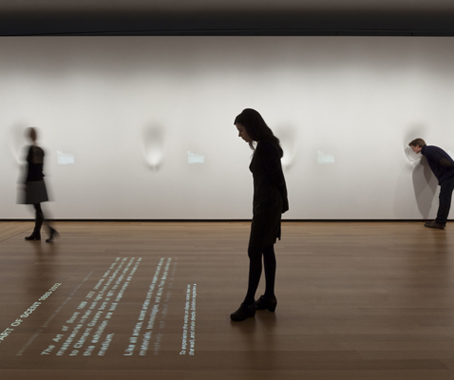
The other challenge, says DS+R project leader Ilana Altman, lay in exhibiting intangible art in a museum context. “We were interested in the convention of a white wall. The technical challenge was to figure out how to make it atmospheric, and how the surface could give a holistic display but still appear to be empty.”

Twelve identical dimples set seamlessly into the walls have space for one visitor’s head, which triggers the release of a dry version of each perfume, dispensed by high-spec trade-show technology, and carefully calibrated to smell the same as if they’d been worn for ten minutes — according to perfumers, the ideal conditions under which to experience a scent.

In the adjacent “salon” a glass table holds the same perfumes in liquid form, into which visitors dip blotters and then add their smelling notes to the online database projected onto a nearby wall to build up a vocabulary of scent criticism.
Tresor, the “13th scent”, has been broken down into its five constituent stages to reveal its design process, each version delivered automatically on a card with a peel and sniff panel through slots in the wall similar to a car park ticket machine.

Each perfume is exhibited without packaging, and is attributed to the perfumer (rather than the brand) through small pieces of projected text that fades on and off. “The visual sense is dialled down,” says Diller. “We considered audio, but decided it would just be a distraction.”
The Art of Scent 1889 – 2012
Dilller Scofidio + Renfro
INDESIGN is on instagram
Follow @indesignlive
A searchable and comprehensive guide for specifying leading products and their suppliers
Keep up to date with the latest and greatest from our industry BFF's!
The internet never sleeps! Here's the stuff you might have missed