The home of architecture and design in the Asia-Pacific
Get the latest design news direct to your inbox!
Get the latest design news direct to your inbox!
When longtime collaborators Studio Y and Ambience Lighting came together on a personal project, they successfully plotted the concept for an office space that is at once conducive to work and incredibly dramatic.


October 18th, 2018
When Dana Barely-Katz was approached to design the interiors at the new Bundoora offices of Ambience Lighting, she was given the perfect brief. As a designer at Studio Y, she’d been collaborating with the company for many years, forming a relationship based on a shared conceptual approach to projects and making use of new technology. Ambience has been around since 1987, using light to manipulate the way people feel in some of the city’s most iconic spaces, in accordance with the brand’s motto, Make Light Work.
“The team gave us the site, the types of spaces, and how many people would be working in there. Everything else was open – we could do whatever we wanted!” says Barely-Katz, adding, “Ambience’s branding is all about the colour spectrum, so right away we wanted to do something with that.”
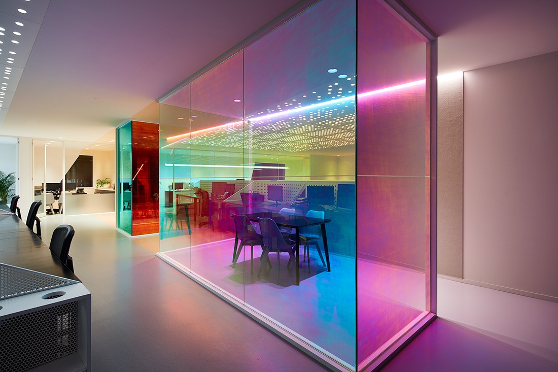
While researching for the project, Studio Y came across some images of optical prisms. If you’ve ever looked into how an optical prism works, you’ll know the flat surfaces are something of a scientific wonder. When natural light hits a prism’s surface, the beam refracts and breaks up into its constituent spectral colours. Natural light going in changes to red, green or blue on the other side.
A few days later, Studio Y presented a concept that would use prisms as a repeating motif, capturing the phenomenon with a series of coloured and angular lines, which would visually connect walls, floors and ceilings. In addition, they added a dichroic film to windows at key junctures. The film would refract the natural sunlight, breaking it up into its spectral colours. “When applying this idea to a whole building, we thought it would create something very intricate and interesting,” says Barely-Katz, “But honestly, we really didn’t know how it would turn out.”
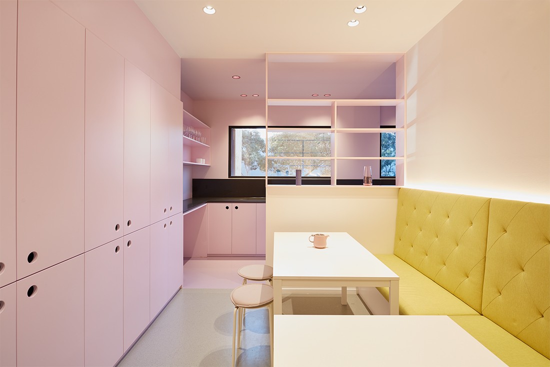
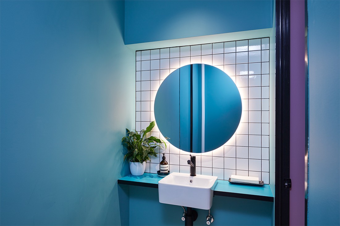
To make the concept work functionally, Studio Y chose a palette of pastel colours, favouring lighter tones in the central space, where neutral tones are more conducive to calm and productive work environment. In break out spaces like the kitchen, meeting rooms, and bathrooms, bolder colours were chosen. “We wanted to explore the nuances in colours, so we selected four bright pastel colours and went all the way with them,” explains Barely-Katz. “They appear throughout the space, but we were careful to select bolder versions of those colours when we wanted to make a more dramatic effect.”
Combined with dichroic film, placed on the outer glass of key breakout areas, Studio Y was able to control the intensity of the prism effect in different areas. In the main working space, for example, the overhead lighting installation is warm and neutral in tone, “giving employees more room to breathe.” Whereas in breakout areas, the natural light is filtered through the dichroic film over rooms adorned with darker tones, dramatising the mood.
The result is a wonderfully compelling office space that, in accordance with nature’s whims, feels like a moving picture. “It’s an incredibly dynamic space, it’s different with every passing hour. The way the shadows drop on the floor, creating angular sections of colour – everything comes together in a very intricate way,” says Barely-Katz.
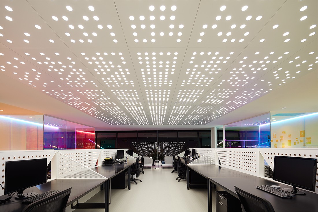
Ambience and Studio Y joined forces to create an innovative lighting design in the main working space, that dominates for hours when natural light is at a premium. “We designed a custom perforated ceiling that acts as a huge lighting box,” says Dana. “Because Ambience designed it themselves, they could really make it work for them and their needs.”
The effect overhead is mesmerising, a sea of lights that play into the building’s repeating circular motif. “The circles appear in the joinery beside the working stations, in the cupboards, the ceiling, and all throughout the building. It’s another little layer of playfulness.”
–
Get more workplace inspiration, sign up for our newsletter.
INDESIGN is on instagram
Follow @indesignlive
A searchable and comprehensive guide for specifying leading products and their suppliers
Keep up to date with the latest and greatest from our industry BFF's!
The internet never sleeps! Here's the stuff you might have missed