The home of architecture and design in the Asia-Pacific
Get the latest design news direct to your inbox!
Get the latest design news direct to your inbox!
Wynk Collaborative has designed a photogenic sushi restaurant at Marina One that abstracts sea elements into a fun, casual environment.

June 7th, 2019
Wynk Collaborative’s design of the Standing Sushi Bar in Raffles Place in 2014 introduced a new way of enjoying sushi. Missing were the tropes of Japanese eatery design (cue: Shoji screens, tatami-mat seating and muted wall colours). Instead, bright colours and creative material use created a convivial atmosphere for the CBD crowd to enjoy lunch and dinner.
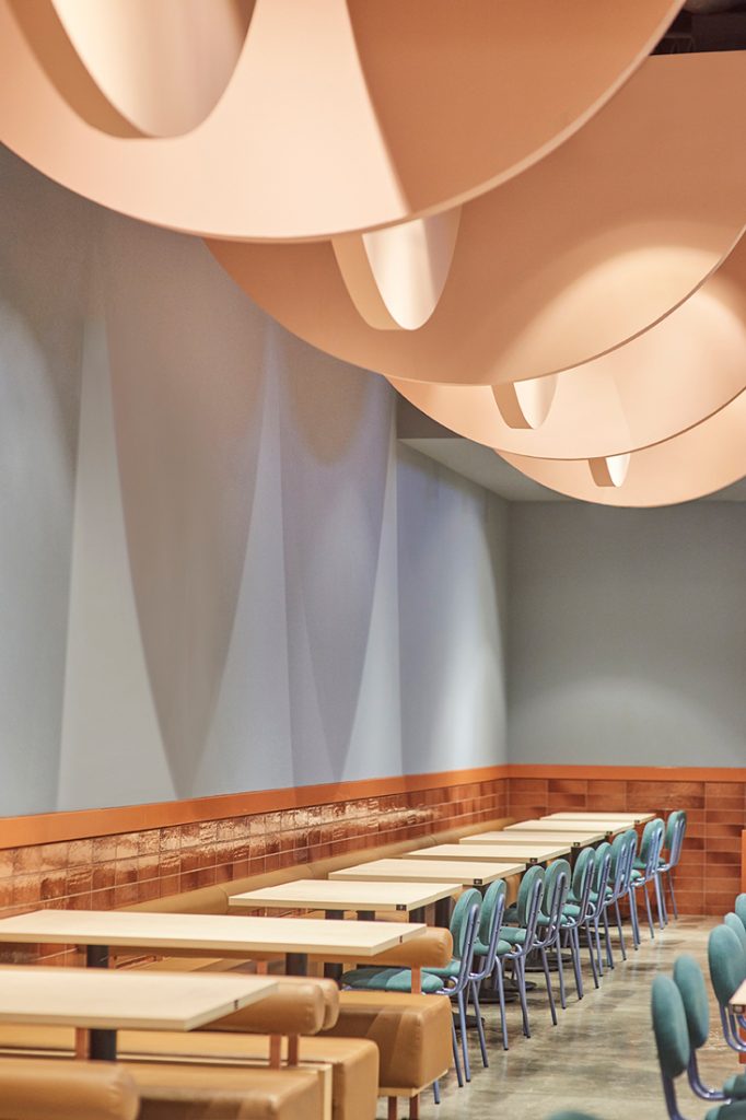
Their newest iteration for the chain, which serves affordable, high-quality Japanese cuisine, is in Marina One. “Aesthetically, we’ve gone slightly brighter and cleaner with a less hard-edged palette compared to the previous one,” says Leong Hon Kit, a co-founder of the firm. Instantly drawing attention is a cluster of semi-circular elements floating overhead. The shape is a play on the restaurant’s logo as well as being evocative of buoys or the undersides of fishing boats at sea. Subtly alluding to the cuisine served, their blush pink tones balance the largeness of form.
Arranging the elements in a single direction, with each row staggered to half a phase from the one before and after, creates a sense of movement, says Leong. At the same time, they unify the different seating areas and partially conceal ducting and services overhead.
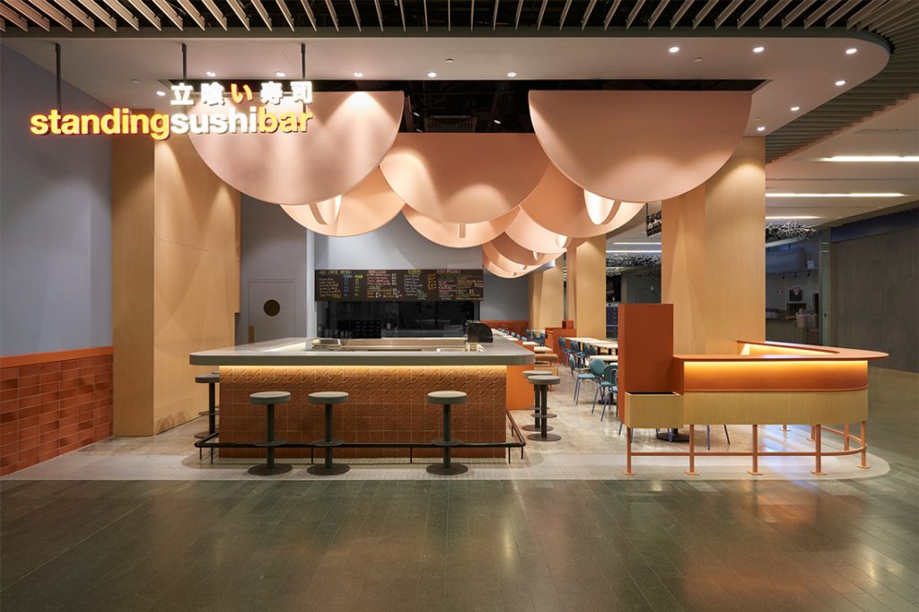
Their exaggerated size and graphic nature was intentional for easy recognition from afar. This was necessary, with the restaurant tucked into a corner of the building’s basement surrounded by many other F&B offerings. Aside from aesthetics, the restaurant’s layout also aids in this. Boundaries between inside and out are blurred with a perimeter counter that allows patrons to linger for drinks on either side. Customers spilling into the public space would ideally create a crowd effect visible from further away to draw even more people over, Leong explains.
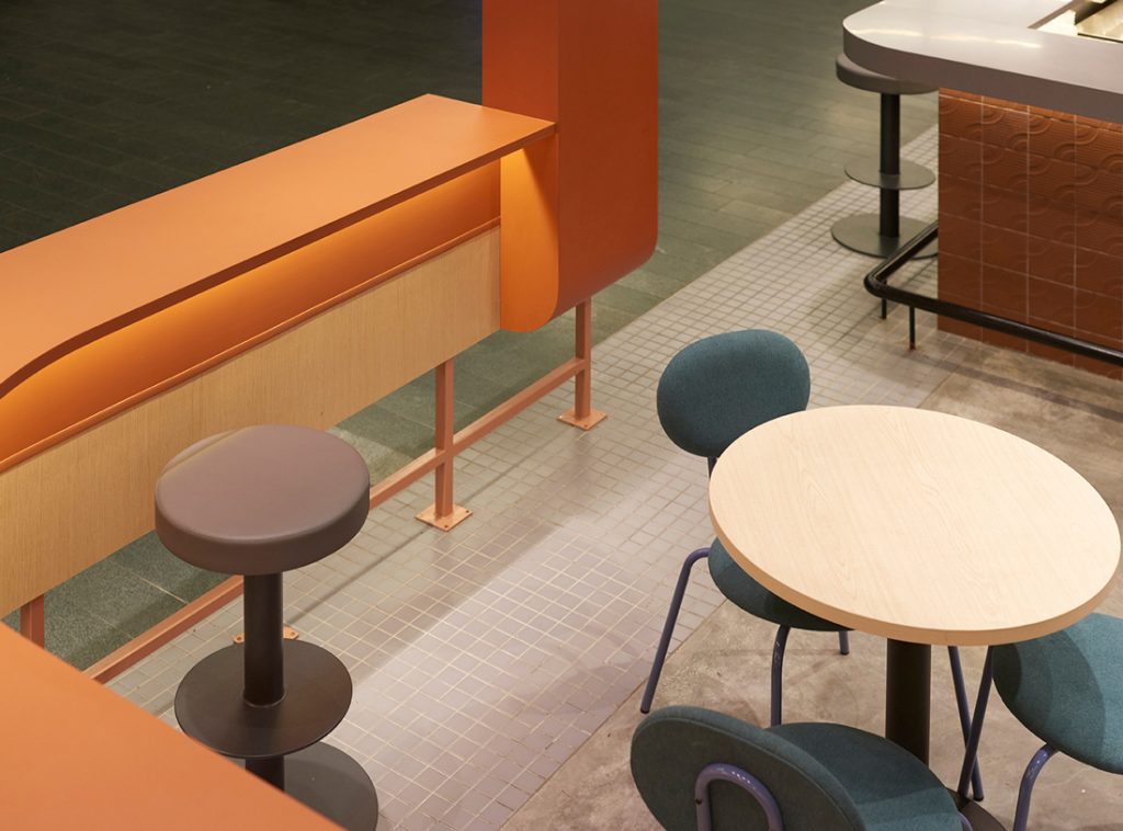
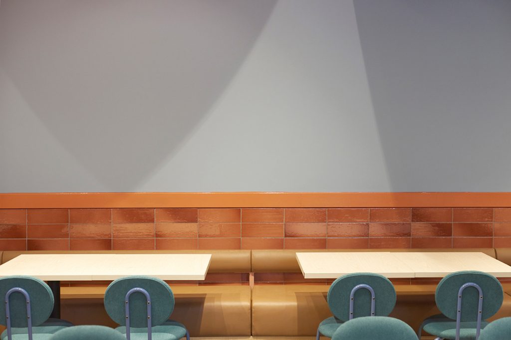
Overall, an open, casual feel has been created. The kitchen is placed in the centre to aid faster serving of food to diners, with a glass panel to the yakitori grill for diners to view the smoke and action. A variety of seating types means customers can observe food being prepared by the bar counter or gather in banquette seating running down the shop’s length.
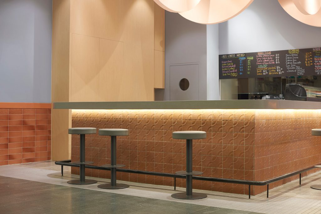
Continuing the curvilinear theme are rotund seats designed by George Soo of Fliq and Sean Dix, as well as terracotta tiles at the bar counter with geometric quadrant patterns composed to form semi-circular waves. The latter were found in an old-school tile shop with a pattern initially intended to prevent slipping on wet backyard floors.
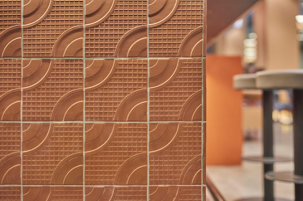
“We used the tile on the bar counter wall, giving the tile’s graphic and aesthetic character precedence over its original functional design… We always like to twist how materials are used,” highlights Leong. The tiles’ material rawness also provides a rougher and earthier counterpoint to the rest of the palette – a combination of dusty blue, coral and oak elements atop grey mosaic tile and cement flooring.
Such sophisticated and bold colour and pattern use have come to define Wynk Collaborative’s oeuvre. This project not only continues their exploration of how F&B design can affect operations and social interactions, but also reflects their belief in creating visually interesting, memorable spaces that keep customers returning.
Designer: Wynk Collaborative (Leong Hon Kit, Si Jian Xin)
Main Contractor: NIJ Deign Pte Ltd
Area: 900 square feet
Grey mosaic tiles from Unlimited Enterprise
Panel veneer board from KD
Aura Spice terracotta wall tiles from Hafary
Geometric pattern terracotta tiles from Unlimited Enterprise
Paint from Nippon
Joinery laminate from EDL Laminates
Chairs by Fliq (George Soo)
Bar stools by Sean Dix
INDESIGN is on instagram
Follow @indesignlive
A searchable and comprehensive guide for specifying leading products and their suppliers
Keep up to date with the latest and greatest from our industry BFF's!
The internet never sleeps! Here's the stuff you might have missed