The home of architecture and design in the Asia-Pacific
Get the latest design news direct to your inbox!
Get the latest design news direct to your inbox!
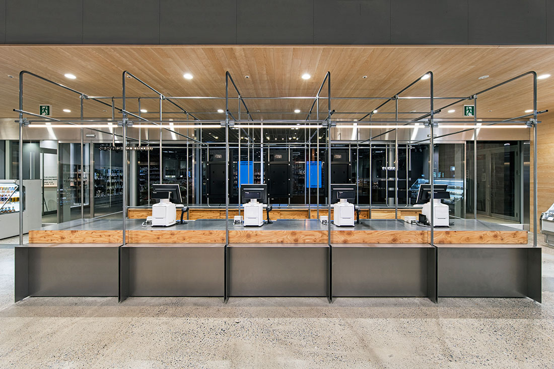
A supermarket that makes you want to linger? Jo Nagasaka of Schemata Architects brought the unlikely notion to physical reality with a communicative interior for Fukushimaya Tasting Market in Tokyo.
Photography by Kenta Hasegawa
January 5th, 2018
Online shopping has brought about a number of shifts in retail design in recent years and that’s a good thing. Designers are now making interiors work harder than ever before just to stay in competition with agile digital environments where everything is about cost cutting and convenience. Good retail design adds value to physical businesses and through a revitalised focus on people, integrating a sense of storytelling and creating memorable in-store experiences, designers are implementing different strategies to achieve increased functionality.
Supermarkets are quite possibly the ultimate measure of retail design efficiency because they need to be constantly updated to meet customers’ fluctuating expectations. For Jo Nagasaka, acknowledgement of the fact that the supermarket and consumer of a decade ago aren’t the supermarket and consumer of today became the basis for designing the Fukushimaya Tasting Market in Akihabara, Tokyo.
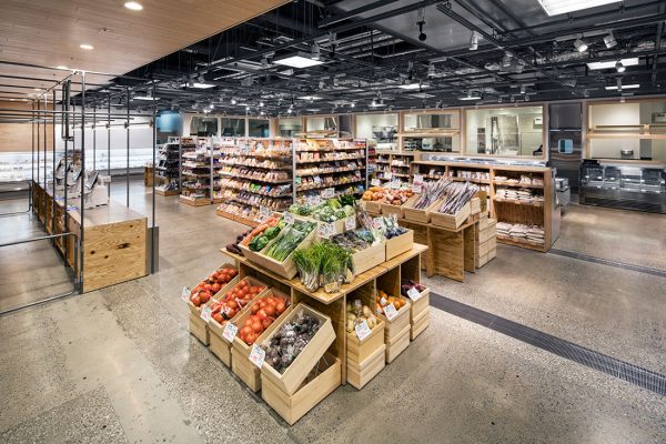
His resulting scheme for the modestly sized supermarket takes its visual cue from a traditional open market concept, where everything is on show and within reach. There’s plenty of room to move around in the aisles, and the display systems themselves appeal for their relatively lo-fi, rustic aesthetic. Nagasaka had a tight budget to work with and this may have initially guided his economical material palette. But it certainly didn’t compromise the quality of the fit-out’s nature-inspired craftsmanship and detailing, or its innovation.

Galvanised steel pipes are used as a minimalist yet effective wayfinding device at the point of sale, while elsewhere, organically grown, pesticide-free vegetables are displayed in neatly arranged raw timber wine boxes. These boxes speak ‘fresh from the garden’ and also allow for flexibility in how the produce is displayed. So in accordance with the seasons or time of day, these boxes can be re-arranged to best showcase the current produce available.
It’s a simple design strategy that keeps customers engaged by offering them different narratives, depending on when they go shopping.
Read the full story in Cubes issue 89 – on sale now!
INDESIGN is on instagram
Follow @indesignlive
A searchable and comprehensive guide for specifying leading products and their suppliers
Keep up to date with the latest and greatest from our industry BFF's!
The internet never sleeps! Here's the stuff you might have missed