The home of architecture and design in the Asia-Pacific
Get the latest design news direct to your inbox!
Get the latest design news direct to your inbox!
The youth-focused mall and education hub embraces the vitality of the arts district while turning the failures of an existing building around.

July 19th, 2023
Singapore’s Selegie Arts District has always had an ambiguous identity. It is a thoroughfare from Orchard Road behind the Dhoby Ghaut area towards Little India, with a hodgepodge of building typologies including dated malls, shophouses and art institutions.
SPARK has given the area a beacon in the form of GR.iD. It is a retrofitting project for Hong Kong’s GAW Capital Partners and Manful Wings Pte Ltd that aims to improve its relevance to the surrounding community through ‘positive reuse’ rather than tabula rasa.
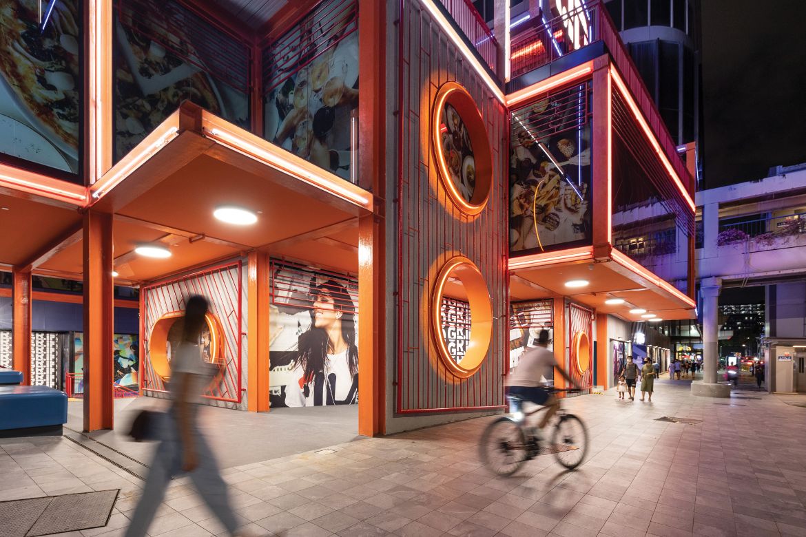
The youth-focused mall and education hub is sandwiched between the School of the Arts (SOTA) and Parklane Shopping Centre. Against the tired grey backdrop of the Park Lane Mall, it attracts with a bright red and cobalt façade that appears as several steel-frame, glass-walled boxes stacked in a random manner.

Like the renovation of the Clarke Quay entertainment district and the Starhill project in Kuala Lumpur by SPARK, GR.iD is intended to increase asset value through social interaction, improved accessibility, an increased quantum of high-revenue-generating F&B units, and ‘the celebration of self and community’. In total, leasable areas at the key corner threshold were increased by 50 per cent, and those along the street front by 30 per cent.
The design of GR.iD is an anomaly in the areas with its use of colour, deconstructed form and assorted programmes. “It is good to be different; that difference is something to celebrate cities that are populated by only one kind of building – glass-clad anonymous boxes that makes a city terribly one-dimensional,” comments Stephen Pimbley, SPARK’s founding director.
The design reinterprets the colourful shophouse elevations across the road. “The façade is a potpourri – remnants of the previous building’s incarnations combined with the transformative corner ‘grid’ matrix,” describes Pimbley.
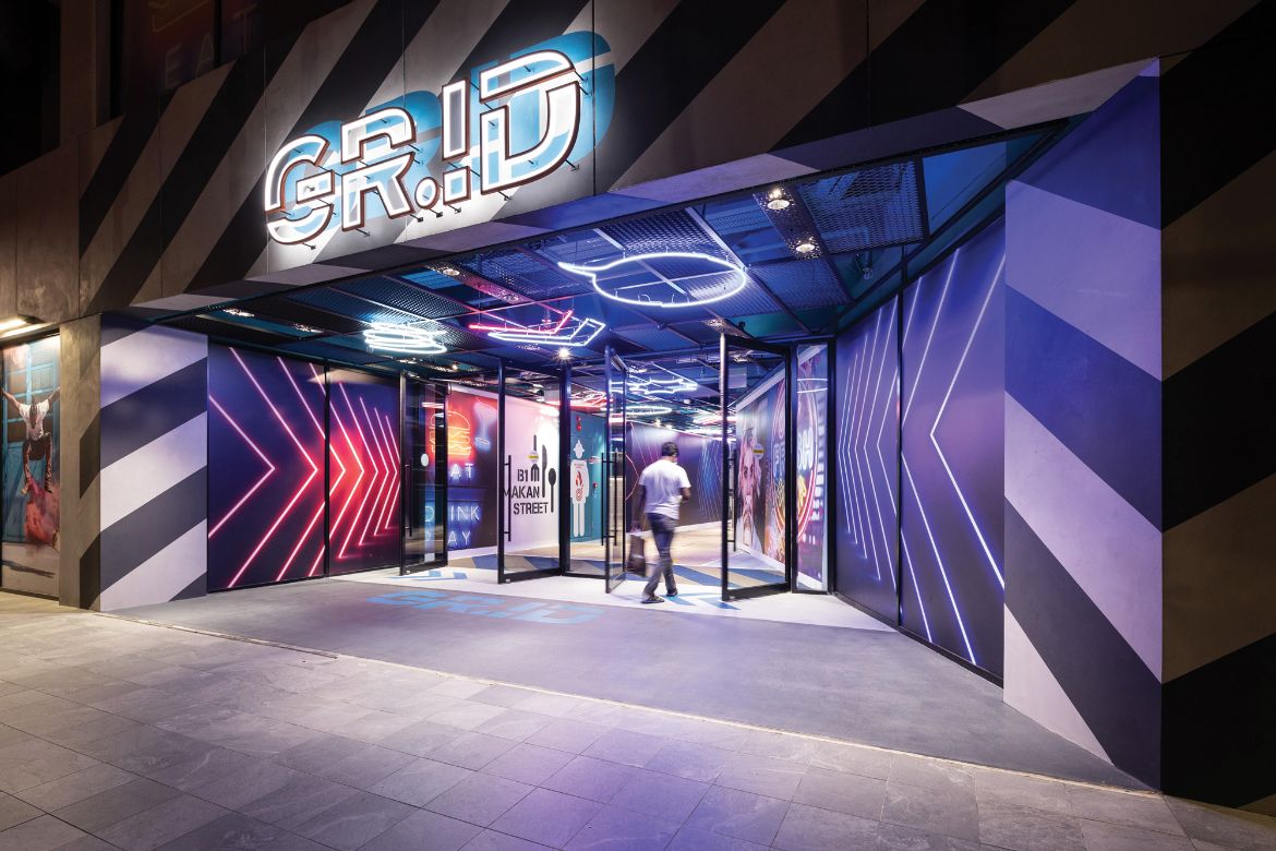
This lightweight expression is made from fireproofed steel frames, glass infill and concrete decks that reduce the overall loading to the building. “Details include industrial textures; raw, painted finishes and exposed services complemented by neon colours,” describes Pimbley of a style that mixes arcade, street, industrial and grunge.
The building’s engaging and lively design offers a direct engagement with the street and context. “The new building additions were placed to mark the corner of Selegie Road and Kirk Terrace [that separates the building from SOTA),” says Pimbley.

Like a surgical procedure, the previous building was subtly replanned “to remove dead and wasted spaces, particularly in areas facing Selegie Road and the rear of the building where Gross Floor Area (GFA) was decanted and moved to the street front where rental revenues are higher,” explains Pimbley.
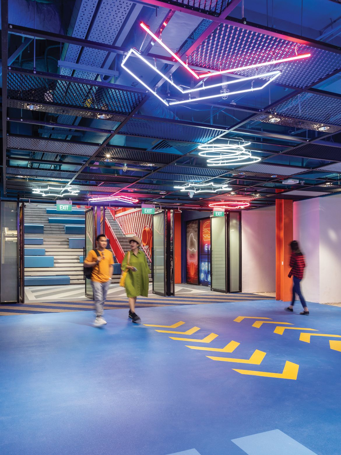
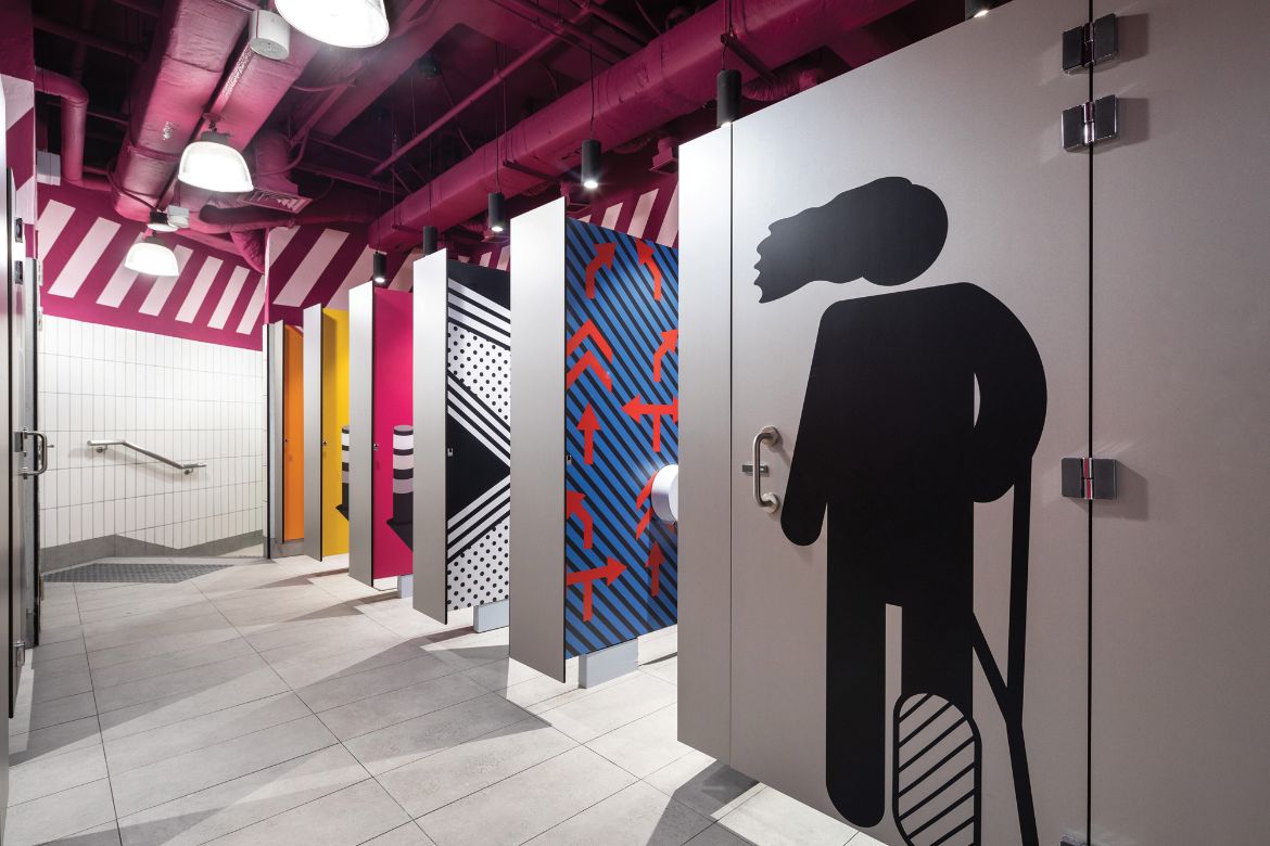
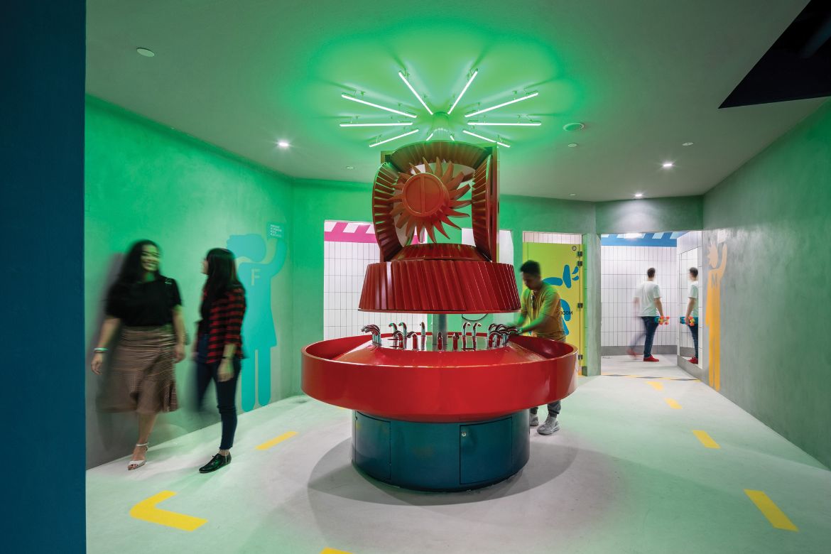
Facing SOTA was formerly an enclosed, high-ceilinged atrium with a small entrance. SPARK opened this up with an open staircase going down to the basement, fronted with rentable units. Pimbley describes this as a “social stair”, an “urban connection” from the street to the basement eateries, gymnasiums, a 6,708-square-foot skatepark, as well as utilitarian facilities transformed into social spaces. These include public study and work zones, vending machines and lockers an a ‘social washroom’ – a lively space with an Instagrammable, sculptural shared washbasin, edgy graphics and exposed ceiling services painted pink.
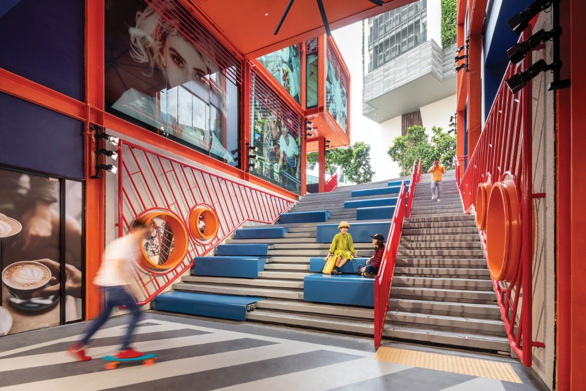
Along the naturally ventilated staircase integrated with seating, youth can meet up with and relax with friends, watch shows on a large screen above or enjoy live performances by GR.iD’s arts-focused tenants. Pimbley shares that this façade and staircase has become a dynamic attraction for the digital generation seeking ‘Instagrammable’ backdrops.
This multi-level high-rent ‘flagship’ corner was a result of moving low-rental value shops from the deeper parts of the building to this easily accessible and highly visible street corner. Many of them now house youth-focused food joints with al fresco dining options on terraces that increase visibility to and from the building while enhancing urban interaction. The former location of the low-value shops were hollowed out and replaced by a double-storey gymnasium to enhance visual and spatial connection from the street through to the basement.
The energy of the exterior continues onto the interior, which embodies elements of post-industrial urban scenery such as neon lights and supersized graphics and floor markings. SPARK describes it as a ‘real life stage set’. Fun ceiling directional signs guide visitors to key social facilities and shops. Their dynamic design by both SPARK and BPI (Brandston Partnership Inc.) embodies youthful insouciance and a sense of motion.
The transformation appears to be a success. As Pimbley shares, “Most people tell us they enjoy going there. We especially like it when someone says ‘GR.iD is my daughter’s favourite shopping mall’, which is better than winning architectural prizes!”


.
GR.iD
Client: GAW Capital Partners, Manful Wings Pte Ltd
Architecture, Interior, Graphic, Wayfinding & Branding Design: SPARK
Team: Stephen Pimbley, Wenhui Lim, Carlo Joson, Jessica Leong, William Nguyen Van Thanh Ha, Andriani Wira Atmadja, Javier Campoy, Mark Mancenido, Michael Halagao, Maribelle Lapizar, Syazana Paudzi, Regina Kartika, Joei Wee, Lili Saputri, Aye Yu Mon, Arissa Rashid, Zhen Xiao Yang
Branding, Logo Design & Marketing Collaterals Collaborator: TRIPPLE
Project Manager: Arcadis Pte Ltd
Structural + M&E Engineers: ARUP
Lighting Consultant: Brandston Partnership Inc.
Quantity Surveyor: Arcadis Singapore
Builder: Gennal Industries Pte Ltd
Gross Floor Area: 21,800 sqm
Retrofitting Workscope Area: 10,000 sqm
INDESIGN is on instagram
Follow @indesignlive
A searchable and comprehensive guide for specifying leading products and their suppliers
Keep up to date with the latest and greatest from our industry BFF's!
The internet never sleeps! Here's the stuff you might have missed


")