The home of architecture and design in the Asia-Pacific
Get the latest design news direct to your inbox!
Get the latest design news direct to your inbox!
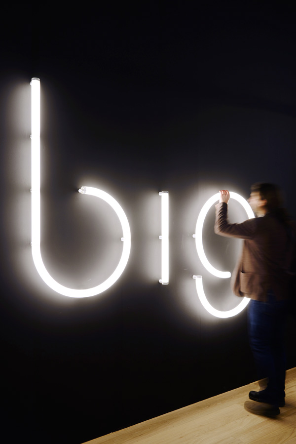
Conceived by Bjarke Ingels Group (BIG) in partnership with Artemide, the Alphabet of Light is a system of linear and curved lighting modules that enable users to form their own words and shapes.

June 23rd, 2016
How do we create a flexible light that can be installed and used by everyone? How do we create a light that fits any space – small or large? These were questions Danish architectural firm Bjarke Ingels Group (BIG) asked themselves when they embarked on their collaboration with design-oriented Italian lighting manufacturer, Artemide.
The end result of the collaboration is a series of lighting modules that grant users free-play when it comes to composing words or messages with lighting. It is aptly titled Alphabet of Light.
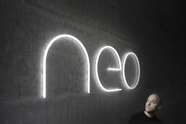
Developed based on the idea of using light as a language to communicate simply and express freely, BIG explored geometrical forms to create a new font that could be translated into lighting components. The anatomy of the new font was broken down into four main modules, straight and curved, alongside six joineries. Precise proportions enable users to mix and match the various components to generate their own content. The simple forms also ensure that users are not limited to alphabets, and may also create straight lines and smooth curves.
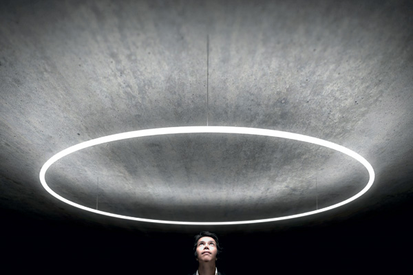

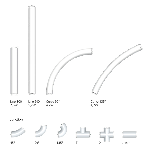
Allowing composition freedom, Artemide has made the connection of components seamless. Each part is linked with a concealed electromagnetic joint that does not cause discontinuities or unsightly shadows. The components illuminate strong lighting, maximised in each geometrical body where two LED Strips emit light from opposite ends. Material absorption is minimised, while retaining a comfortable and functional illumination.
Alphabet of Light was first presented at Milan Design Week 2016, as part of an initiative by Artemide to highlight new relations between light, space, man, and the environment.
Artemide is carried in Singapore by Million Lighting.
BIG
big.dk
INDESIGN is on instagram
Follow @indesignlive
A searchable and comprehensive guide for specifying leading products and their suppliers
Keep up to date with the latest and greatest from our industry BFF's!
The internet never sleeps! Here's the stuff you might have missed