The home of architecture and design in the Asia-Pacific
Get the latest design news direct to your inbox!

Get the latest design news direct to your inbox!
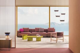
The esteemed Italian brand has collaborated with Yusuke Kawai to create Kawara, a lighting collection defined by adaptability, elegance and a touch of tradition.
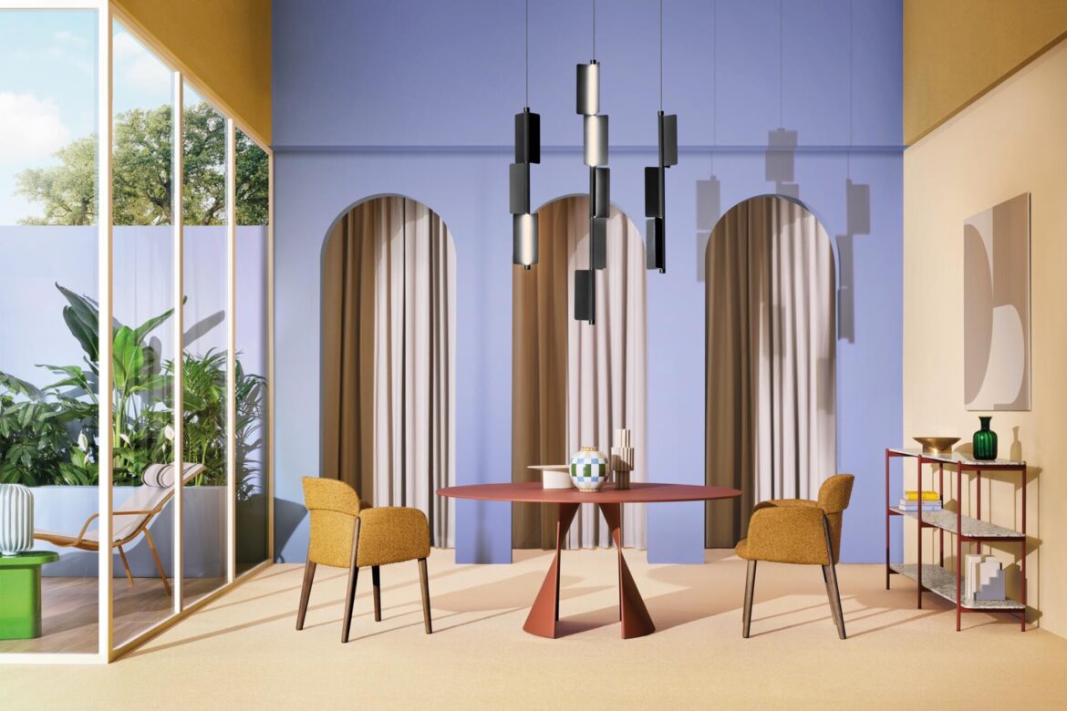
Art direction studio FM Milano, photo by Omar Sartor, set design & styling Studio Milo.
June 4th, 2025
What would Milan Design Week be without Pedrali? As usual, the prestigious Italian brand crafted a tantalisingly beautiful stand at the Salone del Mobile fair. Surrounded by sumptuous colour and refined furniture, there was a very special standout piece on show this year thanks to Pedrali’s collaboration with Japanese designer, Yusuke Kawai. Kawara is a modular lighting collection inspired by traditional Japanese tiles – and, in the year of Euroluce, it was one of the highlight lighting product launches across the whole of Milan Design Week.
For Kawai, it all starts with the concept of modularity: “Before I start thinking about lighting design or anything else, being sustainable is important as a designer. So, that’s why I was thinking that modular lighting design could be a good solution – because, with a very good modular system, you can adapt to many different scenes and there are lots of different needs you can cover,” he explains.

As with so much modern Japanese design, it was a surprisingly short conceptual leap from the industrial principle of modularity to traditional design precedents. Kawai’s eye was caught by Kawara, a roof tile that typically adorns the triangular roofs of sacred buildings in Japan.
“The reason is that Kawara itself is beautiful on its own, but also, when combined with other tiles, they create distinctive texture and characters,” says Kawai. “I realised that the idea could fit with modular lighting design, so that was where the inspiration came from.”

The resulting product is indeed highly adaptable. Kawara is available as a pendant – horizontal or vertical – as well as in a floor version. Perhaps the most notable aspect, however, is the possibility of opting for a single continuous element or adjustable modules. They use extruded aluminium, allowing for a technical and essential appearance, while the latter separate modules are connected by small joining rings. These options allow for choices ranging from orderly, clean lines to more playful effects, all while maintaining precise lighting direction control.
“Given the size of the lighting, I think it will perfectly match with a whole interior,” says Kawai, who also shares his own favourite setting for Kawara. “I think on the dining table or meeting table would be a perfect fit because everyone has different lengths or sizes of tables, so you can just adjust [the pieces].”
Kawai continues: “We have horizontal suspension types, which you can use as a single element, but also you can combine with other modules and choose the length of the lighting. Also, you can actually turn the direction of the light [during installation], so that gives you lots of possibility to change the ambience of the space, as well as lots of functionality in use.”


Meanwhile, grooves running along the rounded back ensure a sense of elegance and aesthetic detail. The LED strip allows for adjustable brightness by way of its dimmer, while choices abound in terms of finishes – from brass, champagne and satin bronze to anodised aluminium or variously coloured powder-coating.
Kawara truly brings together two worlds, each renowned for its distinctive and refined design culture. “I think both Italy and Japan [pay] strong attention to the details,” asserts Kawai. “When I visited the Pedrali factory, I saw how they pay a lot of attention to the details. They really care about the quality and the details, so that’s something very similar to Japanese design philosophy.” It’s a synthesis that shines through the Kawara collection in all of its rich configurations.
INDESIGN is on instagram
Follow @indesignlive
A searchable and comprehensive guide for specifying leading products and their suppliers
Keep up to date with the latest and greatest from our industry BFF's!
The internet never sleeps! Here's the stuff you might have missed