The home of architecture and design in the Asia-Pacific
Get the latest design news direct to your inbox!
Get the latest design news direct to your inbox!
Luxury boutique hotel Lloyd’s Inn, in Singapore near the bustling Orchard Road, has had a re-branding. Part of that meant a re-vamp of the entire design. Multidisciplinary practice FARM has taken a no-frills, minimalist approach, capturing the hotel’s holistic mission. Olha Romaniuk has the story.
September 23rd, 2014
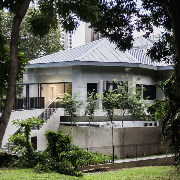
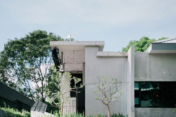
While located in close proximity to one of the most bustling shopping districts in Singapore – Orchard Road – Lloyd’s Inn’s hidden location is a testament to the hotel’s pledge to stay in tune with nature and allow its visitors to completely unwind and disconnect from the outside world. “The owners felt that more could be done to the hotel, given the fantastic site (right smack in town but surrounded by gardens),” FARM discloses. “They basically wanted people to look at it again. They also wanted something simple but exciting and wanted to take advantage of the surrounding site.”
Recognising the hotel’s commitment to being a sanctuary to the weary traveller, FARM’s branding approach reflects this pledge in the minimalist design of the hotel’s new logo, collaterals and website that, in turn, tie in together with the new stripped down interior of the hotel. As a result, all parts of the physical and digital design elements work together to create a cohesive look to reveal the hotel in a new light.
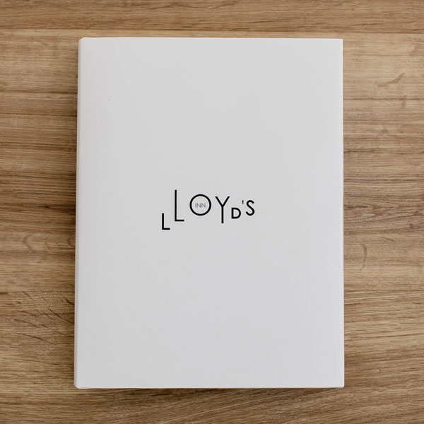
While the previously conventional logo of Lloyd’s Inn did not disclose anything about the hotel’s mission, the new memorable and playful logo design immediately creates a strong statement about Lloyd’s Inn as a brand. The mischievous letters of the alphabet vary in size and alignment, attesting to the hotel’s recognition of the individuality of every traveller staying on its premises. “We just continued pushing how the treatment of the typography could work where it needs to be applied, and tried to have some fun with it at every new opportunity.”

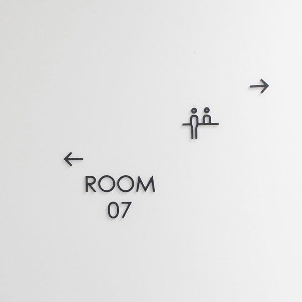
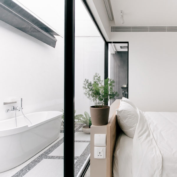
The playfulness and light-heartedness of the brand carries over into the interiors of the hotel’s otherwise minimalistic room décor. Room names, like Big Sky Room, Patio Room and Business Loft, reflect the individualistic attitude that is integral to the hotel’s mantra. Against the base unifying elements of raw wall and floor finishes, unexpected nooks and openings provide sights of nature, washes of light and glimpses of the sky that make every room different from one another.
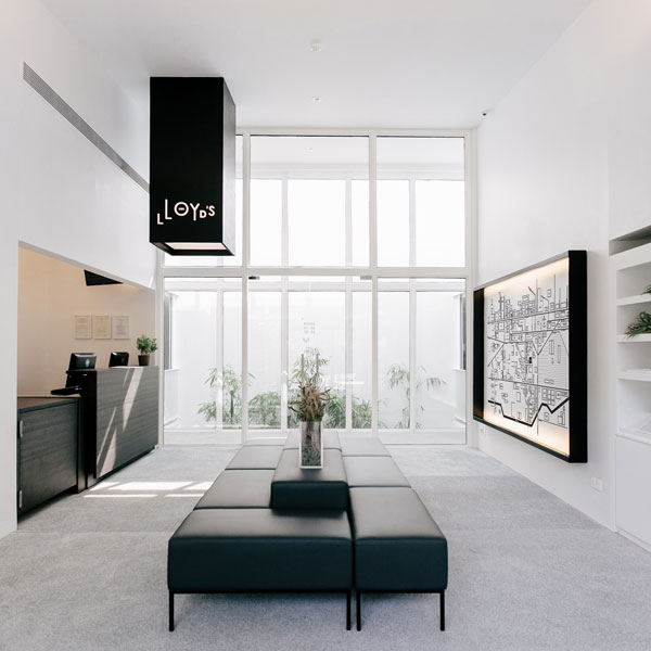
FARM’s team of designers readily admits that the final holistic branding approach was made possible through many discussions over what would and would not work for different elements, spaces and functions within Lloyd’s Inn. “The brand design was applied a lot more strictly to collaterals compared to the spatial design where nature and materials have greater effect. But as the brand is applied on spatial elements like signages and in the lobby, it gets a bit more fun. For example, we developed a neighbourhood map introducing places around the hotel as part of the experience and this was made into something more interactive in the lobby.”

“It was very challenging but the opportunity was also there to create something really special. We were looking both inside out and outside in at the same time. Not very typical in a hotel design, where it’s usually one or the other.”
FARM
farm.sg
Look out for the project feature on Lloyd’s Inn in issue #71 (Dec 14/Jan 15) of Cubes Indesign.
INDESIGN is on instagram
Follow @indesignlive
A searchable and comprehensive guide for specifying leading products and their suppliers
Keep up to date with the latest and greatest from our industry BFF's!
The internet never sleeps! Here's the stuff you might have missed