The home of architecture and design in the Asia-Pacific
Get the latest design news direct to your inbox!
Get the latest design news direct to your inbox!
If engaged at the beginning of a business’ lifecycle, designers can become so much more than the vessels of a new brand. In the case of Escala Sydney, Molecule has had the opportunity to define it.


So often, design is synonymous with surface-level spruiking; a pretty shell lending a cotton touch to the harder stuff of business. But on the rare occasion that designers are engaged at the beginning of a business’ lifecycle, designers have the chance to become so much more than a footnote. Brought on early enough, they can come to define the tone of a business.
This is what happened when Escala, a relatively new wealth management firm, commissioned Melbourne-based design practice Molecule to build its first office. This original, character-shaping build in Melbourne was so impactful that clients came to associate Escala’s services with its physical manifestation.
So, when it came time to build a second headquarters in Sydney, Escala again engaged Molecule with a concise brief of: “Make it like Melbourne”. Obviously, it wasn’t that simple from a design perspective.
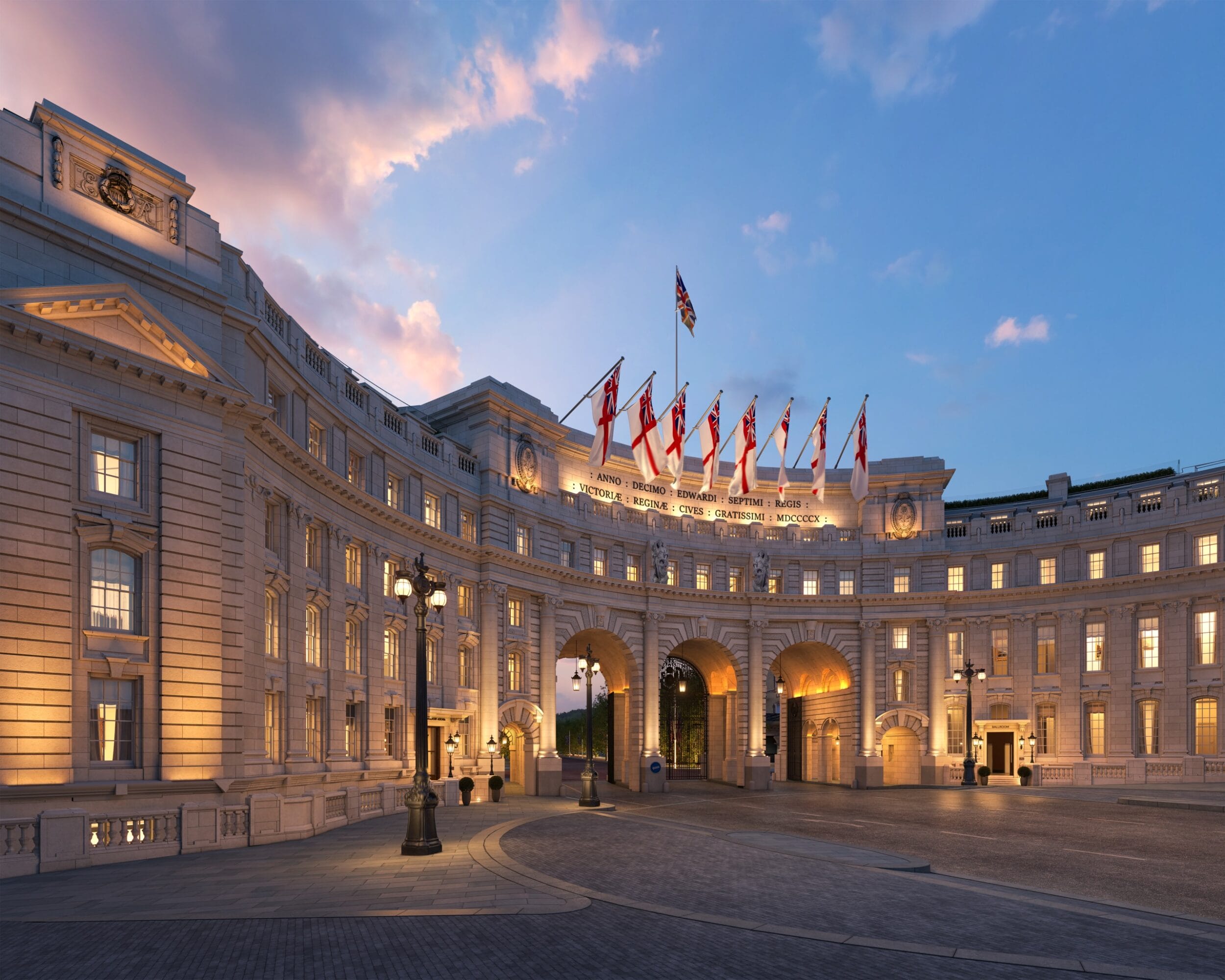
The new office space needed to accommodate 30 workers and fit into the existing building shell – a stone-and-steel monolith called Grosvenor Macquarie Tower that sits in the heart of Sydney’s centre of commerce. There was also the tiny issue of context, which few good designers are wont to overlook.
With Sydney’s harbour colours and towering thickets of sandstone in such close proximity, it would be counterproductive to adhere entirely to Melbourne’s inward-looking vernacular.
“As designers, we see the Sydney context in a particular way. The water and those heritage buildings right throughout the CBD – those colours and textures were [elements] that we wanted to
introduce,” explains Molecule director Anja de Spa, who played a fundamental role in shaping both the Sydney and Melbourne projects.
“The Melbourne office space has been quite instrumental in the application of the Escala brand. It appears throughout their website and collateral documents, and there was this very clear instruction from the company CEO that he wanted the [Sydney] space to be exactly the same.
“What we were interested in exploring was how we could really maintain that carefully executed atmosphere in a new city, so that the two spaces felt like close siblings without feeling like a direct replication of one another.”
Before de Spa and team began work on the conceptual stage of the design process, they thought carefully about the spatial planning of the new office, and how thematic elements from Melbourne could best be reapplied in this context. One of the concepts that was picked up from the original build was what de Spa calls the “three-zone approach” to layout – the division of the floor plan into “black, white and grey functions”.
With the company’s intensive focus on client comfort, the immediate impression one has walking into Escala’s Sydney offices is of not three but two zones: the club-like reception area (“grey function”) and the cultivated string of meeting rooms (“black function”). The third, “white” area – a relatively stock standard open-plan workspace – is cleverly tucked away behind the reception wall, letting the more public-facing areas affect clients with an instant sense of composed hospitality.
As with most commercial spaces, the reception area bears the brunt of responsibility for making a good first impression. In the case of Escala, this impression is of a silence so thick and warm as to almost have a plush quality to it. The idea that Molecule developed for this space was of “a reinterpreted club” that spliced old-fashioned opulence with leaner, more energetic insertions.
“We were looking at taking a heritage interior motif and twisting it – like taking wainscot panelling and coffered ceilings and kind of stripping them back,” explains de Spa. “Those motifs are present a lot throughout heritage interiors but are often employed by contemporary designers to employ a sense of presence.
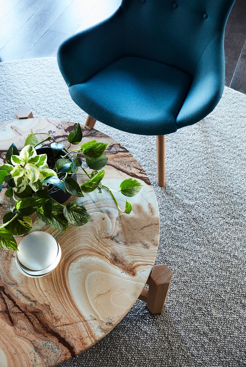
Rather than insert a contemporary office building, we were looking to reimagine that as an atmosphere within that location. That came about as a high-gloss paint detail; a very tightly considered finishes palette of timber, tan leather and Palomino marble; and [a loose assemblage of] furniture in soft, caramel-coloured leather.”
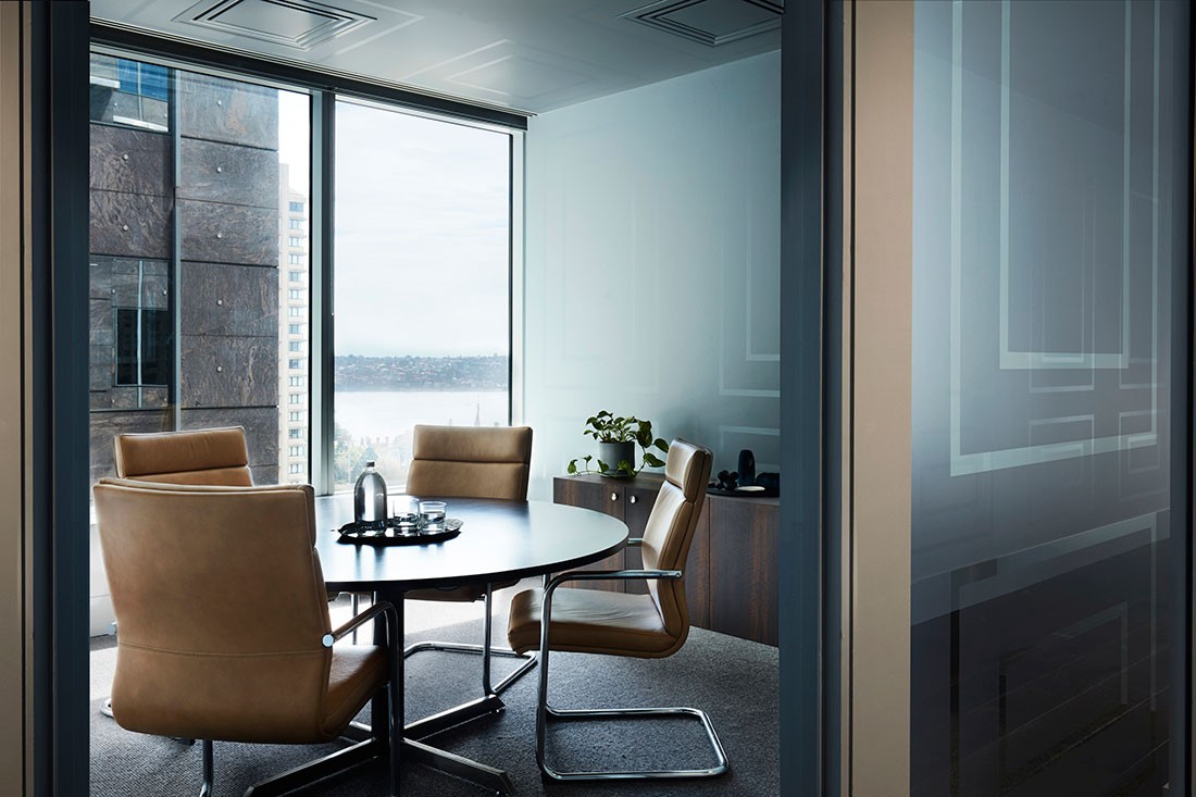
The meeting rooms — where clients will ultimately spend most of their time — were cleverly planned around the floor’s periphery, to capitalise on views over the harbour. In this way, it was easy to absorb context into the “black area” design.
The “grey area” proved more difficult. With its established and vaguely aristocratic clubhouse tone, local colour had to be inserted in more subtle ways, such as through the art-filled light boxes that sit along the entry wall.
Common to both the Sydney and Melbourne offices, these decorative fixtures were specially commissioned by Molecule, who asked photographer-slash-artist Katie Carmichael to develop subject matter as a direct response to the respective contexts. Whereas the Melbourne entrance is framed with a “moody cloudscape”, Sydney clients are greeted with a series of choppy sea portraits.
As much as the third and final of these zones is overlooked upon immediate entry, Molecule did not want to hide the workers away entirely. In fact, the idea of transparency was lent particular gravity within this project — a matter of design reflecting disposition.
“We were interested in breaking down what could be quite a fixed barrier between the clients and the staff – especially in wealth management firms,” says de Spa. “The treatment of the workspace is quite utilitarian, in contrast to the more finely detailed client areas. We made the area along the border of these zones a communal café area, where more informal conversations can happen both between Escala and the clients, and just within the Escala team.”
The balance between these dual needs of contained comfort and openness was struck with a series of timber panels that pivot open from the reception wall. Once open, visitors to Escala are able to see the 30-odd staff members that are hosting them.
In an era that is moving away from the creation of spaces with defined usages, Escala is an office where every detail is secure in its purpose and identity. And yet, Escala is far from being formulaic. While the Sydney office fits comfortably within the prescribed brief and fixed building envelope, the youngest sibling finds its own identity somewhere between same-same and different.
This article originally appeared in our current issue of Indesign magazine: The ‘Information Age’. Take a deep dive into our workplace design archives.
–
Always be inspired. Sign up for our newsletter.
INDESIGN is on instagram
Follow @indesignlive
A searchable and comprehensive guide for specifying leading products and their suppliers
Keep up to date with the latest and greatest from our industry BFF's!
The internet never sleeps! Here's the stuff you might have missed