The home of architecture and design in the Asia-Pacific
Get the latest design news direct to your inbox!
Get the latest design news direct to your inbox!
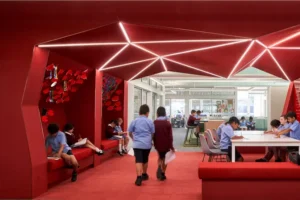
Blooms the Chemist by Tom Mark Henry defies the traditional pharmacy aesthetic by stepping away from the sterile landscapes of pharmacies.

January 10th, 2025
In a world where the way we approach general practices or tedious errands is being reconsidered through thoughtful, design-led interventions, the sterile landscapes of clinics, dental practices and pharmacies are evolving. The notion of comfort and sensory engagement is slowly, but surely, replacing that cold, clinical feel long associated with healthcare spaces. Blooms The Chemist, conceived by Tom Mark Henry, stands at the forefront of this shift, alchemising the monotonous design of chemists seen perpetually on most main streets of any suburb — reevaluating what a pharmacy can be. “The concept draws on the notions of vitality and wellness, rather than the standard pharmaceutical idea of treating sickness,” says Cushla McFadden, Director of Tom Mark Henry, emerging as a precedent for reimagining healthcare interiors, challenging perceptions and setting a convivial standard for pharmacies.

With a palette rooted in natural textures and minimalist forms, Blooms the Chemist defies the traditional pharmacy aesthetic by stepping away from a barren colour palette that may emit fear or evoke a negatively connotated feeling within visitors. “Early design goals included embracing the notions of wellness architecture, combining natural textures and organic forms. We aimed to balance a warm and sensory retail experience with ensuring the product was sufficiently highlighted,” shares McFadden. Gone are the fluorescent lights and stark white walls. Instead, this space offers a sense of fluidity and warmth. Timber tones, softly diffused lighting and drapery invite visitors to linger and experience the space with ease. The design references early apothecaries, weaving in a touch of nostalgia while maintaining a contemporary edge. A balance that rightfully captures the essence of the Bloom brand — rooted in their commitment to quality healthcare, community and environmental consciousness.
Subtle splashes of colour juxtapose glass, acrylic and stainless-steel features, that differ from the contrasting material palette and idiosyncratic cobalt blue elements that lacquer the signage and walls at traditional chemists. Respectively, each element in the space, from curved shelving to modular displays, has been crafted with aesthetic appeal and functional simplicity in mind. “We curved the bulkheads to create depth and visual interest to the ceiling, in what was otherwise a fairly typical retail ceiling,” McFadden explains. “Drapery not only softens the space but has the practical element of providing privacy to the consultation area. Blooms were very happy to go beyond their standard retail environment, by incorporating these elements to ensure a more elevated offering for this development.”
Discover more: It’s all about the ambience at Superfreak by YSG

McFadden continues: “Spatial planning was a delicate balance of maximising retail display and maintaining a fluid and comfortable flow of traffic from the entry, to the prescriptions in and out and point of sale. Pharmacies are busy spaces that meet the different needs of their customers, which often have to be accommodated at once. One strategy we employed to aid with this was ensuring sight lines to all key areas were visible at any point throughout the customer journey.”
The interplay of light and transparency improves visual connectivity from the street frontage, given the corner location of the site. “It was important to consider how both the shopfront and the western elevation was received by external customers, providing a focal point by drawing the eye to certain areas, while transparency highlights featured displays, effectively guiding customer attention throughout the space,” McFadden concludes.
Tom Mark Henry
tommarkhenry.studio


Next up: A windswept house filled with art
INDESIGN is on instagram
Follow @indesignlive
A searchable and comprehensive guide for specifying leading products and their suppliers
Keep up to date with the latest and greatest from our industry BFF's!
The internet never sleeps! Here's the stuff you might have missed