The ‘Geo’ table can be customised to a range of sizes and with over half a dozen materials, making it a versatile addition to any domestic interior.
May 13th, 2014
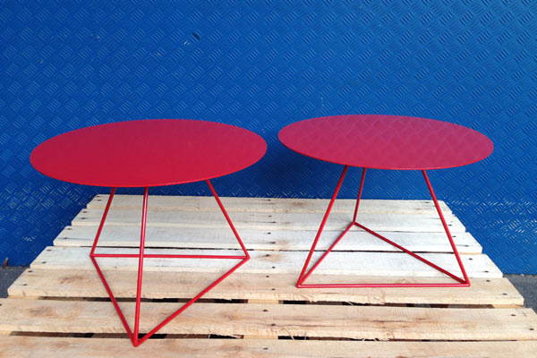
The ‘Geo’ table from Catapult Design with Cath Ertler is a picture of versatile style. Whether it sports slick powdercoated coloured lines, luscious honed marble, or the warmth of Tasmanian Oak, the ‘Geo’ is a perfect addition to any room in the house.
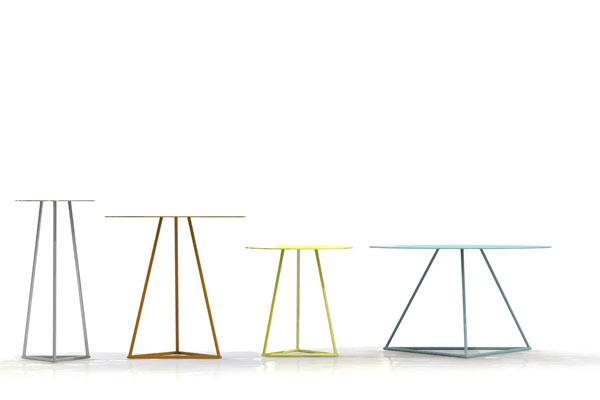
The options are too numerous to list—each table can feature custom tops in over half a dozen different materials, they range from 250mm to 1200mm in diameter and 350mm to 750mm high as standard, and can be zinc electroplated for outdoor use. Plus, they’re Australian designed and manufactured, and, depending on the finish, can be extremely cost effective.
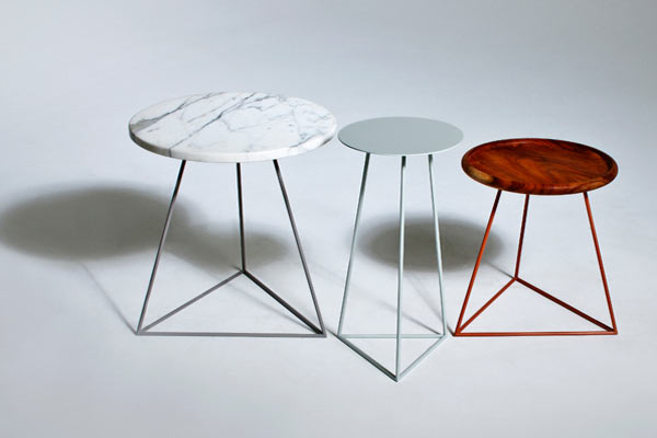
Their distinctive base is almost cheeky, and provides a counterpoint to the circular top, drawing out the geometry for a distinctive profile. ‘Geo’ is customisable in every way, and continues to support the Australian design and manufacturing industry.
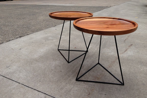
‘Geo’ tables are available exclusively from Catapult Design.
Catapult Design
catapultdesign.net.au
INDESIGN is on instagram
Follow @indesignlive
A searchable and comprehensive guide for specifying leading products and their suppliers
Keep up to date with the latest and greatest from our industry BFF's!
The Geelong College’s Sport and Wellbeing Centre ‘Belerren’ designed by Wardle is designed around bringing in natural light. But Shade Factor’s job was to help modulate and precisely control it for the most important competitive moments.
As Woven Image celebrates 40 years, it introduces a new collection developed in collaboration with Australian artist Ben Goss, inspired by his original artwork Where the Kookaburra Sits into a vibrant collection of digitally printed EchoPanel® murals and patterns.
When Italian furniture maker, Pedrali partnered with design studio, Formafantasma, the collaboration was always going to result in something both elevated and imbued with impeccable detail and flair.
Aeron Chair’s new shades, Nightfall and Jasper, arrive with a sense of quiet cohesion – no bells and whistles, no loud technicolour; just two timeless, perfectly versatile near-neutrals. But the new hues aren’t just about colour – and their significance is much more profound than their surface-level subtlety might suggest.
At dedece Sydney, Anna Lenti introduced the Chromatic Alphabet, a new design tool intended to make architects and designers less hesitant about working with colour.
Tamara Veltre, director at Breathe, reflects on the studio’s collaboration with Haymes Paint — a deliberately reduced, architect-designed palette that reframes colour as part of architecture, not an afterthought.
The internet never sleeps! Here's the stuff you might have missed

In the very heart of Sydney’s CBD, 1 Elizabeth is a vast civic-scale project that integrates workplace design, transport infrastructure, event spaces, and hospitality around some dramatic void spaces.
Ahead of Saturday Indesign, architects reflect on why smaller gatherings, unexpected voices, candid discussion and meaningful follow-up can make meeting in person genuinely worthwhile.