The home of architecture and design in the Asia-Pacific
Get the latest design news direct to your inbox!

Get the latest design news direct to your inbox!
Woven Image introduces their new range of EchoPanel® Prints.
August 14th, 2009
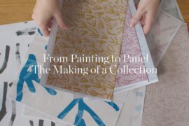
EchoPanel® from Woven image offers the ideal base for printing, using the latest inkjet, digital or screen-printing technology.
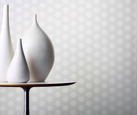
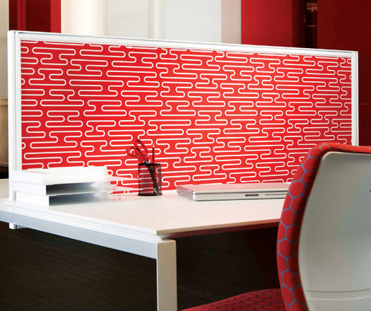
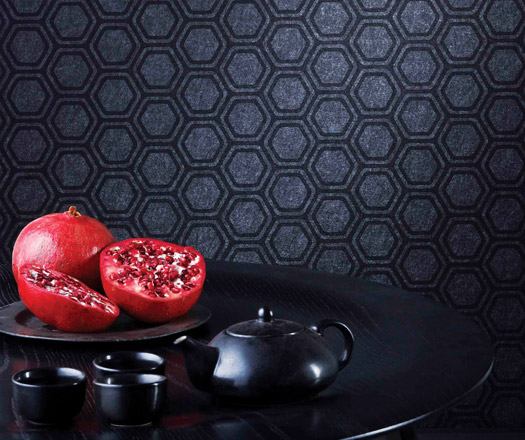
Consisting of four contemporary designs, overlayed onto a range of EchoPanel® colours the Woven Image EchoPanel® Print Story is ideal for a wall-covering and panel applications.
EchoPanel® also offers amazing benefits in acoustics, weight and flexibility, making it the perfect solution for almost any application.
With Green Environmental Choice Australia (GECA) certification, EchoPanel® is produced from 60% post-consumer recycled PET. The product is supported by the Woven Image product stewardship program – which takes into account the full life cycle from material use to end-of-life.
Woven Image have recently added to the EchoPanel® Frequency product with the new, fresh and tactile EchoPanel® Hex, Puzzle and Ripple prints. Sensitively complementing the classic EchoPanel® range or stunning as a standalone finish, the new Print Story offers designers an endless array of smart material possibilities.
INDESIGN is on instagram
Follow @indesignlive
A searchable and comprehensive guide for specifying leading products and their suppliers
Keep up to date with the latest and greatest from our industry BFF's!
The internet never sleeps! Here's the stuff you might have missed