Establishing a project narrative is a pivotal first step on any design project. The narrative is a framework that becomes the ‘north point’. It’s a story that guides design decision-making and, importantly, aligns all stakeholders with a vision everyone can champion. After all, who doesn’t love a good story?
The project narrative sits alongside the contextual considerations that underpin all design briefs. Think of the narrative as an opening paragraph. It sets the scene for the story to unfold and build depth through the layering of form and spatial qualities; materials, texture and colour; interior design and details; and landscaping.
A narrative can be the story of a place. It can be an approach, an object, an image or a symbol. There’s no one way to do it and no formula. The important thing is to leave technical jargon at the door and use storytelling as a powerful tool to decode design thinking and unite everyone involved around a central idea.
Here are three examples of Buchan projects that demonstrate how co-created narratives can benefit design teams, consultants and clients alike.

Indigeneity today – Australia Pavilion, Expo 2025 Osaka
The Australia Pavilion for Expo 2025 in Osaka had an exciting brief – an overarching theme of ‘chasing the sun,’ a focus on sustainability and the desire to connect the 28 million projected Expo visitors with First Nations perspectives, experiences and interests.
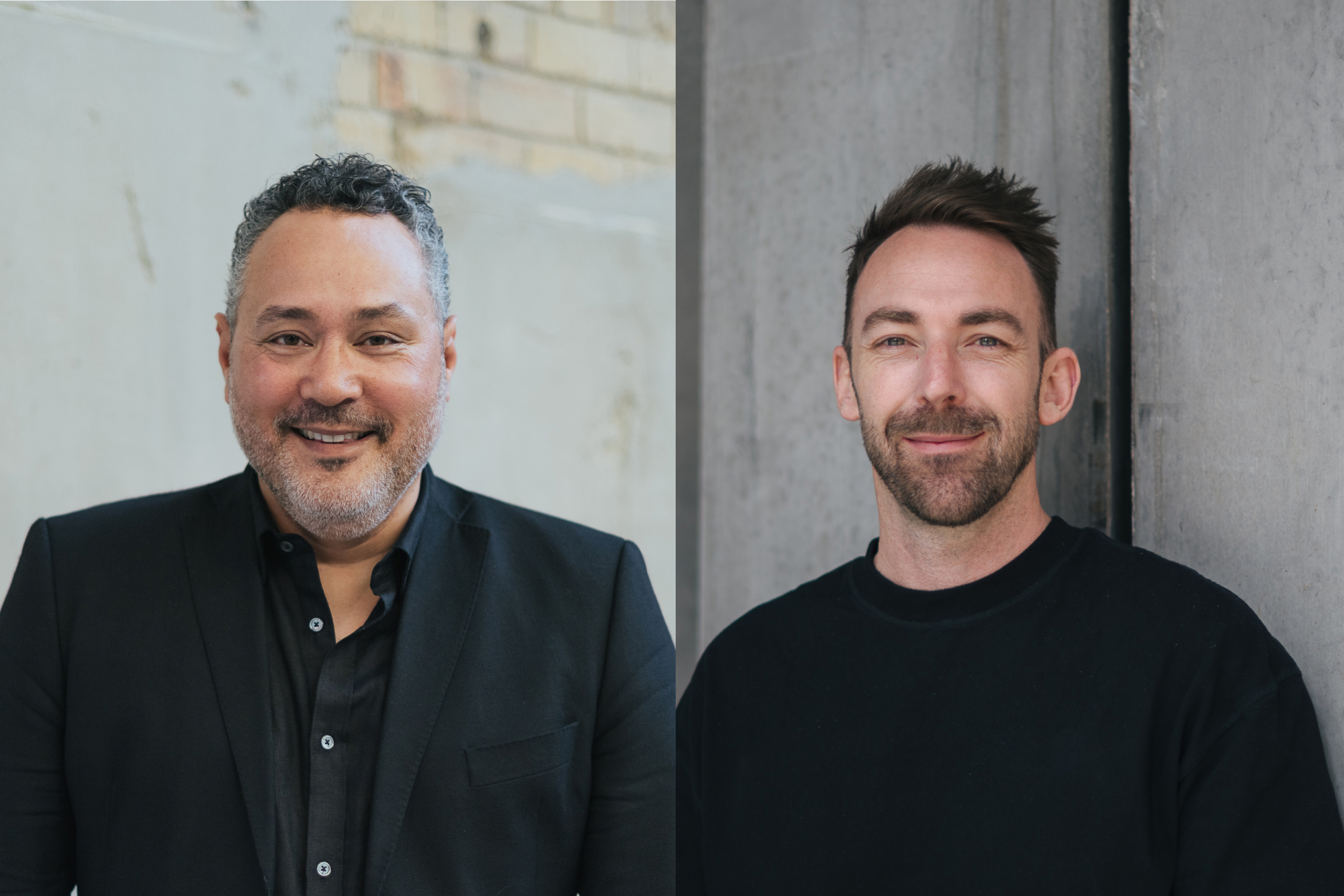
Our team developed the initial narrative with client DFAT. It was further shaped through early engagement with Barbara Bynder and Farley Garlett of Indigenous cultural advisor Karrda.
Barbara commented: “Here we are in this modern world. We still acknowledge our past yet we have this beautiful modern culture and I think that’s what I wanted to represent in the building. I wanted it to be the representation of Indigeneity today.”
The central idea had to represent commonality across all the nation’s peoples and cultures, old and new, acknowledging that not all stories are ours to tell. Our workshops identified the eucalypt tree as something ubiquitous across Australia. The gumnuts’ diverse shapes, forms and colours symbolise the diversity and resilience of the Australian people. The desire to celebrate Australia’s vibrant colours was encapsulated in an image of a pink flower bursting out of a gumnut, and this image became a narrative foundation and the cue for the Pavilion’s design concept as an outer shell bursting with life.
Inside the pavilion, the exhibition design was conceived as a bushwalk that would capture the experience of walking through Country, which Barbara described as ‘a feeling’. The exhibition will be an immersive, sensory journey that ‘chases the sun’ across Country – land, sky and water – based on the structure that songlines take and how they travel across Country in a flow connecting places.
Barbara and Farley’s creativity and deep knowledge helped the team evolve the Australia Pavilion’s narrative into something far more meaningful and valuable than where it began. Notably, the connection between caring for Country and sustainability added a fertile layer of learning we are carrying forward and sharing with the world.
‘This is not a library’ – Biyal-a Armstrong Creek Library and community hub
Armstrong Creek in Greater Geelong is a new, masterplanned community in one of Victoria’s fastest-growing regions. Its first landmark structure is the Biyal-a Armstrong Creek Library and community hub, an eye-catching three-storey facility housing books, resources and multipurpose spaces.
The design process started with an interactive, informal workshop with the council. A phrase that emerged was ‘this is not a library’, a simple idea that helped everyone focus on what the building was to do. More than a traditional library, it had to be a nourishing place for people of all ages to meet, learn and come together to create a shared future.
The architecture and interiors teams worked closely with the Indigenous and wider communities. The waterways of the Wadawurrung people have been a natural meeting point for centuries. They are rich in cultural and spiritual significance, and this evolved into a narrative theme of ‘living water’.


The ‘living water’ theme is expressed in a building that uses organic shapes and is embedded with cultural heritage and connection to nature. Expressive circular windows punctuate the facade and frame views of nature from within. A circular opening in the cantilevered roof above the entry connects with the sky.
The interiors evoke the rich landscape of Wadawurrung Country through colour, materials, greenery, and a floor pattern that mimics a creek winding through the building.
The completed project has faithfully captured the original design intent thanks to all stakeholders understanding and embracing the ‘living water’ narrative from the outset, streamlining the approvals process to the benefit of everyone involved.


The spaces in between – Melbourne Walk
Melbourne Walk is the first new development in Bourke Street Mall for over 50 years. It knits together several buildings on a large inner city site that will house a retail podium alongside InterContinental Hotel Group (IHG)’s first Australian dual-branded hotel, a Holiday Inn and Hotel Indigo.
Planning respects the site’s heritage, retaining individual buildings behind four restored heritage facades. A new arcade will connect Bourke Street to Little Collins in a modern take on the grand tradition of the neighbouring Royal and Block Arcades. A new covered East-West crosslane further increases urban permeability and will allow natural light to penetrate deep into the site.

Storytelling looked to the horizontal and vertical spaces that connect the multiple buildings. Our narrative developed around these ‘spaces in between,’ acknowledging negative space to be as important as the buildings and their functions, maintaining the site’s identity as a ‘collection of buildings’.
This framework allowed us to define the spatial qualities, noting the Hotel Indigo’s focus on creating bespoke, local experiences. The site’s rich social history, with quirky, historic figures such as E.W. Cole, Sidney Myer and James Hosie, informed the next design layer. Historical references embedded in the hotel design flow to the arcade, which merges retail glamour with the gritty laneway culture of contemporary Melbourne.

Creating a story that uses public space and heritage to connect a complex group of co-located buildings and stakeholder groups will deliver a memorable, urban destination with a strong identity that can evolve with time. These examples highlight the value of all stakeholders uniting to develop a strong narrative. Establishing a clear reference point creates confidence across the project journey and gives everyone a shared sense of pride. Delivery is made easier, and when ribbons are cut, success is amplified. That is a real win.
Buchan
buchan.au
Photography
Buchan, Tom Roe, Jes Lindsay