The home of architecture and design in the Asia-Pacific
Get the latest design news direct to your inbox!
Get the latest design news direct to your inbox!
From the Dulux Colour Awards 2021 finalists, these 7 projects each delivers a lesson in how colour can enhance learning environments – for all ages.

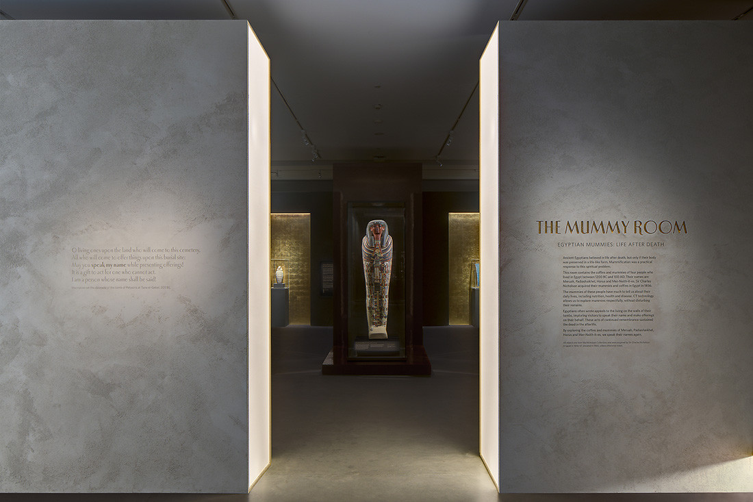
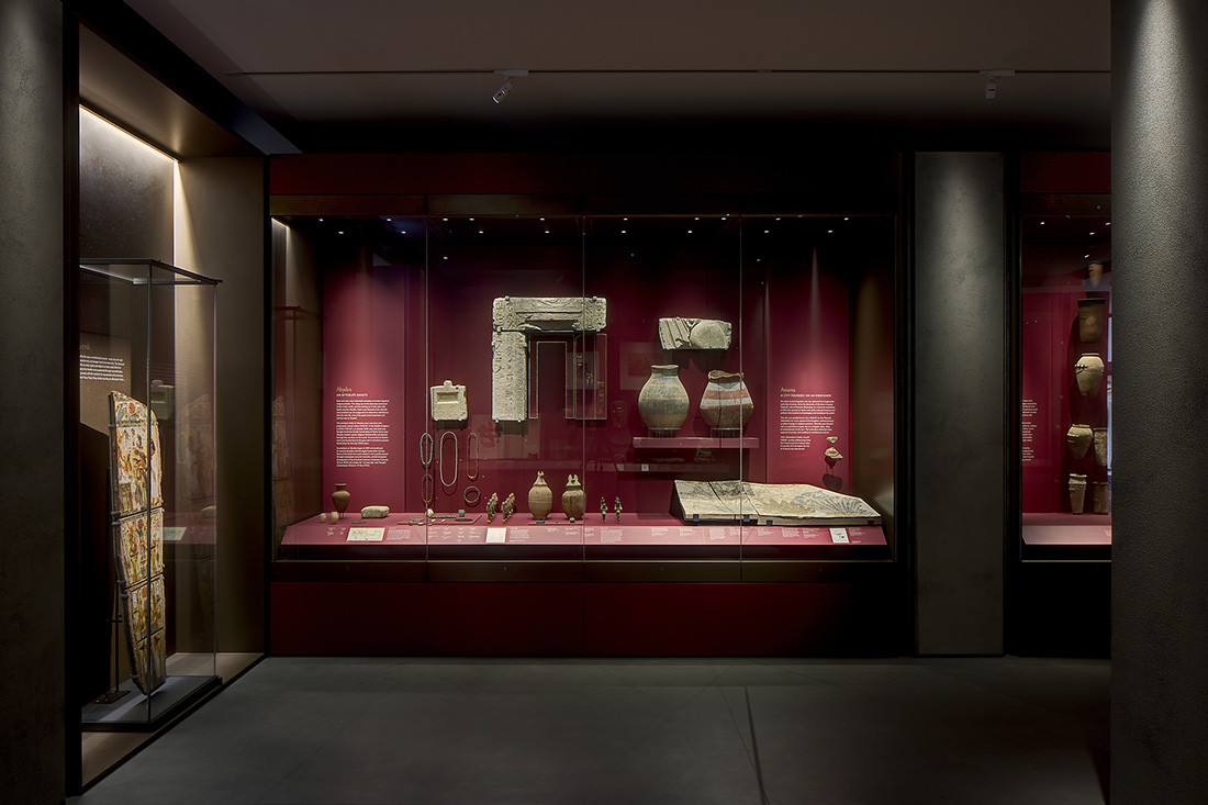
The Nicholson Galleries are the new home for the University of Sydney’s collection of Egyptian, Greek and Roman antiquities within the new Chau Chak Wing Museum. The exhibition spaces introduce atmospheric elements of the ancient world to the public through techniques of light, colour, volume and texture.
Taking inspiration from ancient architecture and construction methods as well as contemporary art and scenography, the Nicholson Galleries establish an immersive and emotive approach to the museum experience, in which massive walls are bisected by light, ethereal visions float in and out of existence behind mirrors, and rough textured walls are punctured by rich gold niches.


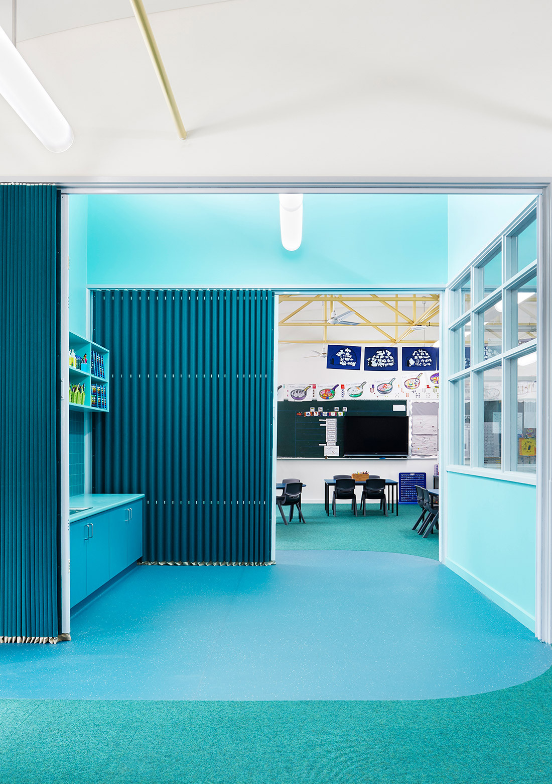
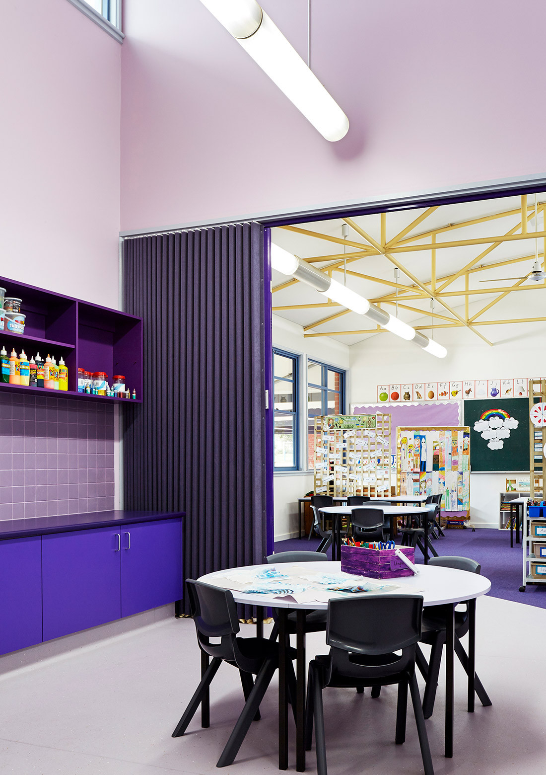
The Surfside Primary School project is a major refurbishment, calling for updated learning spaces that instate flexibility and accommodate collaborative learning opportunities in keeping with pedagogical aspirations.
The traditional hierarchies of a formal classroom are inverted and re-interpreted by the creation of new central shared spaces. Internally, a variety of new spaces support a range of diverse social interactions. Informal social interactions are encouraged throughout the corridor zones, where new ‘social zones’ are demarcated using colour on the floor and walls. Colour creates a sense of place to slow down and socialise with others. Not only does it serve to stimulate and visually appeal but the durability and resilience of the products aid in the school’s functionality. The colours act as a way finding device through the building allowing for more intuitive use and easier navigation.

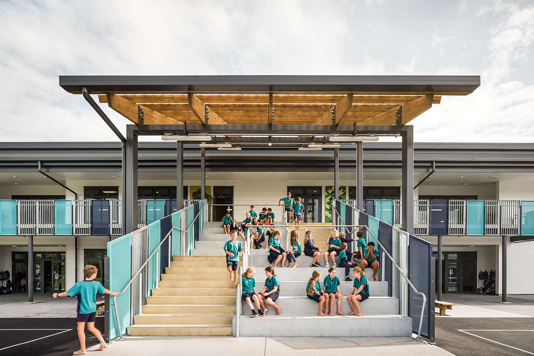
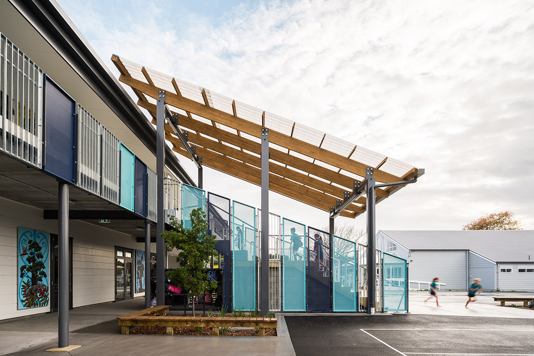
Prior to Warkworth Primary School’s new redevelopment, the school lacked colour and presence to the street. By adding familiar colours to the buildings, both students and the community can associate with the new buildings, fostering a sense of belonging and place.
The palette takes inspiration from the school’s logo, which comprises three core colours: blue, turquoise, and yellow. Blue and turquoise represent the nearby Mahurangi River and coastline, and yellow represents New Zealand’s native kowhai flower (Warkworth is located on the Kowhai Coast). The blue, turquoise, and yellow colours have been brought through on the school’s external balustrade infill panels, glazing, and bleacher seating. These colours are also utilised internally for wayfinding purposes.


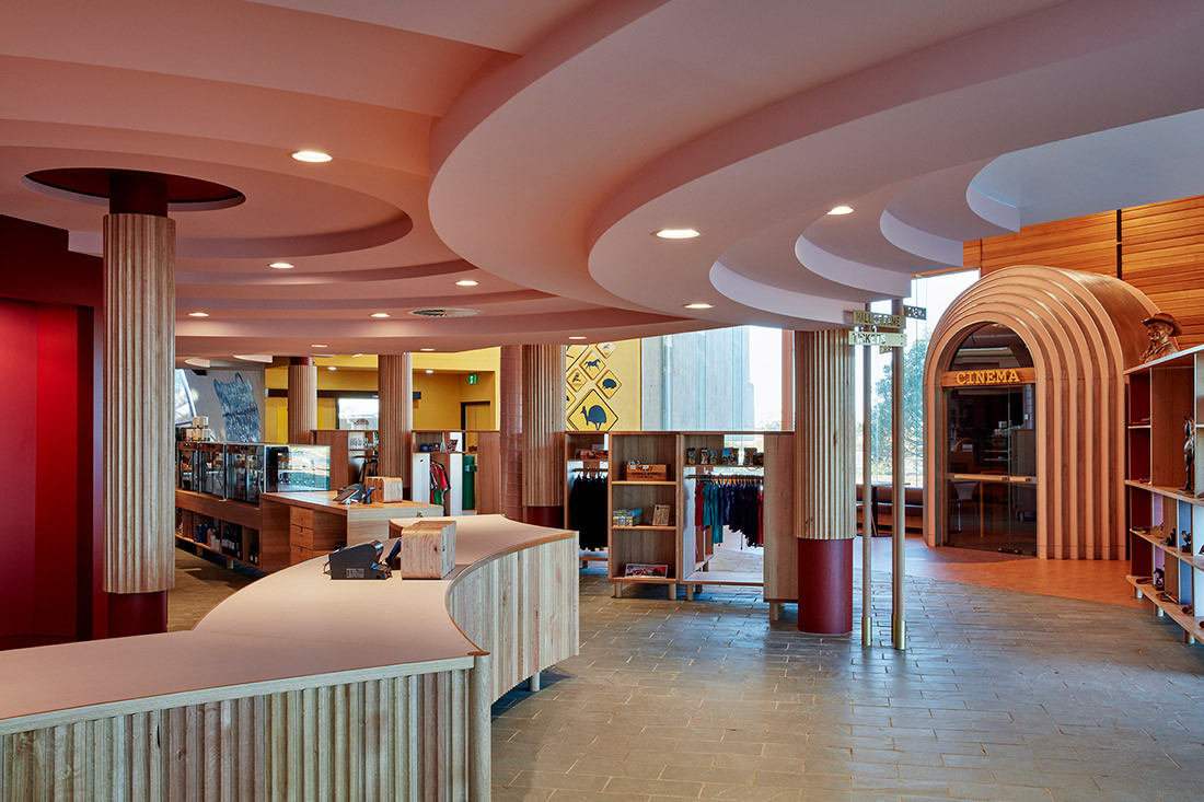
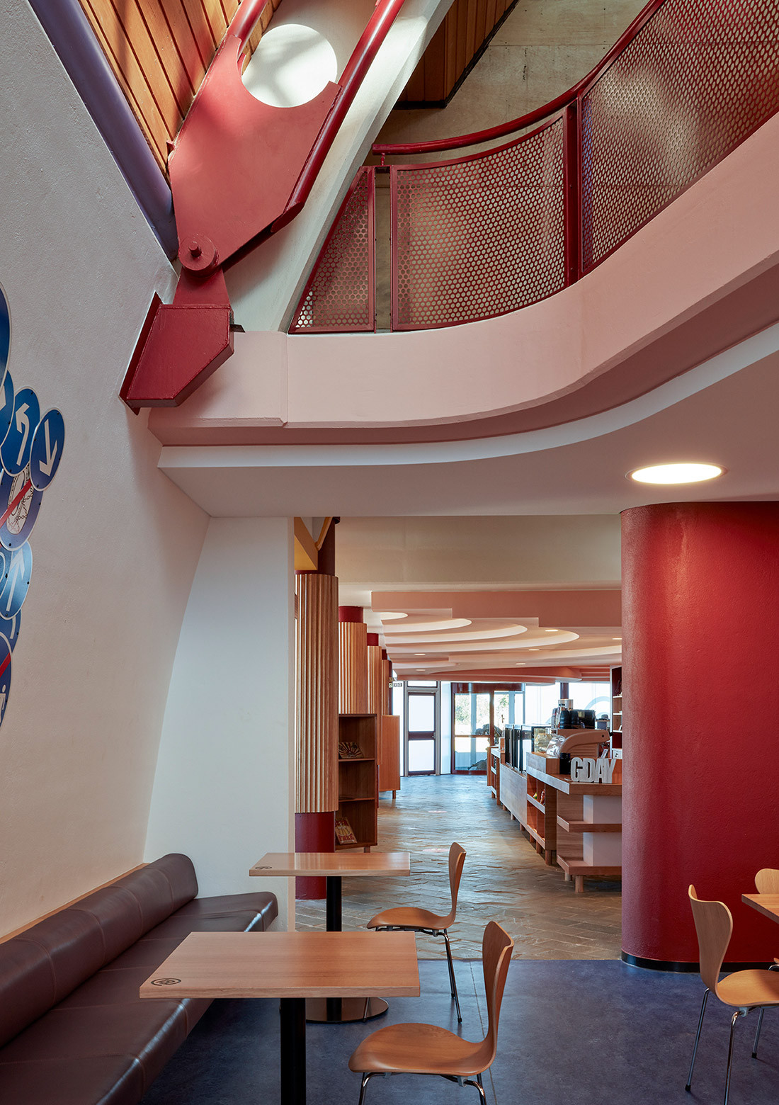
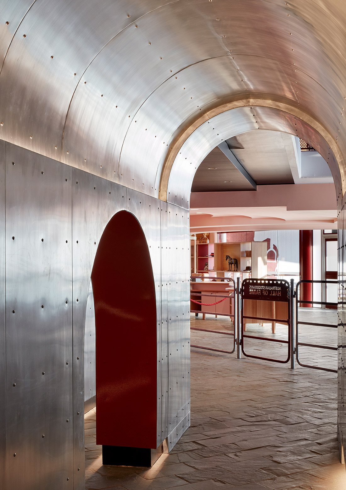
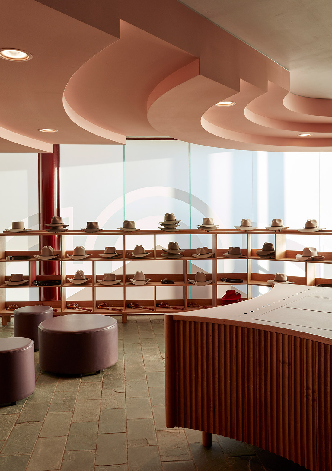
The notion of a Stockman’s Hall of Fame was very different in 1988. The voices of Indigenous peoples and women were less evident, retail offerings were minimal, technology was in its infancy, exhibits were static and servicing arrangements rudimentary. This revitalisation project addresses these issues with the architects designing the public areas and setting the spatial rules for exhibition and circulation to respect the existing architecture. Colour sits at the heart of this work.
The new palette takes its cues from this work to create spatial conditions suitable to the orientation of rooms reopened to the landscape. Blue rooms, sunrise yellows, and a range of hues (both as paint colours, stains and natural finishes e.g. zinc and brass) take the projects materials through the full range of Outback sunrise and sunset experiences. Whilst ‘night’ is used for experiential interiorised spaces.
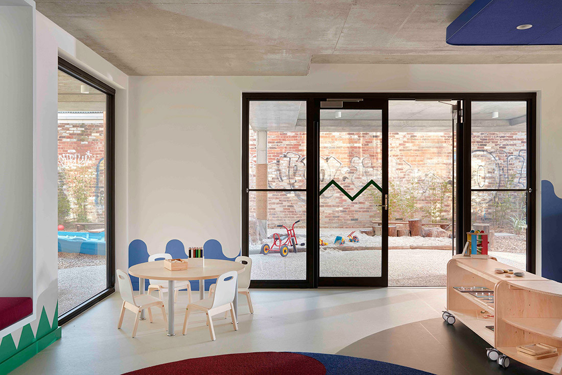
An exemplary childcare centre development incorporating abundant landscaped grounds and quality play spaces for children as well as a great working environment for educators and administrative staff.
Materials and finishes are playful and robust, without resorting to gaudy or childish references. All children and adult spaces remain sophisticated and calm. The functional brief was interrogated and tested throughout the design process resulting in rigorous planning solutions – such as the layout of the children’s dining space which allows for direct access to a veggie patch and chicken coup. Interaction with the kitchen also encourage opportunities for carers to educate them about cooking and healthy eating.
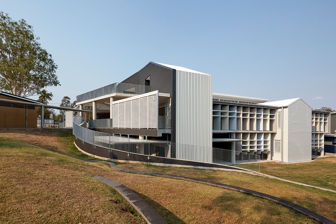
The School requested an engaging building that would reflect the local residential context. The design draws inspiration from the many ‘Queenslander’ houses in the area, integrating domestic elements of this style with the institutional scale, and softening the transition from home to school life. Primary shapes feature heavily throughout to further enhance the link with early learning.
Sun blades arch at their base as though subtracted by scissors which references arched detailing common to ‘Queenslander’ screening. The blades take on a pastel hue – a softness that breaks the stark whites and charcoals used elsewhere for depth and directional changes – with the five shades selected representative of colours prevalent throughout the local neighbourhood.


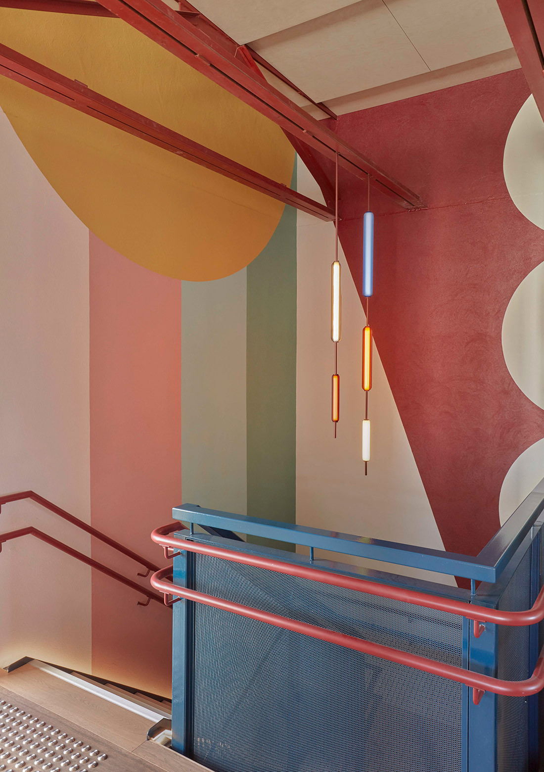
“I regularly use colour in my interiors work but it is not often I have the opportunity to be as bold with colour specification,” says designer, Danielle Brustman. “This project was an ideal environment to treat each wall, bench surface and material with a range of colour blends of varying hue and material.”
Defying the “crude and institutional” use of colours and materials that often lets learning spaces down, it was important that playrooms had their own character and feel and the flow between the spaces was cohesive. The resultant scheme includes graphic wall murals—all hand-painted by Ben Maitland (a.k.a. Box Car Benny)—designed in relation to the themes and made up of block shapes that created boats, star bursts, clouds, rainbows, waves and trees.

See more of the Dulux Colour Awards 2021 finalists here.
INDESIGN is on instagram
Follow @indesignlive
A searchable and comprehensive guide for specifying leading products and their suppliers
Keep up to date with the latest and greatest from our industry BFF's!
The internet never sleeps! Here's the stuff you might have missed