The home of architecture and design in the Asia-Pacific
Get the latest design news direct to your inbox!
Get the latest design news direct to your inbox!
Aesop’s Gough Street store pays tribute to Hong Kong’s vertical urban character, as well as the store’s original printing press bones and the humble but effervescent glass brick.

Aesop’s hair and skincare products, which the brand formulates using scientifically-proven botanical ingredients, may come in uniform, streamlined packaging but the opposite is true for its retails stores. Designed by a diversity of architects and designers, each is highly individualistic. What binds them are unexpected and exciting material explorations and a strong sense of locality.
This strategy of creating unique retail destinations is daring but effective in the digital retail milieu. It inspires and tempts customers to linger rather than just pick and go, and heightens brand association through memorable, visceral encounters.
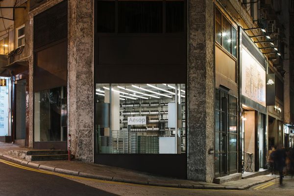
The new Gough Street outlet in Hong Kong continues in this direction. Its footprint is modest but it is texturally and spatially rich. Aesop tasked Australian architecture firm March Studio to consider the city’s hilly topography and glass-and-steel skyscrapers in the design.
“We discussed with the designer the inherent verticality and height of Hong Kong’s architectural fabric, the symbolism of stepping and climbing those streets, and how to reflect that external environment inside,” says Denise Neri, Aesop’s Retail Architectural Manager.
Hong Kong’s shopping culture is very much defined by large malls, so this store’s junction location in an area lined with restaurants and boutiques is unique. “The street corner offered an unusual opportunity to connect with the local community and interact with like-minded people,” says Neri. Two entrances – one on each face of the wedged-shape plot – enhance this interaction and allow customers to experience the varying gradients of each street.
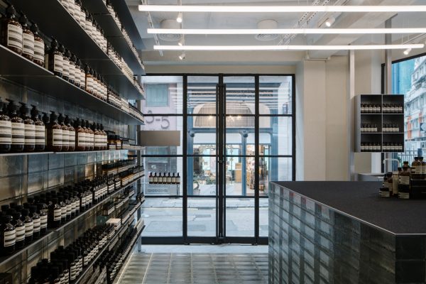
The formerly dark space – a result of the store’s traditional printing press history – was brightened with large windows and the generous use of glass bricks. Remnants of the past in the rough-textured facade, tall volume and tiled surfaces are juxtaposed with the reflectivity and glossiness of the new material. Forming a series of glass steps and terraces, these glass landforms are Hong Kong’s iconic skyscrapers in the abstract.
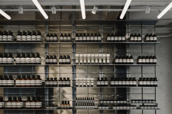
Underfoot, the layering of old and new is again encountered as the original concrete floor is observed through a glass brick floor hovering on steel legs. Akin to a museum exhibit, the stratified narratives add gravitas to the project. They are also strong visual and tactile stimuli, and a beautiful backdrop to Aesop’s minimally packaged products.
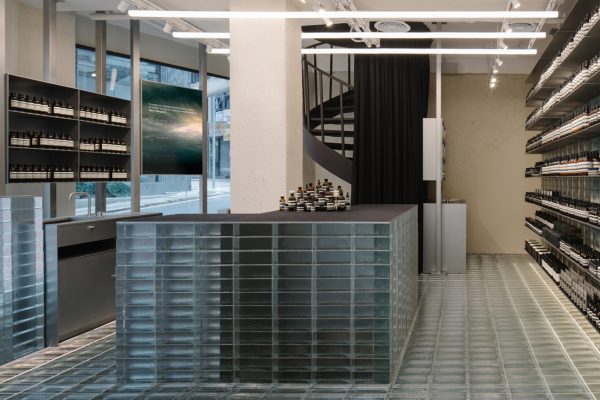
“The glass bricks – transparent by day and shimmering by night – draw the eye and intrigue the passer-by, inviting exploration,” affirms Neri. To encourage ambling, a counter has been placed in the centre with three demonstrating sinks radiating outward. Small details add to the overall experience. For instance, felt-lined counters protect customers’ handbags, and to reach the treatment room, customers sweep aside a thick curtain and walk up an existing spiral staircase in a spatial game of slow reveal.
“We aim to be locally relevant and subtle, to delight the eye and every other sense, and always contain an element of small surprise,” says Neri. For this reason, Aesop continues to work with the ever-inventive March Studio. This is the firm’s seventeenth store design for the brand.
At the same time, Aesop’s attentiveness to the customer experience evolves alongside its store designs. The Gough Street store, which incorporates a tea corner, is the city’s first dedicated sole-use building that allows the hosting of customers and events in a sophisticated and comfortable space. Customers can also return glass and plastic bottles for recycling or reuse to the store.
INDESIGN is on instagram
Follow @indesignlive
A searchable and comprehensive guide for specifying leading products and their suppliers
Keep up to date with the latest and greatest from our industry BFF's!
The internet never sleeps! Here's the stuff you might have missed