The home of architecture and design in the Asia-Pacific
Get the latest design news direct to your inbox!
Get the latest design news direct to your inbox!
Peter Sackett finds out how technological advancements and the demands of corporate branding have steadily lifted recognition of the professional disciplines involved in creating effective signage.
June 5th, 2012
Considering the sheer volume of information thrown at us daily, it comes as something of a shock to learn that there are fewer signs around – the clamorous, commercial type – than there used to be.
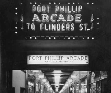
Port Phillip Arcade (1969) Image: Wolfgang Sievers. State Library of Victoria Pictures Collection
But one glance at a 1967 photograph of the façade of Melbourne’s Young & Jackson Hotel confirms it: the swarms of billboards, banners, and riotous marquees – insistent as a headache – have nearly passed. Signs are sleeker, stealthier and more potent now, packing more message into less space.
Signage, as it has come to be called, is serious, high-tech business these days, but still retains physical and emotional traditions. Diadem, a Melbourne-based sign management company situates some of the most recognisable icons on the modern Australian horizon.
When Diadem took ANZ as a client, marketing director Kelvin Taylor explains, they assumed responsibility for the physical representation of the bank brand across 32 countries and at over 4000 specific commercial touchpoints – ATMs and bank branches, foreign exchange stations, sports stadiums and kiosks.
“We work with design firms, such as graphic designers and architects,” Taylor says, “but the truth is no design firm can take on that kind of responsibility.”
What was once commonly referred to as sign making has blossomed into a profession of high-stakes strategising: Diadem and other such companies specialise in “brand implementation” and “sign management” which, according to Taylor, have been regarded as an accepted discipline probably only since the 1990s.
“We work with a broad range of clients that own established brands to help them interpret and deploy them within 3-dimensional space,” he explains.
Signs of every conceivable type and context – in airports, over supermarkets, inside retail stores, throughout libraries and on panel trucks – are specified, sourced, commissioned, assembled and placed according to the consultant’s strict recommendations. The logos already exist, but Diadem and others make certain you can find them when you step outside.
Technological innovations have polished the messages. LEDs, now commonplace, represent a landmark for the unlimited text and image configurations they can assume, as well as for energy savings and mechanical reliability.
Adding quick response (QR) codes (the squarish, pixilated thumbprints that can be scanned by smart phones) represents an even newer innovation. So far, most of what the QR codes link to is blatantly commercial – YouTube movie trailers and marketing for consumer goods. But those codes, or something like them, Taylor explains, can assist with way-finding in a variety of situations: summoning gate directions at an airport, for example, or on a university campus to download language-specific interpretive services.
Stephen Banham, a Melbourne typographer and educator, points out an even more fundamental shift in the way we interact with signs, the rich history of which he discusses in his recent book Characters: Cultural Stories Revealed through Typography.
“It’s not so much about how signs are built as about how we’re using them to orient ourselves,” he says. “We have always experienced signs along the horizon; our perspective has been horizontal. Now we’re starting to navigate by looking down at our handheld devices for information.”
When corporate interests are at stake, creating even the most basic sign involves extraordinary coordination, involving some subtle factors that are often imperceptible to others during the exciting conceptual stages.
“One of the things most misunderstood about signs is the complexity of the process – that things just happen by themselves,” Taylor says.
“I’ve been in this for 30-odd years, and for some reason signage design is a very emotional experience for people. Everyone has an opinion, and they all think they’ve got the answer.”
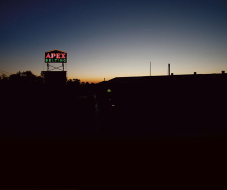
The Apex Belting sign, a glistening landmark of the western suburbs (2011) Image: Jesse Marlow
That phenomenon may be understandable, because we’ve all heeded or rejected countless signs throughout our lifetimes. “But it’s a bespoke industry,” Taylor notes. “Things are handmade still, and always will be.”
For companies like Diadem, working out all the practical questions becomes the art form: how high, how wide, where and how often? If it’s a glass cube with LEDs inside, the glass comes in certain sizes and needs to join with other pieces. How are those joins to be made – butted or concealed? The discussions get rigorously technical.
“A lot of people in the design fraternity are still applying their knowledge to a two-dimensional forum, like the internet or printed collateral,” Taylor observes. “But now we see designers and clients get really excited when they touch and handle something that is truly physical. Suddenly, it’s a tactile experience.”
As sophisticated as signs become, methods of assembly can remain stubbornly traditional. By way of illustration, Taylor recalled working with Caltex, a huge first-world corporate entity, to determine how exactly to implement their petroleum brand in the Philippines, a less technologically equipped country, and where the actual Caltex signs would be manufactured.
“I kid you not,” Taylor recalled gleefully. “I walked into the factory and saw them vacuum-forming the plastic elements over hot coals.”
This article originally appeared DQ #45, available now
Diadem
diadem.com.au
Letterbox
letterbox.net.au
INDESIGN is on instagram
Follow @indesignlive
A searchable and comprehensive guide for specifying leading products and their suppliers
Keep up to date with the latest and greatest from our industry BFF's!
The internet never sleeps! Here's the stuff you might have missed


")


")