KTX archiLAB creates the ultimate designer experience for a Japanese dispensing pharmacy, and we are crazy jealous.
No one “likes” going to the chemist. It’s often home to a strikingly bad combo of crappy carpeting and product packed to the rafters that’s merchandised in such a way that it almost physically assaults you as you attempt to make your way to the holy pharmacists’ altar (what’s with that high-up platform, anyway?) Not to mention that you generally only go to the chemist when you’re feeling physically vulnerable. It’s an all-around bad experience and something should be done!
Japan, as always, has found an elegantly design solution that will have you clambering to get to your local drug store.
To start with, did you know that in Japan, there are not one but two types of “pharmacies”? The first are your more retail-style drug stores, where you can find standard over-the-counter cold & flu type meds as well as basic services and minor medical aids like cough drops and band-aids.
The second type, however are called “dispensaries”, usually an adjacent institution to a nearby clinic or hospital. In these dispensaries, the products are produced in concealed backroom – rather than a plinth – once the customer presents a prescription. Once prepared, the pharmacist has to explain to the customer about the prescription and offer detail medical consults with the customers.
Culturally, the experience of going to the chemist is far more resolved and requires a hands-on approach from the pharmacists in working directly with their customers. Here, customers and pharmacists’ need to be able to easily access one another, and therefore requires a vastly different design approach to your local Aussie chemist.
Japanese design studio KTX archiLAB recently perfected this model of healthcare in their design of a dispensing pharmacy within the precinct of a general hospital. For KTX archiLAB, the starting point of this design was to question the criteria that customers use to select a pharmacy, other than geographical location. What would make a pharmacy better than another one? The purpose of visiting a pharmacy is the same, purchasing medicines and seeking healing is the overall goal. And from this, the driving theme of “healing” forged the design brief.
Traditionally speaking, it has been common practice to ‘soften’ and ‘palette’ the pharmacy experience, taking a more comfortable approach to their design. However, with advances in medical science and technology, KTX archiLAB discovered that the more advanced the medicine appears, the more trustworthy it becomes; true peace of mind is reached when the medical care is at its cutting edge. Here, the decision was made to base the design less on past and more on future.
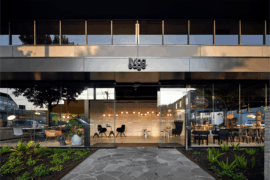
Because the pharmacy is situated along one of the most important streets in the region, the façade is totally glazed and contoured by protracted sharp edges. The edges are also projected into the minimalist white interior demarcated by a black cross. The vertical line of the cross is the gate towards the backyard where the prescriptions are prepared. The horizontal line is a console for exhibiting key products, but contrary to most chemists, its product display is intensely minimal. The entrance is on the left side of the building in the direction of the hospital liberating the glazed façade from unnecessary additional lines. This minimalistic space designed in clean straight lines – enhanced with indirect lighting slits –creates that high-tech sharpness that patients now expects from advanced medical clinics.
Additionally to the appearance, the quality of service is a major a major criteria for selecting a dispensing pharmacy, and so of course this had huge implications and demands on the design of the space.
According to KTX archiLAB, traditionally, the patient handles their prescription at the reception counter; the pharmacist will then prepare the medicines in the back whilst the patient is sitting in the waiting space. Once done, the patient will be called again to the counter to get explanations about the prescription. This dispensary differs in that the patient will not be called to the counter again. Instead, the pharmacist will meet them at their waiting area furnished with what are largely clinical (but still designer) chairs and tables. These small attentions can make a big difference by providing an image of high quality services, which can only benefit the overall process of healing.
Australian architects take note: we want sexier chemists! #MakeChemistsSexyAgain
INDESIGN is on instagram
Follow @indesignlive
A searchable and comprehensive guide for specifying leading products and their suppliers
Keep up to date with the latest and greatest from our industry BFF's!
The new range features slabs with warm, earthy palettes that lend a sense of organic luxury to every space.

For Aidan Mawhinney, the secret ingredient to Living Edge’s success “comes down to people, product and place.” As the brand celebrates a significant 25-year milestone, it’s that commitment to authentic, sustainable design – and the people behind it all – that continues to anchor its legacy.

Designed by Plus Architecture, the Bone Marrow Cancer Trust’s Rānui Apartments have been officially opened by New Zealand Prime Minister Christopher Luxon.

Healthcare design expert Tracy Lord joins us on the Stories Indesign podcast to discuss her varied inspiration and the need for nuance in her sector.
The internet never sleeps! Here's the stuff you might have missed

Luchetti Krelle’s timeless design at Epula marries heritage grandeur with classic sophistication, celebrating the spirit of a European piazza whilst remaining unmistakably of its place.

With Steelcase having reopened its refreshed WorkLife Showroom in Singapore this year, we spoke to Navedita Shergill about some key workplace macro shifts identified in their research.