The home of architecture and design in the Asia-Pacific
Get the latest design news direct to your inbox!
Get the latest design news direct to your inbox!
Asylum’s second store for skincare brand Aesop is a meditation on Singapore’s relationship with land that pairs textural contrast and carefully calibrated lighting to a maximum impact.

October 31st, 2019
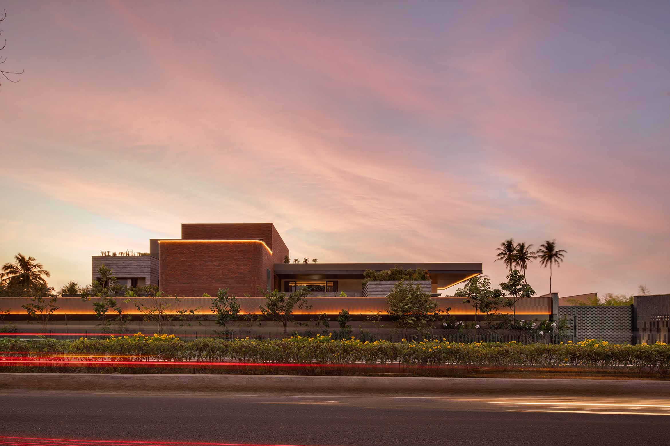
Land. It is one of Singapore’s most cherished resources and one of its greatest ambitions. So says Cara Ang, Design Director at Asylum, at the media preview of Aesop’s latest signature store at Marina Bay Sands last week.
At 890 square feet, Aesop Marina Bay Sands is the skincare brand’s flagship store in Singapore. It is also currently the largest Aesop store in Southeast Asia. The store marks Aesop’s second collaboration with Asylum, after the blush-toned Aesop Store at Ngee Ann City in 2017.
“Asylum offers us a fresh perspective, a new lens with which to see our own practices and preconceptions. This can be project-specific but also have relevance more generally as it connects Aesop to wider architectural thought and discourse,” says the Aesop team of the repeat collaboration.
The interior of the Aesop MBS store is a meditation on Singapore’s relationship with land, a specific tribute to the store’s location. Comments Aesop’s team: “We strive to support local vitality and expression and engage with the neighbourhoods we enter—it makes for a more interesting life in our increasingly connected world.”
A series of pivoting partitions separate the store from the rest of the Shoppes at Marina Bay Sands. When these fin-like partitions are closed, they present a mysteriously opaque facade that puts Aesop’s logo and signature product front and centre. Floor-to-ceiling glazed strips flanking these partitions provide a glimpse into the interior.
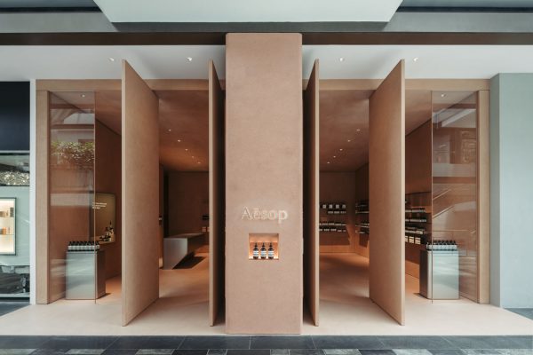
When opened, the four-metre-tall partitions present a neat symmetrical facade. It’s a stately greeting for shoppers that is well-balanced by the warm glow emanating from the interior.
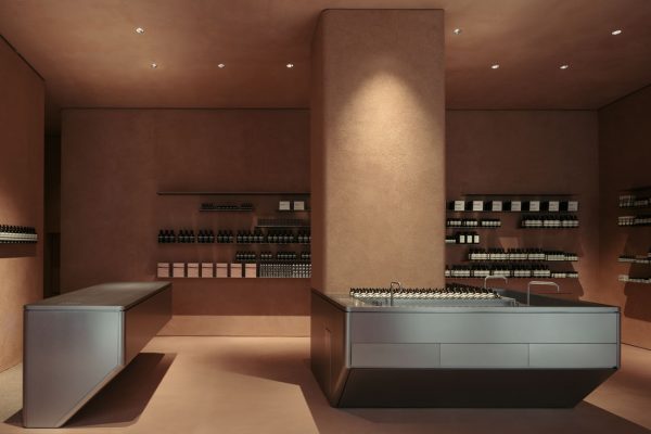
At first glance, the interior appears to be spacious, sparsely furnished, and entirely finished in a uniform shade of terracotta. Upon closer inspection, it reveals its wealth of texture.
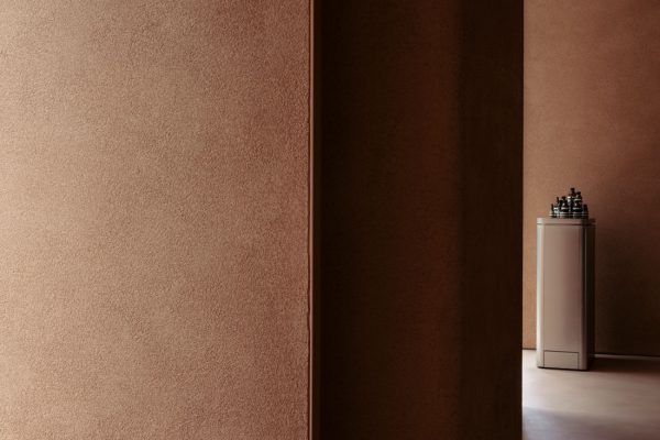
At the front of the house, the walls sport a fine clay render finish that was created manually by hand on-site while the floor and ceiling are left smooth, creating a subtle textural contrast as the light hits the surfaces.
The rear portion of the retail unit has a compact ceiling height – a natural fit for the back of the house area that is accessible through a discreet entrance behind the checkout counter.
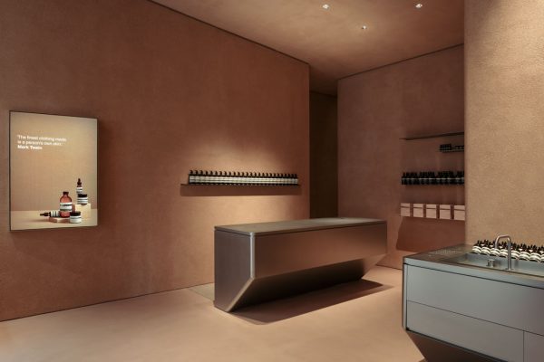
Asylum balances the warmth of the terracotta architectural shell with stainless steel interior elements. The sculptural stainless steel volumes, one serves as the checkout counter and the other as the central basin, are a nod to the caisson structure used in Marina Bay’s land reclamation project.
“Natural clay render creates a feeling of refuge while stainless steel contributes a streamlined lustre,” shares the Aesop team. The contrast, they say, is symbolic of Singapore’s transformation from a humble port island into a glittering global city.
As with the other Aesop signature stores, the central basin is the centrepiece of the interior. Here, it is contained in a stainless steel sculptural form that wraps around the central column, inviting customers to explore Aesop’s complete range of skin, hair and body care products with the help of the store’s consultants.
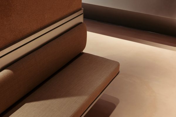
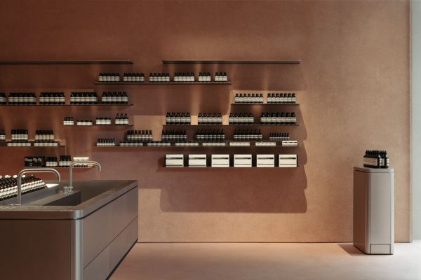
A padded bench behind the column provides a seating area where customers can sit and carefully consider the products displayed on the shelves. The sleek and deceptively simple stainless steel shelves are embedded into the wall during the construction of the interior, resulting in a crisp meeting of surfaces.
To shop in an Aesop store is to treat oneself to a multisensorial retail experience that is unique to the store’s location, and once again it has succeeded. At Aesop MBS store, the brand’s signature scent, the interior’s textural contrast, material selection and finely-tuned lighting all work in concert to create a retail experience that stands out at its extremely competitive location.
INDESIGN is on instagram
Follow @indesignlive
A searchable and comprehensive guide for specifying leading products and their suppliers
Keep up to date with the latest and greatest from our industry BFF's!
The internet never sleeps! Here's the stuff you might have missed