The home of architecture and design in the Asia-Pacific
Get the latest design news direct to your inbox!

Get the latest design news direct to your inbox!
“I’m interested in the invisibility of the design scripts that are hidden within objects we use every day that channel certain stereotypes,” says Central St Martins course leader Betti Marenko. Looking around there are plenty of design objects embedded with gender stereotypes – from the ubiquitous fail of Bic for Her pens to Nika Zupanc’s “feminine” gold chair for Moooi.

The Golden Chair, designed by Nika Zupanc for Moooi. Photo by Andrew Meredith
February 15th, 2019
When Nika Zupanc designed The Golden Chair for Moooi it was received by the press and the public, like many of the designer’s pieces, as a decidedly “feminine” object – it’s flamboyant gold colour drawing comparisons to thrones and decorative rather than functional objects. That same object in black, however, becomes a strikingly sober and minimal object, and – many would argue – more masculine. Even in today’s world of shifting gender identities, something as simple as a colour change can cause an object to take on different connotations.
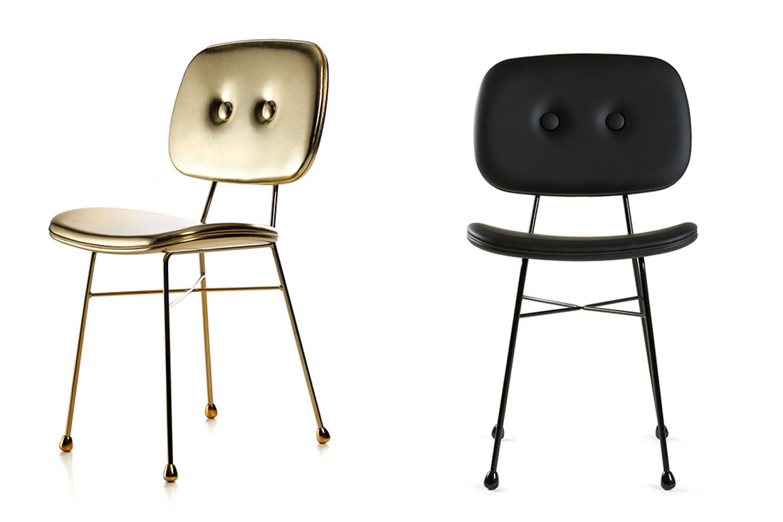
“Some of my work was very misunderstood by the public and journalists,” said Zupanc during a panel discussion organised by Disegno last year titled “Objects in Drag”. “I like to work with icons or strong symbols – a colour or visual element – [but] I take the predominant meaning out of the context and use it in a way where this meaning becomes something new; where it becomes genderless. I want to equalise the feminine and masculine gender codes.” Unlike other objects that have gender coding within their design in an attempt to market them – remember the “Bic for Her” pens debacle back in 2012? – Zupanc is attempting to disrupt and question how we perceive gender.
Perhaps, however, it is wishful thinking to believe that it is possible to create objects that won’t be perceived through the cultural lens of gender stereotypes. “We don’t live in a world where gender is abolished,” said Nina Power, senior lecturer in philosophy at the University of Roehampton, during the discussion. “We live in a world where gender is performed constantly, is reinforced all the time… there are social penalties for not conforming in certain ways.”

And, it’s far from a simple discussion. While it is arguably meaningless to attach gender to an object like Zupanc’s chair (which is the point she is making by introducing such blatant gender coding) or to a ballpoint pen, there are other objects that must address gender in order to be inclusive.
Betti Marenko, course leader in Contextual Studies on the BA Product Design course at Central St Martins, raised the example of the crash test dummy. Since the 1940s, the dummies have been designed around the proportions of the average American male. It wasn’t until 2011 that a female crash test dummy was introduced – despite studies showing that the same accident would be 47 per cent more serious for a female than a male. “I’m interested in the invisibility of the design scripts that are hidden within objects we use every day that channel certain stereotypes,” she said. “Sometimes they are just a little bit misogynistic, sometimes they cause injury.”

All of this arguably leads back to the larger issue of representation within the design industry and the question of who is behind these objects that either blatantly uses gender stereotypes for commercial benefit or disregard the specificity of certain experiences and responses, often those of females or minority groups. The real question is, as posed by Power during the discussion: “How do we recognise differences but not tie people to them?”
INDESIGN is on instagram
Follow @indesignlive
A searchable and comprehensive guide for specifying leading products and their suppliers
Keep up to date with the latest and greatest from our industry BFF's!
The internet never sleeps! Here's the stuff you might have missed