The young Korean designer shows us how he transforms the written word into a rich visual story.

June 21st, 2012
At Spazio Rossana Orlandi in Milan, designer Kyuhyung Cho offered us a fresh new perspective on the written word. Using 4 pictorial fonts that he had created, the 37-year-old showed us how songs, letters and all forms of text could transform into mysterious, colourful symbols that in turn, were able to tell a new visual story.
Thus intrigued, we caught up with Kyuhyung after the furor of Milan Design Week had somewhat subsided for a quick chat.

Garden Regular Font
How did you come to develop these fonts?
[While doing] my master’s degree [at Konstfack in Sweden], I was trying to diversify the forms of collaboration. I invited unwitting collaborators in the process, which seems strange first. [An] unwitting collaborator refers to one who [is] working with me but has no intention [to]. It could be nature or social laws and customs.
As a part of this practice, I was interested in the order of letters in text. In order to keep the meaning of text, text should keep a certain order of alphabet. One day, I wanted the order of letters in text in my project as a new unwitting collaborator. So I offered the text my unreadable fonts to make unexpected but beautiful images.

Pippi Longstocking lyrics typed in Creatures Italic Font
What are some the mediums that these fonts can be applied to?
[The fonts] can be applied to anything, on furniture, glass, [even] tattoo. It depends on where you want to keep your story.
In each of my experiments, the aim is to bring the text closer to a person’s everyday life.
I made a blanket for a kid with her favourite song, and for a writer, a scarf with her novel printed on it. I also did a special wallpaper for a woman with her last love letter from her husband.
I am [also] going to apply the pattern based on our story in our everyday goods like furniture, fashion and dishes.

A Love Letter typed in Garden Regular Font

Lea Ahmed Jussilaninen and with her love letter
Have there been any unusual requests?
I got asked to make a print for Ivar Björkman, the former president of Konstfack. Konstfack gave me a letter to ascribe the honour to him. I then typed the letter with one of my fonts, Garden Regular, and screen-printed it. The prints itself is not only beautiful like his life at Konstfack but also meaningful, containing all our appreciation.

A Love Letter typed in Garden Regular Font

Barbara Voors wearing her novel
Were there any unexpected challenges or surprising outcomes resulting from this project?
At first, I just wanted to do collaboration with the order of letters. I didn’t expect to make a strong connection between human and product through our own stories. That is why I love to do self-initiated projects [that are open-ended], besides commercial design.

Geometry Regular Font
What else is keeping you busy right now?
My dream is to do design for a long time [and] it is very important for me not to lose interest in design. So I will broaden my limits and challenge [myself] in new fields.
I am making a chair with a Japanese designer. It is so nice because there are lots of ‘first things’ I have never done.
Who knows? I may work in Singapore several years [down the road].
We have a request. Can you please write Indesignlive Singapore in your pictorial fonts?
Here’s Indesignlive Singapore in Creatures Regular.

Thanks Kyuhyung!
Top image: Isis Backstrom covered by her favourite song, Pippi Longstocking
Kyuhyung Cho
kyuhyungcho.com
INDESIGN is on instagram
Follow @indesignlive
A searchable and comprehensive guide for specifying leading products and their suppliers
Keep up to date with the latest and greatest from our industry BFF's!
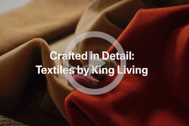
For a closer look behind the creative process, watch this video interview with Sebastian Nash, where he explores the making of King Living’s textile range – from fibre choices to design intent.

For those who appreciate form as much as function, Gaggenau’s latest induction innovation delivers sculpted precision and effortless flexibility, disappearing seamlessly into the surface when not in use.
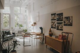
Sydney’s newest design concept store, HOW WE LIVE, explores the overlap between home and workplace – with a Surry Hills pop-up from Friday 28th November.
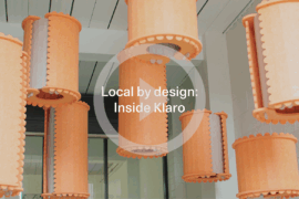
In an industry where design intent is often diluted by value management and procurement pressures, Klaro Industrial Design positions manufacturing as a creative ally – allowing commercial interior designers to deliver unique pieces aligned to the project’s original vision.
In the early 1950s, Swiss engineer Alexander Weber revolutionised window furnishing products by creating the world’s first silent curtain track using nylon gliders and aluminium profiles.
Zanui celebrated their launch into the retail revolution with a champagne brunch for media on Tuesday 8 May, at the newly opened Posto in Sydney’s Rushcutters Bay.
The internet never sleeps! Here's the stuff you might have missed
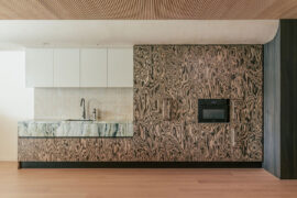
Trust sits at the core of Everton Buildings’ new office, where Ambit Curator was given licence to move beyond convention and deliver a workplace defined by vision, materiality and assured detail.
In the New Year, architecture will be defined by its ability to orchestrate relationships between inside and outside, public and private, humans and ecology, and data and intuition.